
Legofied Best Picture Posters by Old Red Jalopy
Neil Robinson (Old Red Jalopy) reimagines 2014 Oscar Best Picture nominee posters as LEGO one-sheets—minifigure stars, brick sets, and poster craft intact.
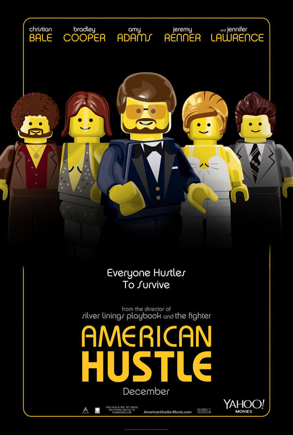
Neil Robinson, working as Old Red Jalopy, is an illustrator known for graphic and poster design and for commissioned work aimed at blogs and magazines. In early 2014 his most shareable project was a set of Academy Award Best Picture nominee posters rebuilt as if each film had been marketed as a LEGO movie. Minifigure faces, brick-built sets, and toy-box color replaced photographic glamour—without losing the silhouette language of the real one-sheets.
The series landed while The Lego Movie was dominating theaters and awards chatter was circling nine Best Picture contenders. Yahoo Movies commissioned the Legofied posters; design sites and film blogs passed them around as Oscar-season candy. The joke only works because Robinson can draw: celebrity likeness collapses into studs and yellow smiles, yet costume, pose, and poster composition still read as Gravity, American Hustle, Her, and the rest of the field.
Who Old Red Jalopy is
Old Red Jalopy is Robinson’s studio identity for illustration that sits between commercial poster craft and playful pop culture remix. The work specializes in graphic clarity—bold shapes, readable hierarchy, and the kind of finish that still looks intentional when compressed into a social feed. Commissioned pieces for editorial and entertainment clients need that reliability: a poster has seconds to explain tone before anyone reads a credit block.
LEGO is a natural medium for that skill set. The brick system already supplies a visual grammar—primary colors, modular construction, instantly recognizable minifigure proportions. Translating a film poster into that grammar is part parody, part design problem. Which details survive when a face becomes a studded smile? Which props must stay so the title still clicks? Robinson’s Oscar set answers those questions film by film.
He had explored similar Legofied Oscar posters in an earlier awards cycle, so the 2014 project was not a one-off gag. It was a return to a format he already knew how to push: keep the marketing composition, swap the rendering engine to bricks.
Why Legofied Oscar posters hit in 2014
Timing mattered. The Lego Movie had just reminded everyone that brick humor could carry satire, heart, and blockbuster craft. Against that backdrop, turning serious Best Picture campaigns into toy aisles felt like zeitgeist, not random nostalgia. The nominees that year also offered a wide mood board: space isolation, 1970s hustle, artificial intimacy, historical trauma, financial excess, quiet Midwestern roads. Seeing all of them speak LEGO underlined how flexible the toy language had become in popular culture.
There is also a useful tension in the concept. Some titles invite playfulness easily—orbital disaster as brick diorama almost designs itself. Others, heavier in subject, make the conversion feel cheeky or even uncomfortable, which is part of why the set circulated. The series does not argue that every story “should” be a children’s toy. It shows what happens when a single visual dialect is forced across a diverse slate, and how much of a movie’s identity lives in poster shorthand alone.
Stars reduced to studs
The original coverage called out how cleanly Robinson “legofied” performers such as Sandra Bullock, Jennifer Lawrence, Leonardo DiCaprio, and Tom Hanks in costume. That is the craft test. A minifigure cannot rely on photographic skin texture or subtle micro-expression. Likeness has to come from hair piece, printed torso, silhouette, and the props that fans already associate with the role.
Bullock’s orbital isolation in Gravity becomes a brick void and a tiny suited figure—poster drama scaled to a playset. Lawrence’s awards-season presence in the hustle-and-glitter world of American Hustle needs period hair and wardrobe cues that survive yellow plastic. DiCaprio’s Wall Street excess has to read through suit, smirk energy, and chaotic supporting clutter. Hanks in Captain Phillips benefits from ship geometry and boarding action that still work when rebuilt from bricks—composition doing as much storytelling as facial likeness.
That is why these pieces reward designers as much as casual scrollers. They are not only “famous movie but LEGO.” They are studies in what a one-sheet truly needs in order to remain itself.
Poster design lessons inside the joke
Look at the surviving hierarchy. Title treatment, key art focal point, and negative space still guide the eye. LEGO versions that work keep a clear hero shape and resist filling every stud with noise. Color blocking replaces photographic grade; saturation does the emotional lifting that lighting did in the live-action campaigns.
Costume translation is another lesson. Fabric drape disappears; printed patterns and accessory bricks replace it. The designer must decide which single wardrobe signal is non-negotiable—a neckline, a hat, a spacesuit proportion—and discard the rest. That editorial ruthlessness is what separates a clever remix from a cluttered brick collage.
Scale comedy matters too. Tiny figures against huge implied environments (open water, orbital black, empty Midwestern roads) recreate the awe of the original posters with opposite means. Instead of a crane shot, you get a carefully framed playset. The awe is still there; the materials changed.
Pop culture remix as illustration practice
Projects like this sit in a long tradition of entertainment illustration that borrows corporate toy languages the way political cartoonists borrow party symbols. The difference is affection. Robinson’s posters read as fandom craft more than corporate takedown. They celebrate how quickly audiences can recognize a film when only a handful of visual anchors remain.
For illustrators, the brief is a useful exercise even years later: pick a known IP poster, rebuild it inside a constrained visual system, and measure success by recognition speed. Can a viewer name the movie in one second? If yes, the design captured the myth. If no, the remix became only texture.
For film fans, the set is a time capsule of the 86th Academy Awards conversation—nine campaigns frozen as brick theater while a LEGO feature film owned the cultural microphone.
Where the work lived
Contemporary write-ups pointed viewers to Yahoo Movies for the full nominee lineup and to Old Red Jalopy’s site for more of Robinson’s graphic and poster work. The Sortrature gallery keeps the Legofied frame that made the project travel: brick Best Picture art under the Old Red Jalopy name, with the playful friction between prestige film and toybox rendering intact.
If you collect Oscar-season design oddities, file these beside other awards-week remixes—but keep the credit clear. The entity is Neil Robinson / Old Red Jalopy, the medium is LEGO-styled illustration, and the subject is Best Picture poster language pushed through studs and smiles until the movies are still unmistakably themselves.
- Gravity: isolation and suit silhouette against empty space.
- American Hustle: period hair, wardrobe flash, ensemble hustle energy.
- Her: intimate futurism reduced to clean shapes and quiet color.
- The Wolf of Wall Street: excess signaled through costume and chaos props.
- Captain Phillips: ship geometry and boarding tension that survive brick translation.

Comments
Continue reading
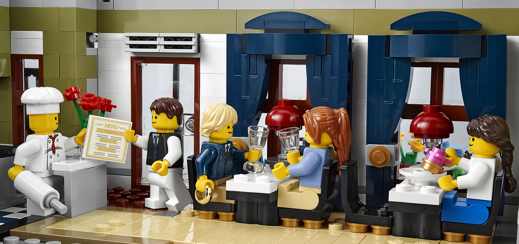
LEGO 10243 Parisian Restaurant: The Modular Bistro Set
Jamie Berard unveiled LEGO set 10243 Parisian Restaurant at BrickCon 2013—a 2,469-piece modular with restaurant, apartment, artist studio, and five minifigures.

Still-Life Photography by Margareth Perfoncio
São Paulo photographer Margareth Perfoncio’s still lifes of food and flowers—Old Master light, dark wood, and tables that feel inevitable.

Meaningful Love Quotes for Inspiration (and Ink)
Meaningful love quotes that still feel true — short lines for tattoos, gifts, and everyday reminders, with placement and wording tips.