
Kate Upton for Vogue US, June 2013
Mario Testino’s sunlit Uruguay cover story for American Vogue’s June 2013 issue—The Kate Upton Effect—in summer knits, swim, and casual glamour.
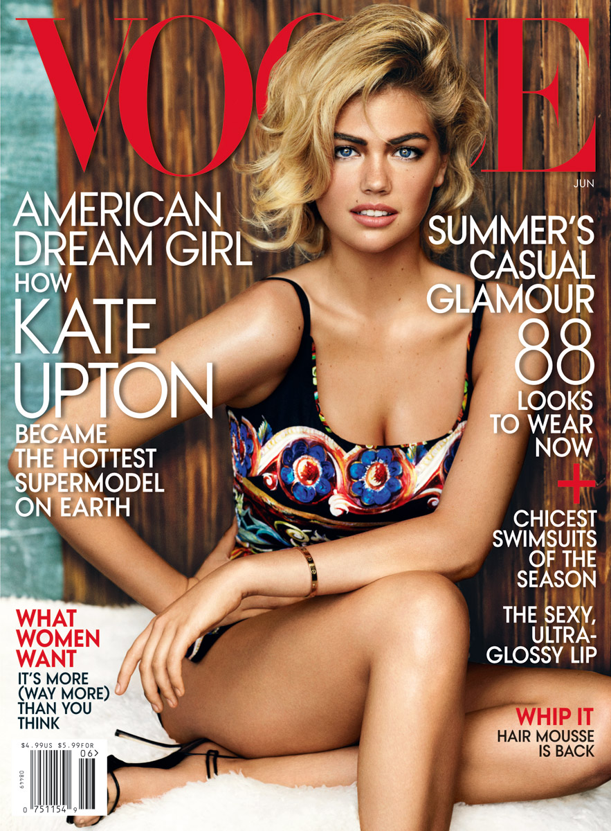
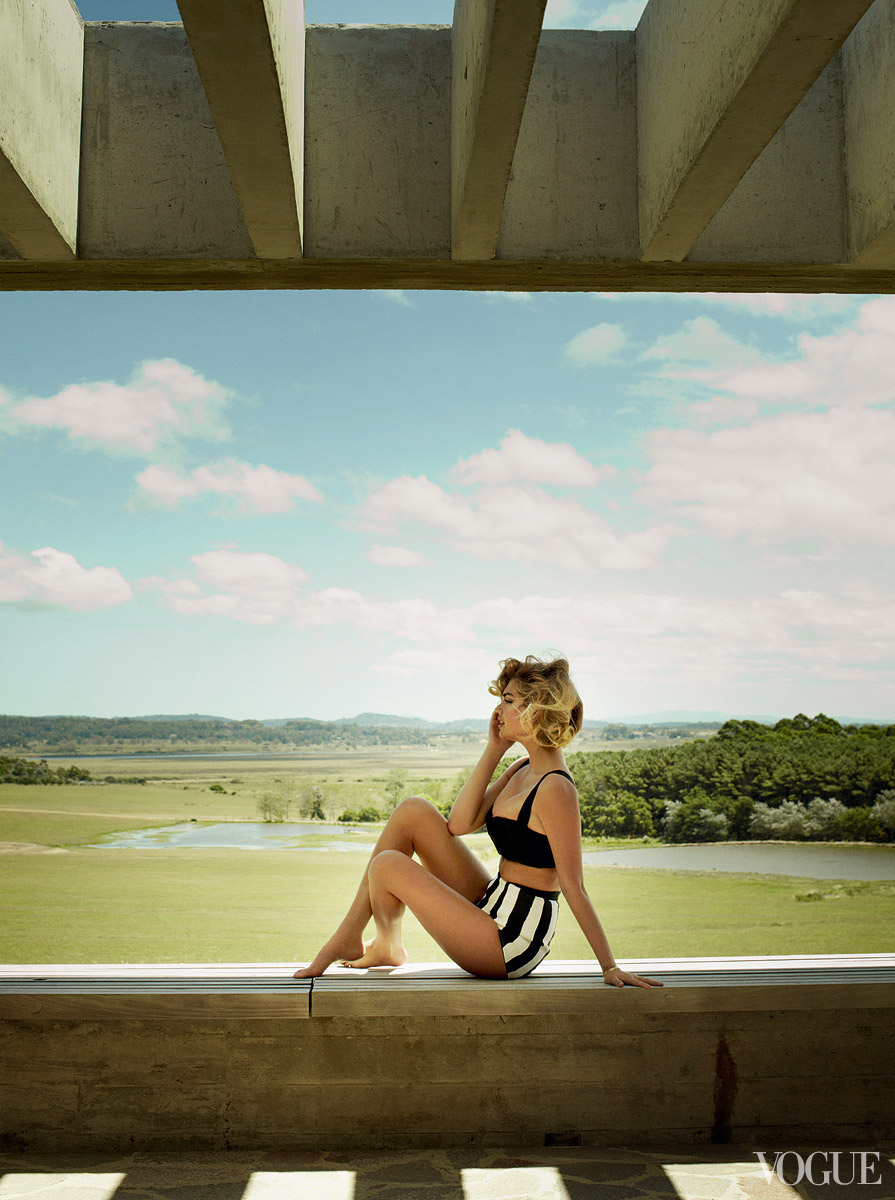
By June 2013, American Vogue was ready to put Kate Upton on the cover—not as a curiosity borrowed from swimsuit culture, but as the season’s own “American Dream Girl.” Photographed by Mario Testino and styled by Tonne Goodman on location in Uruguay, the package sold summer’s casual glamour: sun on wood and grass, knit separates that looked like a long weekend, a Chanel swimsuit with white piping, and the easy laugh that had already made Upton a digital-age celebrity before fashion’s gatekeepers fully claimed her. The issue coverline said it plainly. This gallery collects frames from that cover story—bright, outdoor, and unmistakably warm-weather Vogue.
The timing mattered. Upton had spent the previous two years proving that a Sports Illustrated-facing career could cross into high fashion without flattening into parody. A smaller Vogue appearance earlier, a major November 2012 Steven Meisel spread titled “The New Girl,” and Carine Roitfeld’s CR Fashion Book cover had already argued the case. June 2013 was the seal: masthead real estate, Testino’s sun-drenched polish, and an accompanying profile by Lizzie Widdicombe that treated social media not as a side note but as the engine of her rise. Read as a historical fashion feature, the set is less about gossip and more about how American Vogue packaged midsummer desirability in 2013—heat first, institutional approval second.
Uruguay light, Hamptons mood
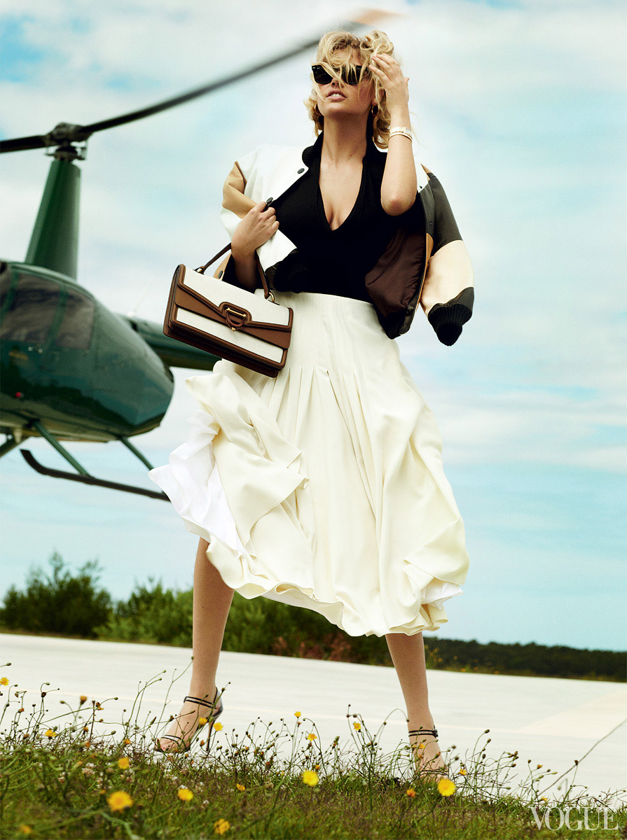
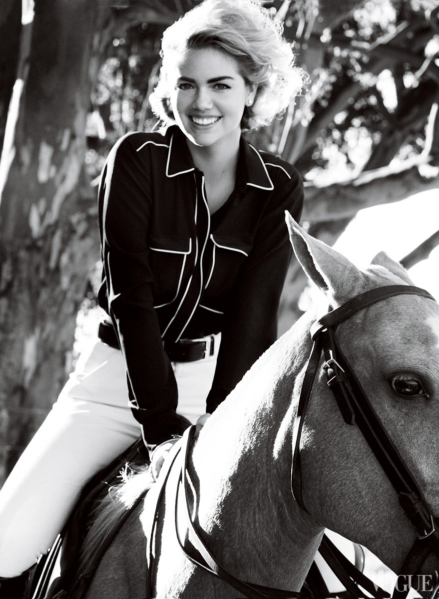
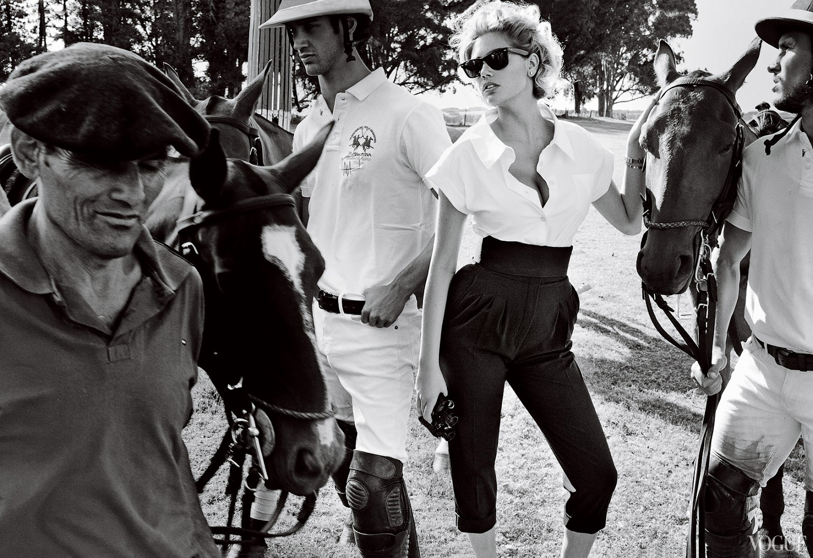
Testino shot the editorial at Uruguay’s Hotel Fasano Las Piedras and in the surrounding landscape—porches, lounge chairs, tall dry grass, the kind of open air that prints as vacation even when the clothes are couture-adjacent. Fashion editor Tonne Goodman dressed the story like sporty weekend wealth rather than red-carpet armor: Rochas cashmere knits in rust and cream, Stella McCartney shirts with Hermès breeches for the equestrian beat, Givenchy bombers over Donna Karan bodysuits, Max Mara color-blocked blouses with Jason Wu shorts, Oscar de la Renta pleats for a jet-set turn. The clothes move. You can imagine walking in them. That is the June difference from colder, more formal studio stories: silhouette still matters, but breeze and smile do half the selling.
Behind-the-scenes material released with the cover leaned into the same idea—Upton talking through summer-escape essentials while Testino and Goodman built a front page that felt like heat without looking cheap. Ray-Ban frames and Cartier bracelets repeat as quiet constants across looks; they ground the fantasy in recognizable luxury rather than costume jewelry noise. Manolo Blahnik sandals and a Gucci bag show up where the story needs city polish without abandoning the vacation thesis. Nothing here is winter armor. Everything wants sunlight.
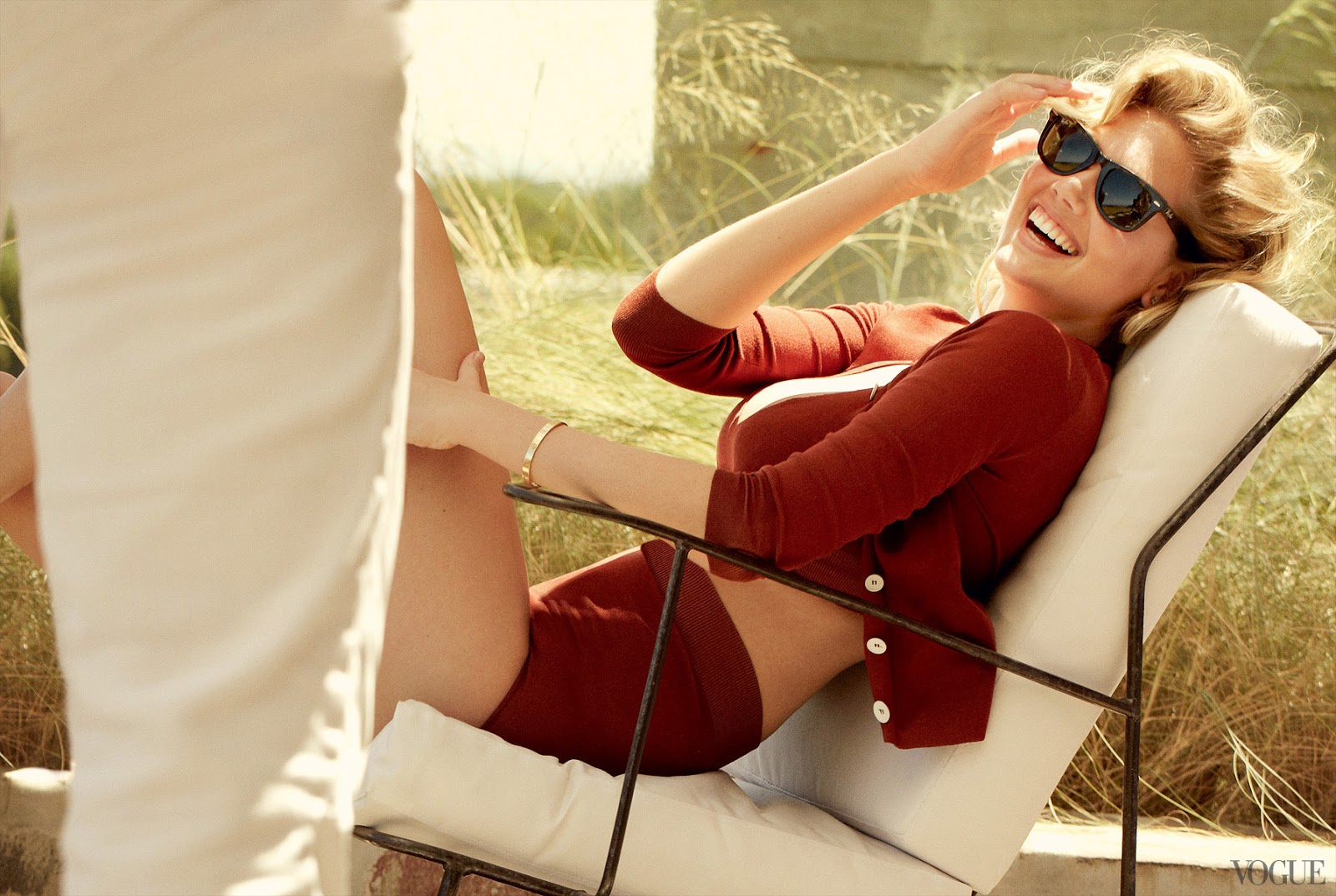
Look at the laughing lounge-chair frame: Wayfarer sunglasses, open cardigan, high-waisted knit bottoms, a gold bangle catching light, dry grass behind. It is not a severe fashion face. It is the magazine agreeing that Upton’s commercial warmth was the point, not a problem to be edited out. Compare that energy with the cooler, more covered sportswear persuasion of her autumn 2012 Meisel story and the seasonal split becomes obvious. November argued she could wear serious fashion inside the book. June argued she could own the masthead in summer air.
The Kate Upton Effect
Vogue titled the feature “The Kate Upton Effect: America’s Favorite Bombshell,” and the text circled a genuine industry tension of that moment. Upton had not been midwifed by the usual runway anointings. She had SI covers, television ads, viral video charisma, and a body the fashion press kept debating even as readers voted with clicks. Widdicombe’s profile framed her ascent as a digital-age path: audience first, establishment later. She had bypassed the classic photographer patronage and even the Victoria’s Secret runway launch pad that minted other names. That framing is why the June cover lands differently from a standard new-face debut. It is ratification after the public had already decided.
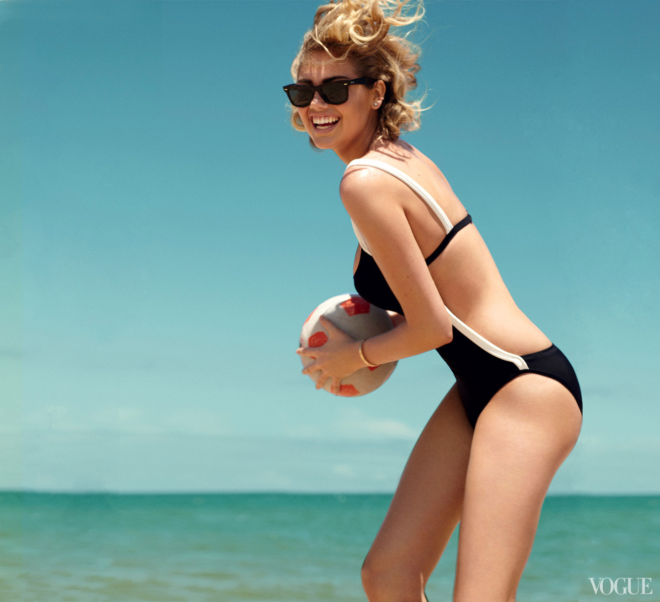
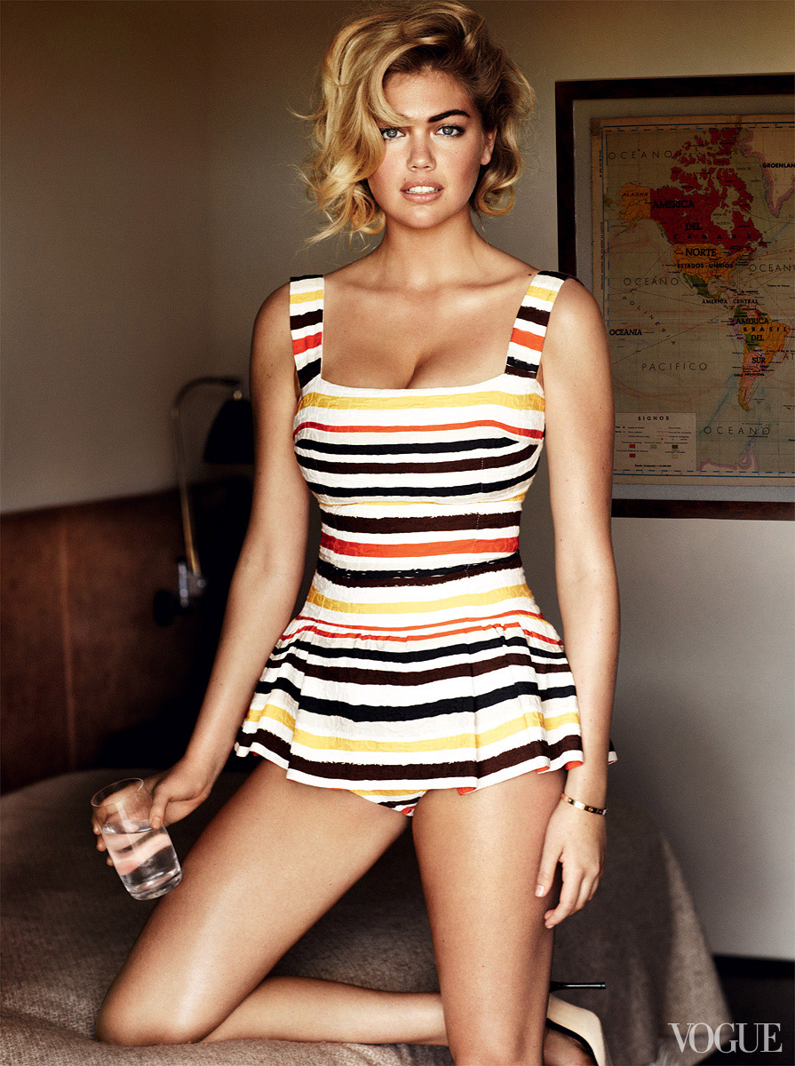
Upton’s own quotes from the period stayed stubbornly simple—pride in her body, career goals mapped like a competitive athlete’s schedule, Florida beach childhood as origin story rather than mythmaking. The photographs back that biography without turning every frame into a swimsuit callback. When a Chanel black swimsuit with white piping appears, it reads as summer wardrobe inside a fashion story, not as a return to catalogue mode. When equestrian kit appears—Stella McCartney shirt, Hermès white breeches, Michael Kors belt—it nods to her real riding background. The editorial keeps offering evidence that “bombshell” and “fashion” could share a page in 2013 American Vogue without canceling each other out.
What summer glamour looked like on the page
Beauty direction for the issue matched the headline stack around glossy lips, sun-kissed skin, and hair with volume that still photographed as beach-adjacent rather than evening-set. The cover itself—patterned one-piece with blue, red, and yellow floral energy on black, weathered wooden planks, shaggy white rug, side-parted waves, thin gold bracelet—announced casual glamour before you opened the book. Cover lines around summer’s casual glamour, chicest swimsuits, and the ultra-glossy lip were not random marketing; they describe the pictures.
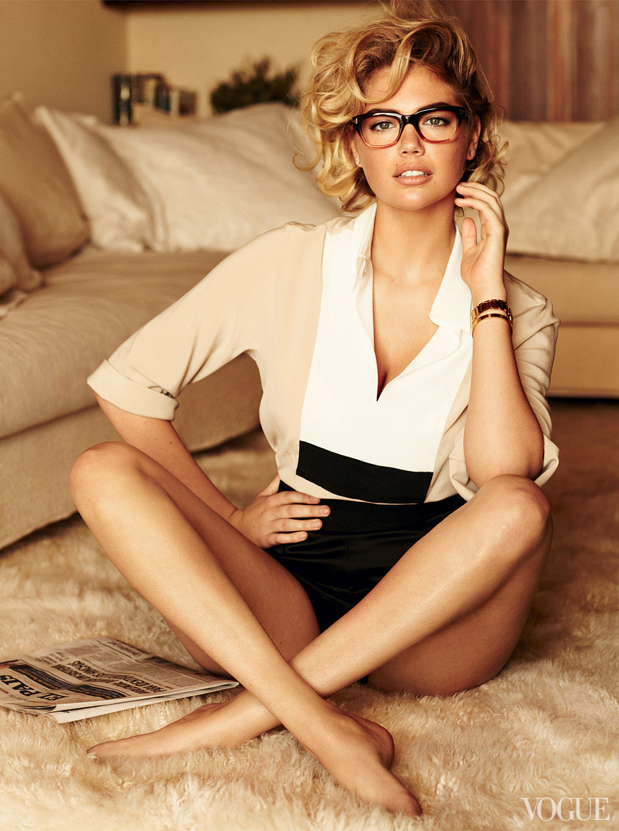
Inside frames continue that grammar: crop knits on a porch, newsy glasses with Tom Ford frames, layered jet-set looks that still breathe. None of it is the gray-backdrop sportswear severity of late 2012. June wanted heat, motion, and a smile that sold the masthead. For anyone archiving early-2010s covers, this set is a useful specimen of how Vogue translated a commercially famous face into seasonal fashion authority. Location does status work; knits do wearability work; swimsuit moments keep faith with the audience that made her famous; designer names keep faith with the magazine’s hierarchy. Testino’s familiarity with glossy optimism helps. Upton looks at home in sunlight in a way studio severity sometimes refused her.
How to read the gallery now
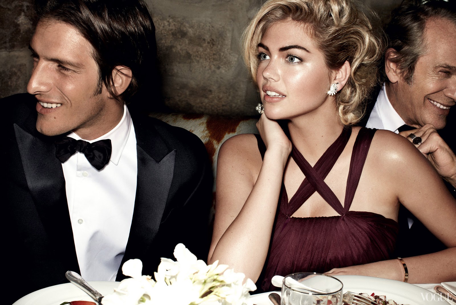
Slow down on three craft decisions. First, color temperature: rust knits, floral swim prints, blonde hair against weathered wood—everything is warm on purpose. Second, pose language: open mouths, reclining chairs, hands near sunglasses, porch leaning—vacation body language sold as fashion. Third, accessory repetition: bracelets and shades that recur are quiet branding, not clutter. Together they explain why this cover still reads as June even if you strip the date off the masthead.
If you are comparing Upton’s Vogue moments from that era, keep the seasons honest. The November 2012 Meisel story argued credibility through designer sportswear and studio control. The June 2013 Testino cover argued ownership through sunlight and masthead scale. Same model, different weather, different job. The frames here belong to the second argument—sun first, ratification second, and a coverline that finally matched the audience’s appetite for an American bombshell who had arrived on her own digital terms.

Comments
Continue reading
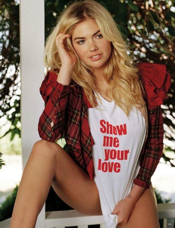
Kate Upton for Vogue Germany January 2013: Bruce Weber
Bruce Weber and Anne Christensen’s January 2013 Vogue Germany feature—outdoor European wardrobe romance, from Ackermann to Eres.
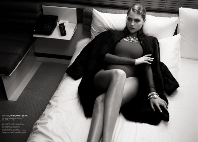
Kate Upton on Vogue Brasil July 2013: E o Novo Sexy
Henrique Gendre and Luis Fiod put Kate Upton on Vogue Brasil’s July 2013 cover in Miu Miu—a Brazilian newsstand thesis on “the new sexy.”
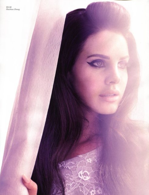
Lana Del Rey for Vogue China: Say Goodbye to the Wonderland
Wee Khim and Grace Lam’s ethereal January 2013 Vogue China story—soft waves, cat eyes, and dreamlike fashion far from French weekly bronze.