
Kate Upton for GQ Italy, August 2012
Guy Aroch photographs Kate Upton for GQ Italia’s August 2012 cover, styled by Emily Current and Meritt Elliot—soft, retro-leaning European men’s-magazine sensuality.
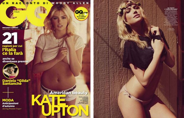
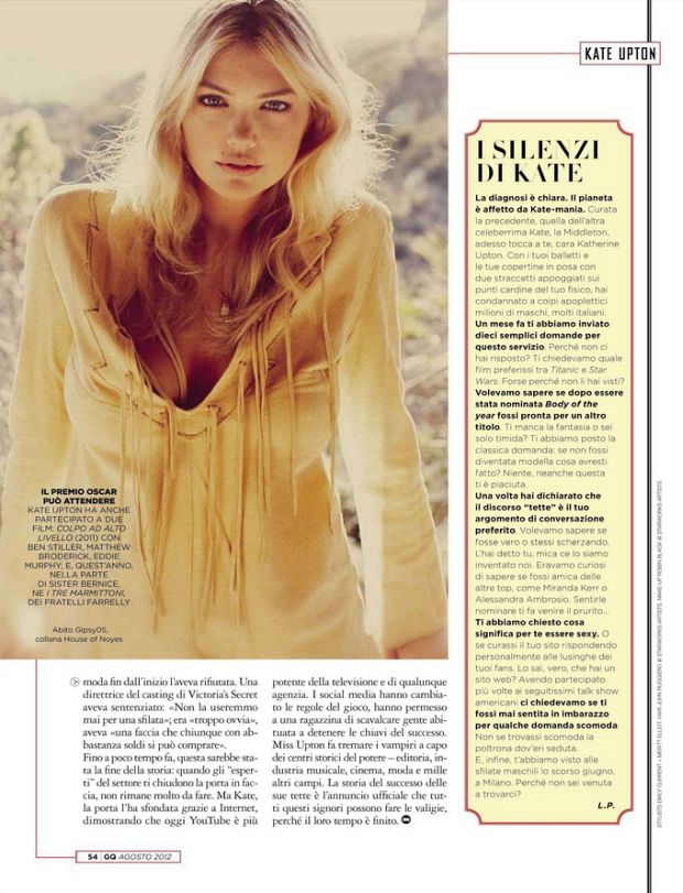
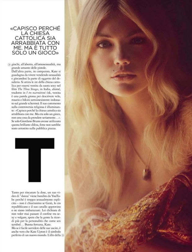
American model Kate Upton heats up the cover of GQ Italy—more precisely GQ Italia’s August 2012 issue—in a set photographed by Guy Aroch and styled by Emily Current and Meritt Elliot. The Italian men’s title wanted a softer, retro-leaning sensuality than the brasher American GQ moments circulating around the same period. Aroch’s Kate is warm, cinematic, and slightly vintage in mood: less punchline, more perfume ad crossed with summer night. That tone is the whole point of revisiting the feature. It is not “another Upton sexy cover” in the abstract; it is an Italian men’s-fashion answer to an American phenomenon, staged for a local newsstand and a local idea of elegance.
By summer 2012 Upton was everywhere in print culture—swimsuit editions, viral clips, competing magazine fantasies of what her fame meant. GQ Italia’s answer was European polish. Men’s magazines across countries share an interest in desire, but they do not share the same lighting grammar. Italian GQ often prefers atmosphere, fabric romance, and a slower gaze. Aroch delivers that register: sensual depth without turning the story into a dare. The cover still has to stop a reader at a newsstand, but it stops him with glow and mood rather than with a stunt or a meme reference that ages in six weeks.
Guy Aroch’s soft focus on fame
Aroch’s photographs treat Upton as a screen presence as much as a model. Light wraps rather than slashes; skin reads luminous; wardrobe choices favor mood over logo shouting. Contemporary fashion commentary described the editorial as deliciously sensual and soft—an “American girl” translated for Italian pages. That translation is the feature’s real subject. Upton does not become Italian; the magazine becomes a lens that Italianizes her American celebrity, the way European editions often remake Hollywood and New York faces for local taste without pretending those faces were local all along.
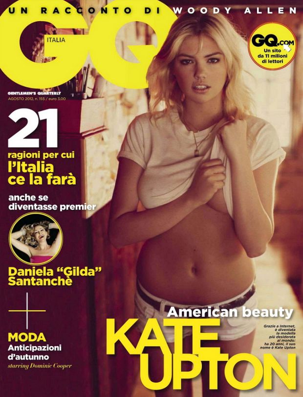
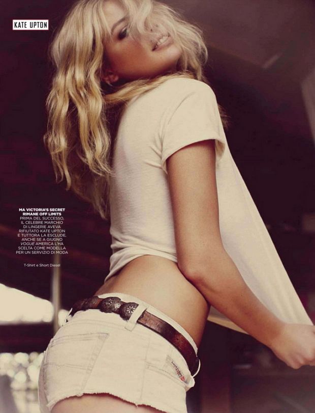

Emily Current and Meritt Elliot’s styling supports the retro tilt. Silhouettes and textures lean toward romantic sensuality rather than sportswear irony. Where some 2012 Upton stories chased meme energy, this one chases film-still energy. The difference is pacing. GQ Italia invites lingering; it does not ask for a punchline in the first frame. Even when the clothes are revealing, the editorial’s manners stay closer to classic European men’s photography than to internet-era gag covers that treat the model as a punchline delivery system.
Soft sensuality is not the same as vagueness. Aroch’s frames still have clear hierarchies: face, skin, fabric, then background. The eye knows where to land. That clarity is why the set still works as a gallery. Thumbnail culture flattens many men’s-magazine shoots into interchangeable heat; Aroch’s lighting signature resists that flattening a little longer because the mood is specific—warm, slightly vintage, closer to cinema stills than to club photography.
Men’s magazine, Italian edition
GQ franchises share a brand, not a single culture. American GQ covers of the era could be louder, joke-friendlier, more pop. GQ Italia sits closer to European fashion-men’s hybrids: clothes matter, lighting matters, the cover still has to perform commercially, but the fantasy is elegance before comedy. Putting Upton on that cover in August 2012 was a bet that her fame could survive a more refined frame—and that Italian readers would accept an American swimsuit star if the photography upgraded the context from viral novelty to editorial glamour.
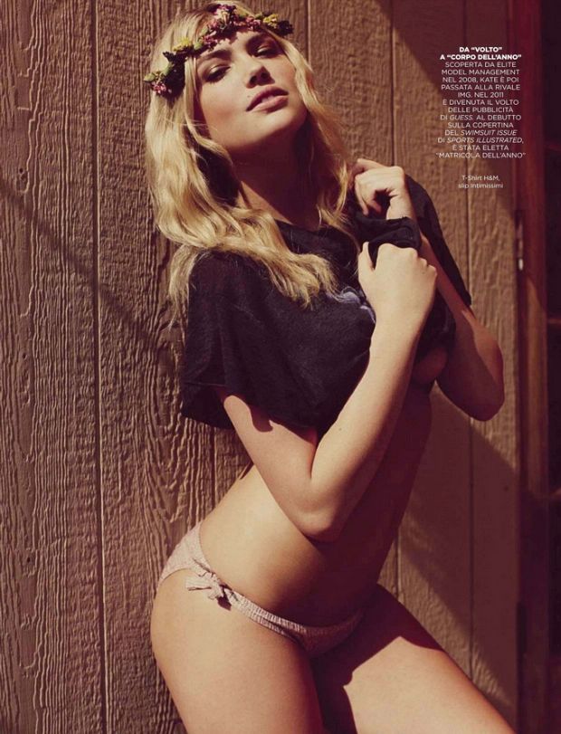

The bet also reflects how international editions used American models as shared currency. A face known from U.S. swimsuit culture could sell Italian issues if the photography relocated her inside a softer erotic tradition—less neon, more shadow and skin warmth. Aroch does not hide Upton’s body; he changes the temperature around it. Desire becomes atmosphere. That is a different product from desire as punchline, and GQ Italia was selling the atmospheric version to readers who expected fashion literacy alongside celebrity heat.
Reading the set against Upton’s other 2012 covers
Stack this GQ Italia feature beside Cosmopolitan’s November western lingerie story and the contrast is instructional. Cosmo wanted outdoor play and magazine-friend quotes. GQ Italia wanted interior heat and fashion sensuality. Stack it beside Jalouse’s October high-fashion coats and you get another contrast: French Jalouse argued for fashion seriousness through volume and designer armor; Italian GQ argued through skin, light, and romantic posing. Stack it beside Elle France’s January 2013 casual “American Beauty” story and GQ Italia looks warmer, darker, and more nocturnal even when the issue month is August.

None of these versions cancel the others. They show how 2012–2013 magazines used Upton as a flexible icon. Photographers and stylists chose which channel of her image to amplify. Aroch and Current/Elliot chose the channel closest to classic European men’s-editorial romance. That choice is why the feature still earns a separate page in any serious Upton print timeline instead of being merged into a generic “sexy covers” folder that erases country, credit, and magazine voice.
Craft, credits, and a way to look
Campaigns and covers from this period often age into internet thumbnails. Aroch’s frames resist that reduction better than joke-driven shoots because their primary tools—light, skin, posture—do not depend on a caption. Even without knowing the issue month, a viewer can feel the temperature: adult magazine, Italian fashion-men’s blend, summer cover energy expressed as glow rather than as beach props. That clarity is craft, and craft is what separates a memorable GQ Italia cover from disposable celebrity packaging.
Credits deserve equal billing with the celebrity name. Guy Aroch sets the sensual soft register. Emily Current and Meritt Elliot decide whether the clothes support romance or fight it. Upton supplies the recognizable face and the physical confidence that made editors keep booking her across continents. Remove any one of those pieces and the cover weakens into either anonymous lingerie or a celebrity snapshot that could belong to any men’s title in any country.
If you are building a timeline of Kate Upton magazine appearances, place GQ Italy / GQ Italia August 2012 in the “European sensual polish” column. One practical tip for looking at the gallery: ignore the urge to rank “more or less sexy” against her swimsuit work. Ask instead what fantasy the magazine is selling. Here the fantasy is close-up glamour with a vintage hum—desire staged as atmosphere, not as a stunt—and that is the Italian GQ difference worth keeping straight.

Comments
Continue reading
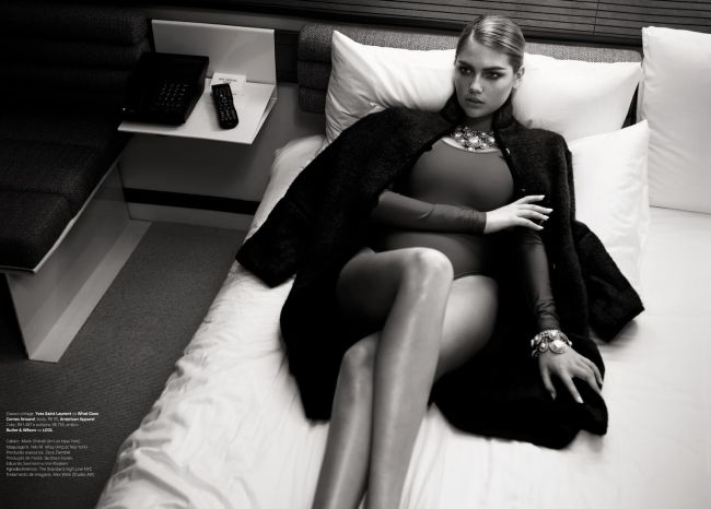
Kate Upton on Vogue Brasil July 2013: E o Novo Sexy
Henrique Gendre and Luis Fiod put Kate Upton on Vogue Brasil’s July 2013 cover in Miu Miu—a Brazilian newsstand thesis on “the new sexy.”

Kate Upton for Vogue Germany January 2013: Bruce Weber
Bruce Weber and Anne Christensen’s January 2013 Vogue Germany feature—outdoor European wardrobe romance, from Ackermann to Eres.
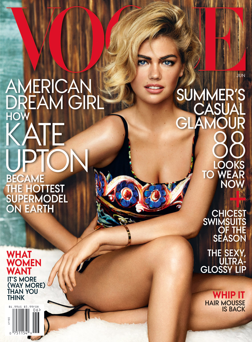
Kate Upton for Vogue US, June 2013
Mario Testino’s sunlit Uruguay cover story for American Vogue’s June 2013 issue—The Kate Upton Effect—in summer knits, swim, and casual glamour.