
Ideas in Pictures: Peechaya Burroughs’ Minimal Conceptual Photography
Sydney-based conceptual photographer Peechaya Burroughs turns striped dresses, paper drawings, and everyday objects into witty minimal frames—starting with a zebra that borrows a human body.
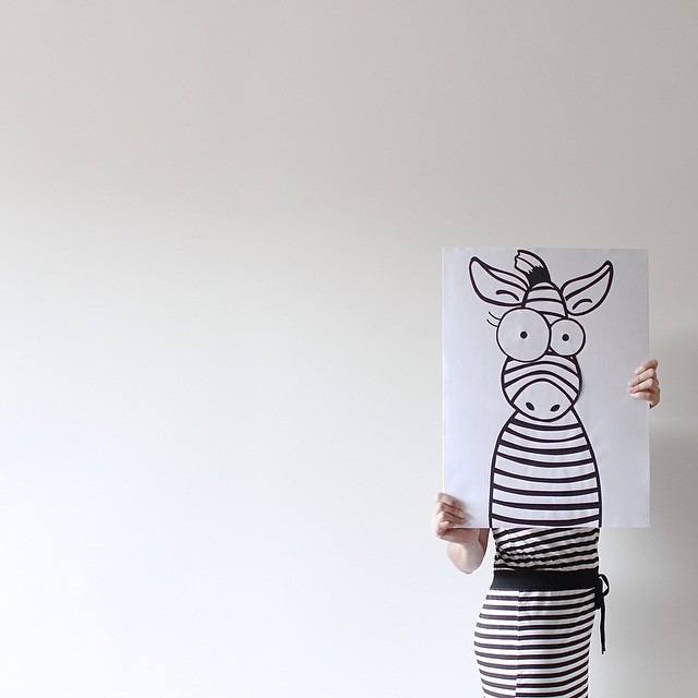
Peechaya Burroughs is a Sydney-based conceptual photographer and designer who builds pictures the way a careful art director builds a poster: few parts, clear hierarchy, one idea that lands at thumbnail size. Her name is Peechaya Burroughs—often shortened online to the handle pchyburrs—and the work that travels under that name is known for minimal arrangements, graphic wit, and a stubborn streak of everyday optimism.
The photograph kept with this feature is a neat introduction. Everything else below maps the practice around it: training, series titles, why the jokes stay gentle, how the pictures travel on feeds, and what other image-makers can borrow without copying her props.
Paper zebra, striped dress, empty wall
A figure stands on the right half of a bright, almost empty frame. A vertical sheet of paper covers the face. On the sheet, a black-line zebra head stares out with uneven cartoon eyes and a small tuft between the ears. Below the paper, a short dress of fine horizontal black-and-white stripes continues the animal’s pattern into cloth. A solid black waistband ties at the side. Hands grip the left and right edges of the paper like a portable mask.
The alignment is the punch line. Drawing and garment cooperate until the illustrated head seems to own a human body. No digital collage is required—only patience, stripe matching, and the decision to hide the face so the cartoon can speak. Negative space on the left keeps the joke from feeling cramped. Soft, even light refuses drama. The picture is closer to a design sketch that learned how to breathe.
Look longer and the craft multiplies: the waistband knot as a small dark accent, the hand tension that proves the paper is real, the unused air that stops the hybrid from feeling glued to the edge. Minimalism here is not emptiness. It is editing.
Design training behind the camera
Burroughs’ résumé explains the polish. She earned a B.A. in Fine Arts majoring in Communication Design at Bangkok University, later studied website production and management in Sydney, and worked across graphic design and advertising—including time with a major Japanese agency network—before photography became the public face of the practice. Communication design teaches message economy: one focal point, controlled palette, margins that mean something. Those habits transfer cleanly into conceptual stills.
Gallery notes often describe the photographs as playful, uplifting, and stylish, with a largely minimalist or monochrome base spiked by deliberate color. Childhood memory and the quirky imagination of children are cited as influences. The result is adult craft pointed at childlike permission—permission to be literal, silly, and kind in the same square. Advertising experience also leaves a tell: the pictures know how to stop a scroll without shouting.
Series as a filing system for ideas
Her portfolio groups work under plain titles that already announce the method: food, liquid, egg obsession, flower obsession, house chores, colour and shapes, self-expression, self-reflection, real life emojis, real life origami, books, and collaborations such as iGNANT’s “Two of a Kind.” An egg is not only breakfast; it can be sunny, cloudy, cracked, poached, or surprised. A chore becomes a still-life riddle. An emoji leaves the phone and reappears as objects on a table. Origami logic meets real materials and suddenly scale becomes the gag.
That filing system matters for readers who only meet one image. The zebra frame belongs to the same family of thought even if it sits alone here: take a familiar pattern, attach it to a body or object, and let recognition do half the storytelling. “Ideas in pictures” is not a vague compliment. It is an accurate genre label for a practice that treats photography as a delivery system for concepts.
Why the humor stays warm
Minimal photography online can turn cold—white infinity curves, ironic distance, props arranged like evidence. Burroughs’ cold surfaces usually warm up through affection. The zebra is a costume party for one, not a joke at the model’s expense. Viewers are invited to complete the hybrid, not to decode a sneer. The googly eyes help; so does the fact that the body language under the dress feels casual rather than stiffly posed for humiliation.
Optimism, in her case, is structural. Bright rooms, readable shapes, and small surprises train the eye to expect delight. Even when the palette is almost entirely black, white, and beige, the mood stays generous. Color, when it arrives elsewhere in the oeuvre, behaves like a character: a single saturated accent carrying an entire series the way a logo color carries a brand. Restraint makes the accent louder.
Platforms that fit the work
Instagram rewarded exactly this clarity when her feed first spread widely: one concept, strong graphic read, emotional hit in under a second. Square-friendly compositions, blank walls, and high-key light travel well on phones. The handle @pchyburrs and the site pchyburrs.photos keep the same shorthand. Behance and exhibition contexts add the longer biography; the pictures themselves rarely need a paragraph to function.
That portability is a craft achievement. Many conceptual projects collapse when compressed. Burroughs’ best frames remain legible as icons. The zebra piece still works if you only see the stripes and the cartoon head. Stay longer and you notice the design decisions that keep it from feeling accidental. Good feeds are full of accidents that look clever once. Her pictures look intentional twice.
Lessons without imitation
Other photographers and art directors can borrow principles without borrowing her props. Limit the palette until the idea is louder than the décor. Choose one transformation per frame—mask, merge, scale gag, material swap. Leave margin; empty space is part of the sentence. Hide or simplify faces when a drawn or object “character” needs the spotlight. Test the picture at the size of a phone thumbnail before calling it finished.
- One idea, one transformation
- Palette limited on purpose
- Margins treated as content
- Thumbnail test before publish
- Humor without cruelty
None of those rules require a zebra. They require the same discipline communication designers use on posters and packaging—then a willingness to let the result be funny. The hardest part is stopping before you add the sixth clever object that kills the joke.
Standing with the hybrid animal
Return to the hidden face and the borrowed stripes. The person is model and display stand. The drawing is mask and character. The wall is background and pause. Biography helps—Bangkok design school, agency years, Sydney base—but the frame does not depend on résumé points. It depends on alignment: stripe to stripe, paper to torso, empty left side holding the breath of the gag.
Peechaya Burroughs keeps showing that minimal does not mean empty. It means selecting the smallest set of parts that still sparks recognition: paper zebra, striped dress, bright room, careful hands. The idea fits in a picture. The picture fits on a wall, a feed, or this page—and still has room to breathe. If you take only one cue from her practice, take the pause before the extra prop. The zebra already said enough.

Comments
Continue reading

Still-Life Photography by Margareth Perfoncio
São Paulo photographer Margareth Perfoncio’s still lifes of food and flowers—Old Master light, dark wood, and tables that feel inevitable.

Meaningful Love Quotes for Inspiration (and Ink)
Meaningful love quotes that still feel true — short lines for tattoos, gifts, and everyday reminders, with placement and wording tips.
Christina Hess’s Animals From History: Costumed Pets as Playful Portraits
Illustrator Christina Hess reimagines historical icons as ornate animal portraits—Elvis Petme and friends—mixing puns, costume detail, and soft history lessons.