
Honest to the Bone Slogans: Clif Dickens’s Brand Parodies
How designer Clif Dickens flipped familiar brand mottos into blunt “honest” lines—and why the joke still works as advertising critique.
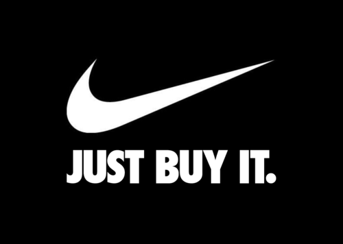
Brand slogans are supposed to sound inevitable—short enough to stick, polished enough to feel inevitable. They are the outcome of briefs, revisions, legal reviews, and a lot of money spent making a company sound like its best self. That is exactly why a blunt, slightly rude rewrite can land so hard: honesty, or a cartoon of honesty, exposes the gap between the pitch and the product.
In the early 2010s, designer Clif Dickens leaned into that gap with a project often known as Honest Slogans. The premise was simple. Take familiar consumer brands—especially in the fast-moving world of everyday goods—and replace the official motto with a line that says what the brand might admit if the marketing filter fell away. The results could feel nerdy, awkward, or a little dirty. They were also easy to share, which is how a design gag becomes a small cultural moment.
Why slogans matter more than they pretend to
A slogan is not only decoration under a logo. For many companies, especially those selling low-consideration products you toss in a cart without a research paper, the phrase is part of institutional identity. It tells shoppers what emotional lane the brand wants: trust, excitement, thrift, indulgence, rebellion, cleanliness, family. Over years of repetition, the line becomes a shorthand for the whole company, even when the product itself is ordinary.
That is why “honest” versions sting. They do not need to be fair, complete, or journalistically accurate. They only need to name a suspicion the audience already carries: that the drink is mostly sugar, that the gadget will be obsolete by Christmas, that the “artisanal” label is theater, that the app is farming attention. Satire works when the audience collaborates.
What Clif Dickens was doing
Dickens’s project sits in a long tradition of advertising parody—think spoof ads in magazines, late-night commercial send-ups, and design-school critiques of visual rhetoric—but the format was ruthlessly shareable. Keep the brand’s visual cues recognizable enough to trigger recognition, then swap the heroic claim for a deadpan confession. The joke is partly linguistic (a crisp rewrite) and partly graphic (the official voice suddenly telling on itself).
Importantly, the humor depends on familiarity. If you do not know the original slogan, the honest line is only half funny. If you do, the new text acts like a caption that rewrites years of billboards in one glance. That is efficient comedy, and it is why these images traveled well on blogs and social feeds when the project was circulating widely.
Honest slogans as a design critique
Looked at as design work rather than only as memes, the series makes a few sharp points:
- Voice is a costume. Brands spend fortunes sounding warm, bold, or wise. Flip the costume and the same typography suddenly feels like a confession booth.
- Clarity can be more memorable than poetry. Many official slogans are vague on purpose. An “honest” line is specific, which is why it sticks—even when it is unfair.
- Identity is fragile. Institutional identity depends on controlled messaging. Parody shows how little it takes to puncture that control when the public already suspects the pitch.
- Consumer literacy is the real punchline. The audience that laughs is an audience that has already decoded advertising tropes. The project flatters that literacy.
None of that means every rewrite is a profound truth about capitalism. Some jokes are cheap shots; some age poorly; some target brands that have since changed positioning. The lasting interest is the method: reduce a brand promise to a blunt human motive and watch recognition do the rest.
Fast-moving goods and the need for a phrase
Categories like snacks, soft drinks, cosmetics, cleaning products, and quick fashion live on repetition. Packaging must communicate in a second. A slogan rides along as social proof and mood. Even huge global companies—maybe especially those companies—lean on a few words because scale makes nuance expensive. The bigger the audience, the shorter the message tends to become.
Honest-slogan satire thrives there because the originals are already compressed. There is nowhere to hide. A luxury maison might wrap itself in heritage essays; a soft-drink brand has a jingle and a three-word claim. Swap those three words for something uncomfortably plain and the brand’s carefully managed aura collapses into a punchline.
Reading the humor without taking it as a dossier
It is worth separating entertainment from investigation. Dickens’s rewrites are not lab tests, financial filings, or investigative reporting. They are creative commentary. Enjoying them does not require believing every jab is literally true, just as laughing at a political cartoon does not require treating the cartoon as a court transcript.
That distinction matters if you share the images. Context disappears online. A joke framed as “what if brands told the truth?” can be screenshot as if it were a leaked internal motto. The smarter way to circulate the work is as what it is: a designer’s satirical series about advertising language, brand identity, and consumer skepticism.
How to look at an honest-slogan image
When you scroll one of these mock mottos, try a quick three-step read:
- Recall the official line if you can. The gap is the joke’s engine.
- Name the suspicion the rewrite is using—price, quality, addiction, obsolescence, status anxiety, empty wellness claims.
- Notice the craft: type, spacing, logo treatment, and how closely the fake retains the real brand’s rhythm. Good parody is also good graphic mimicry.
That habit turns a shareable gag into a small lesson in visual rhetoric. You start seeing how often real advertising relies on mood words that dodge specifics—and how quickly specificity, even fictional specificity, feels more “honest” than the approved poetry.
Why the format still resonates
Advertising has not become less polished since these images first made the rounds. If anything, brand voice has multiplied across apps, influencers, packaging, and push notifications. The more polished the surface, the more appetite there is for a line that sounds like someone finally said the quiet part out loud. Honest-slogan humor feeds that appetite without needing a long essay. One frame, one swap, one laugh of recognition.
Clif Dickens’s series sits in that sweet spot between design portfolio and internet folklore: sharp enough to critique institutional identity, light enough to pass around among friends. Whether a given rewrite still feels current depends on the brand and the decade, but the underlying question remains useful. If the motto dropped the gloss, what would it admit—and why do we enjoy imagining the answer?

Comments
Continue reading

Still-Life Photography by Margareth Perfoncio
São Paulo photographer Margareth Perfoncio’s still lifes of food and flowers—Old Master light, dark wood, and tables that feel inevitable.

Meaningful Love Quotes for Inspiration (and Ink)
Meaningful love quotes that still feel true — short lines for tattoos, gifts, and everyday reminders, with placement and wording tips.
Christina Hess’s Animals From History: Costumed Pets as Playful Portraits
Illustrator Christina Hess reimagines historical icons as ornate animal portraits—Elvis Petme and friends—mixing puns, costume detail, and soft history lessons.