
Ground Coffee Illustrations by Liv Buranday
Philippines artist Liv Buranday shapes coffee grounds into minimalist animals, characters, and jokes—toothpick details on white, photographed before they scatter.
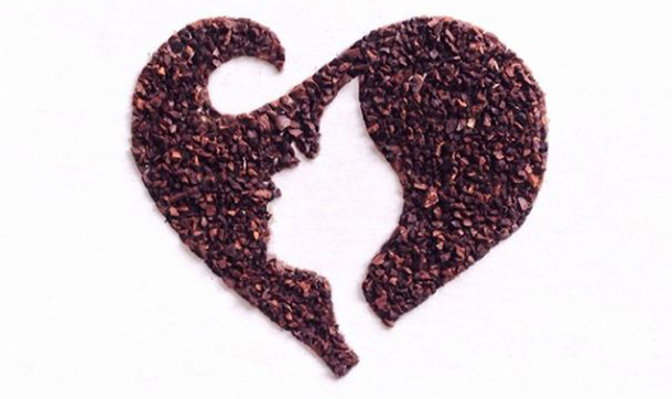
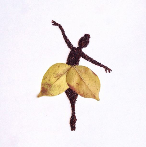
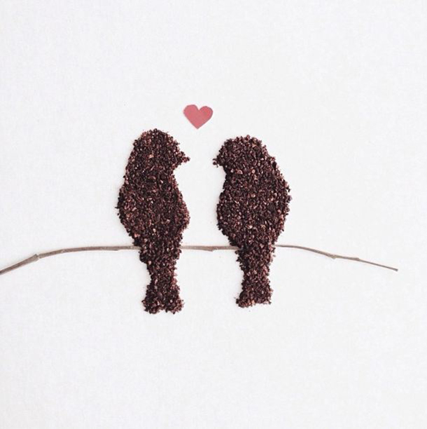
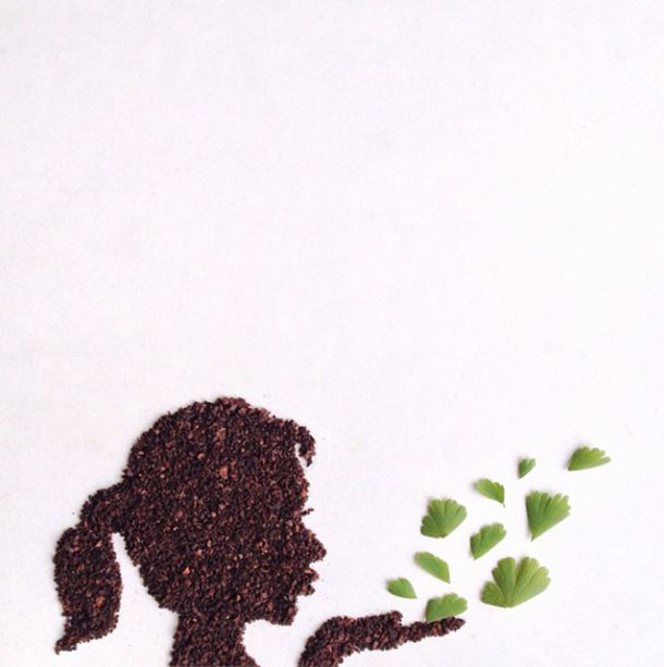
Coffee is usually measured in cups, not compositions. Philippines-based artist Liv Buranday treats the opposite as obvious: the grounds scooped from a familiar tin—or arranged after the brew—can become line, shadow, gesture, and punchline on a white field. Working under the Instagram handle @livscreams, she builds small narrative scenes from dark granules, then photographs them before a breeze or a clumsy elbow can undo the work.
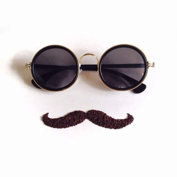
The body of illustrations that circulated widely around 2014 under tags like #groundcoffeeart looks simple until you try to copy it. There is no elaborate lighting manifesto in the concept itself. There is coffee, a pale background, patient fingers, a toothpick, and occasional tiny props—a leaf, a stick, a scrap of texture—that finish a gag or a mood. The restraint is the style.
Where the idea started
Buranday has described the spark in domestic terms. Watching her father’s daily affection for brewed coffee, she wondered whether the contents of a roast tin could become a medium rather than only a drink. That origin matters because the work never pretends to be industrial design or high-concept installation. It begins at kitchen-table scale and stays readable at phone-screen size—perfect for the Instagram era in which it found an audience.
She has also credited the platform itself. Looking at other people’s minimalist photographs and illustrations nudged her toward images that feel calm, open, and free of visual clutter. Coffee grounds, piled and scraped into silhouettes, fit that aesthetic with almost comic efficiency: one material, one color family, endless shapes. In interviews from that period she linked minimalism to a kind of peace—the sense that chaos has been edited out of the frame so a single idea can breathe.
At the time she was also balancing studies in nursing with art made in stolen hours. That dual life helps explain the work’s clarity. When time is limited, a medium that sets up quickly and photographs cleanly is not only poetic; it is practical. The grounds become a sketchbook that smells like breakfast.
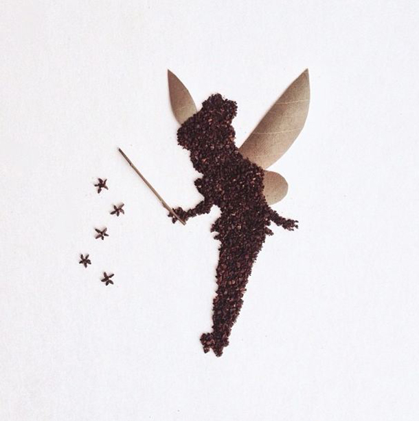
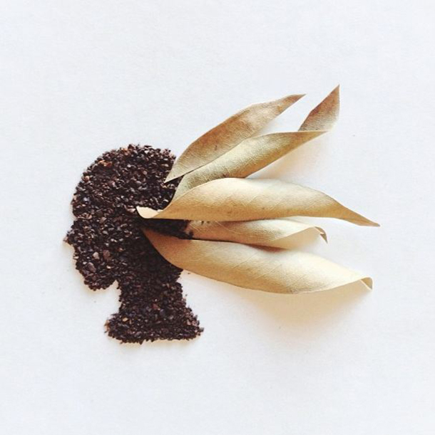
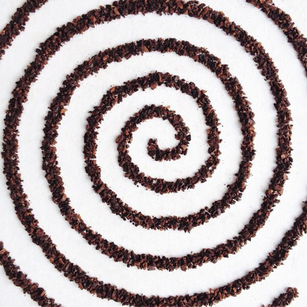
How the illustrations are made
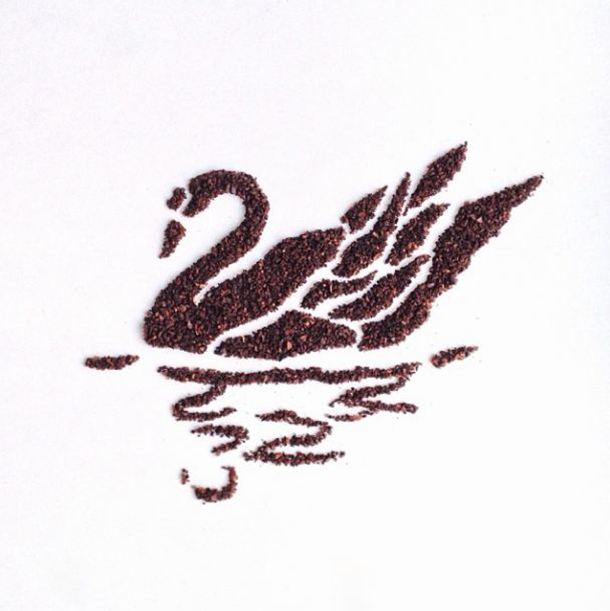
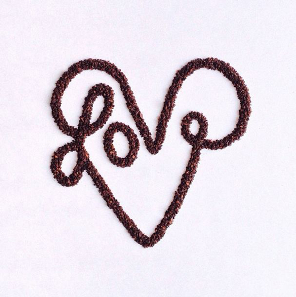
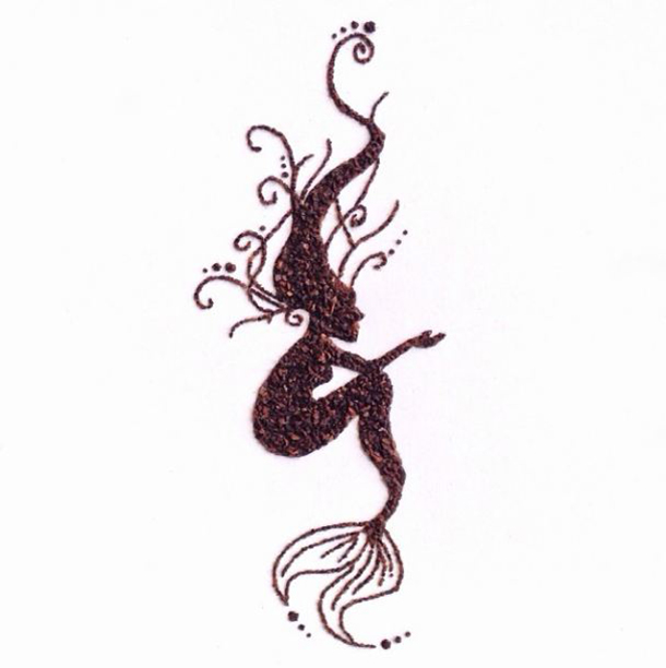
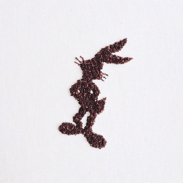
Technique here is closer to drawing with sand than to painting with pigment. Buranday shapes piles and trails of grounds with her hands, then refines edges and interior details with a toothpick. Negative space does heavy lifting: a white expanse becomes sky, table, stage, or silence around a figure. Because the medium is granular, curves look soft while still holding a silhouette sharp enough to read as an animal, a cartoon face, a letterform, or a tiny landscape.
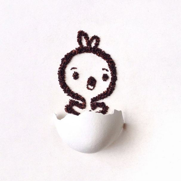
Value control replaces color theory. Densely packed grounds read as shadow or solid body; thinner scatters read as midtones, mist, or fur. A wiped gap can become an eye highlight or a smile. Those micro-decisions are why the pieces feel drawn rather than merely poured.
Early arrangements were temporary by nature. Loose grounds shift. A photograph becomes the durable artwork—the edition of one that can travel. Later, Buranday began using glue to fix compositions when patience with scattering grains ran out. That practical evolution turns an ephemeral arrangement into something that can survive longer than a photoshoot, without abandoning the look of loose grit.
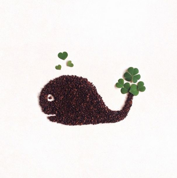
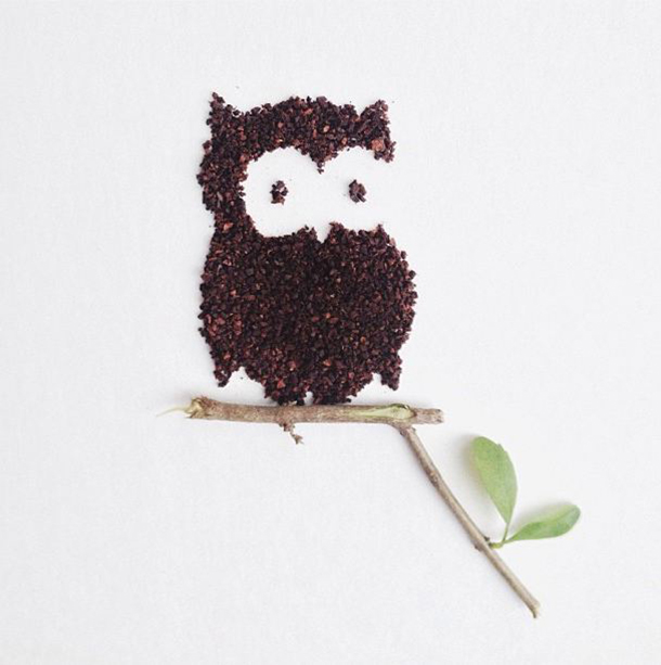
Props appear sparingly. A real leaf can become a tree canopy; a stick can stand in for a tool or a horizon mark. Those additions never overwhelm the coffee. They act like punctuation in a sentence written in brown dust.
What the pictures tend to show
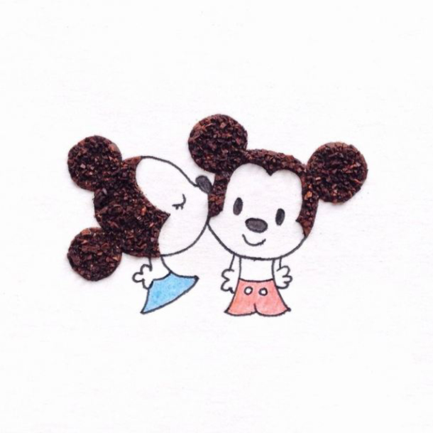
Across the set, subjects lean playful and familiar: animals, pop-culture silhouettes, short phrases, and everyday characters caught mid-gesture. The tone is closer to a sketchbook joke than to solemn still life. That friendliness is strategic. Viewers recognize the subject in a second, then spend a longer second admiring how little material was needed to get there.
Some frames behave like single-panel comics. A posture implies a punchline; a prop implies a before-and-after. Others feel quieter—almost like logos invented for imaginary cafés—where the pleasure is pure shape. Because Buranday keeps the background empty, each piece reads as a staged object rather than a cluttered craft table. The white field is not leftover space; it is part of the composition’s manners.
Relatability matters too. Coffee is a shared morning language across cultures. Turning that language into characters lets strangers feel included without needing an art-history decoder ring. You do not have to know the artist’s full biography to smile at a rabbit made of roast.
Why the work travelled online
In the mid-2010s, design and curiosity blogs loved projects that could be understood in one sentence and shared as a grid of images. Liv Buranday’s coffee illustrations fit that circuit perfectly. The medium was unexpected without being grotesque; the craft was visible; the artist’s origin story was human rather than corporate. Roundups could run a dozen photos with almost no caption and still feel complete.
There is also a quiet joke about waste and value. Grounds are what many people throw away after the “real” product—the drink—has been consumed. Buranday briefly reverses that hierarchy. The leftover becomes the art; the cup is only the backstory. Even when she uses fresh grounds from a tin rather than spent ones, the association with ordinary kitchens remains. The work flatters thrift without preaching recycling sermons.
For students of illustration, the series is a reminder that constraint can be a style engine. Limiting yourself to one tonal material forces clearer silhouettes and stronger negative space. For casual viewers, it is simply delightful: proof that imagination can hijack breakfast. Either audience can enter through pleasure and leave with a lesson about economy.
How to look—and how to try
Start by reading each image as a silhouette test. Could you recognize the subject if the coffee were replaced by ink? If yes, the drawing underneath is strong. Then look at the edges: toothpick lines create whiskers, smiles, lettering, and tiny tools that hands alone cannot refine. Finally, notice the white field. Buranday leaves enough emptiness that each scene feels staged rather than crowded—a small theatre made of grit.
If you try a version at home, work on a tray so you can photograph from directly above. Keep lighting even and diffuse so texture reads without harsh glare. Use a soft brush for cleanup, accept that the photograph is part of the piece, and expect humidity and sneezes to act as critics with veto power. Start with a simple animal profile before attempting lettering; grains forgive curves more readily than they forgive thin typography.
Think of process as three passes: block the big shape, carve the character with the toothpick, then decide whether a single prop earns its place. Stop early. Overworking coffee usually muddies contrast instead of adding charm.
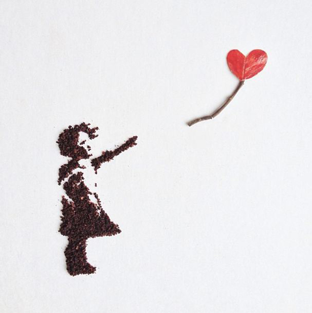
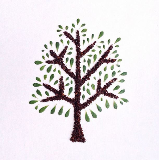
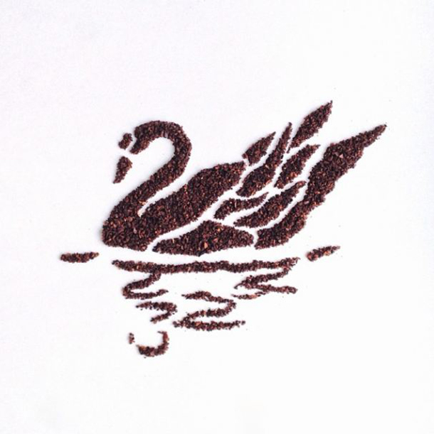
Somewhere between a cartoon animal and a one-line joke drawn in roast, Liv Buranday’s project keeps asking a modest kitchen question with a charming answer: what else can coffee be for, once you stop assuming the only correct verb is “drink”?

Comments
Continue reading

Still-Life Photography by Margareth Perfoncio
São Paulo photographer Margareth Perfoncio’s still lifes of food and flowers—Old Master light, dark wood, and tables that feel inevitable.

Meaningful Love Quotes for Inspiration (and Ink)
Meaningful love quotes that still feel true — short lines for tattoos, gifts, and everyday reminders, with placement and wording tips.
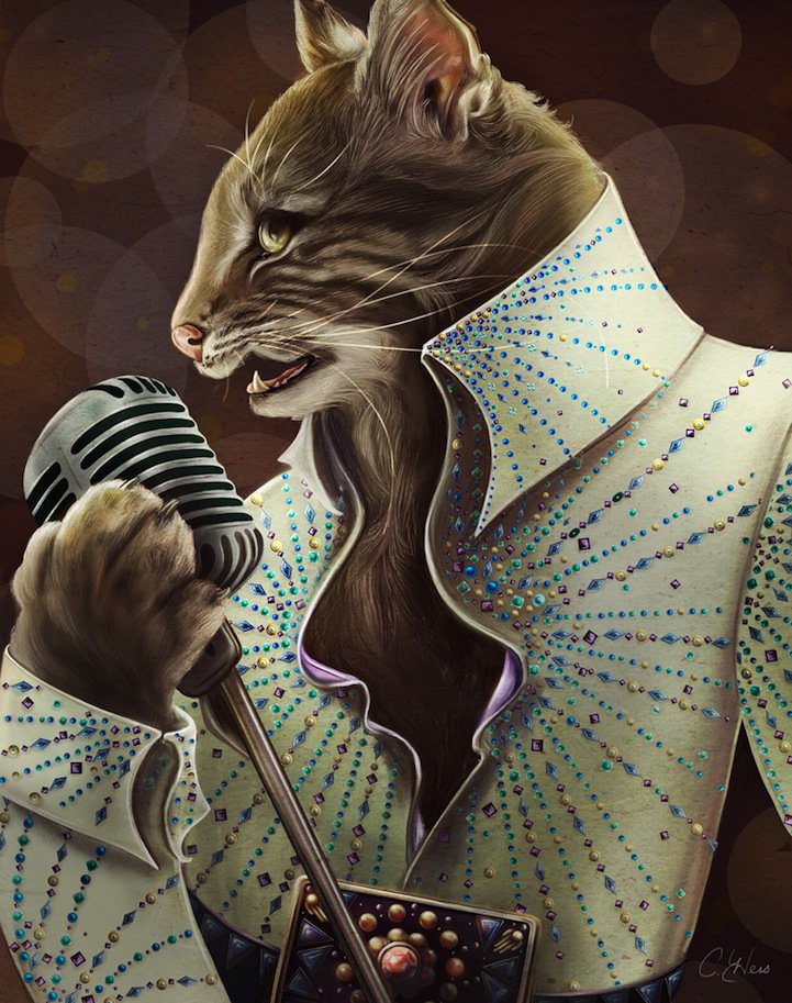
Christina Hess’s Animals From History: Costumed Pets as Playful Portraits
Illustrator Christina Hess reimagines historical icons as ornate animal portraits—Elvis Petme and friends—mixing puns, costume detail, and soft history lessons.