
Google’s Tel Aviv Offices: Workspace Design in Electra Tower
A period design reading of Google’s late-2012 Tel Aviv workplace by Camenzind Evolution with Setter Architects and Studio Yaron Tal—themes, collaboration landscapes, and the photo record.
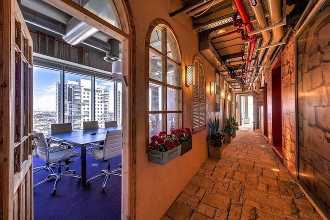
When Google Israel opened its new Tel Aviv workplace at the end of December 2012, design coverage treated the project as a landmark in corporate interiors: roughly 8,000 square meters stacked through Electra Tower for growing teams of engineers, sales, and marketing. Lead design came from Swiss studio Camenzind Evolution, working with Israeli practices Setter Architects and Studio Yaron Tal. The photographs that circulated in early 2013 were not decoration for a press note—they were the argument. Looking at them still explains why the office became a reference point for themed, city-rooted tech workplaces of that moment.
This piece reads those spaces the way a design editorial of early 2013 would: as a finished workplace experiment about local identity, collaboration ratio, and material storytelling. It is not a survey of later Google buildings or a real-estate update. The subject is this Tel Aviv fit-out as it entered the design conversation—views, themes, dining rooms, Campus floor, and the LEED ambition reported at the time.
Electra Tower as a vertical campus
Central Tel Aviv’s Electra Tower supplied height, long views toward the city and the sea, and the planning puzzle of stacking culture floor by floor inside a skyscraper plate. Google rented multiple levels. Most housed Google teams; one level was dedicated to Campus Tel Aviv, powered by Google for Entrepreneurs. At opening, that Campus was only the second of its kind worldwide, launched in December 2012 with high-profile local attention. The split mattered for how the building felt: headquarters floors for Googlers on one hand, a hub for startups and developers sharing the same vertical energy on the other.
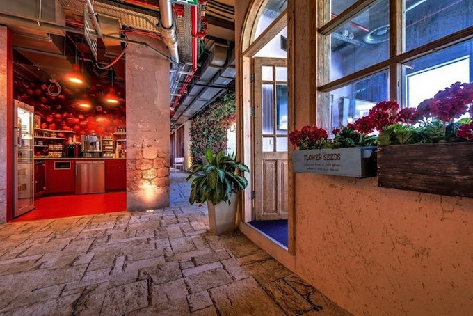
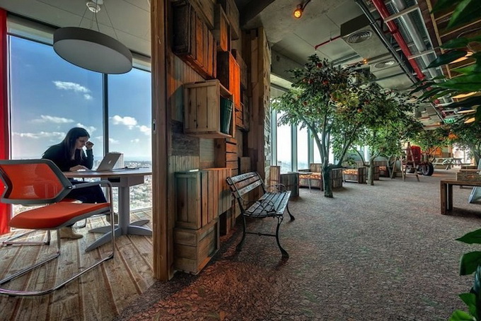
Camenzind Evolution already carried a reputation for Google workplaces elsewhere. Pairing with Setter Architects and Studio Yaron Tal pulled Israeli material culture, street references, and local craft into the detailing. You can see the collaboration in the mix: international tech-campus planning language meeting textures and props that feel specific to place rather than generic “fun office” kits.
Half desk, half conversation landscape
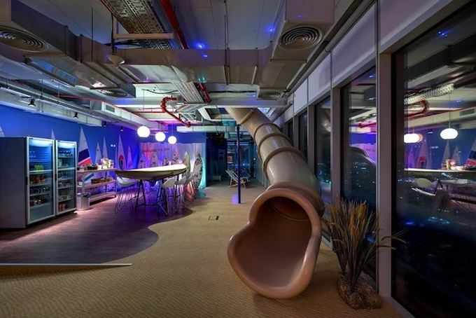
A defining planning idea was the near fifty-fifty balance between focused workstations and communication landscapes. Quiet desk zones—on the order of several hundred stations in contemporary project notes—were meant to stay relatively distraction-light for deep work. Around them, nearly half the area became informal meeting ground: street-like corridors, lounge clusters, playful seating, and themed rooms where small groups could talk without booking a sealed glass box every time.
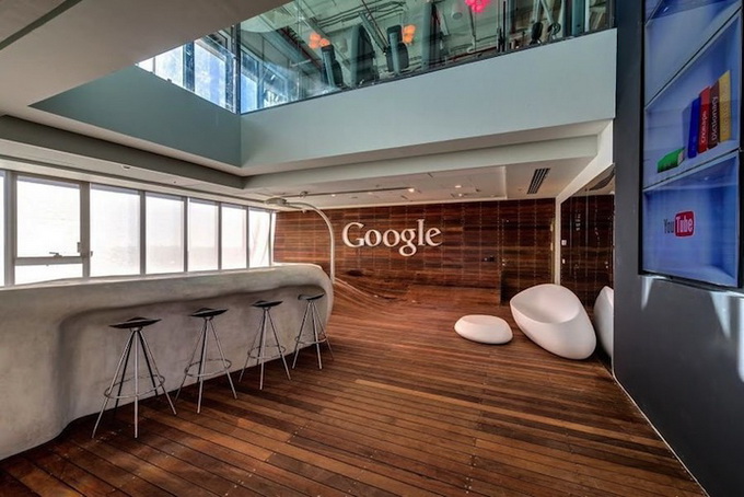
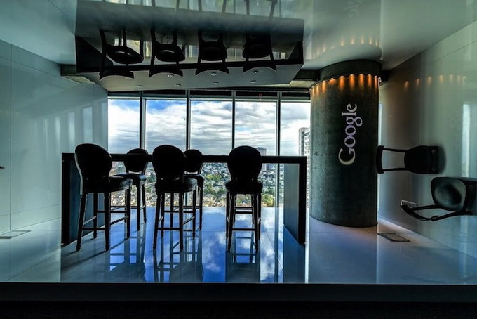
That ratio was the design thesis. Many offices of the era talked about collaboration; Tel Aviv allocated square meters for it and then dressed those meters so people would actually want to linger. In the photo set, workstations read as calm equipment, while the social half becomes a sequence of set pieces. The clarity of that separation—concentrate here, gather there—is what keeps the theatrical interiors from collapsing into chaos.
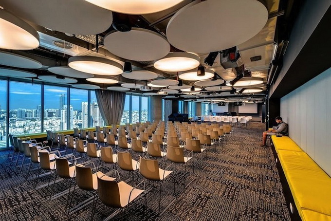
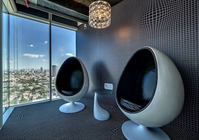
Circulation matters as much as rooms. Narrow “street” atmospheres compress movement and chance encounters; wider lounges slow people down. When designers treat hallways as leftover, collaboration dies in calendar invites. When hallways become places, the fifty-percent communication landscape starts working before anyone sits down.
Floors as chapters of local identity
Each occupied Google floor followed a different facet of Israeli identity and landscape, selected and interpreted with a local employee group. Themes were not random party rooms. They were a way to illustrate diversity of place—urban density, countryside, coastal mood, agricultural imagery, cultural references—inside a repeated floorplate.
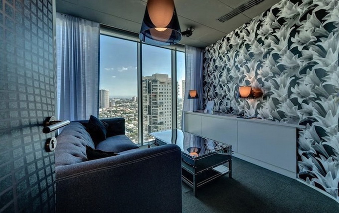
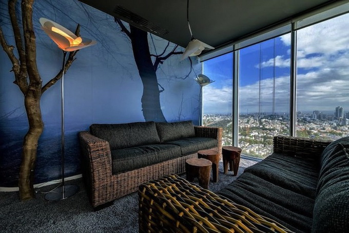
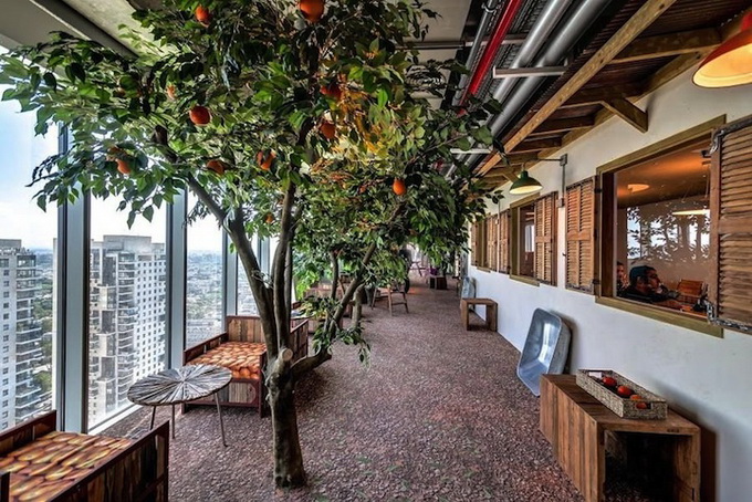
In the images, that approach appears as cobbled street atmospheres, oversized photographic walls, playful rural props, patterned carpets with a digital twist, and furniture closer to a film set than to catalog beige. The risk of themed offices is kitsch. Tel Aviv’s better moments keep materials tactile—wood, metal, textured flooring, real props—so the theme reads as environment rather than sticker pack. Employee co-authorship of themes also reduces the “headquarters decorating the colony” problem: the stories belong to people who work there.
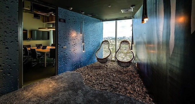
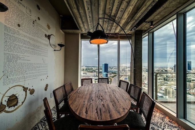
For designers studying the set, notice how often a theme is allowed to change acoustics and posture, not only wallpaper. Soft seating invites longer talks; harder tables support shorter stand-ups; enclosed nooks protect confidential work adjacent to loud social zones. Theme without program is cosplay. Theme with program is workplace design.
Food spaces as primary design, not amenity leftover
Because the workplace sits in Israel, dining was planned with care: multiple restaurants with distinct styles and dietary approaches, including kosher options, each given its own interior personality. In workplace design terms, that is more than amenity bragging. Shared meals are where cross-team conversation happens; giving those rooms equal attention as meeting nooks reinforces the collaboration half of the plan.
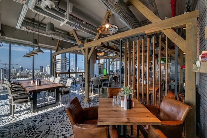
Food rooms also absorb peak social load that would otherwise flood meeting rooms at noon. A well-zoned cafeteria can be louder and brighter than engineering desks without damaging focus zones—if the plan keeps them acoustically and visually distinct. The Tel Aviv photos suggest that distinction was intentional: dining reads as destination, not as a microwave alcove with branding.
Materials, play, and the LEED ambition
The material palette in period coverage is deliberately wide: varied woods, steel and iron elements, textured carpets, and an eclectic prop language that makes circulation feel like a walk through curated neighborhoods. Pop-bright meeting tables sit near quieter focus rooms. Informal seating can look almost theatrical—pillow landscapes, unexpected vehicle-as-furniture moments in press photography—yet the underlying plan still separates concentrate-here zones from gather-here zones.
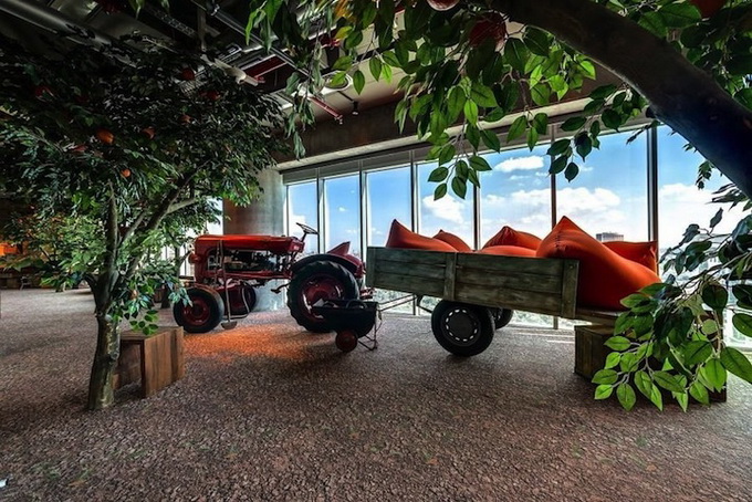
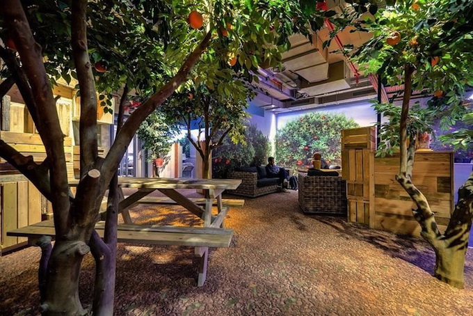
Sustainability was part of the brief from the start. Contemporary reports described the project as pursuing LEED Platinum certification—framed then as a first for an office project of its kind in Israel. Whether readers came for the tractor lounge or the floor themes, the certification goal cast the fit-out as more than visual novelty: energy, materials, and performance were meant to match the ambition of the interiors.
Play without performance ages into embarrassment; performance without character ages into forgettable efficiency. The Tel Aviv project’s claim on attention in 2013 was that it tried to hold both.
A designer’s checklist from the photo set
Browse the sequence as practical notes rather than envy fuel. Give collaboration real area, not leftover corners. Let local employees co-author themes so “place” is specific. Keep focus desks visually calmer than social landscapes. Treat food and informal seating as primary programs. Use props and graphics sparingly enough that materials still do half the work. Protect acoustic contrast between loud and quiet. Remember that a Campus or partner floor changes who the building serves at each elevator stop.
Camenzind Evolution with Setter Architects and Studio Yaron Tal delivered a clear case study of that formula in Electra Tower at the end of 2012. The images remain useful because they still show the decisions—not just the spectacle.

Comments
Continue reading
Neatly Designed Home Office Ideas That Actually Work
Practical home-office design: desk placement, light, storage, seating, and visual boundaries—so the room looks calm and supports real work.
Closet Office Ideas on a Budget: Measure, Build, and Outfit a Tiny Workspace
Practical DIY closet-office plans—desk builds, vertical storage, lighting, and a weekend checklist—for remote work without spending for a full room.
Functional Attic Office Designs That Actually Work
Turn a quiet top floor into a real workspace—design criteria for light, layout, and storage, plus when structural and safety work needs a pro.