
Forgiveness by Mike Joos: When Arch-Enemies Learn to Hug
Illustrator Mike Joos’s Forgiveness series restages comic-book rivals in quiet embraces—why the 2012 hug prints still work as design, humor, and fan wish.
Comic-book rivalries are built to never end. Wolverine and Sabretooth keep clawing. Superman and Lex Luthor keep circling the same moral argument. Batman and the Joker treat Gotham like a shared unfinished sentence. That endless tension is part of the fun—until illustrator Mike Joos asks a quieter question: what if they simply hugged it out?
In his series Forgiveness, Mike Joos redraws famous arch-enemies as tender, almost domestic figures. Costumes stay readable. Body language flips. The clawed hunter becomes a careful partner in an embrace. The cape still hangs, but the posture softens. The joke lands because the characters are instantly recognizable; the feeling sticks because the drawings treat reconciliation as a visual event, not a lecture.
When the series circulated widely around 2012—shared on design blogs, geek culture sites, and Tumblr-style roundups—it arrived at a moment when pop-culture illustration thrived on one clear twist. Mike Joos already had an audience for playful mash-ups, including his bicycle portraits of heroes and villains. Forgiveness uses a similar clarity: keep the icons, change the emotional temperature.
What the drawings actually do
The strength of the series is restraint. Mike Joos does not bury the punchline under dense backgrounds or ironic captions. Each piece usually isolates a pair. You get silhouette, color blocks, and the geometry of an embrace. Arms wrap. Heads tilt. Shoulders drop. Even when a character is famously armored or masked, the hug reads as human-scale contact.
That choice matters. Hug art can tip into sentimentality or parody. Here the humor comes from fidelity. Sabretooth still looks like Sabretooth. Lex still looks like Lex. The surprise is not costume redesign; it is the decision to stage peace without erasing identity. Viewers who know the lore feel the dissonance immediately. Viewers who only know the silhouettes still get the story: two enemies, one ceasefire.
Color helps. Soft fields and clean outlines keep the images poster-ready. They work as gallery prints, shirts, and feed thumbnails for the same reason: the idea survives at any size. You can squint and still see “rivals” and “affection” at once.
Why arch-enemies make good subjects
Arch-enemies are narrative engines. They define each other. Batman without the Joker feels incomplete; the Joker without Batman loses his stage. Mike Joos leans into that co-dependence. A hug between rivals is funny because it looks impossible, and moving because it briefly answers a wish stories rarely grant: that conflict might pause without anyone disappearing.
The series also plays with how fans already talk about these characters. Online culture loves “what if” AUs, redemption arcs, and soft reinterpretations of hard characters. Forgiveness compresses that impulse into a single gesture. No multi-issue crossover required. No speech bubble explaining motives. The hug is the argument.
Pairs often cited when the work traveled include Wolverine with Sabretooth, Superman with Lex Luthor, and other franchise opposites such as horror icons who usually share only a fight scene. Exact lineups vary by print run and roundup, but the pattern holds: choose enemies whose rivalry is public knowledge, then remove the violence while keeping the costumes.
Mike Joos and the craft of the pop twist
Mike Joos works in a tradition of illustration that treats mass-culture icons as shared visual language. His earlier bicycle series—heroes and creatures on bikes tuned to their personalities—showed the same instinct: take a familiar figure, place it in an unexpected but carefully designed scenario, let recognition do half the storytelling.
Forgiveness is tighter. The bicycle pieces invite you to inspect custom details. The hug pieces ask you to feel a contradiction. That contradiction is gentle rather than cynical. The drawings do not mock fans for caring about these characters; they borrow fan affection and redirect it toward a temporary truce.
Technically, the images favor readable shapes over hyper-detail. Hands, spines, and the angle of a chin carry the emotion. Masks and logos stay intact so the “before” story remains present inside the “after” pose. Good character design already encodes personality in silhouette; Mike Joos uses that encoding, then changes only the relationship between two silhouettes.
Humor without cruelty
A lot of mash-up art earns laughs by humiliating a character. Forgiveness mostly avoids that. The hug is awkward in concept, not in execution. Bodies fit. Expressions read as willing or at least willing-enough. The comedy is situational: these two should not be doing this, and yet the drawing makes it look natural for a second.
That tone is why the series traveled beyond hardcore comics readers. You do not need issue numbers to enjoy it. You need only the cultural shorthand of hero versus villain. In that sense the work behaves like a visual proverb—short, repeatable, and open to projection. Some people see satire of endless franchise wars. Others see a soft joke about masculinity and armor. Others simply enjoy cute enemy energy.
All of those readings can sit beside each other because Mike Joos leaves space. He does not caption the moral. He stages the embrace and lets the title do the naming.
Looking at forgiveness as design
If you treat the series as a design problem, the brief is brutal: communicate reconciliation in one frame using characters famous for refusing reconciliation. Solutions usually fail by over-explaining. Mike Joos’s solution is compositional intimacy. Distance collapses. Weapons (when present) stop being the focal point. Negative space around the pair becomes a quiet stage.
There is also a useful lesson for anyone drawing fan art or editorial illustration. Specificity beats abstraction. “Two people hugging” is generic. “These two people hugging” is a story. The more loaded the pair, the less text you need. That is why the series feels efficient. Each print is almost a logo for an emotion.
Print culture of the early 2010s helped. Etsy shops, blog roundups, and shareable image posts rewarded work that was both collectible and instantly meme-legible. Forgiveness fit that ecosystem without looking disposable. The idea is soft; the draftsmanship is clean enough to hang on a wall.
What still resonates
Years later, the series still works because rivalries have not gone out of style. Streaming eras keep recycling nemeses. Costume designs stay iconic. The hunger for kinder alternate frames persists. Mike Joos’s hugs do not rewrite canon; they offer a temporary exit from it.
They also remind viewers that character design carries ethics as well as aesthetics. How you pose a figure teaches an audience how to feel about power, threat, and contact. Change the pose, and you change the lesson—even if only for one illustration.
Next time a feed shows two bitter opposites mid-embrace, check the credits. If the linework is spare, the costumes faithful, and the joke arrives without a paragraph of explanation, you may be looking at the same instinct that made Mike Joos’s Forgiveness series travel so far: peace drawn as a simple, surprising hold.

Comments
Continue reading
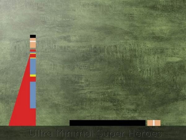
Eyal Rosenthal’s Ultra Minimal Superheroes
How Eyal Rosenthal reduces iconic heroes and villains to color blocks and geometry—an early-2010s minimalist series that still reads as a visual riddle.

Still-Life Photography by Margareth Perfoncio
São Paulo photographer Margareth Perfoncio’s still lifes of food and flowers—Old Master light, dark wood, and tables that feel inevitable.

Meaningful Love Quotes for Inspiration (and Ink)
Meaningful love quotes that still feel true — short lines for tattoos, gifts, and everyday reminders, with placement and wording tips.