
How to Design Your Own T-Shirt Online
Pick a blank, place type or art, and order a wearable custom tee—without hard-sell checkouts. File prep, contrast, placement, and print care explained.
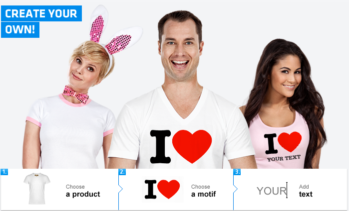
Mass-market tees are fine until you want a family reunion motto, a band logo that never made it to merch, or a joke that only six people will understand. Online T-shirt designers exist for that gap: you pick a blank garment, place art or type, preview it on a mockup, and order a single piece or a small run without learning screen-printing from scratch.
This guide walks through how those tools usually work, what to decide before you upload a file, and how to avoid the common disappointments—blurry prints, odd placement, and designs that look clever on screen and muddy on cotton. The goal is a shirt you will actually wear, not a one-wear novelty that peels after two washes.
What “design your own T-shirt online” really means
Most browser-based shirt makers follow the same loop. You choose a product (crew-neck tee, hoodie, tank), pick a color and size range, then add layers: uploaded images, text, and sometimes clip-art motifs. A live preview shows front and back. When you are satisfied, you check out; the printer produces the garment with heat transfer, direct-to-garment (DTG) ink, or another method depending on the shop.
You do not need design-school software for a simple slogan. You do need patience with file prep if you care about crisp edges. Vector logos and high-resolution PNGs with transparent backgrounds behave better than a photo cropped from a social feed. If your art is a photo of a person or pet, expect the print to look best on lighter shirts unless the printer supports solid underbases for dark fabrics.
Step 1: Choose the garment like a blank canvas
Start with fabric and fit, not the graphic. A heavyweight cotton tee hangs differently from a thin fashion blend; hoodies hide some of a busy back print under the hood; women’s and men’s cuts place the visual center differently on the chest. If the shirt is a gift, size up when in doubt and prioritize a color that matches the recipient’s real wardrobe—not only the color that makes your design “pop” in the mockup.
Color contrast is design, not decoration. Dark ink on a navy shirt disappears. White or light ink on black reads loudly. Mid-tone heathers can muddy both light and dark prints. Many online tools show a warning when contrast is weak; believe them. If you want a soft vintage look, choose a heather base and a single muted ink rather than fighting for neon brightness.
Step 2: Motifs, trends, and knowing when to skip them
Clip-art libraries in online designers are tempting: stars, hearts, seasonal icons, and whatever motif is circulating that year. Used sparingly, a small accent can balance a short phrase. Used as the whole idea, the shirt dates itself quickly. Ask whether you would still wear the graphic in two years. If the answer depends on a meme, consider a cleaner typographic treatment or a personal photo instead.
When you do use a motif, keep scale honest. A tiny emblem near the hem can look intentional; a stretched clip-art panel across the entire torso usually looks like a template. Leave breathing room around the design. Blank fabric is part of the composition.
Step 3: Text that reads from across a room
Typography fails more shirts than bad clip art. Prefer bold, simple fonts for long phrases. Script fonts look elegant at large display sizes and become unreadable when reduced to chest prints. Check letter spacing after you type; automatic tracking in browser tools often leaves words cramped. Limit yourself to one or two typefaces. Hierarchy beats variety: one line large, supporting text smaller, or a single stacked block with consistent alignment.
Placement matters as much as font. Classic chest prints sit a few inches below the collar and stay clear of armpit seams. Full-front prints need balanced margins from the side seams. Back prints should clear the collar and, on hoodies, account for the hood’s resting position. Flip between front and back previews before you commit—many people design only the front and forget the back is empty, or overload both sides until the shirt feels like a billboard.
Step 4: Upload images without wrecking them
When you use the upload control, aim for a file that is already the right kind of asset:
- PNG with transparency for logos and illustrations that should sit cleanly on the fabric color.
- High resolution—if the tool warns that the image will print blurry, believe the warning and find a larger source.
- Simple backgrounds—busy photo backgrounds compete with folds and shadows in real fabric.
- Legal rights—only upload art you own, licensed, or created. Team logos, movie stills, and brand marks are common rejection or copyright problems.
Crop tightly before upload so you are not paying (visually) for empty margins. After upload, resize on the mockup, then step back from the screen. If you cannot read the main shape at thumbnail size, it will not read across a street either.
Print methods in plain language
You rarely choose the machine by name, but understanding the method helps set expectations. Direct-to-garment printing behaves somewhat like an inkjet on fabric: good for multicolor photos, softer hand on light shirts, sometimes less opaque on dark ones. Heat transfers and vinyl can deliver bold solids and are common for names and numbers. Screen printing still wins for large identical runs, but many one-off online tools are not true screen shops—they are print-on-demand.
Read the care notes the seller provides. Wash inside out, avoid high heat, and skip harsh bleach if you want the print to last. A brilliant design that cracks after three dryer cycles was never a bargain.
Design habits that separate “cute mockup” from wearable shirt
Limit colors when you can. Fewer inks look intentional and often print more cleanly. Align edges: center a crest, or deliberately left-align a block of type—accidental almost-centering looks unfinished. Test legibility by squinting at the preview or viewing it on your phone from arm’s length. If friends need the joke explained after they read the shirt, shorten the copy.
For gifts, personal details beat generic slogans: a date, a place name, a small inside reference rendered simply. For groups—teams, clubs, reunions—agree on one shared front and optional name/number on the back so the set feels unified when people stand together in photos.
A practical order checklist
- Garment type, color, and size confirmed for the real wearer.
- Contrast checked on the actual shirt color, not only on white.
- Image resolution accepted by the tool without blur warnings.
- Text proofread (names and dates especially).
- Front and back reviewed; seams and hood clearance considered.
- Print method and wash care noted before checkout.
Online shirt design is least stressful when you treat it like a small product decision: blank first, message second, decoration last. Open any reputable designer, follow those three priorities, and you can move from blank cotton to a personal piece in one sitting—without needing a studio, and without buying into every clip-art trend the interface waves at you.

Comments
Continue reading

Funny Animal Signs That Warn People (While Animals Ignore Them)
From a seagull on a no-birds disc to classic zoo and park ironies—why animal warning signs get funny, and what the rules are still for.

How to Find Local Amenities on Vacation: Mechanics, Haircuts & More
Locate trustworthy local services and everyday spots while traveling or settling in—using publications, reviews, map apps, neighbor tips, and low-pressure exploration.

Kristen Stewart for V Magazine, Spring Preview 2013
V81’s Wild at Heart cover story—Kristen Stewart shot by Inez & Vinoodh, styled by Joe McKenna, in pale minimal spring glamour.