
ndikol 2009: Cute Vector T-Shirt Designs by Adhika Rahmani
Why the Yogyakarta illustrator’s Behance-era tee prints traveled—silhouette-first characters, saturated colour, and lessons still useful for graphic shirts.
In 2009, the Indonesian illustrator Adhika Rahmani—better known online as ndikol—put a body of t-shirt print work into circulation that design blogs and apparel communities could not stop passing around. The Behance project simply titled “ndikol 2009” became one of those early-portfolio landmarks: bright vector characters, pop-culture mashups, and cute-but-sharp compositions built to survive the rough life of cotton, ink, and small online thumbnails.
This page looks at that moment in tee design—what made ndikol’s prints travel, how the style sits in the late-2000s graphic-tee boom, and what still holds up if you design shirts today. The original gallery links pointed back to Behance; the ideas below stay with the work itself: illustration meant to be worn.
Who ndikol is in that 2009 frame
Adhika Rahmani works from Yogyakarta, Indonesia, and built an early audience on Behance after joining the platform in February 2009. The “ndikol 2009” collection gathered an intense following for its era—hundreds of thousands of project views and thousands of appreciations—because it arrived when Behance was still a primary discovery engine for freelance illustrators and when print-on-demand and community tee sites were hungry for fresh character work.
Contemporaries described the drawings as cute, colourful, and fresh—vector illustrations you could easily imagine on a summer shirt. That reading is fair but incomplete. Under the softness sits tight silhouette control, bold colour blocking, and jokes that read at walking distance. Cute without structure disappears on fabric; ndikol’s pieces were built to stay legible after a wash cycle and a phone-camera crop.
Later years would take the same hand into collaborations, community contests on platforms such as Pampling, and pop-culture tees tracked by apparel sites. The 2009 set matters because it shows the vocabulary already formed: friendly characters, graphic punch, and a willingness to remix icons without losing a personal line quality.
Why 2009 was a sweet spot for illustrated tees
The late 2000s sat between two forces. On one side, screen-printing and indie labels still prized original art over licensed blandness. On the other, sites like Threadless, Woot’s shirt projects, and European community brands turned illustration into a weekly sport—vote, print, ship. Behance and Flickr acted as scouting grounds. A strong project could jump from portfolio to production conversations in days.
Vector tools lowered the barrier to clean, scalable art. Illustrators who mastered limited palettes and bold outlines thrived because printers loved files that separated cleanly. Soft gradients and tiny hairlines died on cheap blanks; chunky shapes and high contrast lived. Ndikol’s work fit that industrial reality while still feeling hand-authored rather than clip-art.
Globally, “cute” illustration from East and Southeast Asia was also finding wider Western blog audiences—kawaii-adjacent softness mixed with street-humour subjects. Ndikol’s Indonesian vantage point fed that appetite without copying Japanese sticker culture wholesale. The characters feel local and internet-native at once.
What the prints are doing formally
Look for a few recurring moves across the 2009 body of work and the tee designs that followed from the same practice.
Silhouette first. A shirt design has about one second in a crowded rack. If the outline does not read, colour will not save it. Ndikol’s figures usually lock into a clear outer shape—animal, person, hybrid mashup—before interior detail is added.
Limited, saturated colour. Bright without muddy. A few strong fills beat a dozen near-neighbours. On fabric, saturation also fights the grey cast of cheap photography in online shops.
Character as headline. Typography, when present, supports rather than competes. The face or creature carries the joke. That is useful for international audiences who may not share a language but share meme literacy.
Pop remix with personal ink. Mashups of familiar franchises or internet tropes appear, yet the linework stays consistent—rounded forms, playful proportions, a slight mischievous tilt. The remix is the subject; the hand is the brand.
These choices explain why the same artist later slid easily into “bomber” toy collaborations and food-fight franchise humour: the graphic system was already modular. A pizza, a donut, a lasagna can become a character the way a cat or a ninja can.
Reading a tee as a small poster
A good t-shirt print is a poster you wear. It must survive distance, motion, and social context. Ndikol’s stronger pieces behave like posters: one focal point, generous negative space or deliberate density that still resolves, and a mood you can name—cheeky, sweet, slightly anarchic.
Placement matters as much as drawing. Chest-centered art for character portraits; wider horizontal locks for scenes; smaller left-chest marks for quieter wear. The 2009 portfolio mindset often showed designs as flat prints first, which is honest: if the drawing fails flat, stitching it onto a mannequin will not rescue it.
Humour lands differently on a body than on a screen. A joke that feels loud on Behance can feel perfect on a tee because clothing already announces personality. Soft illustration with a sharp gag—cute line, odd premise—gives wearers cover: approachable drawing, memorable idea.
Lessons for designers still making shirts
You do not need to imitate ndikol’s exact characters to learn from that 2009 peak. Borrow the constraints instead.
- Design for the thumbnail and the ten-foot view before you decorate.
- Separate colours as if a screen printer will ask for films tomorrow.
- Keep one joke per shirt; sequels belong on the next blank.
- Test the art on a wrinkled mockup, not only a flat white rectangle.
- Protect a signature proportion or eye shape so a series feels like a series.
- Respect licensing when you remix culture; fan energy and legal clearance are different jobs.
Community platforms still reward clarity and charm. What changed is speed and saturation: more illustrators, more POD shops, shorter attention. That makes the old virtues sharper, not obsolete. A clean vector character with a readable silhouette still cuts through noise.
Where to place “ndikol 2009” in a longer career arc
Treat the 2009 project as a public sketchbook that happened to catch fire. It is not the end of the story—Rahmani’s later posts include cafe-racer builds, leatherwork, New Year illustrations, and commercial mashups—but it is the chapter that taught a wide audience what “ndikol” meant on fabric: colourful, character-led, internet-fluent illustration from Yogyakarta that could hang with global tee culture.
For collectors and design students, that chapter is also a time capsule of Behance-era discovery. Before algorithmic feeds fully dominated, a single well-tagged project could define an illustrator’s reputation for years. “ndikol 2009” did that work: it named a year, a style, and a promise that shirts could still be little portable galleries.
If you are hunting inspiration rather than nostalgia, open the prints and ask a practical question: would this still read on a heather grey blank under fluorescent shop lights? When the answer is yes, you are looking at craft, not just cute. That is the standard the best pieces from that set still meet.

Comments
Continue reading
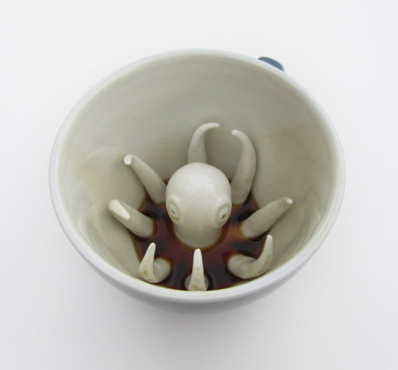
Creature Cups by Yumi Yumi: Hidden Animals at the Bottom of Your Mug
Designer Yumi Yumi’s Creature Cups hide sculpted animals—octopus, otter, and more—under your drink so each sip slowly reveals a ceramic surprise.
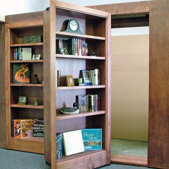
Bookcase Design Ideas: Hidden Doors, Built-Ins, and Sculptural Shelving
From hidden bookcase doors to freestanding towers and quiet built-ins—design ideas that balance storage, scale, styling, and everyday use.
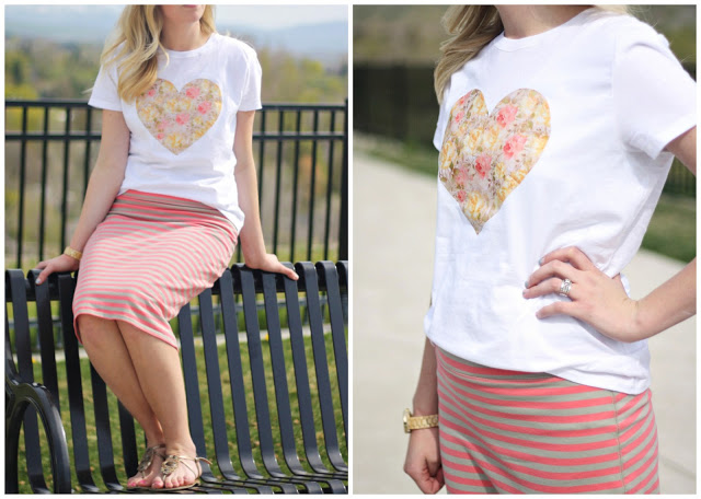
DIY T-Shirt Redesign Tutorials: Knot, Fringe, Dye, Appliqué, Paint
Step-by-step methods for knotted crops, fringe, iron-on appliqué, ombré dye, lace inserts, galaxy spray, and painted patterns—plus order of work and care tips.