
Creative Save-the-Date Card Ideas for Weddings
Photo cards, typography, maps, and playful prints—plus timing, wording, and production tips so guests actually clear the weekend.
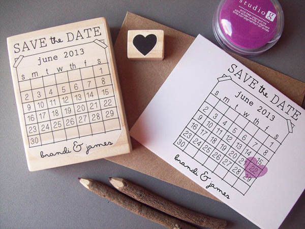
Once the wedding date is set, the first piece of paper most guests see is not the invitation. It is the save-the-date: a short, memorable notice that asks people to protect a weekend before hotels fill and calendars harden. Done well, it also sets the visual tone for everything that follows—typography, colour, humour, and how personal you want the stationery to feel.
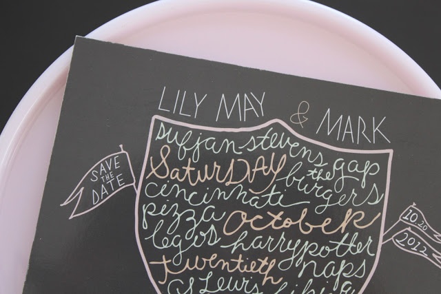
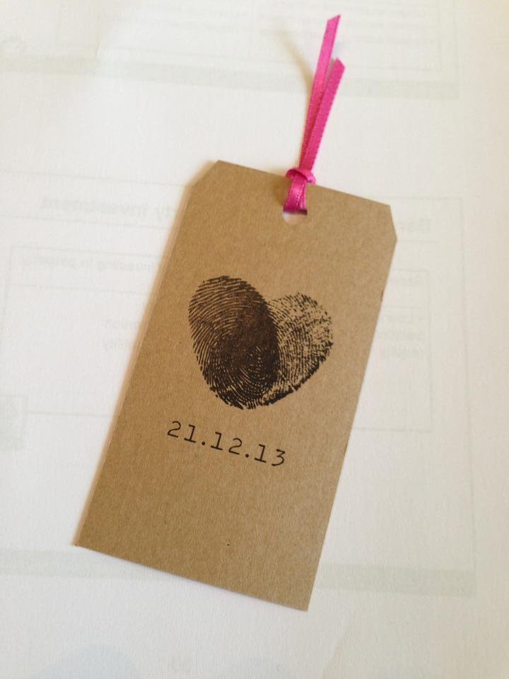
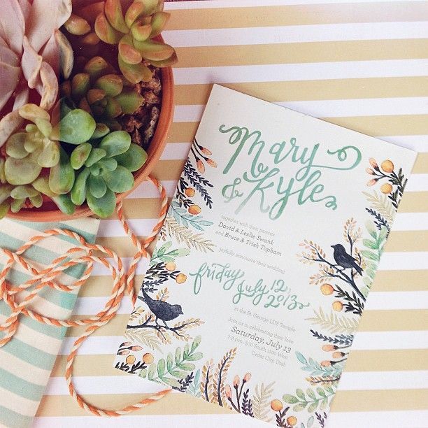
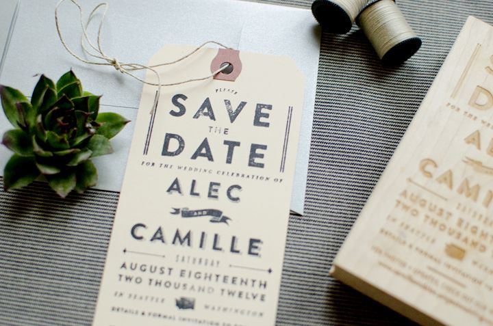
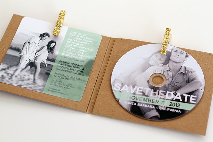
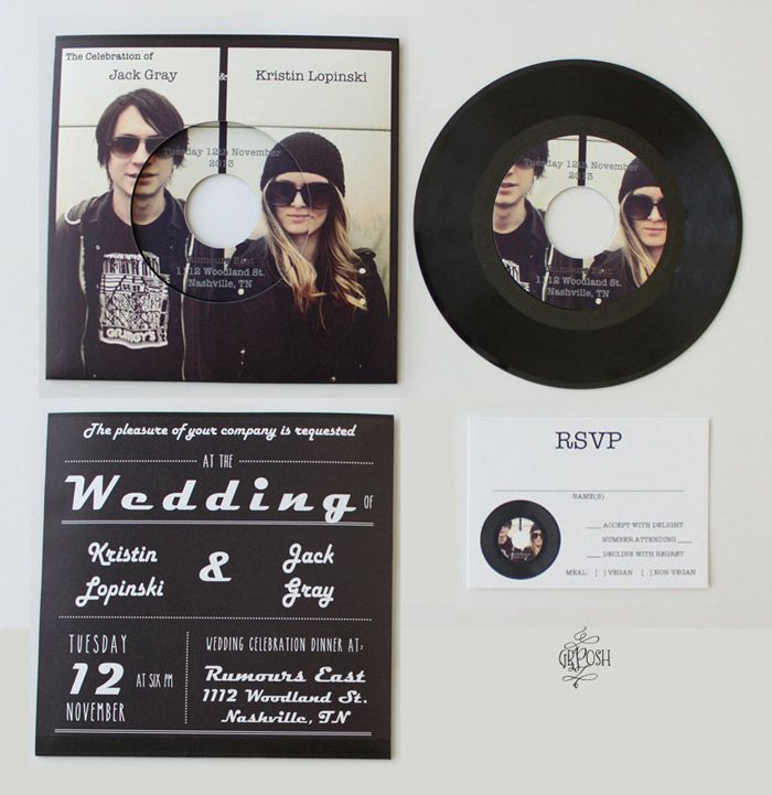
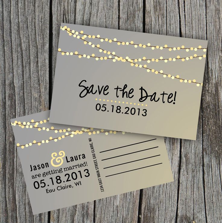
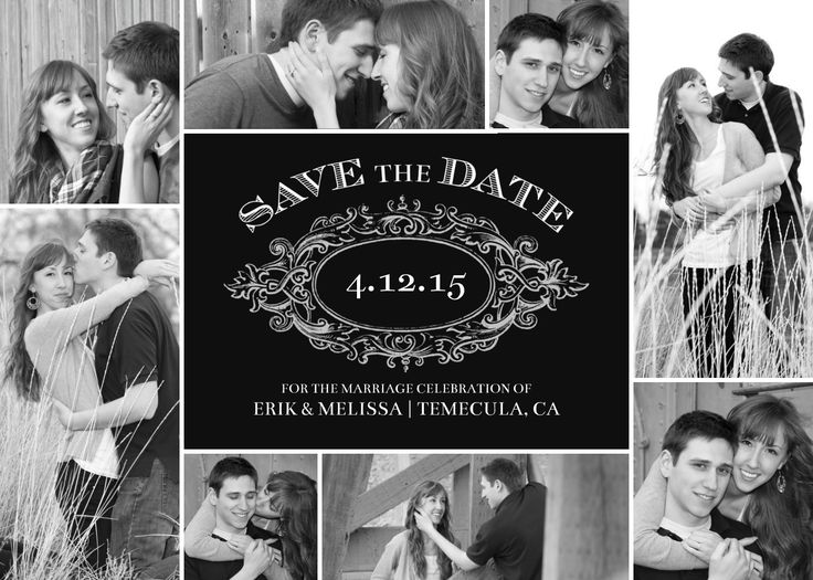
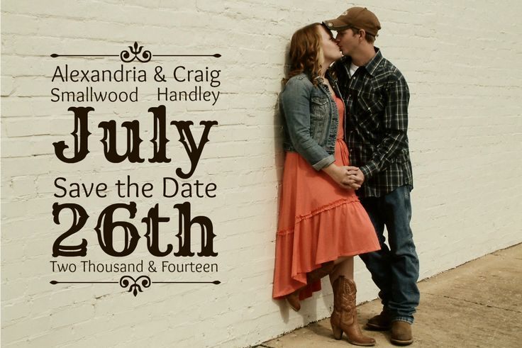
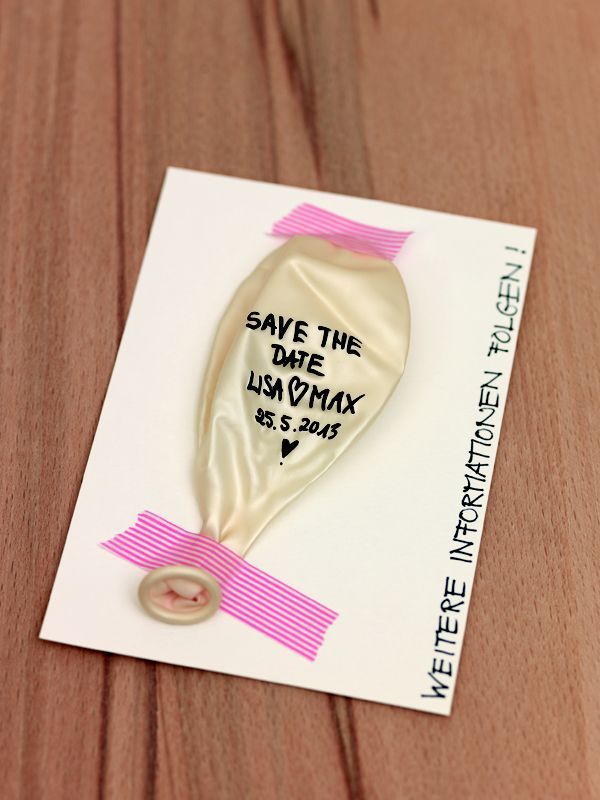
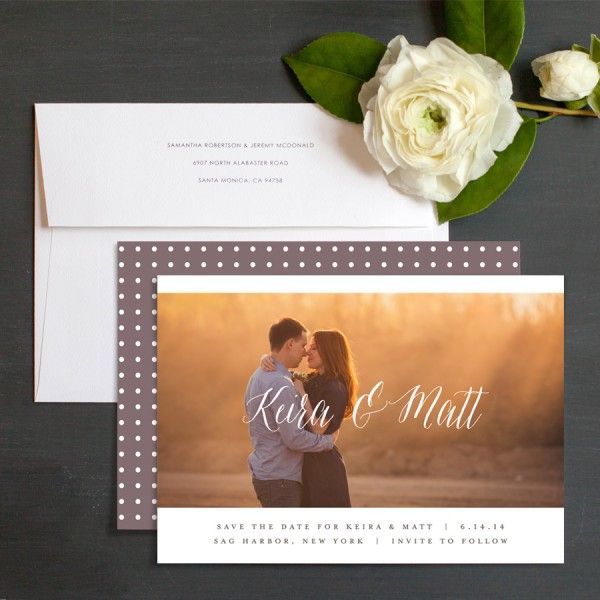
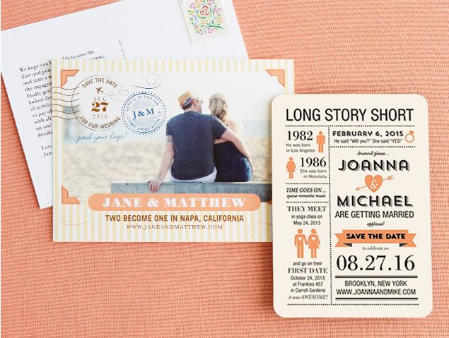
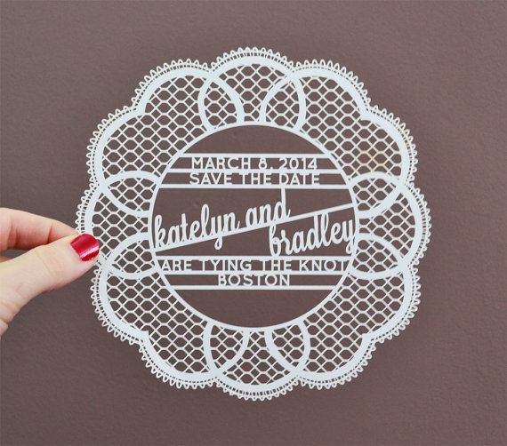
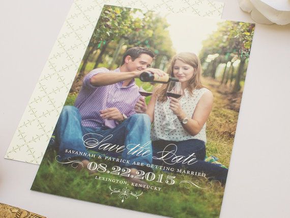
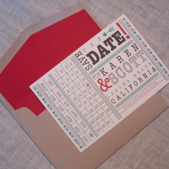
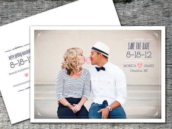
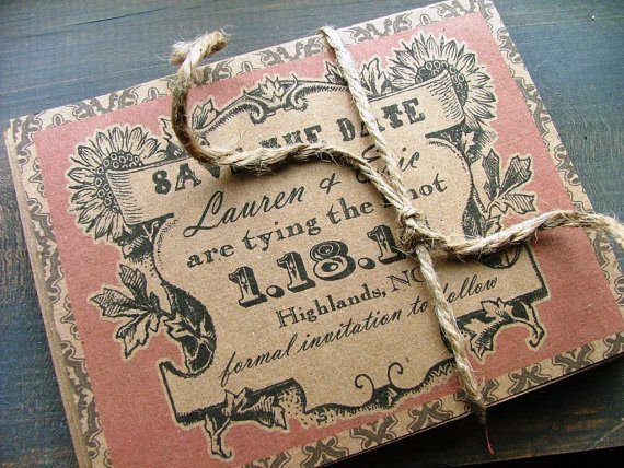
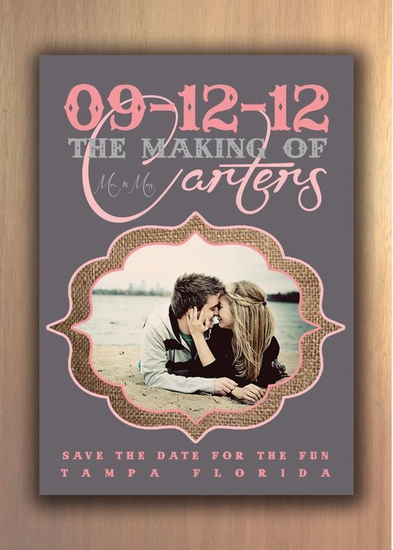
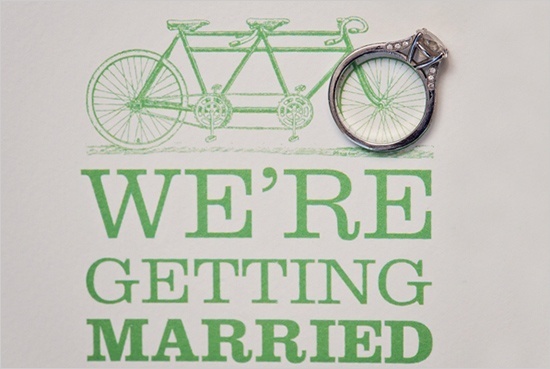
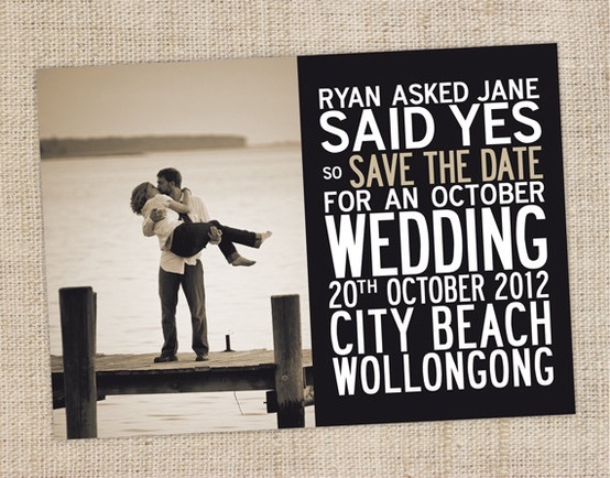
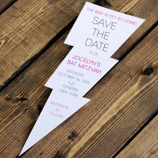
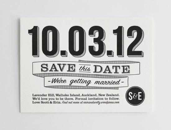
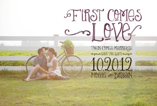
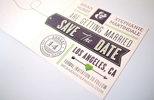
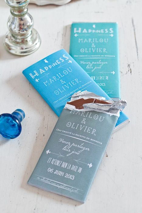
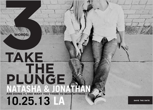
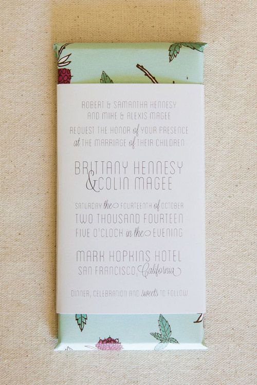
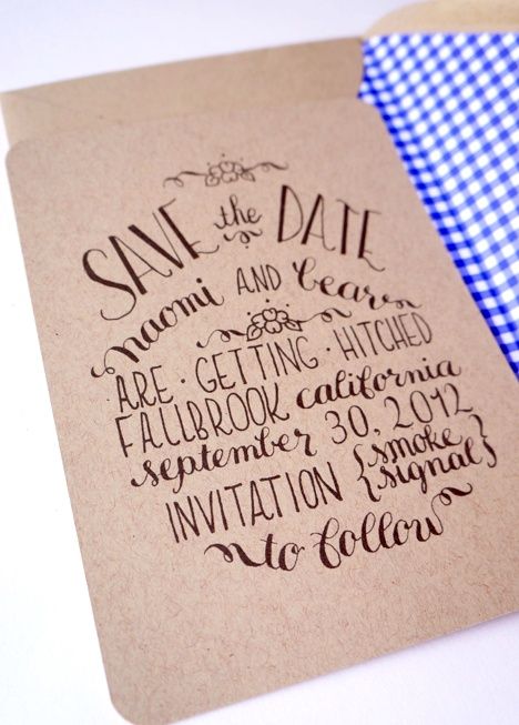
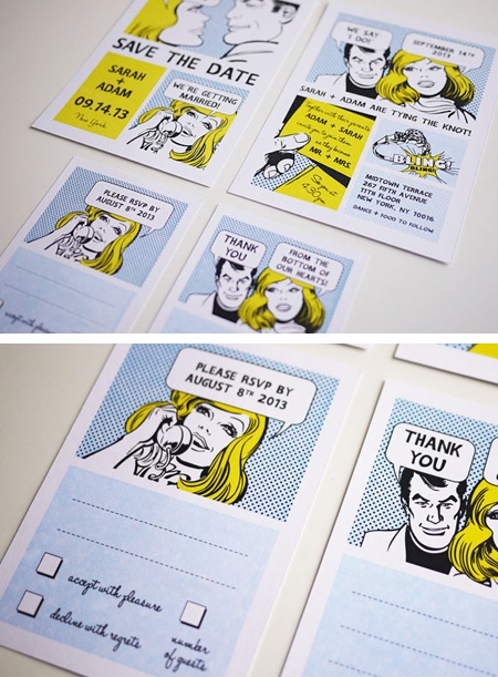
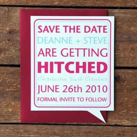
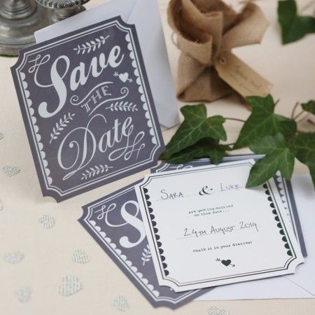
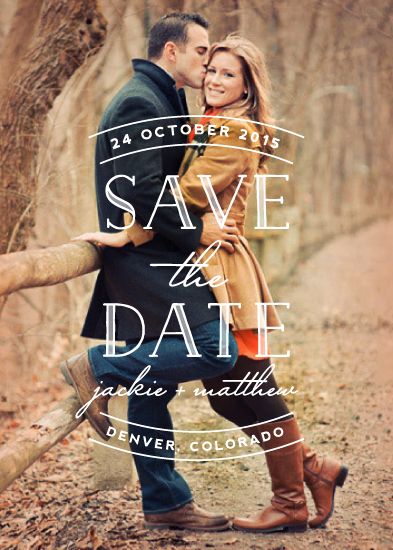
The cards below show how wide that range can be: photo-forward announcements, typographic posters, playful die-cuts, map motifs, and designs that treat the date as a keepsake rather than a sticky note. Use them as prompts while you decide what your guests need to know now, and what can wait for the formal invite.
What a save-the-date must carry
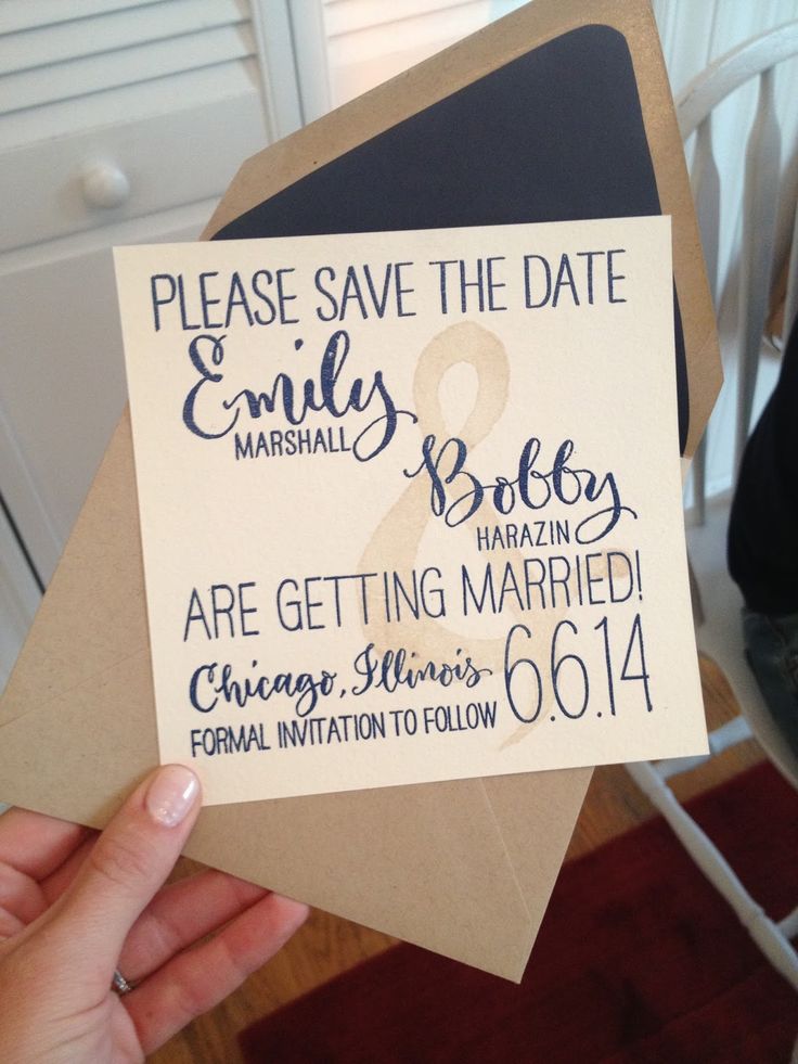
Keep the essentials clear: your names (or the couple’s names), the date, the city or region, and a line that formal details will follow. A wedding website URL or QR code helps if you already have one; a simple email for questions works if you do not. Everything else—dress code, hotel blocks, registry—belongs later unless the event is so destination-heavy that travel planning must start immediately.
Timing matters more than flourish. For local weekends, three to six months ahead is common. For destination weddings or holiday weekends, six to twelve months gives guests a fair chance to book flights. Send once you are confident the date will not move; a corrected save-the-date undermines the calm you are trying to create.
Match the medium to the guest list. Letterpress and letterpress-look prints feel ceremonial. Postcards travel light and cheap. Magnets stay on refrigerators where dates are actually remembered. Digital saves work for younger circles, but older relatives still often prefer something they can hold. Many couples mix: print for family, email for friends abroad.
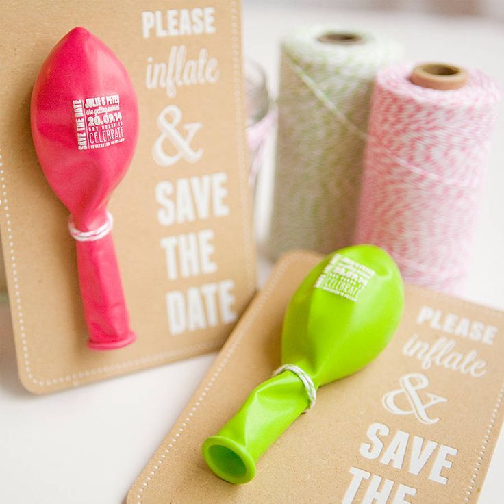
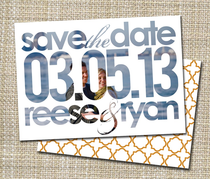
Photo cards that feel like a story, not a dump
Engagement or proposal photos turn a date notice into a shared memory. Choose one strong image—or a tight pair—rather than a collage that fights the type. Faces should read at postcard size; busy backgrounds steal attention from the date. If the photograph already carries emotion, keep the typography quiet: a clean sans or a restrained script, high contrast, and generous margins.
Black-and-white photos age gracefully and hide colour clashes with ink. Colour photos ask for a palette pulled from the image so the card feels designed, not slapped together. Crop with intention: a close portrait suits a vertical card; a landscape of the proposal place suits a wide format. Leave a calm zone where the date can sit without covering a smile or a ring.
If you lack a professional shoot, a candid from the engagement weekend can still work. Avoid low-resolution phone snaps that pixelate in print. Soft daylight beats harsh flash. Guests remember warmth more than perfection.
Typography, maps, and graphic concepts
Some of the strongest saves skip photography entirely. Oversized numerals make the date impossible to miss. A custom monogram or monogram-like lockup can echo the invitation suite later. Map silhouettes of the wedding city or venue neighbourhood hint at place without needing a full itinerary. Ticket stubs, boarding passes, and calendar pages work when the humour matches the couple—forced gimmicks feel louder than the wedding itself.
Colour should support readability first. Soft pastels can wash out light ink; deep backgrounds need bright type or foil. Metallic accents photograph beautifully on blogs and still need a practical proof: print a sample and read it under kitchen light, not only studio LEDs. If you plan a matching invitation suite, lock the save-the-date palette early so the paper goods feel like one conversation.
Die-cuts and unusual shapes delight when the silhouette reinforces the idea—hearts, luggage tags, house outlines for a home wedding. They also cost more and can jam in postal machines. Ask your printer about mail-safe sizes and consider a simple outer envelope even for postcard formats when the piece is fragile.
Tone: playful without confusing the job
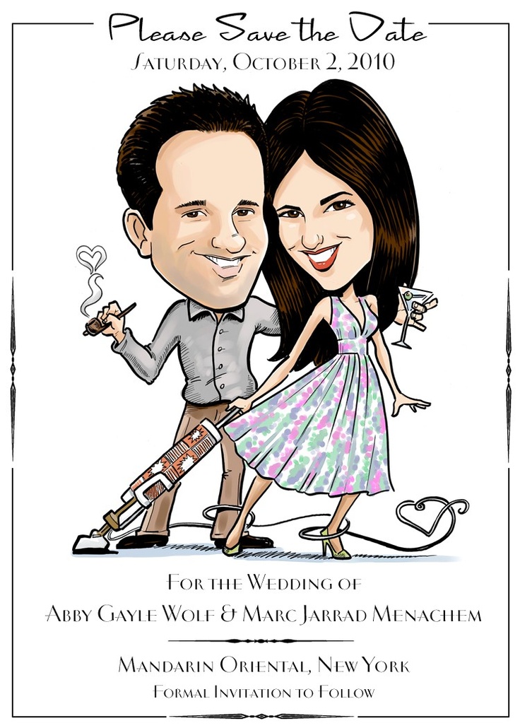
Save-the-dates can joke. Puns, cartoon drawings, and quirky props work when the date remains the hero. Guests should not hunt for the year among flourishes. If your humour is niche, add a plain line underneath so relatives who miss the reference still know when to clear the weekend.
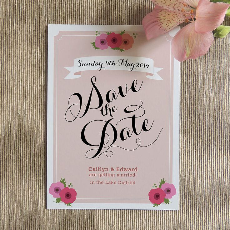
Seasonal cues help orientation: autumn leaves, winter lights, spring botanicals. They are optional, not mandatory. A summer wedding does not require a beach illustration if neither of you likes nautical motifs. Align the tone with the ceremony you are actually planning—black-tie formality and slapstick cartoons rarely share a suite comfortably.
Multilingual households may need bilingual text. Keep both languages equally clear rather than treating one as decoration. Name order and cultural honorifics deserve a careful pass before you print two hundred pieces.
Practical production notes
Order a few extra cards for last-minute plus-ones and keepsake copies. Proof names carefully—nicknames that feel intimate on social media can confuse mailrooms and older guests. Confirm the postal address list separately from your social guest list; they rarely match one-to-one.
Paper weight affects how “real” the notice feels. Thin stock curls and looks temporary; heavy stock costs more but signals care. Recycled and cotton papers photograph nicely and handle letterpress well. If you DIY with a home printer, use templates designed for your paper size and test bleed and margins before the full run.
Magnets need a flat metal surface to matter; not every guest has one. Stickers for planners suit detail-oriented friends. Whatever format you choose, put the date in a form people can transfer quickly: “Saturday, 14 June 2014” beats “06.14.14” for international guests who flip day and month.
Connecting the save to the full invitation suite
Think of the save-the-date as chapter one. Motifs, fonts, and colours introduced here can return on the invitation, reply card, programs, and menus. You do not need a perfect match—slight evolution looks intentional—but sudden switches from rustic kraft to glossy neon confuse guests about the wedding’s character.
If the formal invitation will be elaborate, the save can stay simpler and cheaper. If the invitation will be digital, a beautiful printed save becomes the tactile object people keep. Decide where you want to spend: paper, calligraphy, photography, or postage for destination inserts.
Before you order: a quick checklist
- Confirm the legal and preferred date, plus city or venue region.
- Choose print, magnet, postcard, or digital—and who gets which.
- Select one hero photo or one graphic concept, not both fighting for space.
- Write names, date, place, and “invitation to follow” in plain language.
- Proof spelling, year, and day-of-week against a calendar.
- Print a sample; read it at arm’s length under ordinary light.
- Mail with enough lead time for your farthest guests.
Pick one design from a gallery like this that already feels like you, then strip it down until the date is unmistakable. Guests will forgive a simple card that is clear; they will not forgive a beautiful object that hides the weekend they were meant to keep free.

Comments
Continue reading

Funny Animal Signs That Warn People (While Animals Ignore Them)
From a seagull on a no-birds disc to classic zoo and park ironies—why animal warning signs get funny, and what the rules are still for.

How to Find Local Amenities on Vacation: Mechanics, Haircuts & More
Locate trustworthy local services and everyday spots while traveling or settling in—using publications, reviews, map apps, neighbor tips, and low-pressure exploration.

Kristen Stewart for V Magazine, Spring Preview 2013
V81’s Wild at Heart cover story—Kristen Stewart shot by Inez & Vinoodh, styled by Joe McKenna, in pale minimal spring glamour.