
Creative Packaging Designs for Inspiration: When the Box Tells the Joke
From Nike stadium shoeboxes to origami tea tags, IV energy potions, and pasta-chef cutouts—a gallery of packaging ideas that use structure, puns, and materials to win the shelf.
Walk any supermarket aisle long enough and the products start to blur. Same jar shapes, same claims, same white lights. Packaging is what breaks the blur. When two honeys, two soups, or two pairs of earphones sit side by side, the box that tells a clearer story—or a funnier one—usually wins the hand that reaches first. The designs collected here treat packaging as more than protection and barcode. They treat it as a tiny stage: a shoebox that opens into a stadium, a tea tag that becomes a boat, a blister pack that acts out its own cure. Some pieces feel premium and quiet. Others are loud jokes. Together they form a practical inspiration set for designers, students, brand managers, and anyone who likes watching ordinary goods become memorable.
Think of this gallery as a field guide. Notice which ideas rely on structure, which rely on print, and which rely on the customer finishing the graphic by drinking, folding, pressing, or carrying. Those patterns travel farther than any single campaign.
Packages that invent a place
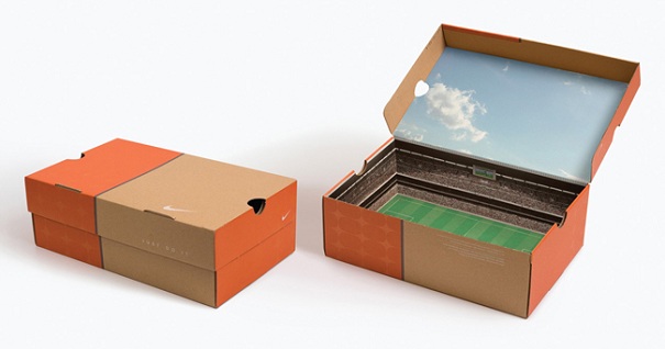
Nike’s cardboard shoe box looks almost ordinary from the outside—natural board, orange accents, a small swoosh, a soft “JUST DO IT.” Open it and the story flips. The lid underside prints a bright sky. The base becomes a green pitch with white lines. Inner walls fill with stadium seating and a miniature scoreboard. The shoe arrives as if it just jogged onto match day. That contrast between calm exterior and theatrical interior is a useful brief for any brand that wants shelf dignity and unboxing delight in the same object.
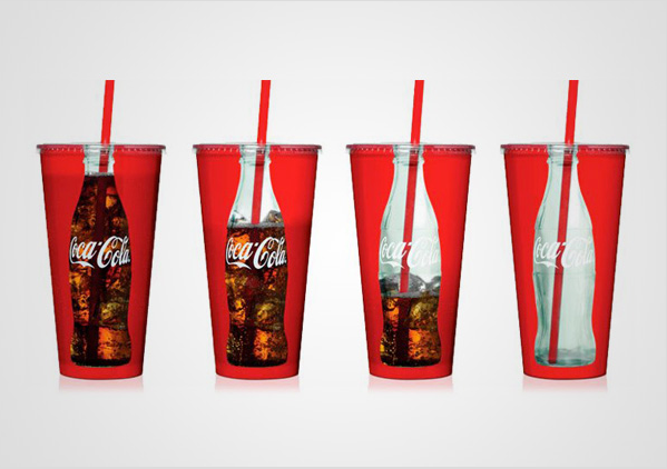
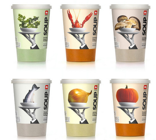
Coca-Cola fountain cups run a similar trick with transparency. A bottle-shaped window on classic red cups fills with dark soda so the contour bottle appears, then gradually empties as you drink. Shown in four stages, the idea is almost educational: branding that changes with consumption. The liquid completes the logo. Delhaize soup cups take place-making in another direction. A black-and-white waiter’s hand holds a silver platter; a tiny bowl on that platter contains a giant herb bunch, crayfish, mushroom cluster, fish, onion, or pumpkin. Vertical “SOUP” type and color bands code the flavor. Gourmet service meets surreal scale, and you never need a photo of broth to understand what you are buying.
Visual puns you can operate
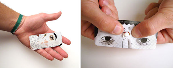
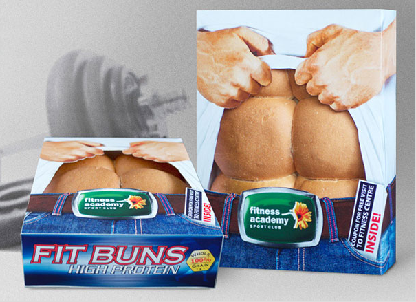
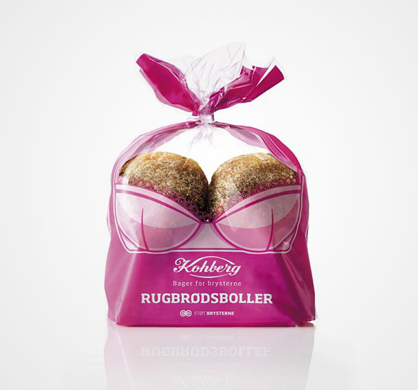
Some of the strongest packaging ideas give the user a verb. Clearasil blister packs print a face with red spots; pushing a pill through the foil makes the spot “pop.” The metaphor is blunt, slightly rude, and extremely sticky in memory. Fit Buns high-protein rolls cut a window over an illustrated torso so six brown rolls read as abdominal muscles, complete with gym cross-promotion copy. Kohberg’s rye rolls sit inside a pink bra graphic for a breast-cancer awareness campaign—Danish bakery shapes drafted into cause marketing that is impossible to skim past in the bread aisle.
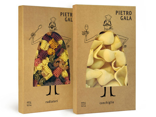
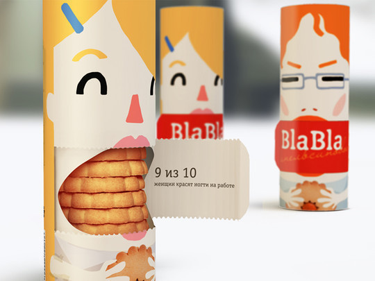
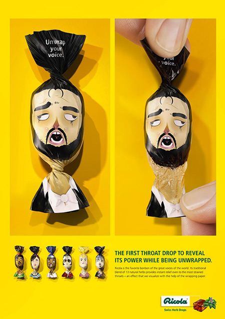
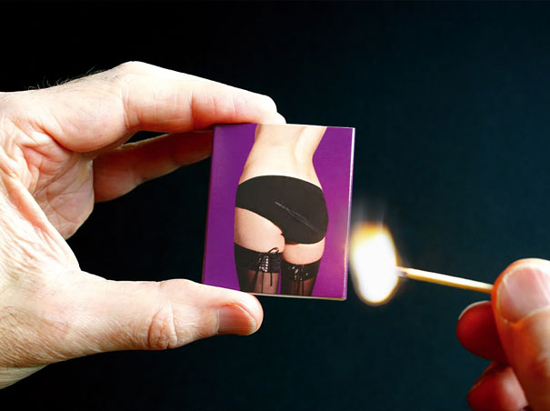
Pietro Gala pasta boxes draw a mustached chef around a body-shaped aperture so radiatori or conchiglie become the chef’s patterned clothes—product as fabric. BlaBla cookie cylinders open at a character’s mouth flap, revealing stacked cookies like edible speech. Ricola wrappers twist at illustrated singers’ throats with the line “Unwrap your voice,” so relief begins the moment the paper loosens. A provocative matchbox places its strike strip beside a cheeky photo so lighting a match completes a visual gag. Humor works in packaging when the joke and the function share one physical motion: press, peel, twist, strike.
Material as message
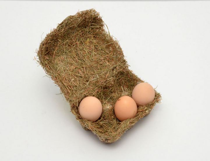
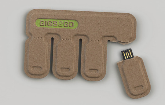
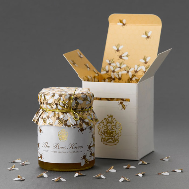
Texture can persuade as hard as typography. An egg carton molded from hay and straw holds brown eggs like a nest that still functions as commercial packaging—biodegradable, farm-coded, and pleasant to touch. Gigs 2 Go forms recycled pulp into tear-off USB drives shared like matchsticks; the eco casing is not a sleeve around plastic so much as the product’s body. “The Bee’s Knees” honey from Klein Constantia commits fully to hive metaphor: ribbed white outer box with gold crest, honeycomb-yellow interior swarming with bee prints, lid wrap patterned with insects, and paper bee cutouts scattered in the hero shot. Premium food packaging often wins by choosing one metaphor and dressing every surface in it until the story feels inevitable.
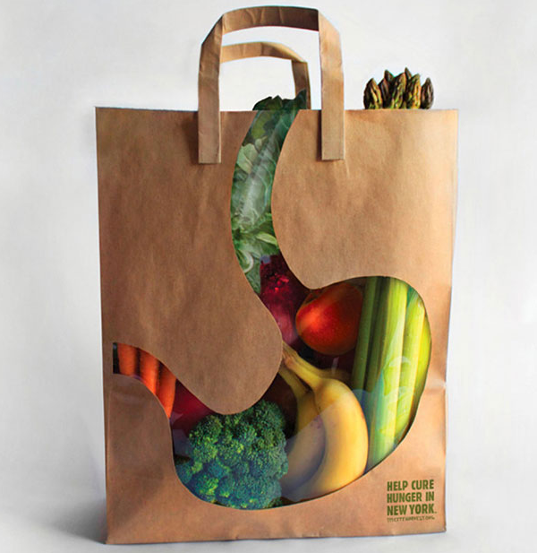
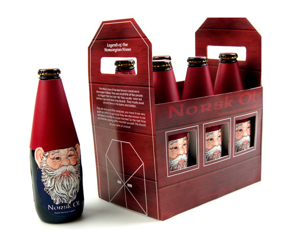
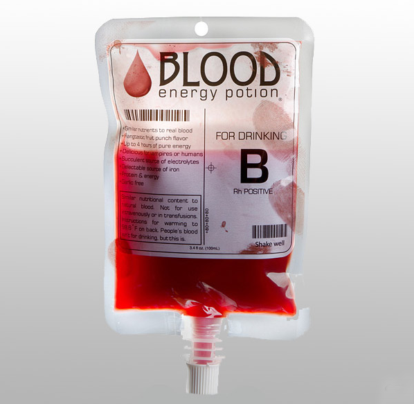
A City Harvest grocery bag cuts a stomach-and-esophagus window so produce literally fills an illustrated body, with a call to help cure hunger in New York. The bag is container and poster at once. Norsk Øl Dark Honey Lager turns bottles into Norwegian Nisse figures—red pointed caps, long white beards—peering through barn-like carrier windows while side panels explain the folklore. Blood Energy Potion packages a red drink in an IV-style pouch with blood-type graphics, fingerprint smudges, and vampire humor. Novelty beverages live or die on silhouette; this one steals a hospital object and dares you not to look.
Quiet cleverness for everyday use
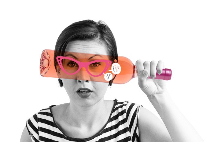
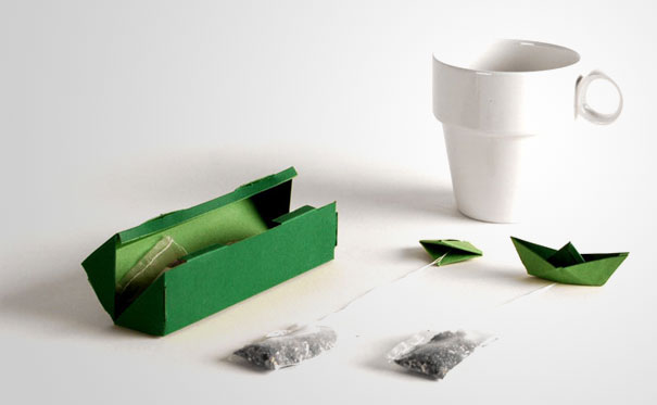
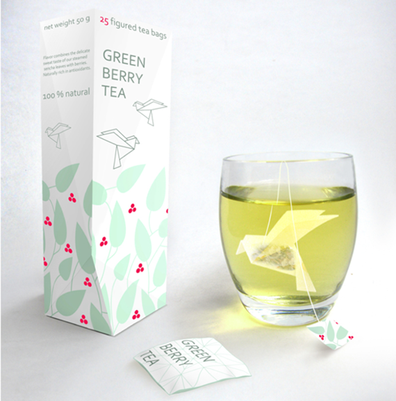
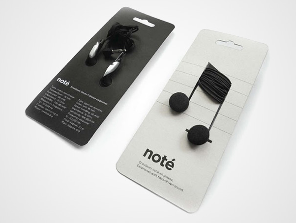
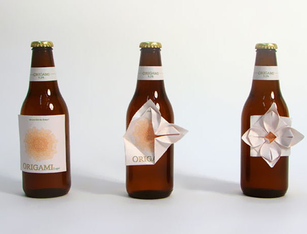
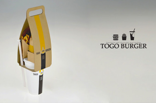
Not every success needs shock value. Forest-green tea packaging ships bags with origami boat tags that float when the tea steeps—decoration that also keeps the string from drowning. Green Berry Tea forms bags as origami birds hanging in the cup, with leaf-and-berry graphics on a tall white box and matching tags. The brand noté mounts earphones and cords on the card so earbuds become note heads and wires become stems—product as logo, bilingual specs on the reverse. Origami Lager labels begin flat and fold into a four-petaled flower after you drink, turning leftovers into craft. Togo Burger stacks burger, fries, and cup into one kraft carrier with a handle and straw lock for true one-handed walking. Pink Glasses Domaine Zinfandel prints cat-eye frames on a rosé bottle so the wine itself becomes the lenses; selective-color photography seals the wink of “rose-colored glasses.”
A short brief you can reuse
Across the set, a few rules keep repeating. Let the product complete the graphic whenever possible—pasta as cloth, soda as bottle, rolls as abs. Give the customer something to do: press, fold, unwrap, tear, strike, carry, drink. Match material to meaning: hay for eggs, pulp for eco drives, gold foil for artisanal honey. Balance shelf presence with unboxing surprise so neither stage feels empty. Know when restraint beats a gag; stadium interiors and bird tea bags whisper, while IV potions and matchbox jokes shout on purpose.
On your next aisle walk, ignore logos for a minute. Watch for the package that changes when you open it, empty it, or hold it up to your face. That object is usually the one already doing the hardest marketing job—earning attention without saying a single extra word.

Comments
Continue reading

Attic Bathroom Design Ideas: Light, Layout, and Roof-Friendly Fixtures
Design ideas for converting an attic into an extra bathroom—working with slopes, skylights, wet-zone materials, eaves storage, and fixture placement.
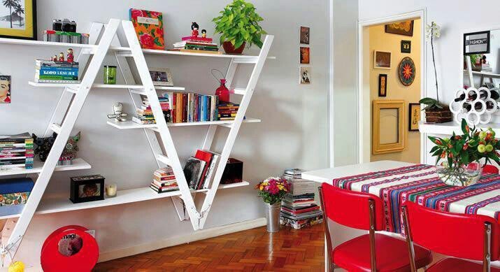
Ladder Shelving Repurpose Ideas: DIY Bookcases, Dividers & More
Turn an old ladder into shelving, a room divider, towel rack, or narrow desk—practical DIY steps, safety checks, and styling tips with photo ideas.
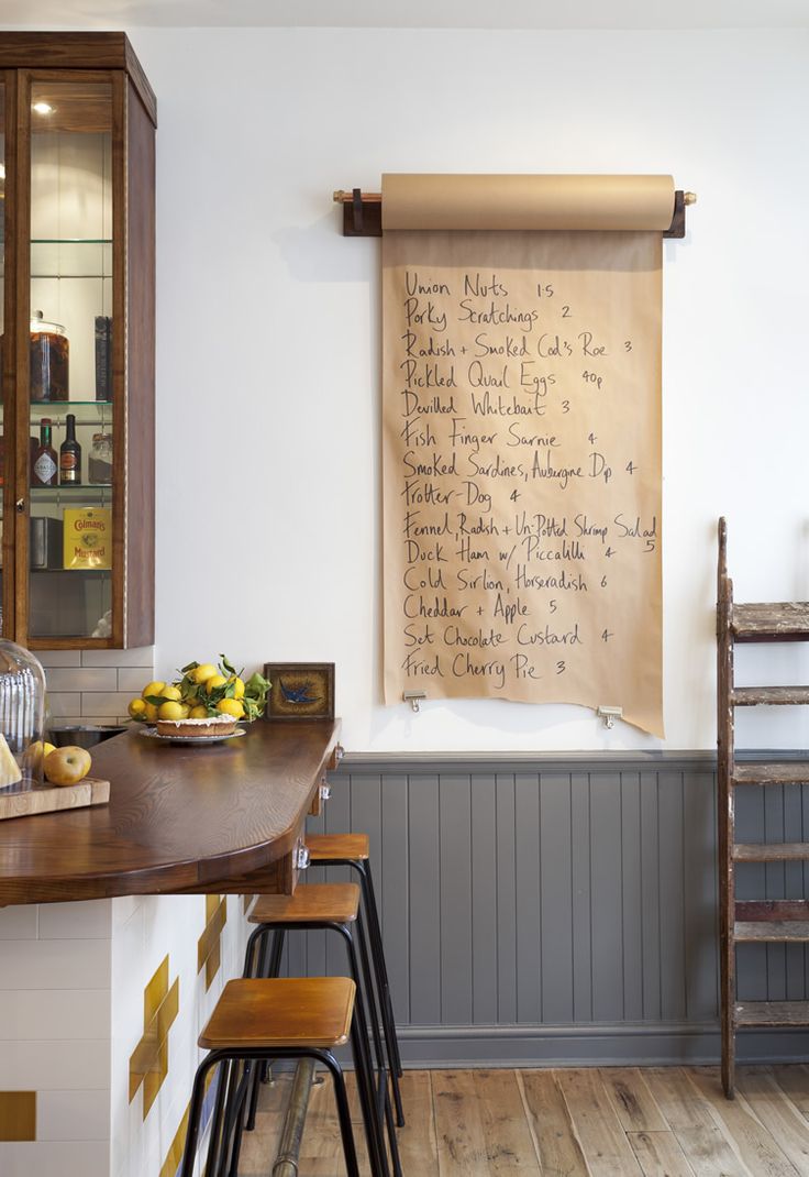
Cool Home Lifehacks That Actually Save Time
Practical household tricks—kraft-paper lists, safer nailing, fridge bottle stops, mint-tin drawers, phone stands—using things you already own.