
Clever Conceptual Illustrations by Nabhan Abdullatif: Visual Puns with Everyday Objects
Omani illustrator Nabhan Abdullatif turns idioms, gadgets, and pop icons into minimalist visual puns—Rubik’s cubes, TVs, flash drives, and more.
Nabhan Abdullatif builds jokes the way a good puzzle designer builds clues: one clean idea, no wasted lines, and a punchline you feel before you finish reading. An Oman-based graphic artist and illustrator, he became widely known through conceptual vector pieces and visual puns that treat everyday sayings, gadgets, and pop icons as characters with opinions.
His panels often look simple at first—flat color, thin stick limbs, a short caption—then the double meaning lands. That is the craft. Language already contains the gag; Abdullatif only has to stage it so the eye confirms what the ear already knows.
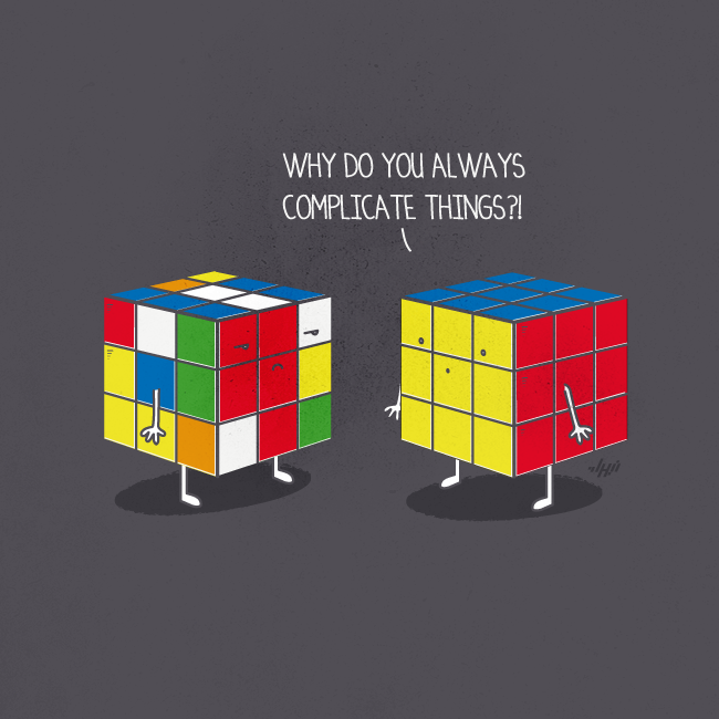
A solved Rubik’s cube lecturing a scrambled twin—“Why do you always complicate things?!”—is textbook Abdullatif. The objects already carry the metaphor. Personality is added with almost nothing: two dots for eyes, a mouth line, a shadow under the feet. Complexity becomes a character flaw; order becomes a smug sibling.
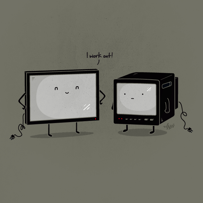
Technology nostalgia gets the same treatment. A slim flat-screen flexes with “I work out!” beside a deep CRT set that can only stand there and absorb the insult. Body talk and product design collide. The humor is gentle, but the observation is sharp: we already judge objects as if they had lifestyles.
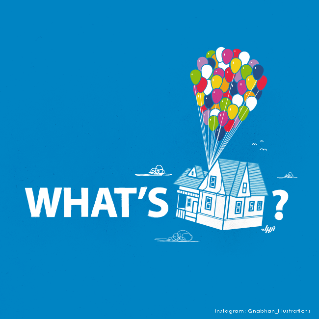
Sometimes the pun is typographic. “What’s” plus a balloon-lifted house plus a question mark becomes “What’s Up?” in one glance. Pop culture does the heavy lifting; Abdullatif supplies the spacing and the restraint. The image works even if you only half-remember the film, because the house-and-balloons silhouette is already public vocabulary.
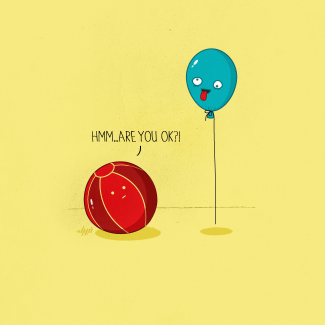
Other panels stay smaller and stranger. A grounded ball asks a floating balloon, “Hmm..are you ok?!” Lightheaded stops being slang and becomes physics with a face. The joke is kind rather than cruel—concern aimed at something that cannot answer—which is part of why these drawings share well. They invite a smile without demanding a target.
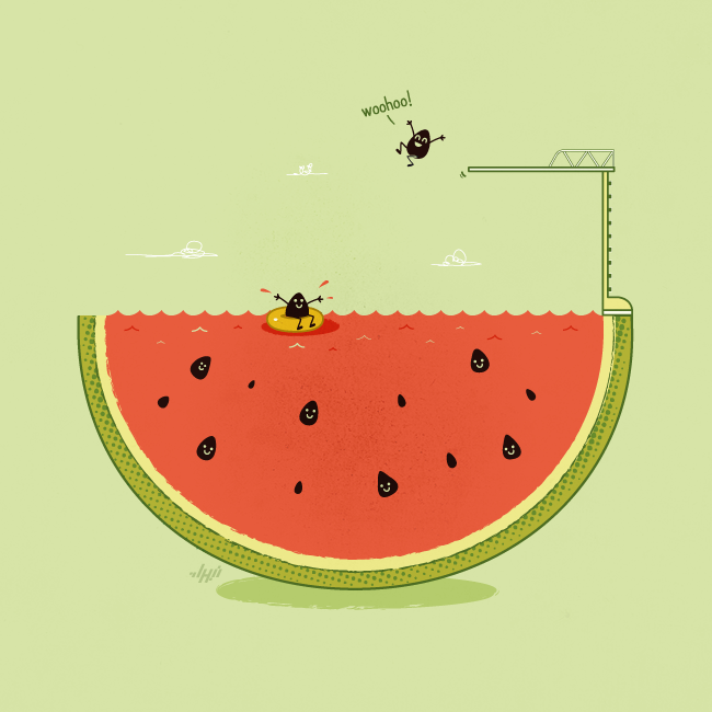
Abdullatif also builds miniature worlds. Watermelon seeds swim, float in an inner tube, and dive from a board built into the rind. The fruit becomes a resort; the seeds become guests. There is no caption because the scene is the caption. Conceptual illustration here means inventing a logic that feels inevitable once you see it.
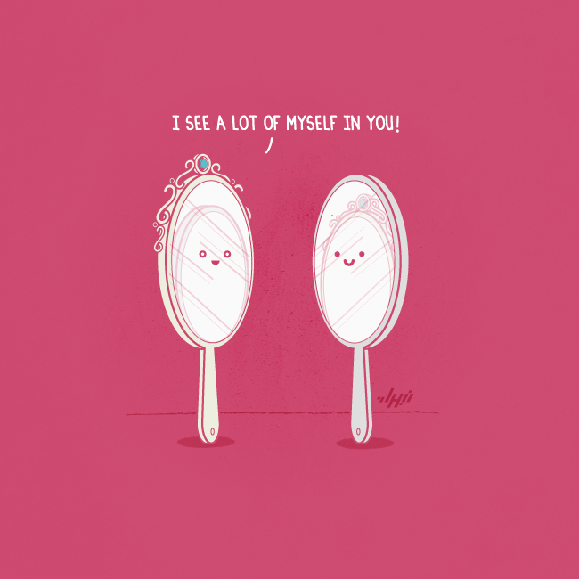
“I see a lot of myself in you!” spoken between two hand mirrors is almost unfairly perfect. One mirror is ornate; the other is plain—yet the plain glass reflects the fancy frame, so the compliment is both sincere and slightly competitive. Idioms about resemblance become literal optics.
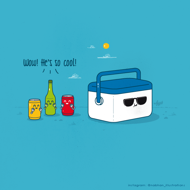
Double meanings of “cool” get a summer staging: cans and a bottle blush at a sunglassed cooler. Temperature and status share a word; Abdullatif only has to cast the cooler as the celebrity and the drinks as fans. The sunny background sells the weather; the sunglasses sell the attitude.
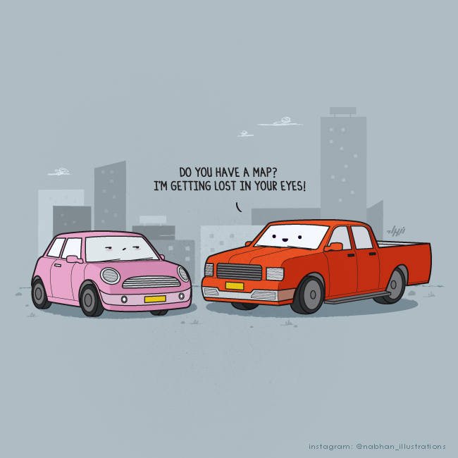
Vehicles get romance, too. A pickup truck leans on the classic line—“Do you have a map? I’m getting lost in your eyes!”—aimed at a skeptical little car. Navigation and flirtation share vocabulary, so the gag feels earned rather than forced. City silhouettes keep the scene grounded in ordinary streets.
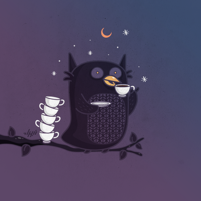
Not every piece is a spoken punchline. A tired owl on a branch, coffee in wing, empty cups stacked beside it, is a portrait of the phrase “night owl” under deadline pressure. Stars and a crescent moon finish the setting. The humor is quieter: recognition for anyone who has stayed awake past sense.
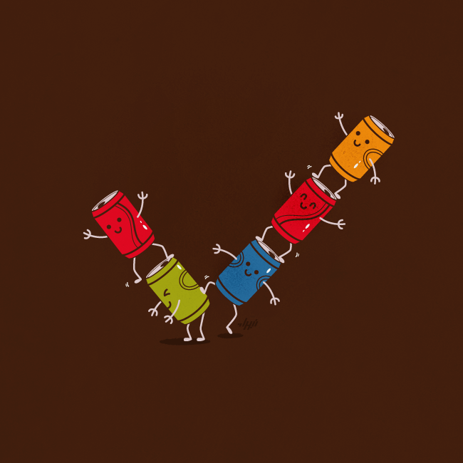
Abdullatif’s cans also perform as geometry. Arranged into a giant checkmark, they turn approval into teamwork—a living tick mark made of soft-drink mascots. The concept is graphic-design cleverness first, character comedy second, which shows how wide his range is inside the same visual language.
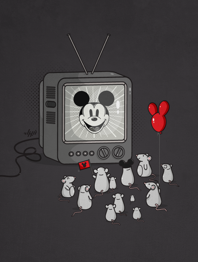
Pop icons return with a sharper cultural twist in a panel where ordinary mice gather around a vintage TV broadcasting Mickey Mouse. Flags, ear hats, and balloons turn fandom into devotion. The drawing asks, lightly, what happens when a cartoon of a mouse becomes an idol to actual mice. Celebrity, branding, and species collapse into one joke.
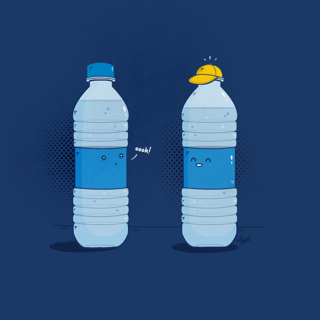
A water bottle admiring another bottle’s baseball cap—“oooh!”—is fashion logic applied to packaging. Cap means closure and accessory at once. The piece is tiny, almost throwaway, yet it demonstrates Abdullatif’s habit of finding social comedy in supermarket objects.
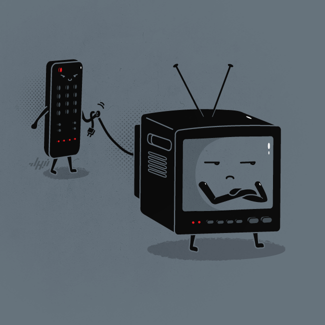
Power dynamics get literal when a remote unplugs a TV and walks off with the cord. The screen looks betrayed; the remote looks pleased. Control devices controlling their hosts is an old anxiety dressed as a cartoon. You do not need a long caption when the plug is already in the villain’s hand.
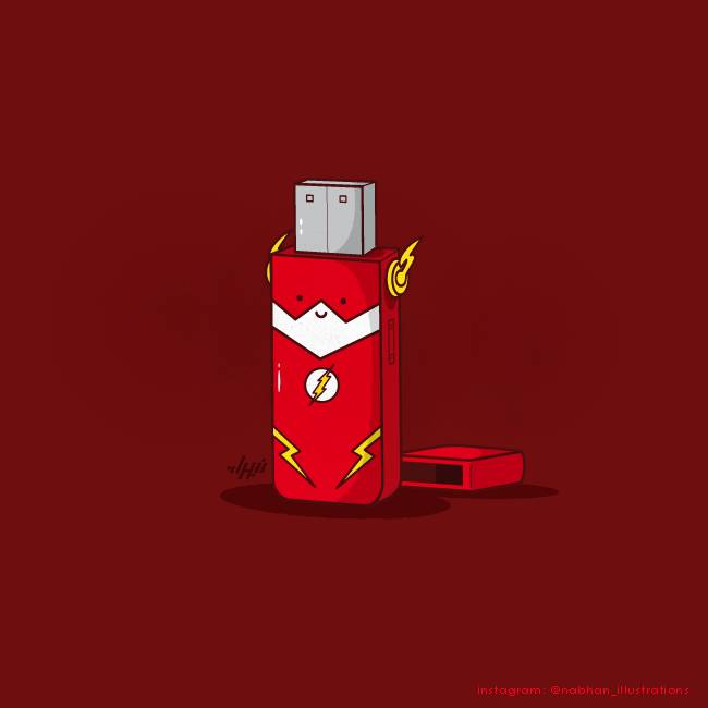
“Flash drive” becomes a red USB stick in superhero drag: lightning bolts, mask shape, logo on the chest, cap discarded nearby. Brand crossover and tech slang shake hands. The gag is immediate because both halves of the compound word are famous on their own.
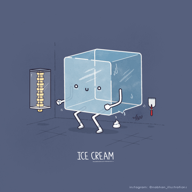
Some jokes lean cheekier. An ice cube in a bathroom, producing a soft-serve swirl under the title “Ice Cream,” pushes the wordplay into bathroom humor without abandoning the clean drawing style. Abdullatif’s palette and linework keep even the crude ideas graphic and readable.
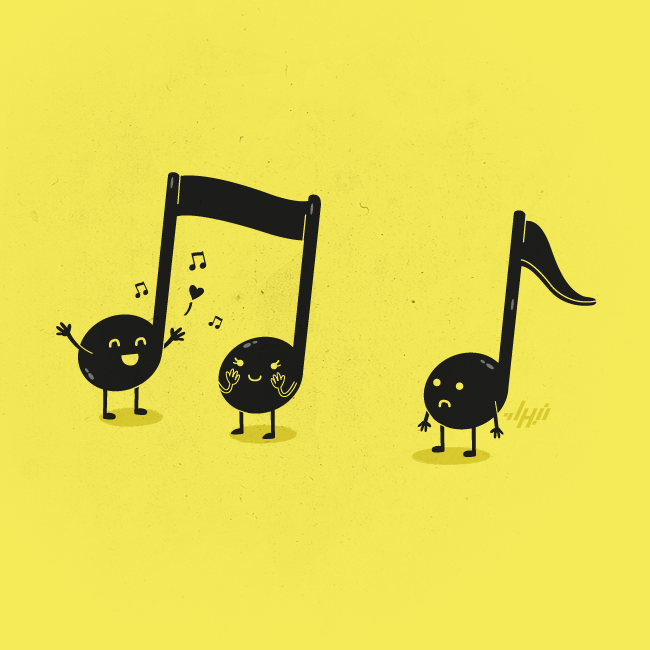
Music notation becomes relationship drama: beamed eighth notes as a happy pair, a flagged single note slumped alone. Connection is structural in music; Abdullatif simply lets that structure feel emotional. Designers and musicians both catch the joke at once.
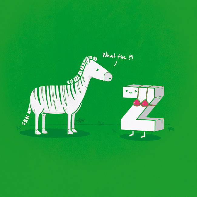
Letterplay returns with a zebra confronting a letter “Z” in a bikini top—zebra as “Z” in a bra. The zebra’s “What the..?!” does the audience’s work. Spelling jokes rarely look this friendly; here the cuteness of the characters softens the groan and makes it charming.
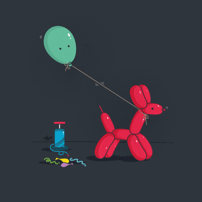
Role reversal appears again when a balloon dog walks a green balloon on a leash past a discarded pump and unused balloons. Who belongs at the end of the string? The image answers without speech. Abdullatif likes these quiet inversions as much as captioned one-liners.
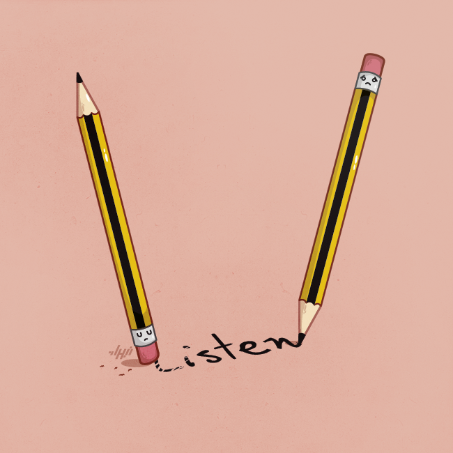
Two pencils argue without words: one writes “Listen,” the other erases the “L,” leaving a sadder message behind. Communication and sabotage share the same tools. The peach background keeps the mood soft even when the idea is sharp.
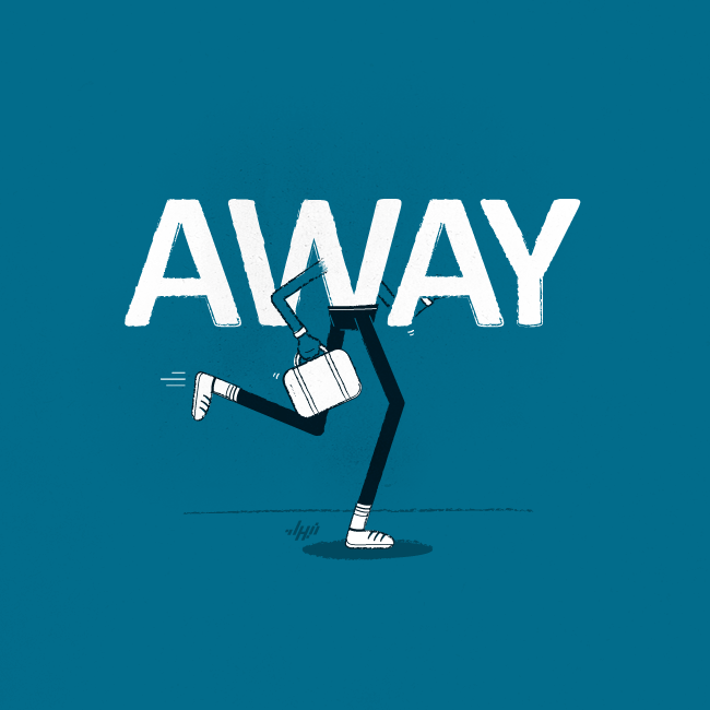
Typography becomes a body in “Away”: bold white letters on running legs, briefcase swinging, sneakers kicking. Departure is not described; it is worn. That is conceptual illustration at full strength—idea, type, and motion fused until none of them is decoration.
Why the style travels
Abdullatif’s work spread across DeviantArt, design blogs, and later Instagram because it is portable. Each piece is a complete joke with a clear silhouette. You can understand most panels without speaking English fluently, yet English idioms give many of them their spark. That bilingual usefulness—visual first, verbal second—suits the internet’s scroll.
He has long worked as a professional vector artist and digital illustrator, with recognition in design communities and print features that treated the visual-pun series as more than novelty. The craft underneath the humor matters: consistent character language, careful negative space, and captions that never over-explain.
If you want a lens for looking at the gallery, try this: find the ordinary phrase or product name first, then watch how little Abdullatif adds to make it theatrical. The best panels do not invent a new world. They rearrange the one you already live in until it laughs back.
Which object on your desk would get a face first—and what would it refuse to say out loud?

Comments
Continue reading

Still-Life Photography by Margareth Perfoncio
São Paulo photographer Margareth Perfoncio’s still lifes of food and flowers—Old Master light, dark wood, and tables that feel inevitable.

Meaningful Love Quotes for Inspiration (and Ink)
Meaningful love quotes that still feel true — short lines for tattoos, gifts, and everyday reminders, with placement and wording tips.
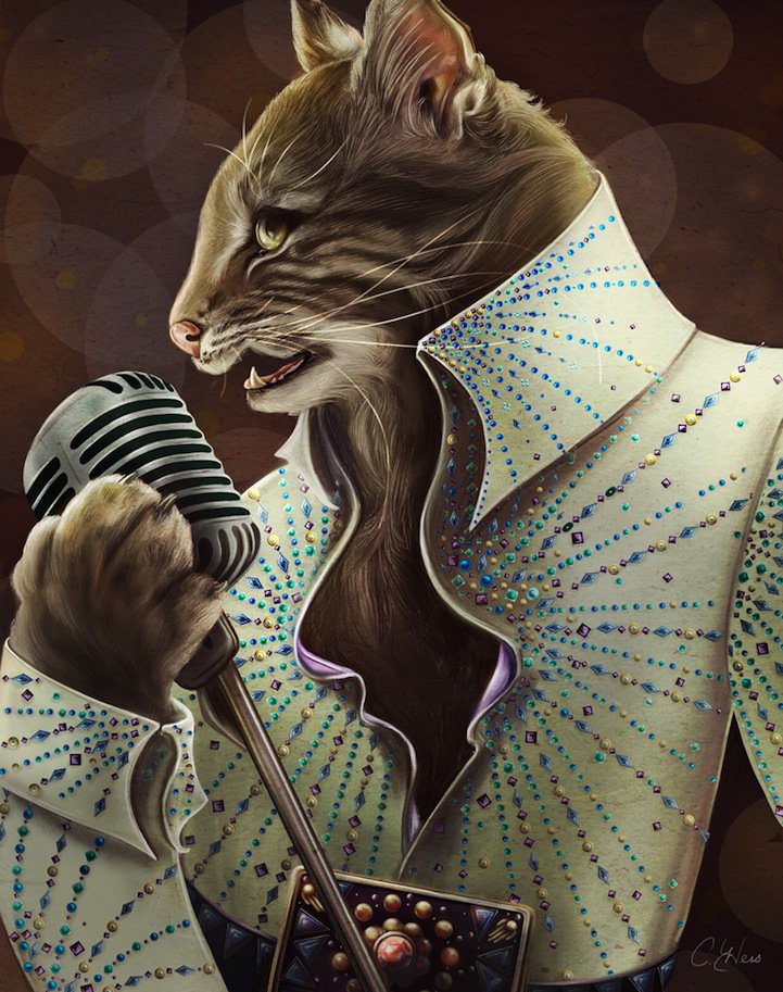
Christina Hess’s Animals From History: Costumed Pets as Playful Portraits
Illustrator Christina Hess reimagines historical icons as ornate animal portraits—Elvis Petme and friends—mixing puns, costume detail, and soft history lessons.