
Brad Pitt for Interview Magazine, October/November 2012
Steven Klein and Ludivine Poiblanc’s black-and-white Interview editorial—multiple personas, from utility cool to Old Hollywood polish.
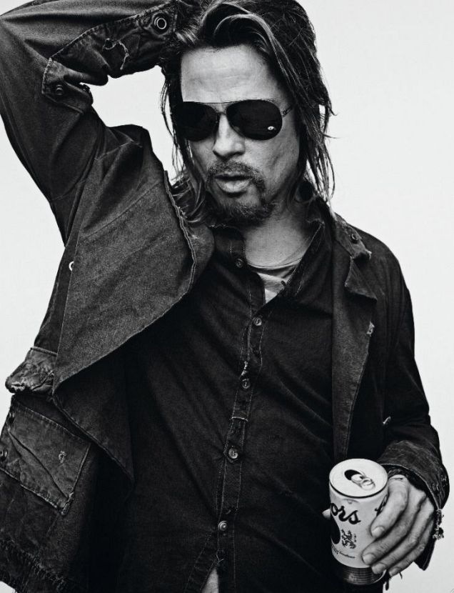
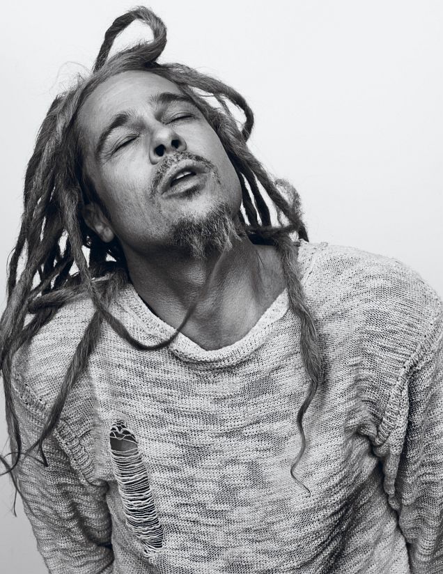
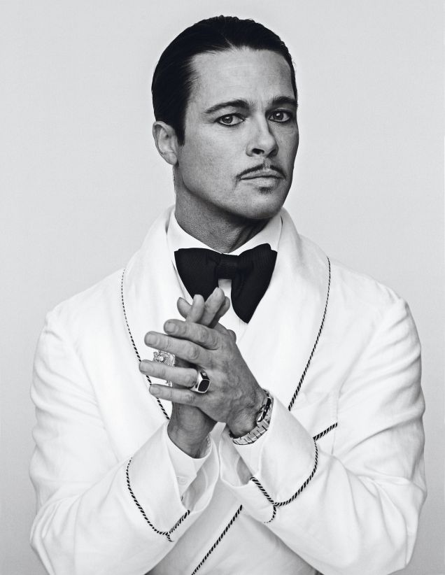
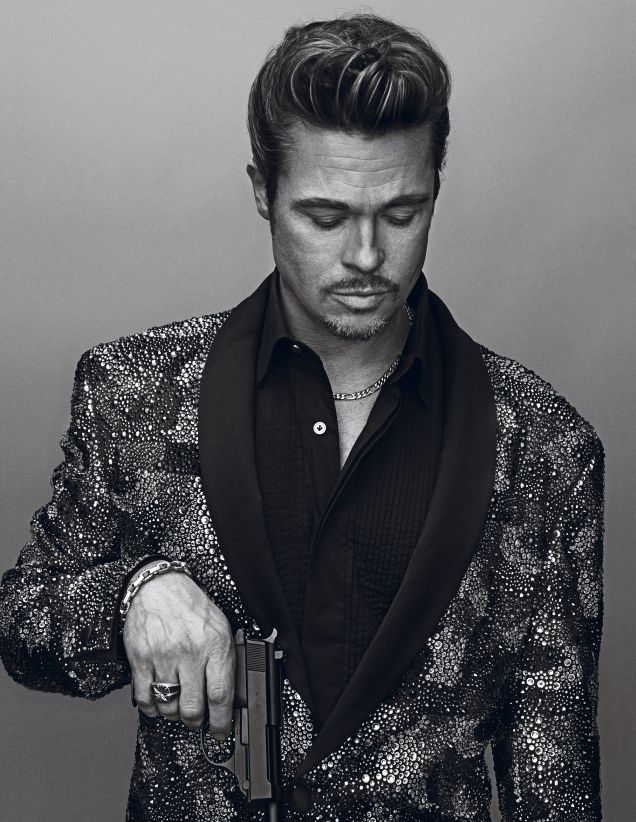
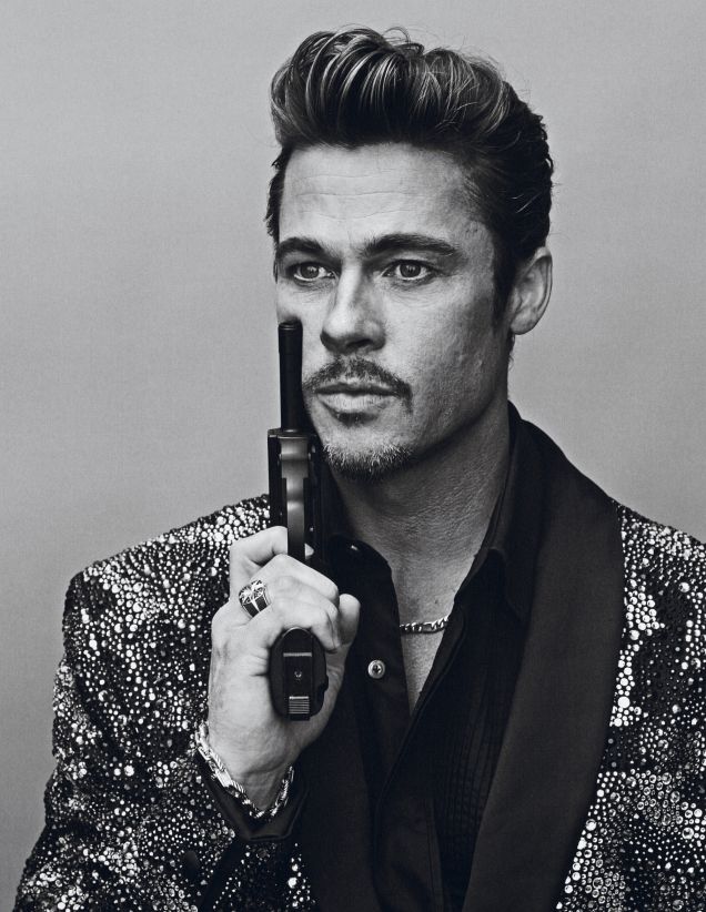
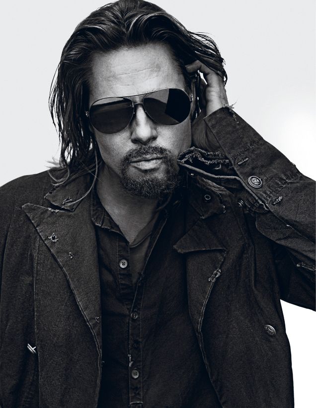
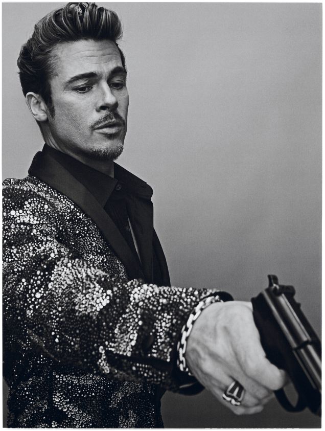
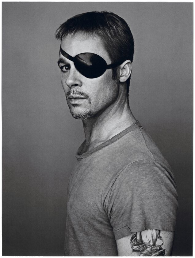
Brad Pitt’s October/November 2012 Interview magazine package is a study in persona. Photographed by Steven Klein and styled by Ludivine Poiblanc, the black-and-white editorial refuses to settle on one “authentic” Brad. Instead it moves him through looks that feel like short films: rough utility and beer-can cool, Old Hollywood polish with a pencil mustache and bow tie, and other character turns that sit between fashion photography and casting.
The timing belonged to late 2012 press culture. The images circulated in October as Pitt’s crime film Killing Them Softly was part of the conversation, and Interview—a title built on art-world celebrity portraiture since the Warhol era—gave him a stage that welcomed transformation. The aim is a period gallery: editorial pictures, credits, and enough context to understand what you are looking at, without inventing quotes or turning the shoot into modern gossip.
Interview’s appetite for character
Interview has long treated covers as casting calls. Subjects are not only photographed; they are directed into attitudes borrowed from cinema, nightlife, and art photography. Klein’s work fits that tradition cleanly. High contrast, plain backgrounds, and costume changes keep attention on face, hands, and silhouette. The magazine’s October/November 2012 issue put Pitt at the center of that machine.
Guy Ritchie’s conversation with Pitt accompanied the pictures in the magazine’s own presentation of the feature. Online, though, the photographs traveled farther than any single Q&A. Fashion blogs and style sites saved the frames as a chameleon portfolio: proof that a bankable movie star could still look like a different person every few pages. That is the search intent this URL still serves.
What separates this package from a standard “actor in a suit” cover is editorial permission to play. Klein and Poiblanc treat wardrobe as script. Sunglasses, facial hair, jewelry, and props are not afterthoughts; they are plot points. The result is closer to a contact sheet from a fictional film than to a conventional Hollywood portrait sitting.
Rugged frames: denim, jackets, and opaque cool
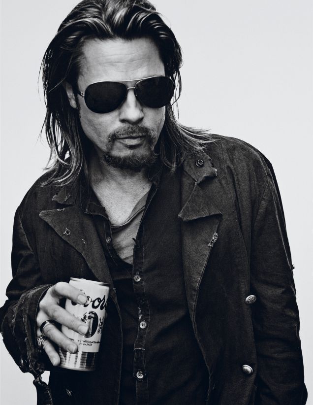
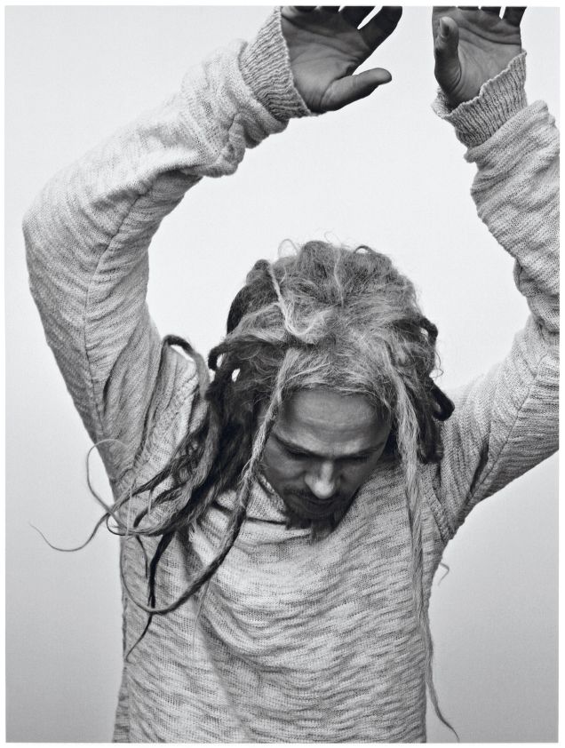
Several images lean into worn-in workwear energy—distressed jackets, open collars, aviators, longer hair, and a can held like a prop from a road movie. The mood is louche rather than tailored. Klein’s lighting keeps textures hard: fabric weave, facial hair, the bright wall that turns the body into a cutout.
These frames matter because they refuse red-carpet gloss. They suggest a character who might walk out of a crime story or a bar parking lot. That atmosphere was useful branding next to a hitman-adjacent film cycle even when the wardrobe was pure editorial fiction. Sunglasses again do heavy narrative work, hiding the eyes so gesture and costume carry the plot.
Look at how little set decoration is required. A blank wall and decisive styling do more than a cluttered location could. That economy is part of Klein’s signature in this period: remove everything that does not help the character land.
Old Hollywood and theatrical polish
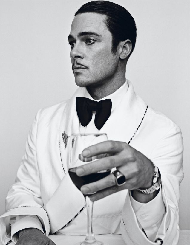
Other pictures flip the dial completely. Slicked hair, a thin mustache, dark eye makeup, a shawl-collar jacket with piping, an oversized bow tie, a wine glass held with deliberate calm—the references point toward classic leading-man glamour and film-noir polish. Poiblanc’s styling here is costume design as much as fashion.
The contrast with the utility looks is the editorial’s real subject. Pitt is not being “revealed.” He is being cast. That distinction matters for readers who arrive expecting a standard celebrity profile gallery. Interview and Klein were selling range: the same face under different masks, photographed with enough craft that each mask feels complete for the length of a page.
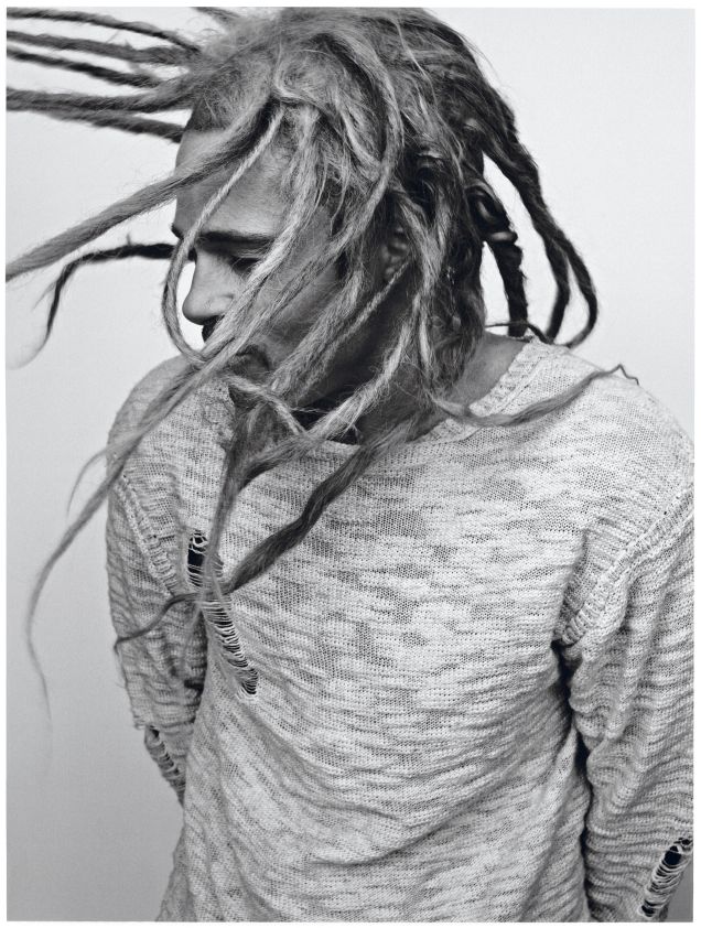
Period write-ups repeatedly noted the shoot’s many faces—gangster polish, dandy codes, looser street-adjacent attitudes—because the gallery itself is structured as a sequence of roles. If you flip quickly, the transformations can look like a stunt. If you slow down, each frame has its own internal logic of grooming, fabric, and prop.
What Steven Klein emphasizes
Klein’s black-and-white approach flattens distraction. Without color, you notice the geometry of collars, the weight of a jacket, the line of a glass or cigarette, the tension in a raised arm. Backgrounds stay spare so wardrobe can change the entire emotional temperature of a frame in one turn of the page.
That economy is why these pictures still circulate. They are not tied to a single outfit drop or a retail collaboration. They are performance stills from a fashion-film experiment conducted inside a print magazine. In an era when celebrity photography often chased candid myth—“caught” off duty in sneakers—this editorial admits artifice and makes artifice entertaining.
For photographers, the lesson is directional clarity: decide who the subject is playing before you worry about which lens flatters. For stylists, the lesson is commitment: half-transformed looks read as compromise; fully inhabited looks read as concept.
How to read the sequence
Move through the images as acts, not as duplicates. Ask what each look is borrowing: workwear, lounge elegance, criminal-adjacent swagger, classic leading-man glamour. Notice which frames feel closest to contemporary street style and which feel like period cinema. That spectrum is the point of Klein and Poiblanc’s collaboration.
Also notice what is absent. There is little interest here in off-duty mythology. Everything is deliberate—hair, facial hair, jewelry, props. The editorial does not pretend the camera stumbled into a private moment. It builds private moments as theater.
If you are using the gallery as a styling reference, pick one persona and follow it all the way: grooming, fabric weight, accessory temperature, posture. Mixing half of the utility look with half of the bow-tie look usually produces costume soup. The magazine’s own sequence succeeds because each page commits.
Why the gallery still gets searched
People return to this set for the same reasons they returned in 2012: the pictures are specific. They belong to a dated press cycle and a particular magazine culture, yet they remain useful as references for styling, portrait direction, and the pleasures of black-and-white celebrity photography done with theatrical nerve.
They also reward comparison with other Pitt editorials from the same years. Where some packages chase a single rugged icon look, this Interview shoot multiplies identities on purpose. That multiplication is the feature, not a lack of focus.
Which persona lands hardest for you—the utility cool, the bow-tied classic, or one of the in-between masks? The editorial was built so that question has no single correct answer. That open casting call is still the best way to leave the page.

Comments
Continue reading

Kristen Stewart for V Magazine, Spring Preview 2013
V81’s Wild at Heart cover story—Kristen Stewart shot by Inez & Vinoodh, styled by Joe McKenna, in pale minimal spring glamour.
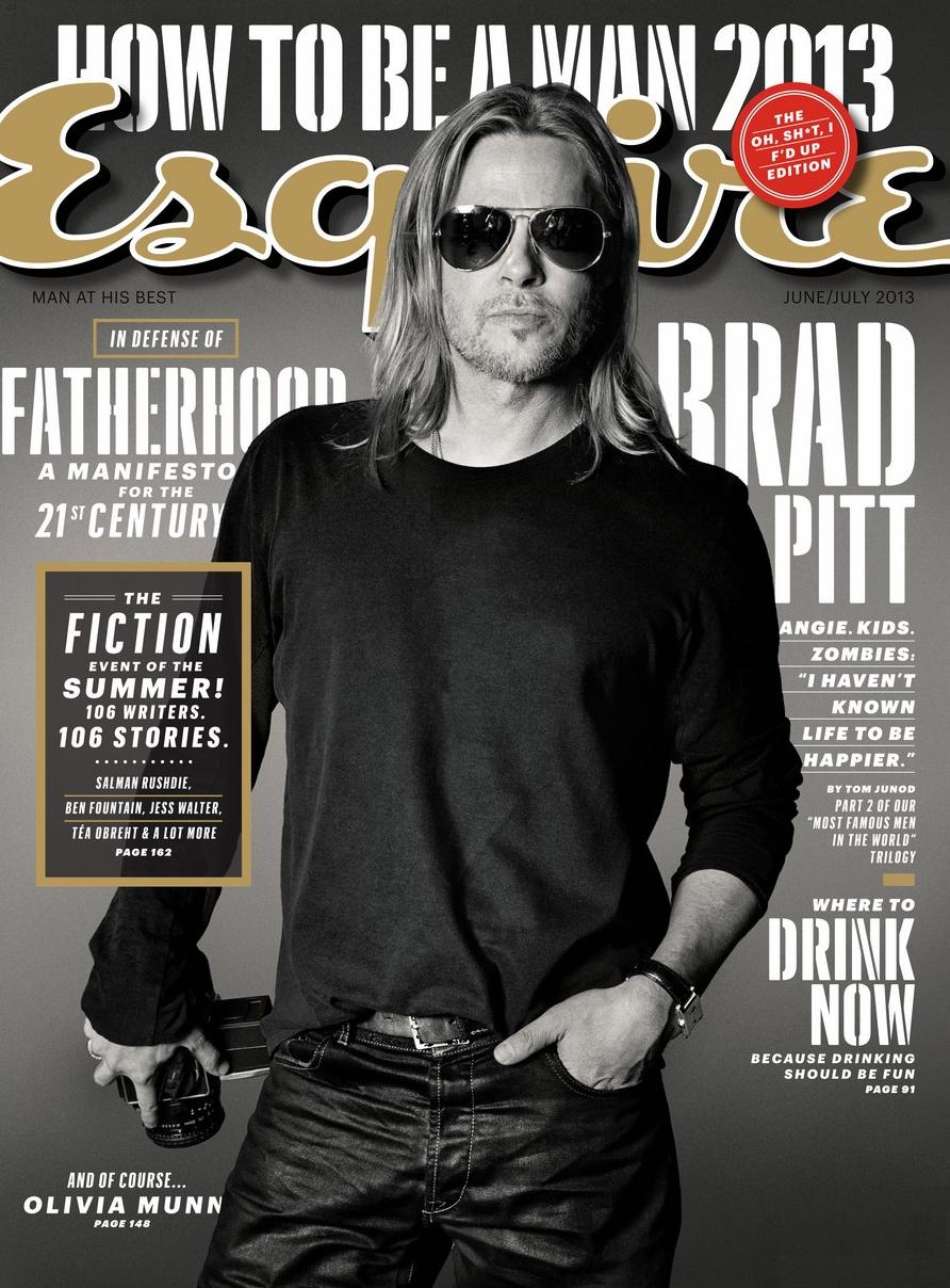
Brad Pitt for Esquire US, June/July 2013
Max Vadukul’s monochrome Esquire cover portraits—camera prop, aviators, Tom Junod’s “A Life So Large” summer 2013 package.
Kate Upton for Vogue Germany January 2013: Bruce Weber
Bruce Weber and Anne Christensen’s January 2013 Vogue Germany feature—outdoor European wardrobe romance, from Ackermann to Eres.