
Brad Pitt for Esquire US, June/July 2013
Max Vadukul’s monochrome Esquire cover portraits—camera prop, aviators, Tom Junod’s “A Life So Large” summer 2013 package.
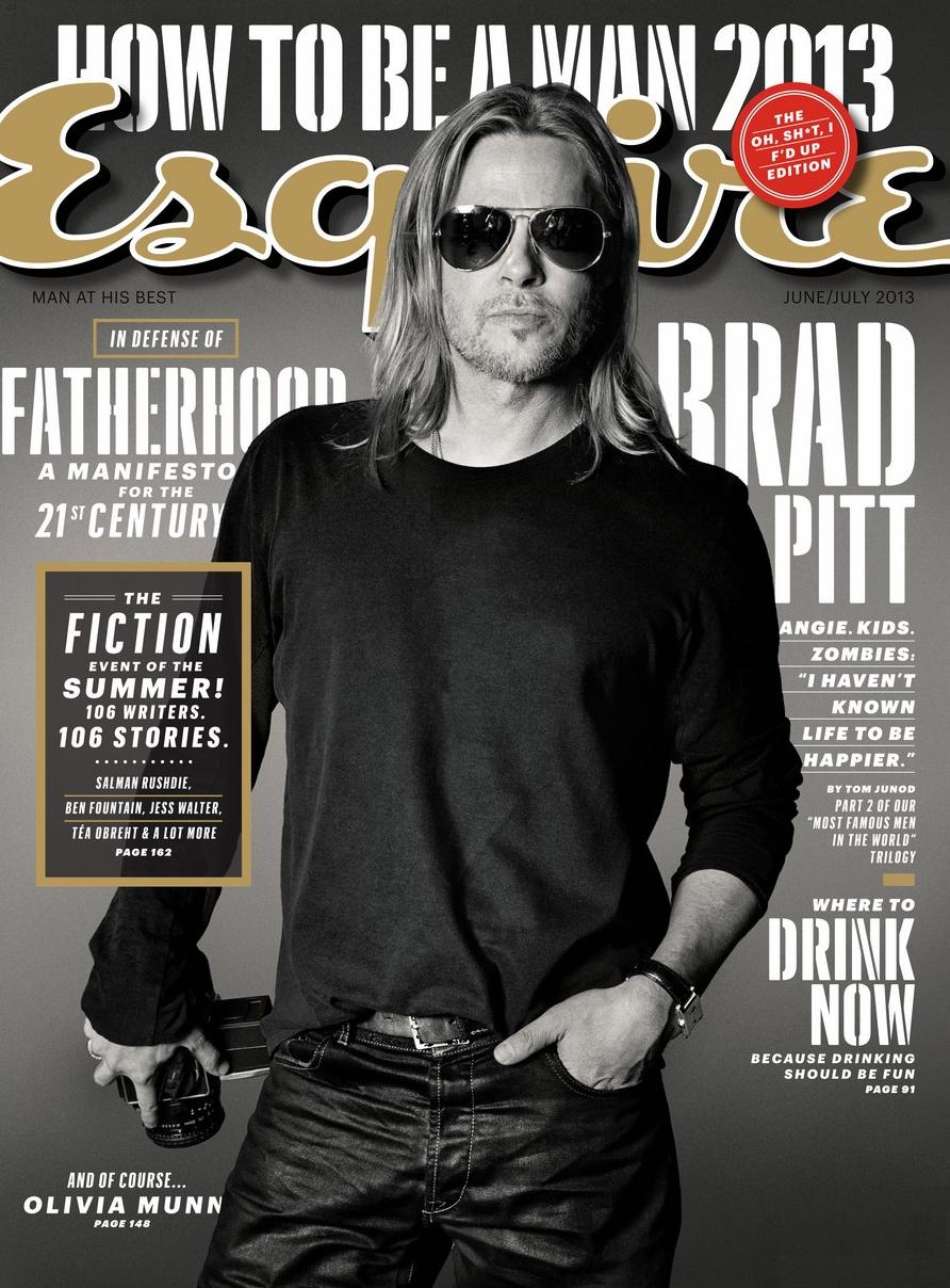
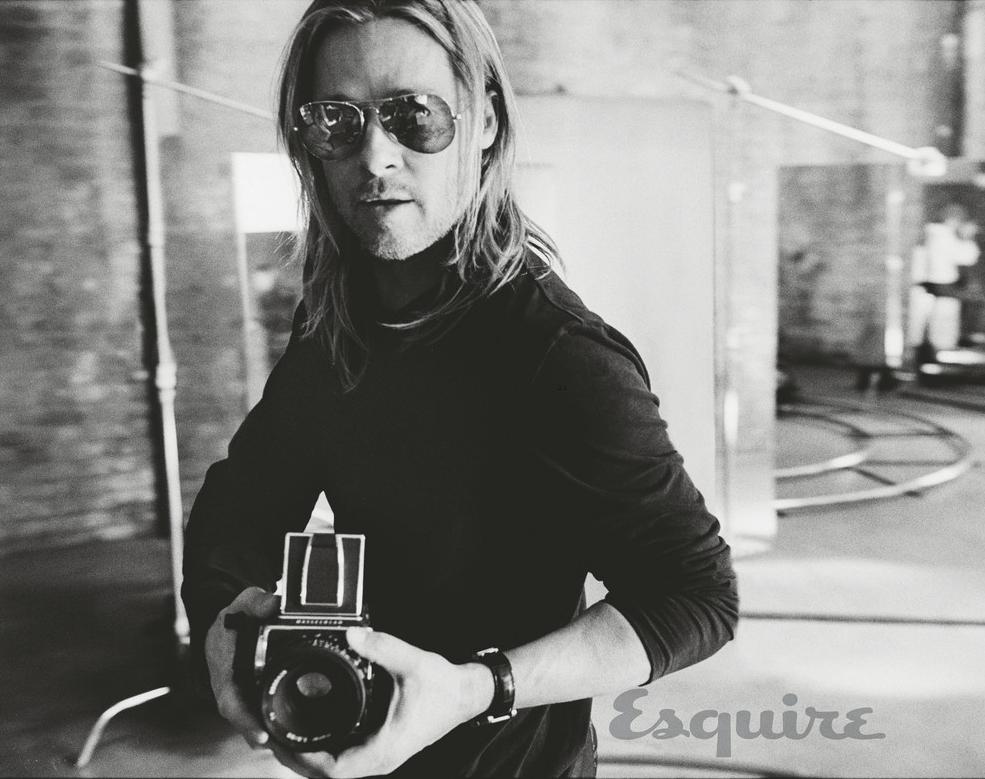
In summer 2013, Esquire US put Brad Pitt on the cover of its combined June/July issue and built the package around a Tom Junod profile titled “A Life So Large.” The photographs—by Max Vadukul—are the lasting draw: monochrome studio portraits that treat Pitt less like a red-carpet mannequin and more like a working actor who happens to be holding a camera while the magazine’s cursive masthead floats above him.
This is a period editorial gallery from the 2012–2013 celebrity-press cycle. It is not a career retrospective, not a net-worth roundup, and not a place for invented interview soundbites. The pictures belong to a specific newsstand moment—sunglasses, long hair, black knit, jeans, and a quiet gray seamless—and that specificity is the point.
What the cover was selling
The US cover is designed to work at sidewalk distance. Pitt fills the frame waist-up in a black crewneck and dark jeans, shoulder-length hair, light stubble, classic aviators. One hand holds a vintage-style camera at his side; the other sits near a pocket. The portrait is black and white against a medium gray field. Above him, Esquire’s script logo and the line “How to Be a Man 2013” set the issue’s broader theme. Cover lines teased family life beside the zombie film World War Z and flagged Junod’s story as part of a “most famous men” trilogy.
That packaging mattered because it told readers how to interpret the face they already knew. The magazine was not dressing Pitt as a fictional hitman or a period dandy. It was presenting a contemporary star who looked ready to step off a set and into ordinary daylight—except the daylight was studio light, and the ordinary clothes were curated for texture.
Fashion blogs and style roundups began circulating the Vadukul frames in May 2013, ahead of the issue’s summer shelf life. Many visitors never read every paragraph of the profile. They saved the images. Galleries like this one exist because photographs travel farther than print deadlines.
Max Vadukul’s approach
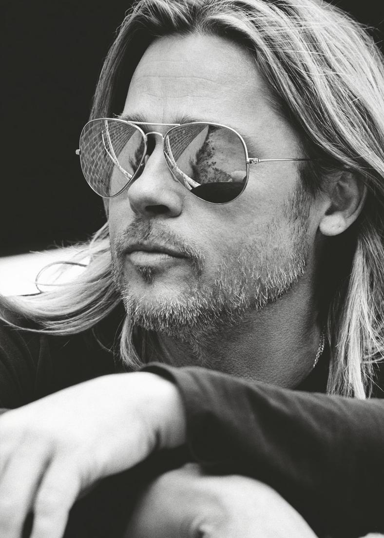
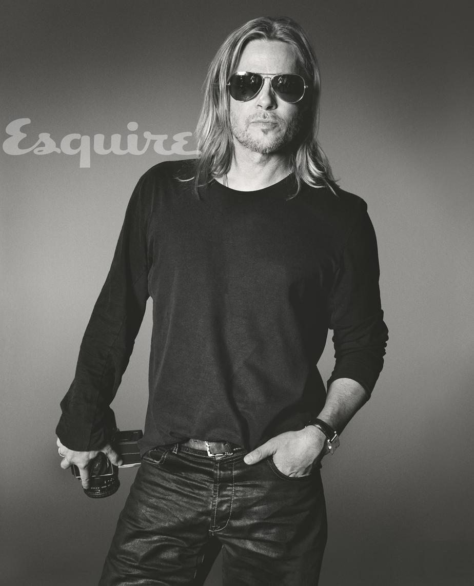
Vadukul’s portraits keep a consistent key. Close frames with crossed arms and reflective aviators pull outdoor architecture into the lenses, so the glasses become tiny landscapes. Three-quarter views emphasize beard texture and the calm of a dark long sleeve against soft focus. Mid-length shots return to the camera prop until it stops feeling like a one-off accessory and starts reading as a motif.
Photographers who study the set usually notice how little decoration is required. There is no carnival of wardrobe changes, no crowded set design, no competing color story. Interest lives in posture, reflection, and the slight asymmetry of a working hand holding equipment. In 2013 men’s magazine photography, that restraint read as confidence: the subject did not need a tuxedo to justify a cover.
Technically, the lighting favors skin and fabric over cosmetic perfection. Blacks go deep without crushing every fold; highlights stay controlled on the aviator rims and watch. The seamless background remains polite. That quiet is why the portraits still feel contemporary when louder celebrity spreads age into costume history.
Why June/July 2013 was the right magazine moment
Esquire’s summer double issues have long mixed fashion, fiction, service journalism, and long profiles. The June/July 2013 package arrived while Pitt’s zombie thriller was moving through the cultural conversation and while the title was still investing in literary-length celebrity writing. Junod’s observational style—attentive to how memory, fame, and private life collide—fit the photos’ mood: a large public life rendered in controlled tones.
For searchers today, the useful context is narrower. People who land on this URL are usually looking for the specific summer-2013 look: long hair, stubble, monochrome, Vadukul’s clean studio grammar. They are not asking for a biography. They want the frames, credited and dated, with enough surrounding text to understand what magazine culture thought a “man of the moment” should look like on paper.
Compare this set, mentally, with more theatrical editorials from the same years—wardrobe transformations, character makeup, narrative props stacked high. Vadukul and Esquire chose the opposite path. The drama is tonal. That choice is part of what separates a lasting editorial bookmark from a forgotten fashion stunt.
How to look at the gallery
Start with clothing. A plain crewneck and jeans refuse costume drama; whatever tension remains has to come from face, hands, and props. Then watch the glasses. Aviators hide the eyes and force attention onto mouth, jaw, and the reflective world bouncing back at the viewer. Finally, track the camera. When a subject holds a camera inside a photographer’s studio, the image becomes a small joke about authorship—who is looking at whom?
Those three decisions explain the set’s lasting appeal better than any rumor cycle. They also offer practical takeaways. If you are a photographer, note how posture and prop can carry meaning without set dressing. If you are a stylist, note how denim and a black knit can still read as cover-worthy when grooming and accessories are intentional. If you are simply revisiting early-2010s men’s editorial culture, treat these frames as a primary source rather than as nostalgia wallpaper.
Also notice what the gallery does not do. It does not chase every career milestone. It does not invent dialogue. It does not turn Pitt into a financial case study. The pictures are enough when the writing around them stays honest about date, photographer, magazine, and mood.
A working definition of the look
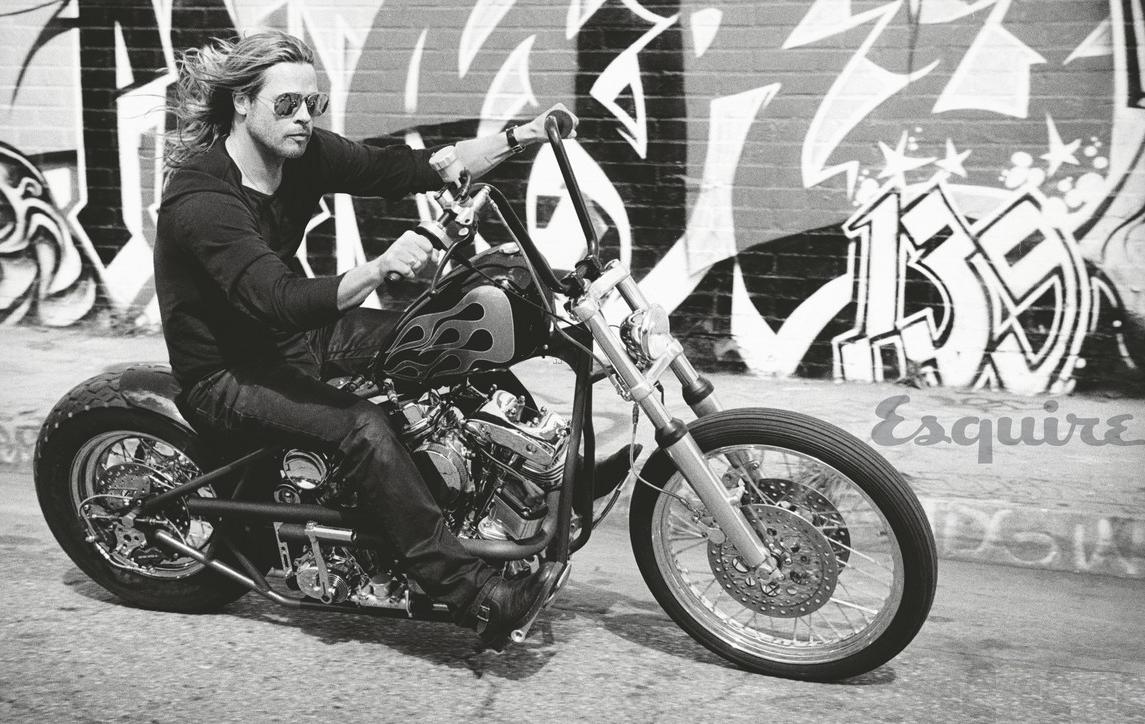
Call it rugged-studio American iconography: facial hair kept short enough to read as texture, hair long enough to break corporate neatness, eyewear that blocks intimacy, clothes that could almost pass for off-duty if the watch and belt did not give the styling away. Vadukul’s contribution is to make that formula feel photographed rather than merely assembled—edges soft where they should be soft, contrast hard where the face needs authority.
Magazine culture in 2013 still believed a black-and-white cover could feel modern. This package is evidence. Color would have changed the temperature; monochrome keeps the conversation on form and attitude. That is useful to remember when scrolling later celebrity campaigns that mistake saturation for intensity.
Return once more to the cover’s camera before you leave. It is not a random prop. It is the editorial thesis in object form—fame looking back through glass—and it is the detail that keeps these Max Vadukul pictures circulating long after the newsstand date faded.

Comments
Continue reading
Leonardo DiCaprio for Esquire US, May 2013
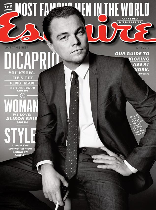
A historical look at Leonardo DiCaprio’s Esquire US May 2013 cover—black-and-white portraits by Max Vadukul timed to The Great Gatsby season.
Adriana Lima for Esquire UK, May 2013
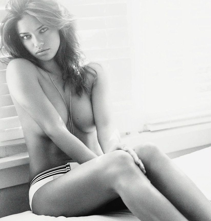
Matt Jones’s black-and-white Esquire UK May 2013 set with Adriana Lima—window light, a Lucky Charms lawn-chair gag, and a garden hose in gingham shorts.

Kristen Stewart for V Magazine, Spring Preview 2013
V81’s Wild at Heart cover story—Kristen Stewart shot by Inez & Vinoodh, styled by Joe McKenna, in pale minimal spring glamour.