
Leonardo DiCaprio for Esquire US, May 2013
A historical look at Leonardo DiCaprio’s Esquire US May 2013 cover—black-and-white portraits by Max Vadukul timed to The Great Gatsby season.
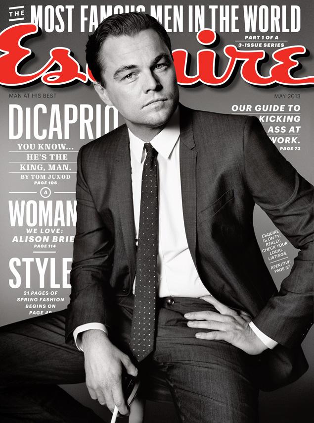
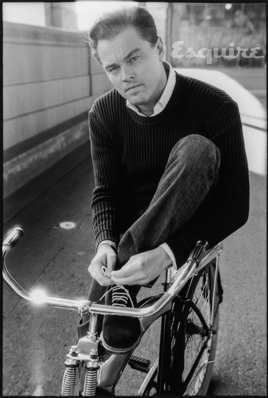
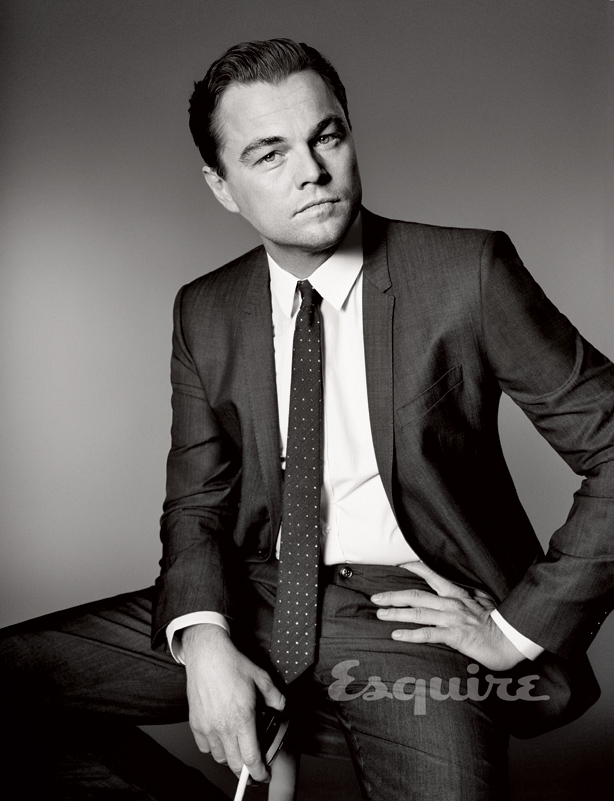
In spring 2013, Esquire US put Leonardo DiCaprio on its May cover in a black-and-white portrait series photographed by Max Vadukul. The package arrived as awards chatter and studio marketing circled The Great Gatsby, and as Esquire published Tom Junod’s profile under the banner “The Moment Leonardo DiCaprio Became a Man.” This page gathers that historical cover story’s image set—not as breaking celebrity news, but as a dated magazine artifact: menswear gloss, Old Hollywood lighting cues, and a star already treated as one of the most photographed faces in the world.
Print covers still functioned as event objects that season. A May Esquire with DiCaprio on the front was timed for newsstand traffic and for a film cycle that wanted the actor to look both classic and current. Vadukul’s frames favor contrast, tailored clothes, and a calm stare more than red-carpet spectacle. Years later they read as a clean specimen of early-2010s prestige-menswear celebrity packaging—useful to archive precisely because they are easy to date.
May 2013 on the newsstand
Esquire’s May 2013 issue treated DiCaprio as a cover-length subject rather than a one-page cameo. The published interview and photo portfolio asked the familiar men’s-magazine question of that era: what does extreme fame feel like from the inside, and how does a star who grew up in public perform adulthood on camera? Junod’s text framed maturity, choice, and the strange narrowness of options when every option looks enviable from the outside. The photographs had a different job. They had to sell the issue in a second—face, suit, confidence—while still leaving room for the profile’s more ambivalent tone.
Context around the cover included The Great Gatsby’s approaching release window. Magazine schedules often hitch a star to a studio moment without turning every portrait into a costume still. Vadukul’s set stays in contemporary menswear territory: sharp tailoring, clean shirts, controlled poses. The “Old Hollywood” feeling readers noted at the time comes from lighting and black-and-white grade more than from literal 1920s wardrobe. That choice keeps DiCaprio in Esquire’s fashion lane while borrowing the glamour grammar of studio-era portraiture.
For collectors of print ephemera, the cover also marks a late high point of a certain menswear-magazine confidence—when a single celebrity portfolio could still organize an issue’s identity on the rack. Digital galleries later flattened that hierarchy; in 2013 the physical cover remained the main advertisement for the story inside.
Max Vadukul’s black-and-white register
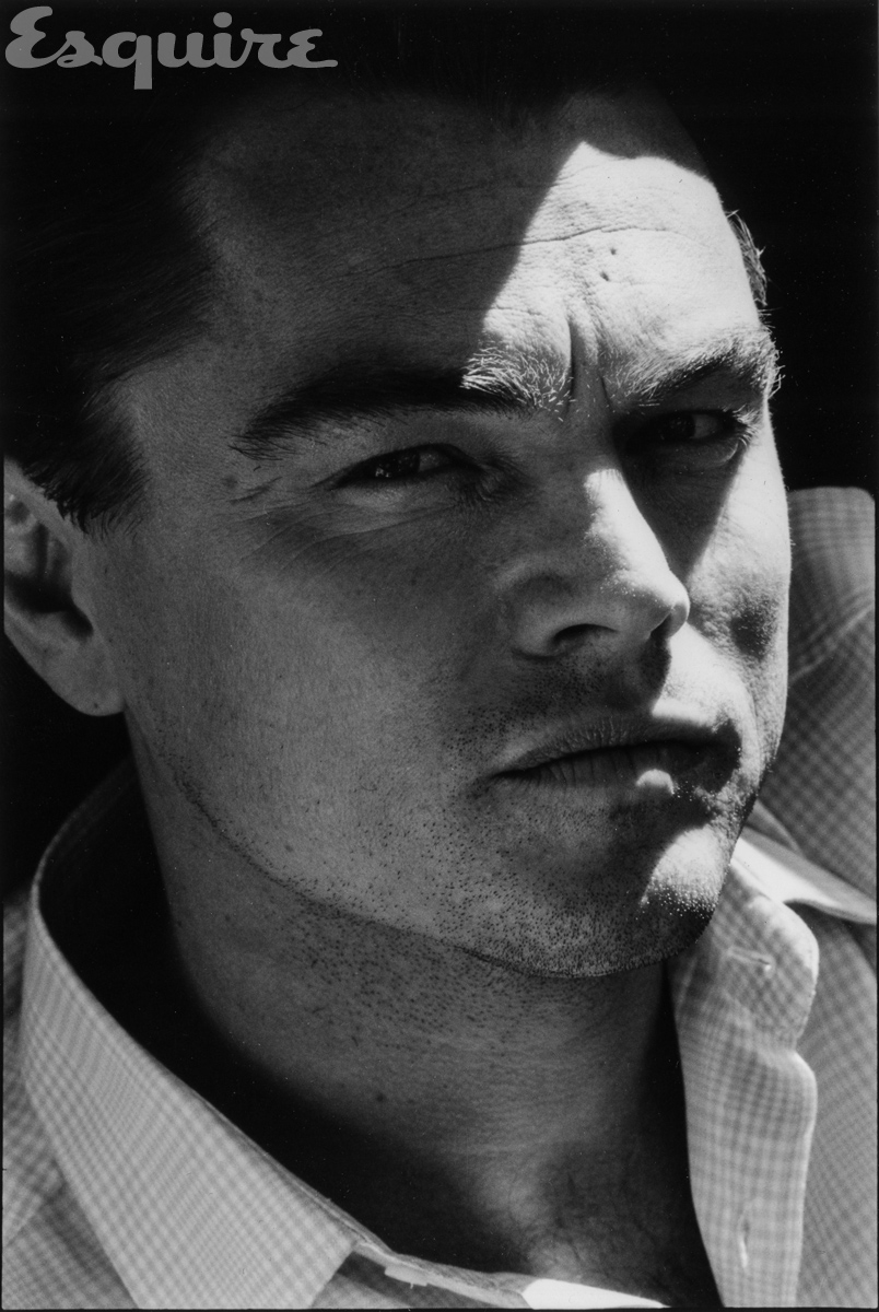
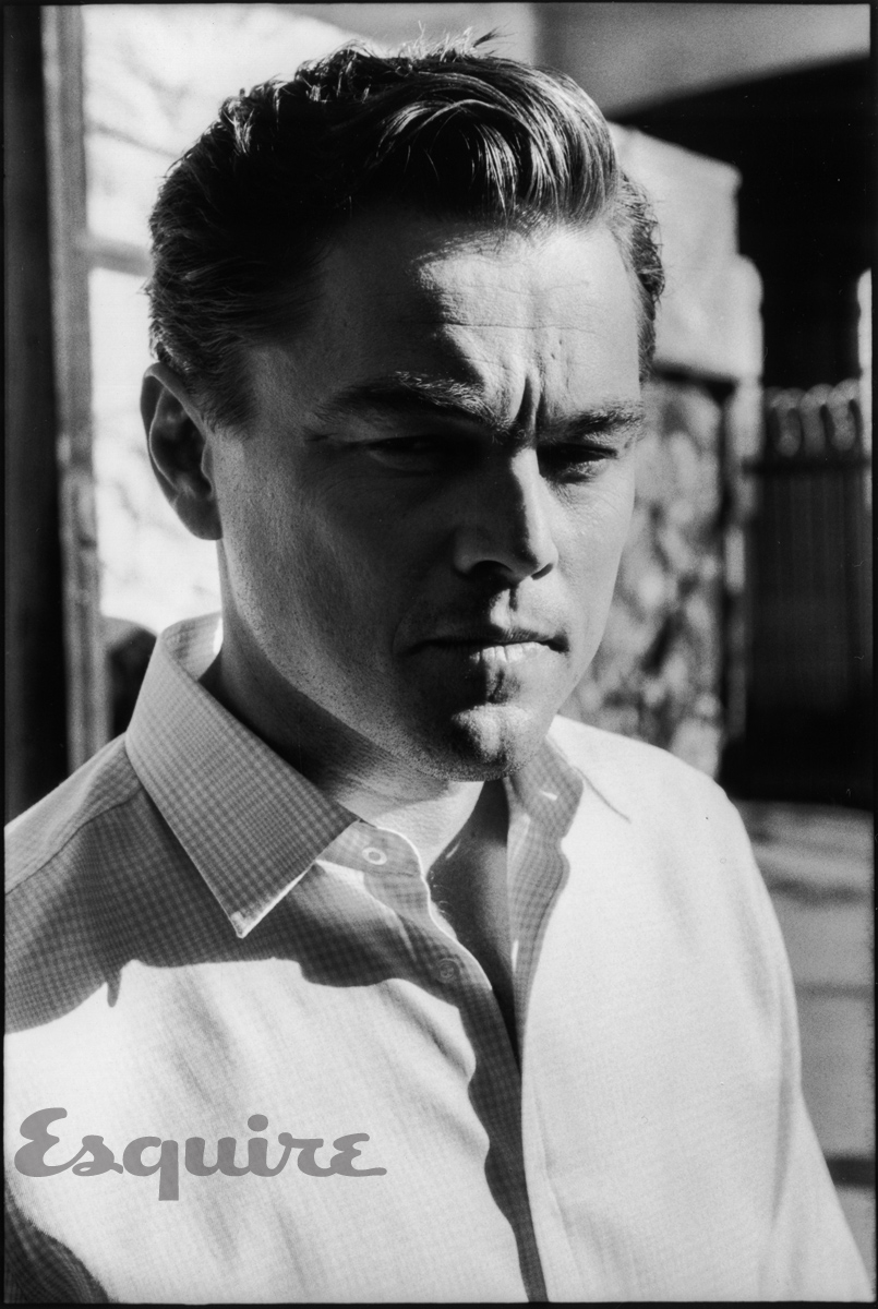
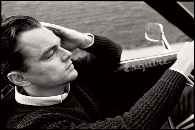
Vadukul’s celebrity and fashion work often leans on graphic contrast and composed stillness. In this Esquire set, grayscale removes the distraction of seasonal color stories and puts attention on bone structure, fabric texture, and gaze. Harder light carves cheekbones; softer fills keep the images from tipping into harshness. The clothes do quiet work—lapels, collars, and the occasional layered outer piece create vertical lines that steady the frame.
Black-and-white also flatters the magazine’s self-image. Esquire in that period liked to present itself as a curator of adult masculine style, not only of trend pieces. A monochrome DiCaprio portfolio signals permanence: this is supposed to look archivable, not tied to a single neon accessory. Whether or not a reader bought that myth, the visual strategy is clear when you flip through the frames in sequence.
Notice how little prop theater appears. There is no elaborate set piece competing with the face. The studio (or near-studio) simplicity is intentional. When a subject already carries decades of public recognition, excess scenery can dilute the cover’s job. Vadukul’s economy trusts DiCaprio’s recognizability and uses light as the main special effect.
How the poses sell “grown” stardom
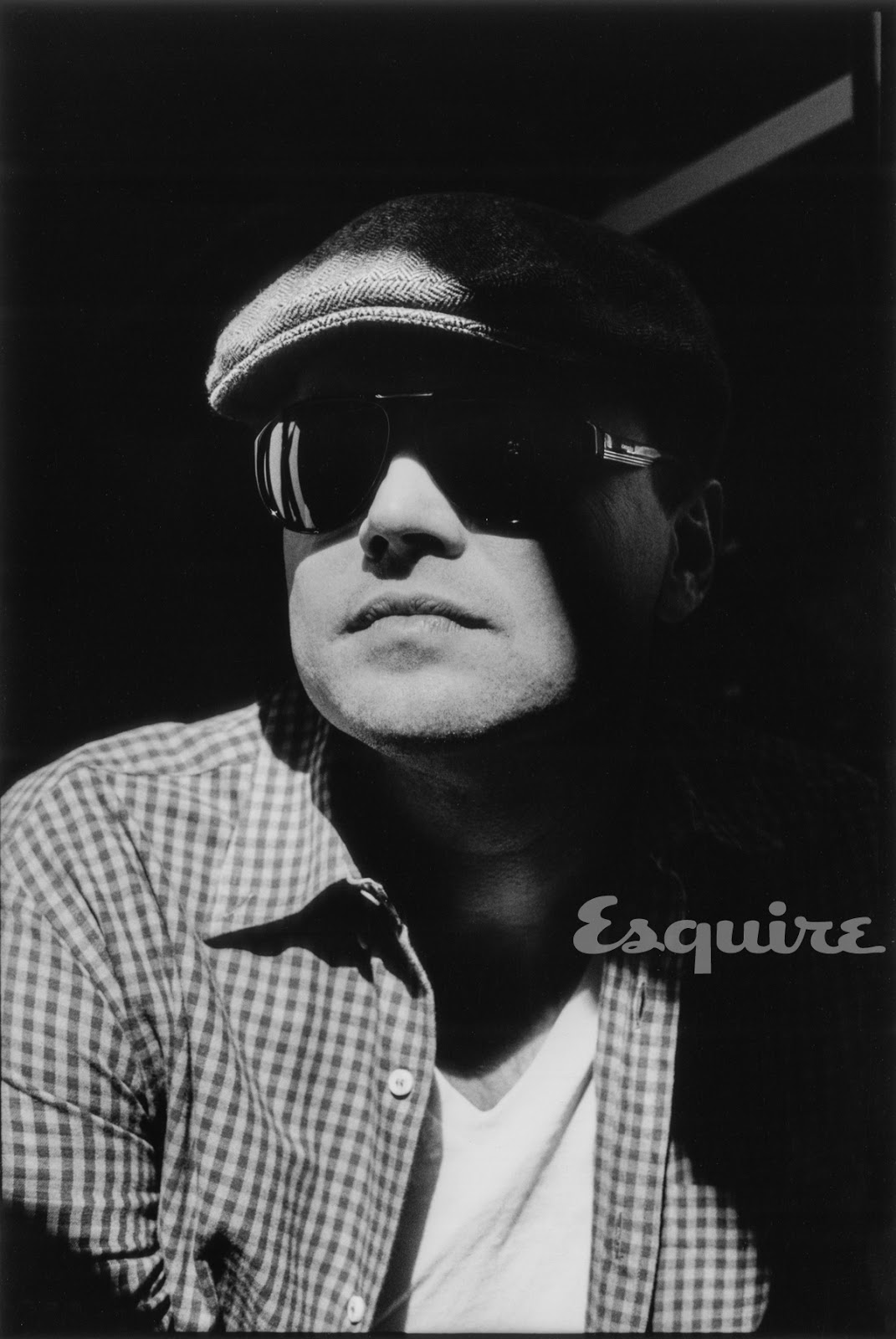
DiCaprio’s magazine value in 2013 rested on a long public timeline: child actor, Titanic-era phenomenon, Scorsese collaborator, environmental advocate, perpetual awards-season presence. Cover photography had to acknowledge that history without illustrating a biography. The solution in these frames is restraint. Shoulders square, chin level, eyes steady. Smile appears sparingly. The body language says control more than charm offensive.
That restraint matches the profile’s fascination with a man navigating life between “degrees of wonderful.” The pictures do not literalize the essay’s questions; they provide the face readers expect while the text handles ambivalence. Fashion magazines often split labor that way: photography for desire and recognition, reporting for complication.
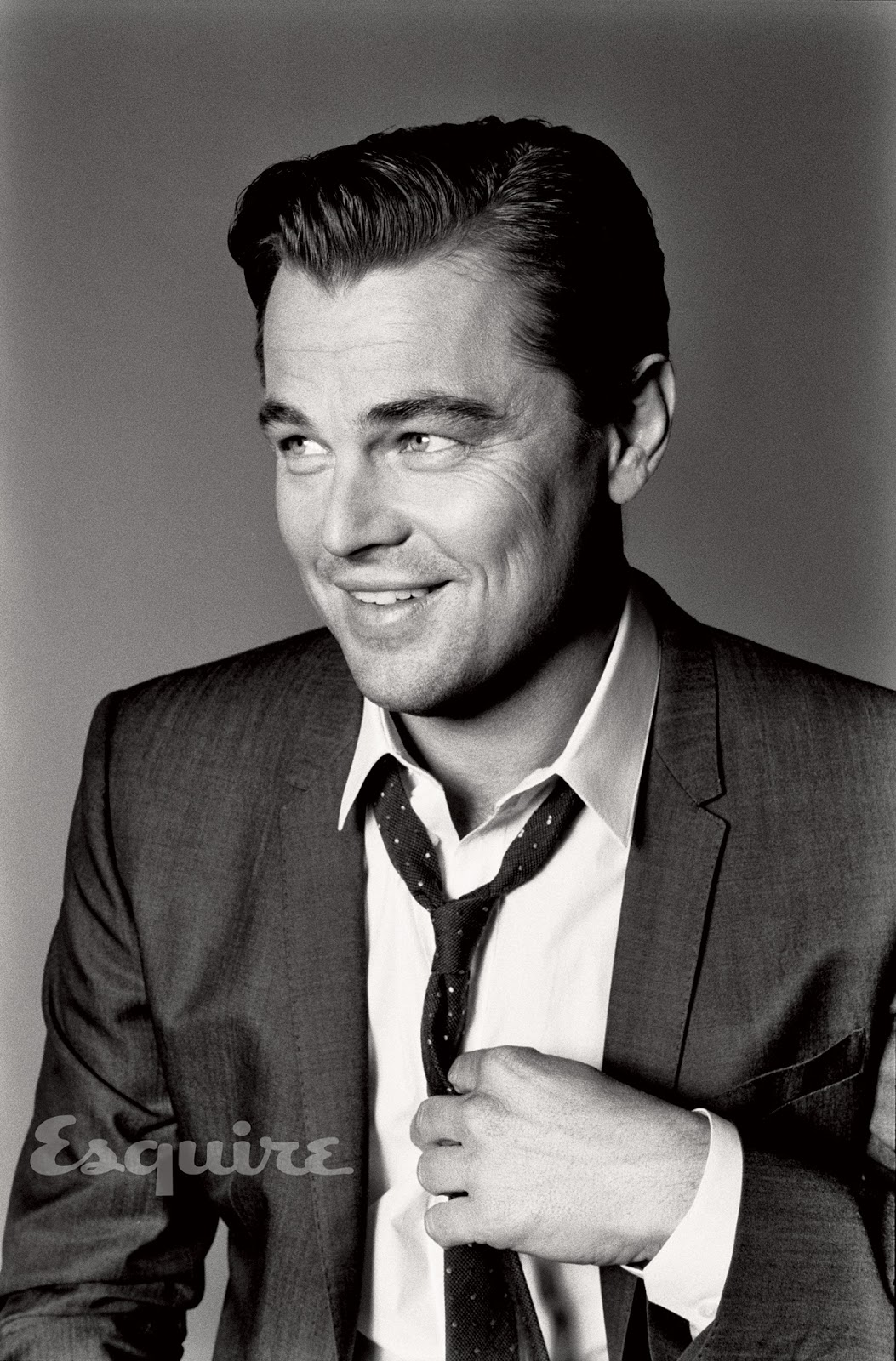
Compare the standing fashion frames with the tighter headshots. Wider shots let tailoring speak—shoulder line, button stance, the way a jacket hangs when the actor is still. Closer frames trade fabric for micro-expression: a slightly harder mouth, a more direct eye line, the kind of look that survives newsprint and phone screens alike. A strong portfolio alternates those distances so the reader never fatigues on a single scale.
Menswear codes of the early 2010s
The clothes in the set reward slow looking even if you never read the shopping credits. Lapels are assertive without costume drama. Collars sit clean. Layers, when they appear, create tonal steps in grayscale rather than color blocking. The grooming is precise: hair controlled, skin polished in the period’s digital-retouch language, brows and jawline doing structural work that color photography sometimes hides behind warmer grades.
This is not street style and not runway eccentricity. It is cover menswear—clothes meant to look expensive at arm’s length and timeless enough that the magazine can claim authority. Studying historical editorials means noticing those codes without mocking them. They are part of how that spring’s fame was supposed to look on a men’s title: composed, tailored, and serious enough to justify a long profile.
Reading the gallery as fashion history
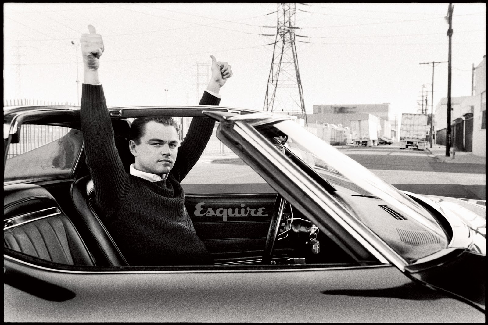
Historical cover galleries are easy to misread as timeless fandom. Better to date them. These images belong to a moment when print still paid for ambitious celebrity portfolios, when black-and-white could signal seriousness on a men’s magazine rack, and when DiCaprio’s public story was tightly braided with a Fitzgerald adaptation’s marketing calendar. The tailoring leans classic rather than experimental; the grooming is precise; the retouching aesthetic matches early-2010s digital polish without the later decade’s softer filters.
Look for craft, not only fame:
- Contrast as hierarchy: Faces and shirt fronts pull focus; backgrounds fall away.
- Tailoring lines: Lapels and shoulders build vertical structure in standing frames.
- Expression economy: Small changes in mouth and brow do more than big gestures.
- Sequence pacing: Tighter headshots alternate with wider fashion stances so the portfolio breathes.
- Monochrome unity: One grade binds cover energy to interior pages.
- Issue dating: May 2013, Esquire US, photographer Max Vadukul—keep the label with the files.
File the set under spring 2013 menswear covers and leave it there on purpose. The fame is obvious; the dating is what makes the gallery useful.

Comments
Continue reading
Brad Pitt for Esquire US, June/July 2013
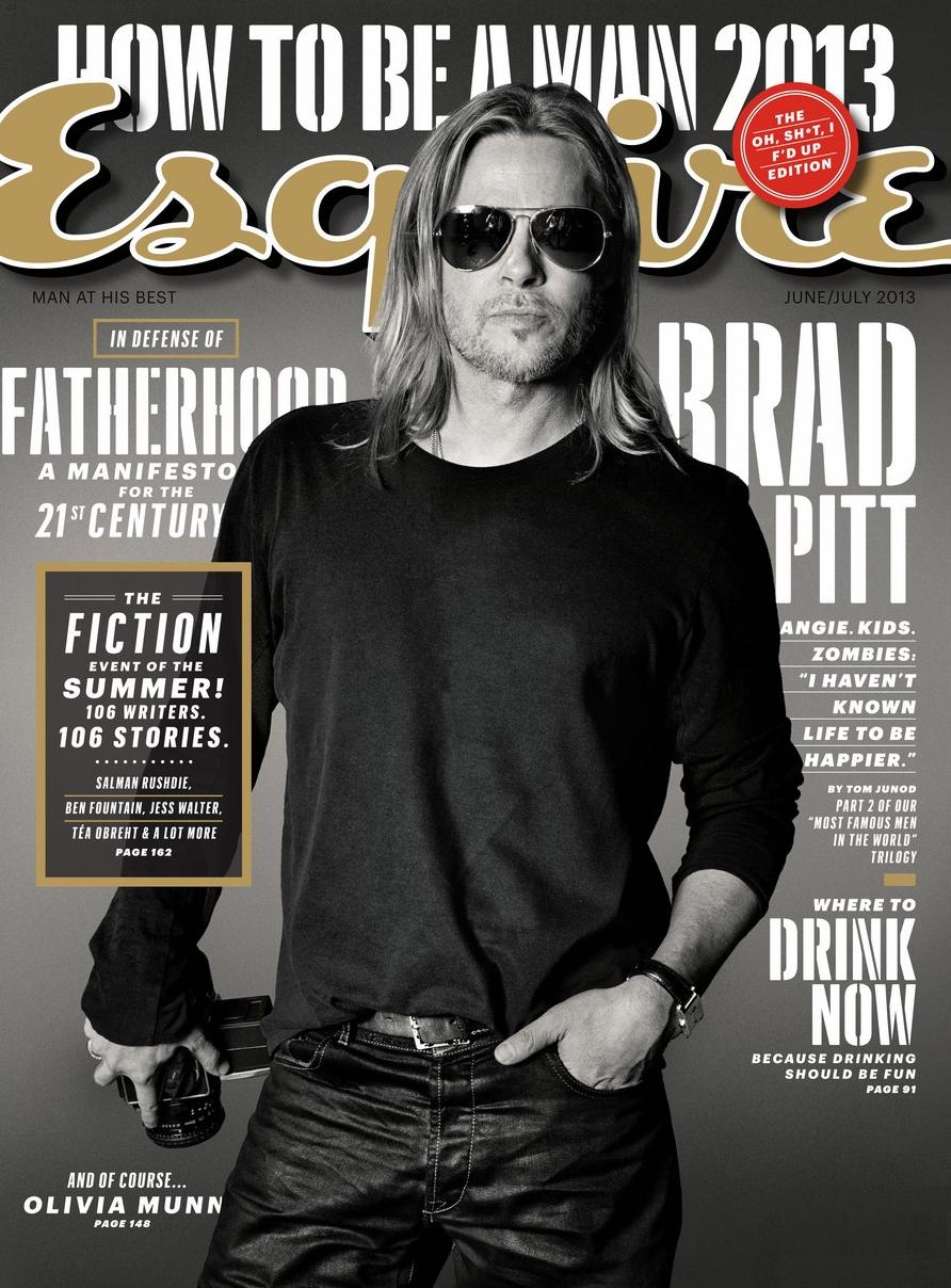
Max Vadukul’s monochrome Esquire cover portraits—camera prop, aviators, Tom Junod’s “A Life So Large” summer 2013 package.
Adriana Lima for Esquire UK, May 2013
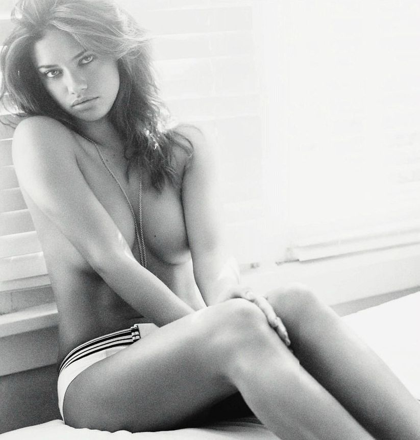
Matt Jones’s black-and-white Esquire UK May 2013 set with Adriana Lima—window light, a Lucky Charms lawn-chair gag, and a garden hose in gingham shorts.

Kristen Stewart for V Magazine, Spring Preview 2013
V81’s Wild at Heart cover story—Kristen Stewart shot by Inez & Vinoodh, styled by Joe McKenna, in pale minimal spring glamour.