
Leonid Afremov’s Palette-Knife Oil Paintings: Color, Texture, and City Light
How Leonid Afremov’s oil-and-palette-knife style built vivid cityscapes, autumn paths, and approachable modern impressionism for a wide audience.
Leonid Afremov’s oil paintings are easy to recognize from across a room: thick knife strokes, saturated color, and city or park scenes that glow as if every streetlamp and autumn leaf were lit from within. He worked mainly with a palette knife and oil paint, building surfaces that feel more carved than brushed. The result sits somewhere between memory and postcard—impressionistic weather, romantic light, and a cheerful refusal of gray restraint.
Born in Vitebsk in 1955 and later associated with Israel, the United States, and Mexico, Afremov became widely known as a modern impressionist who sold and promoted much of his work online rather than through a traditional gallery circuit. That path mattered to how people encountered him in the early 2010s: not only as a painter of rain-soaked avenues and umbrella crowds, but as an artist whose images traveled easily through blogs, social feeds, and print-on-demand culture.
Palette knife as primary language
Most painters keep a knife for mixing. Afremov made it the main tool. Oil laid on thick creates impasto ridges that catch real light when you stand in front of a canvas. Edges of buildings, reflections in wet pavement, and tree canopies break into facets of pure color instead of blended transitions. From a distance the scene coheres; up close it becomes a topography of decisions.
That technique favors subjects with strong value contrast and rhythmic repetition: rows of streetlights, reflections doubling a boulevard, parks thick with fall color, seascapes with broken water, flowers pushed toward jewel tones. Soft atmospheric haze is harder to fake with a knife; Afremov’s strength is energy—movement suggested by directional strokes, weather suggested by shine and puddle geometry rather than delicate glaze.
Color is not shy. Blues sit against oranges; violets lean into yellows; night scenes hold both deep shadow and neon-adjacent brightness. Critics of the style sometimes call it decorative. Admirers answer that decoration, done with conviction, is still a form of generosity: the paintings want to be lived with, not decoded into theory first.
Subjects that return again and again
Cityscapes dominate the popular image of Afremov’s work. Rain, umbrellas, and lamp-lit streets appear so often they become a signature weather system. The appeal is obvious. Wet pavement turns a road into a mirror. Artificial light becomes color. Pedestrians become silhouettes of motion. You can feel the temperature drop without reading a caption.
Autumn parks and tree-lined paths offer a related pleasure: leaf color as architecture. Afremov’s foliage rarely settles for olive realism; it pushes toward ember reds and electric yellows. Landscapes and seascapes follow the same logic of heightened sensation. Portraits and floral still lifes appear too, but the street-in-rain and park-in-fall motifs are what many viewers mean when they say “an Afremov.”
He often worked from photographic references drawn from travel and observation, then translated them into emotion rather than documentary accuracy. The painting is less a report of a particular corner than a mood about walking through color. That distinction helps explain why the images share a family resemblance even when the skyline changes.
Context: training, migration, and reach
Afremov trained in arts and graphics in Vitebsk and came of age with exposure to modernist and impressionist legacies that still haunt that city’s cultural memory. Family accounts of his life track a late-Soviet departure to Israel around 1990, later years in Florida, and a final chapter in Playa del Carmen, Mexico. He died in 2019. Those biographical waypoints matter for historical framing, not for turning every look at the paintings into a timeline quiz.
What shaped reception for internet audiences was accessibility. Afremov promoted a model that bypassed much of the dealer system, selling directly and, over time, working with studio collaborators who produced hand-painted recreations in his method. The aim—stated often in materials associated with his studio—was to put oil on canvas into ordinary homes, not only into rarefied collections. That philosophy sits behind the bright, approachable look: the work wants company.
Because so many images circulated as reproductions and recreations, viewers should separate the pleasure of the style from questions of edition and authorship when buying. Looking at the paintings as a visual language is different from authenticating a specific canvas. For a feature like this, the language is the subject: knife, oil, color, and recurring scenes.
How to look at an Afremov painting
Start farther back than you think you need. Let the scene assemble. Then step in until individual knife marks separate. Ask where the brightest lights sit—lamps, sky breaks, water flashes—and whether those lights pull you through the composition or simply decorate the surface. Strong examples usually have a path for the eye: a street vanishing point, a bridge, a row of trees, a shoreline curve.
Notice reflection logic. In rain scenes, the ground should answer the lights above it, even if the answer is exaggerated. In park scenes, leaf color should relate to sky temperature. When those relationships hold, the intensity feels intentional. When they break, the painting can tip into candy without structure.
Texture is part of the meaning. Photographers who shoot Afremov canvases often struggle because camera sensors flatten ridges that matter in person. If you only know the work from screens, remember that the real objects are built for angled light. A side lamp in a living room can animate a painting that looked flatter on a monitor.
What the style offers painters and viewers
For painters, Afremov’s public technique is a lesson in commitment: choose a tool and exhaust it. Palette-knife landscapes teach decisive value shapes and the courage to leave a stroke alone. They also warn against letting saturation replace design. Color shouts; structure still has to whisper clearly underneath.
For viewers, the work offers an uncomplicated invitation to pleasure. Not every painting needs to argue with the century. Some need to make a hallway feel warmer after a long day. Afremov’s best-known images understand that job without apology.
Stand in front of a rainy street or autumn path in this style and ask one question: if you turned the color down by half, would the composition still walk you into the scene? If yes, you are looking at more than brightness. If no, you have found the limit of the particular canvas—and a useful way to judge the next one.

Comments
Continue reading
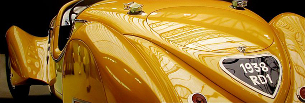
Photo-Realistic Muscle Car Paintings by Cheryl Kelley
Cheryl Kelley’s glossy oil paintings of classic muscle cars—photo-based realism, chrome reflections, and a feminine take on automotive glamour, with gallery images.

Ray Massey’s Hand Paintings: Trompe-l’oeil Athletes, Castles, and Everyday Objects
Ray Massey’s painted-hand photographs turn fingers into footballers, sprinters, castles, pencil cups, and bananas—studio trompe-l’oeil with lasting wit.

Evgeny Lushpin’s Evening Journey: Twilight Cities, Canals, and Cable Cars
A gallery walk through Evgeny Lushpin’s twilight paintings—from St. Petersburg roofs and European canals to Montmartre rain and the San Francisco Evening Journey canvas.