
Apple to Sea Foam Green Ideas for Home and Everyday Style
From bright apple accents to calm seafoam—practical ways to refresh rooms, plants, and wardrobe details along the green spectrum.
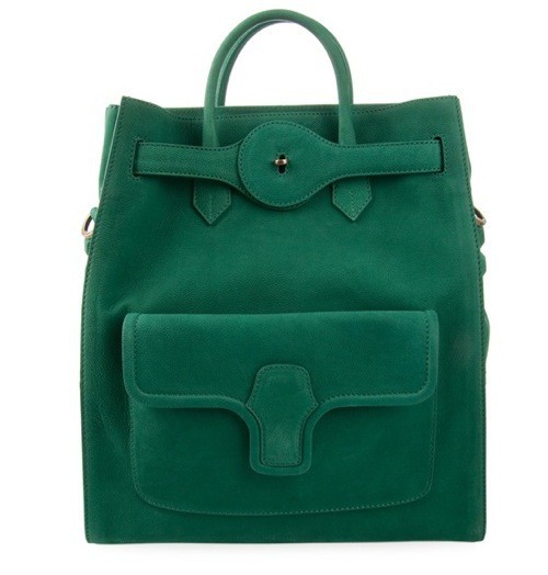
Green refreshes a room and a wardrobe the way open windows refresh stale air: not by shouting, but by changing the temperature of everything around it. Between crisp apple green and soft sea foam sits a long gradient of possibilities—acid leaf, celadon, mint, sage, jade, and pale aqua that leans almost blue. Used as details rather than as a total takeover, those hues can lift a tired corner, calm a busy outfit, or give everyday objects a second life.
This is not a demand to paint every wall chartreuse. It is a practical map of green ideas from apple-bright accents to seafoam quiet, so you can choose intensity the way you choose volume on a radio.
Reading the green spectrum
Apple green sits toward yellow. It is lively, slightly sharp, and excellent at waking neutrals—cream, gray, black, raw wood. In small doses it reads optimistic; in large fields it can fatigue the eye, which is why apple often works best as a chair seat, a vase cluster, a kitchen stool, or a single garment rather than as wall-to-wall color.
Sea foam sits toward blue and white. It softens edges, cools warm rooms, and pairs easily with linen, marble, pale oak, and silver metals. Where apple energizes, seafoam soothes. Midway greens—sage, moss, celadon—bridge the two: grounded enough for longevity, gentle enough for daily living. Knowing where a swatch sits on that line saves you from buying “green” that fights the light in your actual space.
Test color in the room’s real daylight and evening lamps. North light cools greens toward blue; warm bulbs pull them yellower. A chip that looked perfect in a store aisle can shift character at home. Tape samples on more than one wall and live with them for a day before committing paint or fabric.
Green details that change a room without a renovation
Start with objects you can move. Pillows in apple or mint against a beige sofa reset the whole seating group. A seafoam throw on the arm of a brown chair cools the palette instantly. Ceramic lamps, glass bottles, and stacked books with green spines create vertical color without drilling holes. Even a bowl of green apples on a table is both literal and decorative—cheap, edible, replaceable.
Textiles matter more than people expect. A patterned curtain with a green motif filters light into a softer cast. A rug with sage borders frames a seating area and hides everyday dust better than pure cream. Kitchen towels and tea canisters in coordinated greens make a utilitarian corner feel designed. Bathroom details—soap, mats, a single plant—introduce spa calm when seafoam and soft white share the sink zone.
If you are ready for paint, try a door, an interior window frame, or the back of a bookshelf rather than an entire room first. A green door becomes a daily hello. A painted bookshelf niche turns ordinary paperbacks into a vignette. These smaller fields teach you which green you actually enjoy living with before you invest in gallons and weekends.
Plants as living green ideas
Houseplants are the original green detail, and they earn their keep by changing shape as they grow. Trailing vines soften shelves. Upright leaves add architecture beside a sofa. Grouping three pots of related greens—different leaf shapes, similar soil and light needs—looks intentional without matching ceramics. Seafoam pots and pale planters keep the focus on foliage; apple-bright cachepots make the container the accent when leaves are dark.
Match plants to honesty about care. Low light favors pothos and snake plant; bright windows support herbs and sun-loving specimens. Overbuying greenery that dies in a month is not refreshing—it is visual guilt. A few thriving plants beat a neglected jungle. Rotate pots occasionally so growth stays even, and wipe leaves so green stays vivid rather than dusty gray-green.
Dressing the spectrum: wardrobe accents
The same apple-to-seafoam logic applies to clothes. An apple-green scarf or bag wakes a navy coat. A seafoam blouse under a gray blazer feels polished without stiffness. Sage trousers with a white shirt make a quiet uniform for warm weather. Jewelry in enamel or stones that pick up green ties the look together without requiring a full monochrome outfit.
Skin undertones influence which greens flatter near the face. Cooler complexions often love seafoam, mint, and blue-leaning jade. Warmer complexions often glow beside olive, moss, and yellow-leaning apple. Hold fabric near your jaw in daylight. If the green makes you look rested, keep it close to the face; if it fights you, keep that shade lower on the body as shoes, a bag, or a hem flash.
Layering greens with neutrals is safer than stacking unrelated brights. Cream, camel, black, denim, and soft metallics all cooperate. If you want pattern, choose small-scale florals or stripes that already include a green you own, so new pieces connect to what hangs in the closet.
Table, desk, and everyday rituals
Green details shine in repeated rituals. A seafoam mug for morning coffee becomes a small design decision you notice every day. Apple-green desk accessories—a tray, a stapler, a notebook—can organize a work surface without turning it into a toy store. Place settings with green-rimmed plates or linen napkins make weeknight dinners feel considered. Candles in green glass throw colored light at night that white jars cannot.
Stationery and paper goods matter for people who still write lists by hand. Mint folders, sage sticky notes, and pale green desk blotters calm visual noise on a white desk. Digital life can borrow the idea too: a soft green phone case or laptop sleeve is a portable accent that travels with you. Refreshing life often starts with objects you touch daily, not only with furniture you rearrange once a year.
Pairing greens with materials and seasons
Wood warms green; marble and chrome cool it. Apple green beside walnut can feel mid-century and playful. Seafoam beside white oak and linen feels coastal without needing nautical clichés. Brass loves olive and sage; chrome loves mint and aqua. Notice the metals already in your room and choose greens that converse with them.
Seasonally, brighter apple and lime accents suit spring and early summer. Deeper moss and forest tones carry autumn. Seafoam and celadon remain year-round in bathrooms, bedrooms, and rooms that want calm. Swap pillow covers and flowers before you swap sofas. Seasonal refresh is cheaper when green lives in the movable layer.
Avoiding the common green mistakes
Too many competing greens without a dominant family can look accidental. Pick a lane—yellow-leaning, blue-leaning, or earthy middle—and let other greens appear as cousins, not rivals. Another trap is matching every accessory to the same chip; slight variation looks collected, perfect matching looks catalog-stiff. Finally, ignore trends that push neon green into spaces that want rest. High-energy green belongs where you want energy.
Maintenance is part of the aesthetic. Washable pillow covers, wipeable lamp bases, and realistic plant care keep green looking intentional. Faded, dusty, or dying green reads as neglect faster than faded beige. Choose finishes you will actually clean.
A small plan you can finish this month
Choose three moves. First, one textile in a green you love—pillow, throw, or towel. Second, one living or edible green—plant or bowl of fruit. Third, one personal accent—mug, notebook, scarf, or bag. Live with those three for two weeks. If the room or your mood improves, add a larger step: a painted door, a rug, a chair. If the green starts to irritate you, swap the shade along the apple-to-seafoam line until it settles.
Refreshing a life with green details is less about perfection and more about recurrence. The eye returns to color the way the body returns to fresh air. Apple wakes; seafoam steadies; the greens between them give you room to edit. Start small, look in real light, and let the next green object earn its place by how often you are glad it is there.

Comments
Continue reading

Funny Animal Signs That Warn People (While Animals Ignore Them)
From a seagull on a no-birds disc to classic zoo and park ironies—why animal warning signs get funny, and what the rules are still for.

How to Find Local Amenities on Vacation: Mechanics, Haircuts & More
Locate trustworthy local services and everyday spots while traveling or settling in—using publications, reviews, map apps, neighbor tips, and low-pressure exploration.

Kristen Stewart for V Magazine, Spring Preview 2013
V81’s Wild at Heart cover story—Kristen Stewart shot by Inez & Vinoodh, styled by Joe McKenna, in pale minimal spring glamour.