
3D Popeye: Lee Romao’s Photoreal Sailor (2012)
Vancouver artist Lee Romao’s realistic 3D Popeye—forearms, pipe, tattoos, and all—and why the 2012 render became a character-design reference online.
In October 2012, a photoreal 3D take on Popeye the Sailor spread across design blogs, illustration feeds, and geek-culture sites. The piece is widely credited to Vancouver digital artist Lee Romao (the surname also appears as “Ramao” in some roundups). It is not a studio trailer and not a remake pitch. It is a character study: E.C. Segar’s spinach-powered sailor rebuilt as if he had walked out of a pulp gym and onto a modern lighting stage—pipe, cap, impossible forearms, and all.
For an art-and-illustration audience, the image still works as a case study in how far “realistic cartoon” treatments can go before they stop being the character.
What you are looking at
Romao’s Popeye keeps the iconography that makes the sailor readable in silhouette—squint, corncob pipe, sailor hat, hypertrophic forearms—while replacing rubber-hose simplicity with pores, stubble, veins, and fabric tension. Coverage from the time repeatedly noted the shredded physique and the tattoo work: an Olive Oyl portrait, “Hold Fast” style lettering on the hands, spinach leaves, and chest lettering playing on the famous “I yam what I yam” line. Those details turn nostalgia into biography. The tattoos suggest a life lived between docks and brawls, not only between animation cels.
The pleasure is uncanny. Popeye was never meant to pass a medical exam. His proportions are jokes that became trademarks. Push them toward anatomical plausibility and you get something between admiration and slight horror—the same reaction other “realistic cartoon” projects courted in that era. Romao’s version succeeds because it does not sand away the exaggeration; it justifies it with muscle, scar logic, and attitude.
Lighting in the circulated renders favors clarity over mystery: skin microdetail readable, metal and cloth separated, the face still recognizably Popeye rather than a generic tough. That readability is why the piece traveled. You can thumbnail it and still know who it is.
Why 2012 was primed for this kind of image
The early 2010s were thick with digital character studies that asked “what if Saturday-morning icons were photographed?” Social platforms and CG portfolio sites rewarded single-hero images that could be appreciated without a four-minute runtime. Popeye was ripe: public familiarity high, design simple enough to recognize after a realism makeover, personality strong enough to survive grit.
Blogs such as Laughing Squid, Joe’s Daily, Inspiration Grid, TrendHunter, and Boing Boing amplified Romao’s sailor within days of each other around mid-to-late October 2012—the same window as this site’s post date. That cluster matters historically. Before algorithmically infinite feeds, a handful of curators could still create a shared “did you see this?” moment for illustrators and 3D generalists.
Romao’s broader profile at the time included feature animation work connections—contemporary notes linked him to projects such as Escape from Planet Earth—which helped frame the Popeye as professional craft, not a one-off meme sculpt. Prints were offered through the artist’s site in some writeups, another sign the piece was treated as finished illustration rather than unfinished R&D.
Craft notes for people who build characters
Photoreal cartoon homage lives or dies on hierarchy. If every pore competes with the pipe and the forearm gag, the icon collapses into texture demo. Romao’s popular stills keep the eye on signature shapes first. The tattoos function as secondary storytelling once you have already accepted the silhouette.
Material separation matters. Skin, wool/cotton hat, metal pipe, inked skin—all need different specular responses or the figure turns into plastic. Even without a published wireframe breakdown, the finished frames advertise careful shading discipline.
Proportion strategy is the real lesson. Realistic Popeye cannot simply be “bodybuilder + sailor hat.” The forearms must remain slightly unbelievable or he becomes any dockworker. The chin, squint, and pipe angle carry more identity than accurate clavicles. Artists copying the trend sometimes overcorrect into handsome neutrality and lose the character; this piece avoids that trap.
For students, useful exercises inspired by the image (without infringing the artist’s rights) include: silhouette tests at stamp size, tattoo placement that supports rather than clutters, and lighting setups that reveal form without bleaching stylization. Study, then invent your own public-domain or original sailor—do not rip the mesh.
Popeye as cultural clay
Segar’s creation has been redrawn for comics, Fleischer theatrical shorts, television, advertising, and the occasional live-action oddity. Each era projects its own idea of toughness onto the sailor. A 2012 realism pass fits a decade fascinated by “gritty reboots” even in illustration form. Spinach becomes nutrition mythology; the pipe becomes a prop with weight; Olive becomes ink under skin rather than only a stick-figure beloved.
That does not mean every classic cartoon should be photorealized. Some designs die when literalized. Popeye survives because exaggeration was always part of his masculinity joke—strength as cartoon physics. Romao translates the joke into gym-world language without fully apologizing for it.
Later years brought other 3D Popeye conversations, including studio animation tests for feature attempts. Those are separate stories with separate dates and crews. This URL points at the illustration moment: a single artist’s realistic sailor catching the internet’s eye in autumn 2012.
How to look at it now
Seek credits that name Lee Romao / Lee Ramao spelling variants and Vancouver so you are not mixing unrelated Popeye CG. Look at the tattoos and forearm silhouette before zooming into skin pores; identity first, flex second. Compare the piece to purely cute chibi Popeyes and to Fleischer rubber-hose frames to see how wide the character’s design bandwidth really is.
If you collect character design references, file it under “icon under photoreal pressure”—useful beside other realism experiments on public-domain or licensed mascots from the same years. Notice what was kept sacred (pipe, hat, arms) and what was newly invented (ink, stubble density, fabric wear).
The short original post on this site was little more than a caption pointing at the artwork. The image deserved more context: who made it, why it spread, and what it teaches about keeping a cartoon soul inside a realistic body. Romao’s Popeye still answers that brief with a sailor who looks like he could punch a battleship—and still look like Popeye while doing it.

Comments
Continue reading
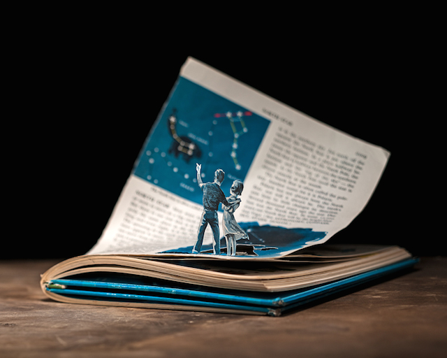
Thomas Allen’s Book-Cut Illustrations
Michigan illustrator Thomas Allen cuts pulp paperback figures into 3D tableaux, photographs them in shallow focus, and gathers the practice in his Aperture book Uncovered.
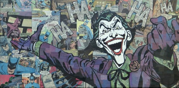
Comic Collage Art by Mike Alcantara: Heroes Built from Comics Only
Austin artist Mike Alcantara cuts comic books into portraits of Superman, Conan, and other pop icons—no paint, no marker, only printed paper.
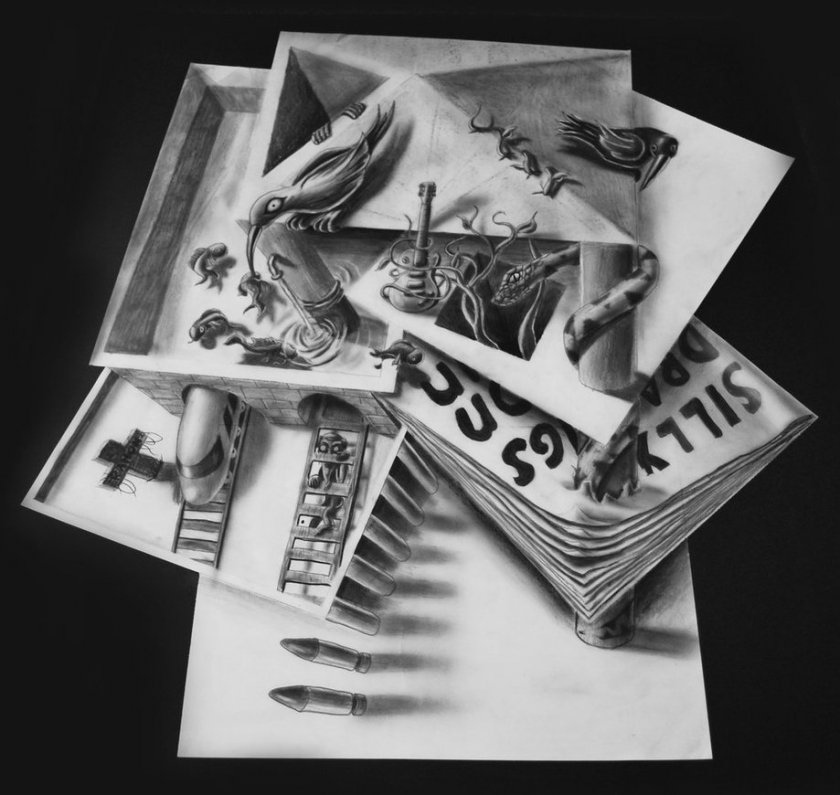
Ramon Bruin’s Studio 3D Optical Illusion Drawings
Dutch artist Ramon Bruin builds tabletop anamorphic drawings on stacked paper—airbrush and graphite illusions locked to a single camera angle.