
15 Ways Cute and Ironic Illustration Works: Chow Hon Lam’s Humor Craft
Cute-meets-ironic illustration craft—fifteen principles inspired by Chow Hon Lam’s funny, soft-edged visual humor.
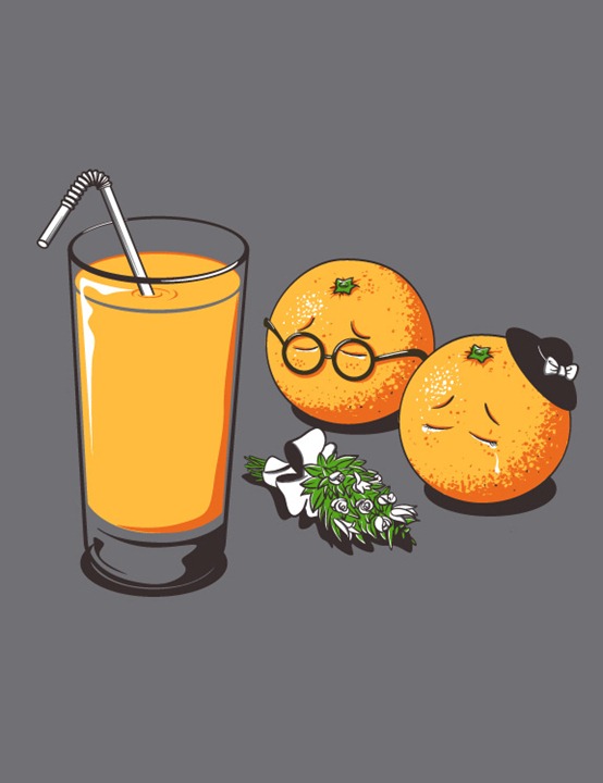
Cute and ironic illustrations thrive on a double take. Soft colors, rounded characters, and friendly linework set up sweetness; the punch arrives when the situation undercuts that sweetness—an everyday frustration, a social habit, or a quiet absurdity dressed in pastel charm. The work associated with illustrator Chow Hon Lam has long been a clear example of that mix: funny pictures that feel gentle at first glance and sharper once you finish reading the scene.
Galleries of this style often promise fifteen or more pieces because the humor is modular: each image is a self-contained joke. Even when only a single frame remains to study closely, the craft lessons scale. Below are fifteen ways cute-and-ironic illustration works—useful if you draw, commission, or simply collect visual humor that is more than decorative sweetness.
1. Soften the messenger
Rounded shapes, big eyes, and toy-like proportions lower the viewer’s defenses. Irony lands harder when the carrier looks harmless. If the same joke were drawn with gritty realism, it might feel bitter instead of witty. Cute form is not a gimmick here; it is the delivery system.
2. Keep the palette friendly
Pastels, clean flats, and limited color sets signal “illustration for delight.” The contrast between pretty color and awkward truth is part of the gag. Muddy, aggressive palettes often push the work toward satire that feels angrier than intended. A calm background can make a small ironic prop shout without shouting visually.
3. Stage a recognizable habit
The strongest ironic cute pieces start from something viewers already do: scrolling in bed, overpacking emotion into a small object, pretending everything is fine in public. Recognition is the setup; the twist is the punchline. If nobody has lived the habit, the irony floats.
4. One twist per image
Like a good single-panel comic, these illustrations rarely stack three jokes. One clear contradiction is enough. Extra props dilute the irony into clutter. Edit until a stranger can point to the twist in under three seconds.
5. Let the title or caption do half the work
Sometimes the drawing is sweet and the words are dry. Sometimes the drawing is the twist and the caption is deadpan. Either pairing can work; both doing the joke at once usually overexplains. Treat text as a partner, not a subtitle track that narrates every beat.
6. Exaggerate politely
Scale tricks—tiny people, oversized feelings, impossible objects—belong in this genre. The exaggeration should feel playful, not grotesque, unless the brief specifically wants dark humor. Polite exaggeration keeps the piece shareable across mixed audiences.
7. Draw expressions that sell the lie
Characters who smile while the situation is clearly wrong create delicious tension. Blank faces can also work when the environment carries the irony. What fails is an expression that already screams the punchline before the viewer arrives. Let the face underplay so the scene can overplay.
8. Use everyday props as symbols
Phones, coffee cups, umbrellas, shopping bags, and office chairs become stand-ins for modern life. Iconic props help the joke travel across languages. Obscure props need more visual explanation and can lock the humor inside one subculture. Prefer symbols most adults meet weekly.
9. Balance cute and critique
Irony without a point is random. Cute without a point is decoration. The sweet spot is a gentle critique: of hurry, vanity, loneliness in crowds, or consumer habits—delivered without a lecture. Viewers should feel seen, not scolded from a podium.
10. Design for a pause
These images are made to be stopped on. Clear silhouettes, readable hierarchy, and a center of attention help a feed-scroll halt. If the joke requires reading five tiny details, simplify. A pause of two seconds is more valuable than a puzzle that rewards only close zoomers.
11. Repeat a visual language across a series
Chow Hon Lam–style sets feel coherent because line weight, character design, and humor tone stay related from piece to piece. Series identity lets each new illustration feel like another chapter, not a random sticker. Consistency also trains the audience to expect the ironic beat.
12. Avoid punching down
Cute packaging does not excuse mean targets. Jokes aimed at vulnerable groups age badly and cheapen the craft. Aim irony at shared foibles and systems people recognize in themselves. Kindness in targeting is part of why this style lives in art feeds rather than only in rage comics.
13. Leave a little ambiguity
The best ironic illustrations invite a second interpretation. Viewers enjoy feeling clever when they “get it.” Spelling out every meaning turns wit into a captioned meme with extra drawing steps. Ambiguity should be intentional, not confused drafting.
14. Craft the silent beat
Negative space, a paused gesture, or an empty chair can be funnier than busy action. Silence in a cute scene feels intentional—like the character knows something the viewer is about to realize. Give the eye somewhere quiet to rest after the twist registers.
15. End on affection, not contempt
Ironic cute work that lasts usually likes people even while teasing them. The aftertaste should be a smile of recognition, not a scold. That affection is why the style sits comfortably in art and illustration collections and why people return for “another bunch of funny illustrations” when they need a light reset.
How to look at a cute-ironic gallery
When you study a set of funny illustrations, name the setup and the twist for each piece. Notice whether color, prop, expression, or caption carries the irony. Ask what would happen if the same idea were drawn in a harsher style—would it still feel like the same joke? That question reveals how much of the humor depends on cuteness as a vehicle.
If you are building your own series, write ten one-sentence modern habits first, then sketch the sweetest possible character stuck inside each habit. Edit until only the clearest contradictions remain. Fifteen strong panels beat thirty almost-funny ones. Keep a swipe file of soft-but-sharp work so your line and color stay consistent while your ideas stay fresh.
Collectors and art directors can use the same lens: reward work that is both adorable and precise. Softness without thought is decorative; irony without craft is a caption. Together, they make illustrations people save, share, and remember—the reason “cute and ironic” remains a lasting search for funny visual art.
Chow Hon Lam’s approach sits in that tradition: approachable characters, clean execution, and humor that rewards a second look. Keep the surviving example above as a craft reference, then seek fuller series from the same vein when you want a longer gallery. The lesson travels even when an original fifteen-frame spread has thinned over time: make it cute, then make it true enough to sting lightly—and stop before the joke explains itself out loud.

Comments
Continue reading

Still-Life Photography by Margareth Perfoncio
São Paulo photographer Margareth Perfoncio’s still lifes of food and flowers—Old Master light, dark wood, and tables that feel inevitable.

Meaningful Love Quotes for Inspiration (and Ink)
Meaningful love quotes that still feel true — short lines for tattoos, gifts, and everyday reminders, with placement and wording tips.
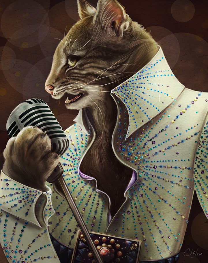
Christina Hess’s Animals From History: Costumed Pets as Playful Portraits
Illustrator Christina Hess reimagines historical icons as ornate animal portraits—Elvis Petme and friends—mixing puns, costume detail, and soft history lessons.