
Walt Disney’s Sin City: Fairy-Tale Faces in Noir Light
Disney icons meet Frank Miller’s Sin City grammar — high-contrast mashup art where princess silhouettes wear Basin City shadow.
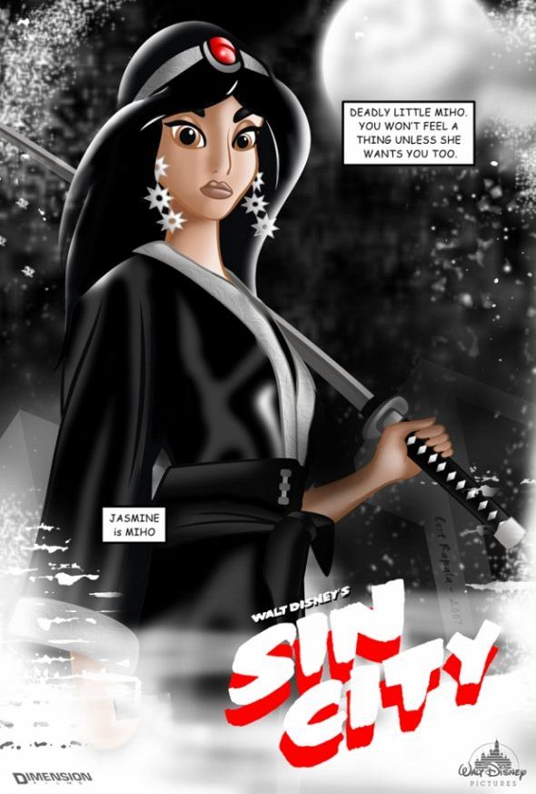
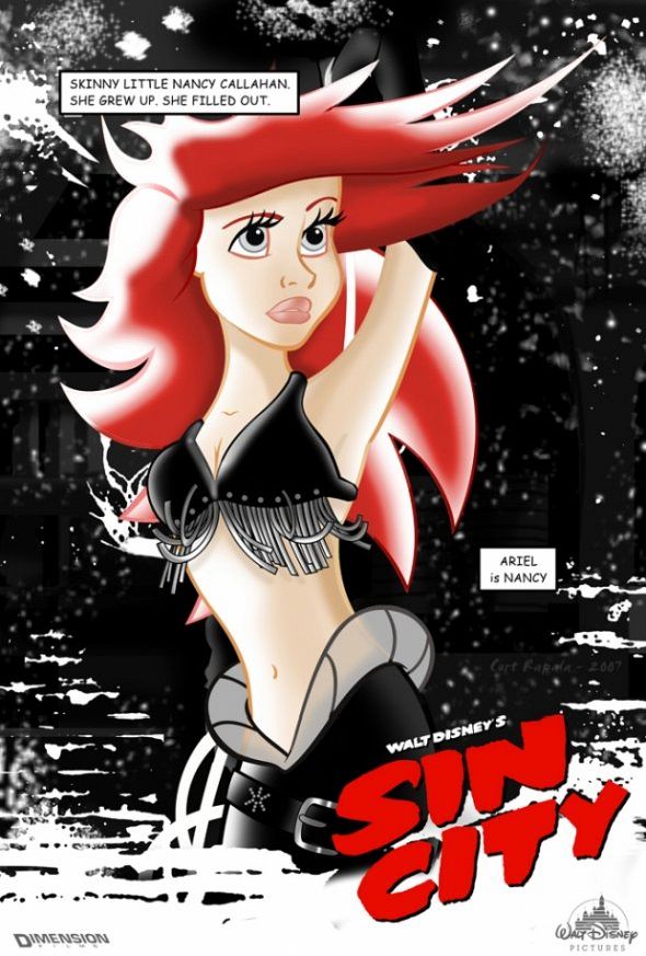
Put a Disney princess into Basin City and the clash does half the work for you. Soft fairy-tale silhouettes meet the hard edges of Frank Miller’s Sin City: crushed blacks, bleach whites, a flash of selective color, smoke, chrome, and faces lit by a streetlamp instead of a castle window. The mashups that traveled as “Walt Disney’s Sin City” — fan promotional posters and Flavorwire-era shares among them — thrive on that exact collision.
This is not a studio crossover and not a claim that Miller inked Mickey. It is a visual thought experiment that stuck because both brands are instantly readable. One sells wonder and clear moral outlines. The other sells noir, danger, and beauty that can cut you. When those codes share a single frame, the image becomes memorable before you finish reading the title treatment.
Why the mashup works
Disney iconography is engineered for recognition at a glance: a silhouette, a color cue, a familiar gesture. Sin City is engineered for mood at a glance: hard cutouts, sparse reds or yellows, and compositions that feel like stills from a crime film. Combine them and you get a double-take. The viewer knows the character, then feels the wrong city around her, then enjoys the wrongness.
That pleasure is partly comic and partly unsettling. Fairy-tale heroines are usually protected by narrative soft lighting. Noir lighting does the opposite: it sculpts cheekbones, hides eyes in shadow, and turns a gown into something that could survive a back alley. The joke lands because the characters remain themselves enough to stay lovable while the world around them turns ruthless.
Graphic novels and film posters also share a language of hierarchy. Big name, big face, tight crop, tagline as threat. Disney posters traditionally promise magic; Sin City posters promise consequence. Recasting princesses into the latter template is a design lesson as much as a meme: change the lighting grammar and you change the story the audience expects.
There is also a casting trick buried in the best pieces. Artists often map Disney heroines onto Sin City archetypes — the dancer under the lights, the fighter with a blade, the woman who knows more than the room admits — without needing speech balloons. Pose and crop do the translation. You feel the role shift even when the hairstyle stays sacred.
What you are seeing in the frames
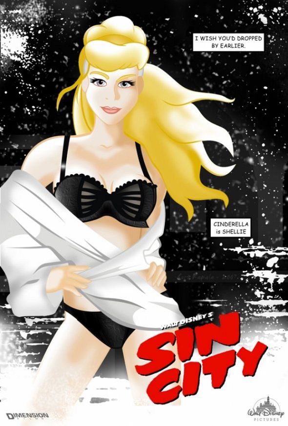
Look for the noir toolkit first. Heavy ink, hard edges, and backgrounds that refuse to be cozy. Windows become rectangles of glare. Hair becomes a graphic shape rather than soft animation fluff. Accessories — a cigarette, a gun barrel edge, a neon smear — act as genre switches. One prop can drag an entire princess wardrobe into Basin City without rewriting her face.
Selective color is the second tell. Miller’s comics famously punctuate monochrome with a single saturated note: a dress, blood, a car. Mashup artists borrow that restraint. A blue gown or a red accent becomes louder because everything else has gone grayscale. The Disney palette survives as a signal flare instead of a full rainbow.
Typography and poster layout matter too. Many pieces echo theatrical one-sheets: stacked names, dramatic cropping, city skyline as teeth. That format makes the gag feel official — as if a double bill were real — which is why the series photographed so well as a set rather than as isolated jokes. A single image can feel like a one-liner; a wall of matching posters feels like a fake franchise campaign.
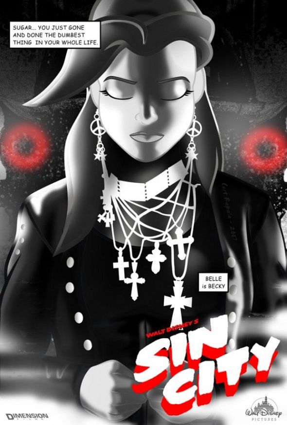
Texture finishes the sell. Film grain, ink spatters, and high-contrast hatching push the work away from clean vector fan art and toward comic-book print. The more the surface looks like it could have come off a pulp rack, the more the Disney face feels kidnapped into the right wrong world.
Disney innocence, Basin City rules
Part of the charge is ethical tension. Disney storytelling often rewards kindness, patience, and found family. Sin City rewards survival, loyalty under fire, and beauty that may be bait. Placing a princess inside that rule set asks a silent question: what happens to “happily ever after” when the city itself is the antagonist?
Fans answer differently. Some read the images as affectionate parody — proof that pop icons can wear any costume. Others read them as critique: a reminder that the fairy-tale look was always a stylized fiction, and noir is another stylized fiction with darker lighting. Either way, the art stays interesting because it refuses a single joke beat. You can smile at the contrast and still feel the mood.
It also sits in a longer tradition of culture-collision art: classical paintings with modern brands, kids’ characters in war-photography lighting, soft logos in hard brutalist frames. The Disney–Sin City set is simply an especially clean pair of opposites. Both are American pop mythology. Both are visually strict. Both already know how to sell a face on a poster. That shared professionalism is why the mashup rarely looks accidental.
How to look at a set like this
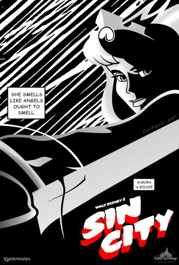
Start with silhouette recognition. Can you name the character before you read any caption? Good mashups keep that answer immediate. Then check the lighting: does the face look animated-soft or inked-hard? Then check the environment: castle balcony or rain-slick street? The stronger each answer is on its own, the sharper the collision when they disagree.
Compare pieces as a sequence. Campaign logic — recurring style, recurring city, rotating cast — is why these works traveled on blogs and design sites. They behave like a franchise that never existed, which is catnip for anyone who loves poster art. Notice which princesses take to noir most easily: characters already associated with night, water, or danger often need fewer props to “belong.”
Finally, notice what stays sacred. Eyes, signature hairstyles, and iconic wardrobe pieces often remain. Violence and grit arrive through atmosphere rather than through rewriting the character into someone unrecognizable. That restraint is what separates a clever mashup from a random costume swap. The best frames still let a child point and say a name — then let an adult feel the wrong weather around her.
Why the idea still sticks
Internet eras change; black-and-white noir does not. As long as Disney faces remain universal and Miller’s Basin City remains a shorthand for stylish toughness, remix artists will keep testing the seam between them. The best pieces do not need a long caption. They need one clean visual argument: innocence can wear shadow, and shadow can still recognize a crown.
If you collect illustration, treat the set as a study in contrast rather than as “Disney gone edgy” for its own sake. Ask what happens when you keep the character and change only the world’s physics — light, grain, moral weather. That craft move sits underneath every viral share of these posters. Would the same princess survive a different city’s rules, and would you still recognize her if she did?

Comments
Continue reading

Dramatic Photo Art by Sukron Ma’mun (Ipoenk Graphic)
Cirebon, Indonesia photographer Sukron Ma’mun uses theatrical natural light to frame village life, play, and place in lyrical photo art.
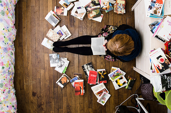
Bird’s-Eye Views: Florian Beaudenon’s Instant Life
Paris photographer Florian Beaudenon’s Instant Life series captures people in their rooms from above—intimate, collaborative overhead portraits of everyday joy.

Abandoned Cars Reclaimed by Nature: Rust, Growth, and Quiet Ruin
When neglected vehicles are left outdoors long enough, rust, moss, and trees rewrite them into strange still lifes—sad, photogenic, and slowly returning to the ground.