
Maja Wrońska’s Watercolor Cityscapes
Polish architect-illustrator Maja Wrońska paints European and beyond city views with architectural precision and watercolor weather—structure first, atmosphere earned.
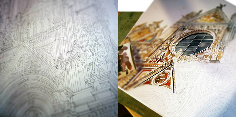
Maja Wrońska paints cities the way an architect reads them: structure first, atmosphere second, romance earned through accuracy. Based in Poland and trained in architecture at the Warsaw University of Technology, she builds watercolor cityscapes that feel both precise and alive—pencil bones under washes of color, façades that hold their proportions, streets that still breathe weather. When this work first circulated widely online, she was a young architecture student; the drawings already showed a professional eye for massing, rhythm, and the small decorative facts that make a skyline specific rather than generic.
Her practice sits at a useful intersection. Architects often draw to explain. Illustrators often draw to enchant. Wrońska does both. A tower is not a vague vertical stroke; it is a stack of floors, windows, and setbacks. A river is not only blue; it is reflection, barges, and the cool of a particular afternoon. That combination is why her European—and later wider—city views travel so well as prints and portfolio pieces: they satisfy people who love places and people who love buildings.
From Warsaw training to a watercolor studio
Architecture school teaches you to measure, to section, to care about how a cornice meets the sky. Watercolor teaches you to surrender some of that control. Wrońska’s method, as she has described it, typically begins with a quick pencil sketch; details arrive later with brush and pigment. The pencil keeps the street honest. The wash introduces accident—blooms, soft edges, uneven skies—that photography rarely grants and that pure drafting can flatten. The finished sheet looks intentional without looking stiff.
After graduating from architecture studies in Warsaw, she developed a freelance practice that mixes architectural thinking with illustration commissions. Over time her city watercolors moved from student portfolio energy into a recognizable body of work: famous centers and quieter urban corners, European capitals and American streets, historic monuments beside contemporary glass. Collaborations and exhibitions followed—including appearances connected with major architecture and art platforms—but the core pleasure remains local to the page: one city, one mood, one carefully staged viewpoint.
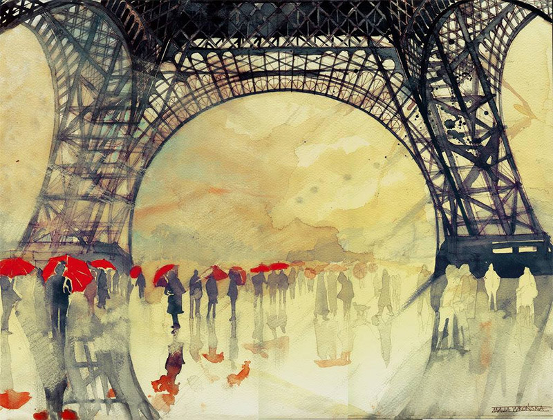
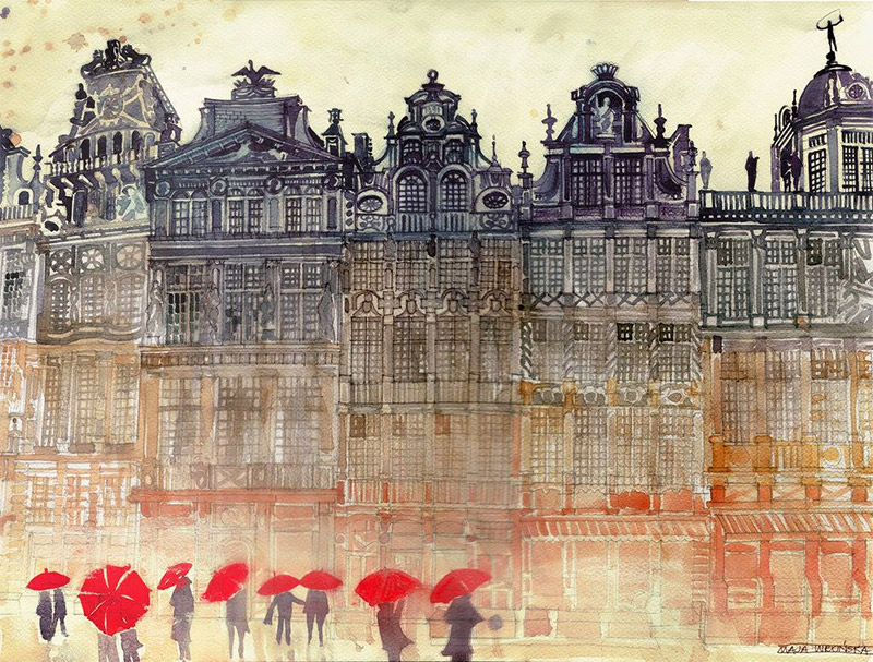
What makes these cityscapes feel unique
Plenty of artists paint landmarks. Fewer make the landmarks feel occupied by air. Wrońska’s stronger sheets often depend on three choices:
- Viewpoint with narrative. Not every painting is a postcard dead-center shot. Angles imply approach—looking along a façade, across water, up through a canyon of streets.
- Architectural literacy. Window grids, roof pitches, and structural rhythms stay believable even when color goes expressive.
- Weather as character. Watercolor’s unpredictability becomes climate: damp stone, bright tourism light, winter clarity, evening warmth.
That last point matters. A city changes personality with humidity and hour. By letting washes granulate and edges soften, she avoids the plastic clarity of purely digital illustration while keeping enough line to reassure anyone who knows the place. Locals can argue about a missing chimney; travelers can still recognize the skyline at a glance. Both reactions are forms of success.
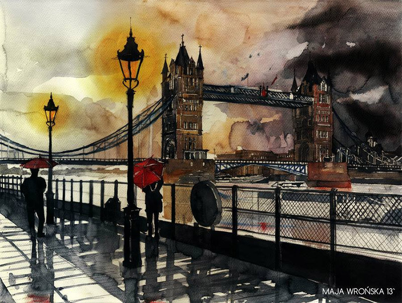
European icons and the pleasure of recognition
Her early widely shared series leaned into iconic European cities—places already heavy with photographic clichés. Watercolor becomes a way to reclaim them. Softened edges take the edge off souvenir familiarity. Color choices can push a famous square toward dusk or toward a cooler, almost analytical morning. Because the drawing underneath is disciplined, the romance never drifts into pure fantasy map-art. You are still in a real street; you are simply seeing it through pigment rather than a phone lens.
For viewers who studied architecture, or who simply walk cities attentively, the reward is spotting how a secondary building is handled—the quiet neighbor next to the monument. Tourist imagery often crops those neighbors away. Wrońska frequently keeps them, which is how urban fabric feels true.
How to look at the work on a screen
Online, watercolor can flatten. Zoom if you can. Look for the pencil that still shows through pale washes. Notice where she protects white paper for highlights instead of painting white later. Track repeated verticals—windows, columns, lamp posts—that set a beat across the sheet. Ask what time of day the palette implies. Ask whether the composition invites you to enter the street or to stand back like a visitor on a bridge.
If you paint yourself, her pages are a lesson in sequencing: structure before splash. If you only collect images, they are a lesson in why some city art feels disposable and some feels like a keepable souvenir. The keepable ones usually respect the city’s bones.
Beyond the student portfolio
Wrońska’s public presence has long included Behance under the handle associated with her architectural and illustration work, alongside a personal site that frames her as architect, watercolorist, and freelance illustrator. The cityscapes remain the signature for many audiences, even as commissions expanded into other illustration contexts and commercial collaborations. What started as a striking student series became a durable visual brand: architecture-informed watercolors of places people already think they know.
That arc is worth naming carefully. The drawings did not become interesting because the artist later collected credentials; the credentials and the drawings share a root. Training taught her what to look at. Watercolor taught her how to let looking remain playful.
A short checklist for city watercolor that lasts
- Establish perspective and major masses in pencil before committing pigment.
- Preserve paper whites for sparkle instead of fighting mud later.
- Keep window rhythms and roof lines believable even when color is bold.
- Use weather—sky temperature, wet streets, haze—to set mood.
- Leave room for neighboring buildings; icons need context.
- Stop before overworking; watercolor rewards decisive layers.
Wrońska’s sheets demonstrate those habits without turning into a textbook. The cities stay the stars. The craft stays visible enough to admire and quiet enough not to steal the view.
If one of these paintings matches a place you have walked, test your memory against her choices: Did she exaggerate the height? Soften the traffic? Warm the stone? Wherever she edited, the edit usually serves clarity of feeling rather than postcard exaggeration. That is a good definition of architectural watercolor at its best—faithful enough to trust, free enough to love.

Comments
Continue reading

Still-Life Photography by Margareth Perfoncio
São Paulo photographer Margareth Perfoncio’s still lifes of food and flowers—Old Master light, dark wood, and tables that feel inevitable.

Meaningful Love Quotes for Inspiration (and Ink)
Meaningful love quotes that still feel true — short lines for tattoos, gifts, and everyday reminders, with placement and wording tips.

Christina Hess’s Animals From History: Costumed Pets as Playful Portraits
Illustrator Christina Hess reimagines historical icons as ornate animal portraits—Elvis Petme and friends—mixing puns, costume detail, and soft history lessons.