
Things to Consider When Designing Your Exhibition Stand
Practical trade-show booth design: set one goal, use height and light, keep copy short, and plan circulation so visitors can find you and stay.
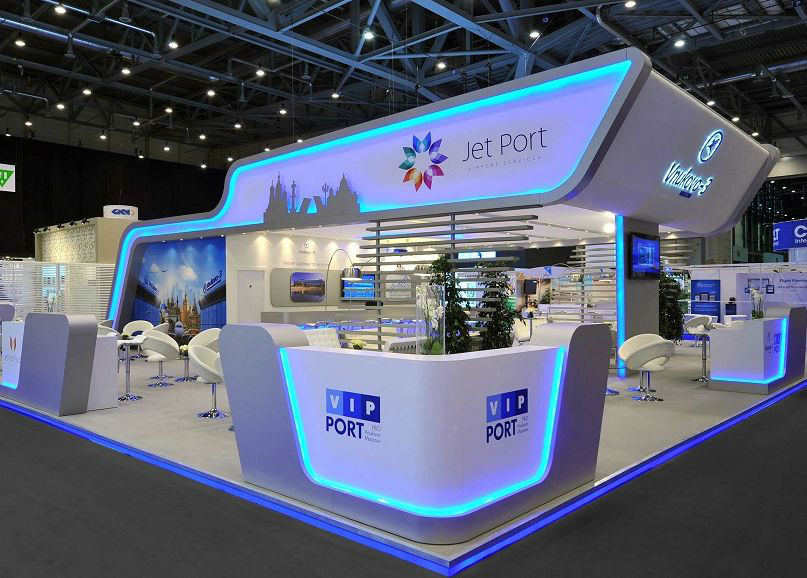
A trade-show floor is loud before anyone speaks. Lights, banners, product demos, and competing logos fight for the same few seconds of attention. Your exhibition stand has to win that first glance and then earn a conversation. Strong products alone will not do it if the booth looks tired, confusing, or closed off. Design is part of the sales pitch: space, height, light, type, and imagery either invite people in or send them past.
Use the checklist below as a practical brief before you sketch layouts or order graphics. The goal is a stand that looks intentional from across the aisle and still works when someone steps inside.
Start with one clear exhibit goal
Most teams arrive at a show with a mix of hopes: launch a product, book meetings, recruit partners, collect leads, or simply look present. A stand designed for “everything” usually communicates nothing. Pick a primary goal and let secondary goals follow.
If the priority is a product launch, give that product the best sightline and the simplest message. If the priority is meetings, design quieter corners, seating, and a clear host point rather than a wall of posters. If the priority is brand awareness, invest in height, logo clarity, and a silhouette people can spot from the far end of the hall.
Write the goal in one sentence and pin it to the design brief. Every later choice—tower, demo table, literature rack, lighting—should pass a simple test: does this support the sentence, or only decorate it?
Design for the people you actually want
Attractive traffic is not the same as useful traffic. A booth that pulls in everyone can waste staff time on visitors who will never buy. Look at who attends the show, what they already know about your category, and what decision they can make on the floor.
Match tone to that audience. A technical industrial show may reward clean diagrams, sample parts, and calm lighting. A consumer lifestyle show may reward color, photography, and a more open social layout. The wrong aesthetic is not only a style miss; it filters the wrong people toward your team.
Also plan the first question your hosts will ask. The stand should set up that question visually—through a demo, a comparison board, or a single headline—so conversations start faster than a cold greeting.
Use every inch you rented—including the air
Organizers assign floor area and usually a height limit. Read the rules before you fall in love with a concept. Many halls restrict hanging signs, open flames, floor loading, and how far graphics may overhang. Build inside those parameters, then squeeze value from what remains.
When floor space is tight, go vertical. Height helps visitors find you above a sea of low counters. Common tools include:
- A tall central tower or column with your brand mark near the top
- An arch or portal that frames entry without blocking sightlines
- A rotating or double-sided hanging sign that reads from two aisles
Keep the floor plan walkable. Crowded furniture, oversized demo tables, and literature towers that sit in the traffic path make people hesitate at the threshold. Aim for a clear “front porch” zone where passersby can pause without committing, then a deeper zone for demos and conversations.
Corner and island booths need design on more than one face. Treat each aisle as a front door. End-cap booths should not waste the side that faces a main walkway.
Light the message, not only the carpet
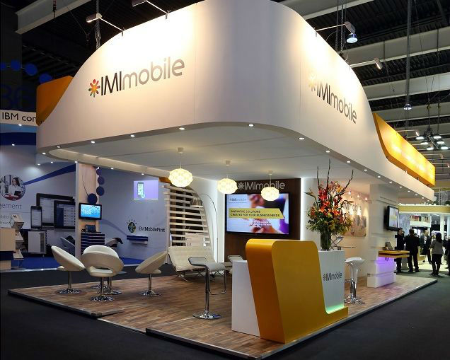
Hall lighting is rarely kind to print. Fluorescent wash flattens color, and neighboring booths can steal attention with brighter spots. Plan your own lighting as part of the design, not as an afterthought rented on install day.
Put dedicated light on key posters, logos, and product displays. If you show physical products, light them so materials and finishes read honestly. Avoid glare on glossy panels that turns headlines into mirrors. Battery-powered or track spots can rescue a dark corner where power drops are limited—confirm electrical needs early with the venue.
Warmth and contrast matter as much as brightness. A stand that is evenly bright but visually flat still looks dull. Use pools of light to create hierarchy: brightest on the hero message or product, softer in seating areas so conversations feel private.
Write less; make type work from a distance
Booth visitors skim. They do not read essays while walking. Keep headlines short and claims concrete. Prefer bullets and one-line benefits over paragraphs on wall panels. Brochures can carry detail; walls should carry orientation.
Choose fonts that stay legible from several meters away. Highly decorative type fails under harsh light and motion. High contrast between text and background beats clever low-contrast “premium” looks that vanish in a busy hall. Place important signs high enough that a crowd at the front desk does not hide them.
Check hierarchy. From the aisle, a visitor should grasp brand, offer, and next step in roughly that order. If the first readable line is a slogan with no category clue, many people will keep walking.
Let images and logo do heavy lifting
Images travel farther than copy. Strong photography, a clear product silhouette, or a simple diagram can explain faster than a paragraph. Your logo should appear large enough to register from across the aisle and consistent enough that returning visitors recognize you year to year.
Do not fill every panel with different photos. A few high-quality images, repeated with discipline, beat a collage of small unrelated shots. Leave negative space; dense walls look cheaper and harder to scan.
If you use screens, treat motion as punctuation. Looping noise without a clear purpose becomes visual pollution. One short demo loop or a quiet slideshow of product contexts is usually enough.
Staff, storage, and the view from behind
Design fails when the team has nowhere to put bags, chargers, samples, or coats. Hidden storage keeps the public face tidy. Plan power, charging, and a discreet place for lead forms or tablets.
Train hosts on the same hierarchy the graphics use. If the wall says one offer and the team pitches another, visitors feel bait-and-switch. Give staff a short script tied to the stand’s goal, plus a plan for busy moments when two conversations collide at the threshold.
Also walk the stand from the visitor’s approach path during setup. Fix anything that looks like a barrier: a table pushed too far forward, a cable trip hazard, a literature stand blocking the logo. Small install-day fixes often matter more than another graphic panel.
A quick stand checklist before you build
- Primary goal written in one sentence
- Audience and tone matched to the show
- Floor rules and height limits confirmed
- Vertical brand signal planned for long sightlines
- Open entry zone and clear circulation
- Dedicated lighting on logo, key copy, and products
- Short headlines, readable type, limited wall copy
- Strong images and consistent logo placement
- Storage, power, and staff brief locked in
Build to that list and your stand will not need to shout over the entire hall. It only needs to be findable, readable, and ready for the conversations you came to have—then the design has already done half the selling before the first handshake.

Comments
Continue reading

Funny Animal Signs That Warn People (While Animals Ignore Them)
From a seagull on a no-birds disc to classic zoo and park ironies—why animal warning signs get funny, and what the rules are still for.

How to Find Local Amenities on Vacation: Mechanics, Haircuts & More
Locate trustworthy local services and everyday spots while traveling or settling in—using publications, reviews, map apps, neighbor tips, and low-pressure exploration.

Kristen Stewart for V Magazine, Spring Preview 2013
V81’s Wild at Heart cover story—Kristen Stewart shot by Inez & Vinoodh, styled by Joe McKenna, in pale minimal spring glamour.