
Tattoo Quotes on a Woman’s Body: Typography, Placement, and Meaning
Choosing mottos and lettering for curves—ribs, shoulders, arms, thighs—with privacy, language, and longevity in mind.
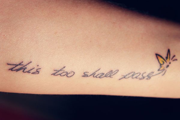
Word tattoos on a woman’s body are typography meeting anatomy. Ribs arc, shoulders slope, thighs taper, and collarbones offer a short stage—so the same sentence can look lyrical or cramped depending on where it sits. This gallery is about quote-as-body-copy: language choice, line breaks, script versus print, and how much of a phrase you want the world to read without asking. It deliberately differs from spine-column designs and from Roman-numeral date codes. Here the medium is prose or motto, placed across living curves.
Nothing below is medical guidance. Comfort during a session varies by person and site; talk with your artist and, for health questions, a clinician. The useful work on this page is editorial: which words, which type, which landscape of skin.
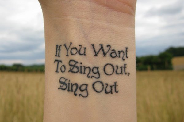
Choose words you will still mean in ten years
Trend mottos age faster than personal lines. A lyric tied to one breakup summer may feel loud later; a short principle you already live by often ages quieter. Latin phrases, family sayings, and lines from books can work when the translation and attribution are accurate—and when you care about the meaning without needing strangers to applaud it. Read the candidate sentence aloud every day for a week. If it starts to sound like costume jewelry, keep drafting.
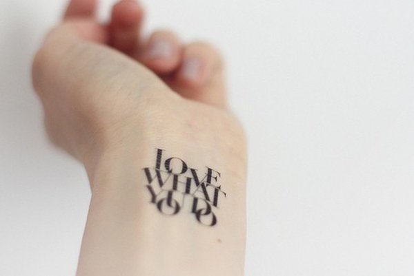
Length is a design constraint. Eight words on a wrist fights for space; eight words along a thigh can breathe. Edit before you ornate. A strong short line beats a paragraph forced into 3-point script.
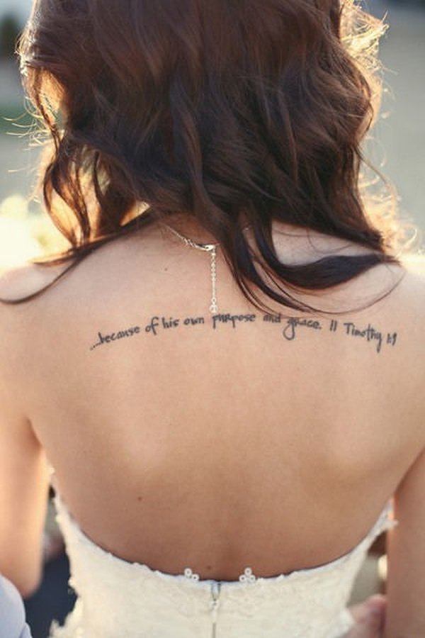
Attribution is optional and sometimes wise. If the line is famous, decide whether you want the author’s name small beneath it or no credit at all. Crowding a delicate site with both quote and citation can spoil both. When the words are yours or your family’s, you do not owe the internet a hashtag—only yourself a sentence that still feels true on ordinary Tuesdays.
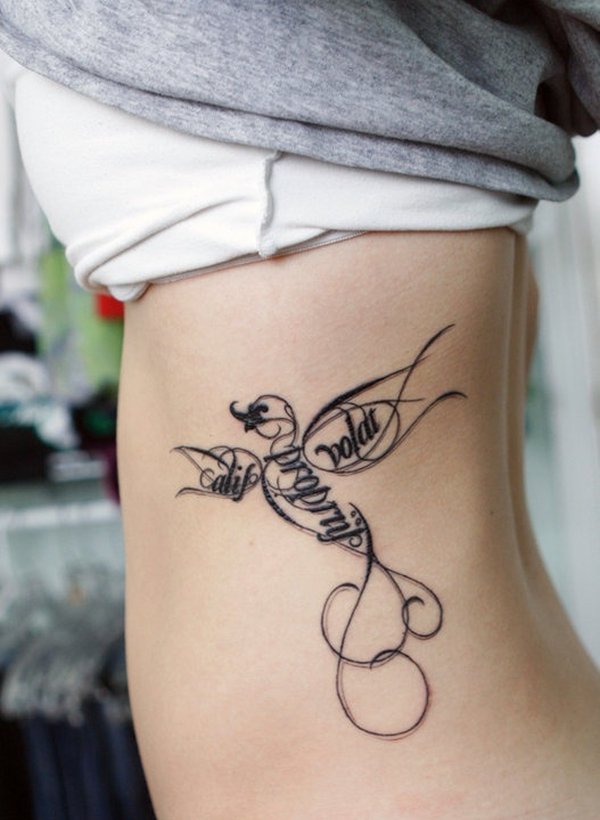
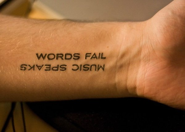
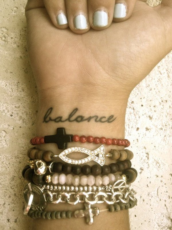
Language mixes deserve intention. English beside Latin, or a mother tongue beside a borrowed motto, can look considered when weights match and the hierarchy is clear—one line primary, one line supporting. Random generator phrases and mis-copied translations are how regret enters lettering work. Verify spelling, diacritics, and grammar with a fluent reader, not only with an app.
Typography that follows the body
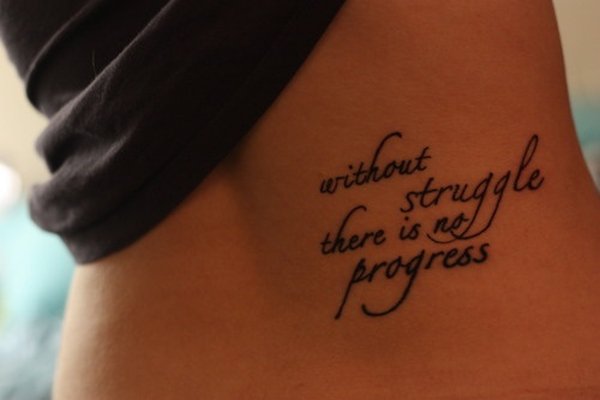
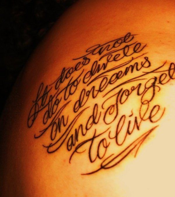
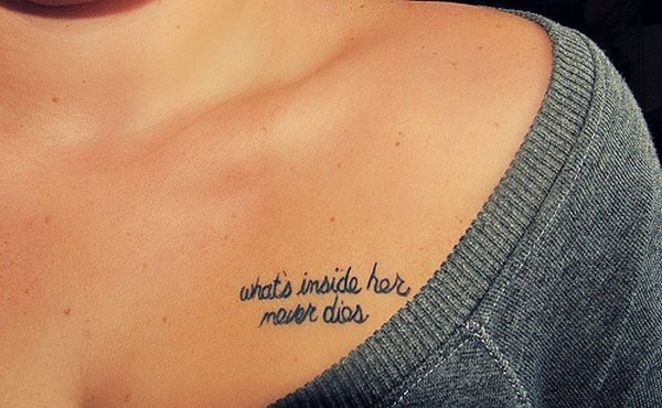
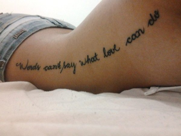
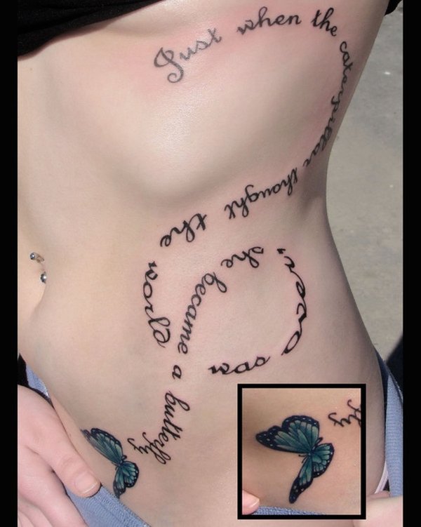
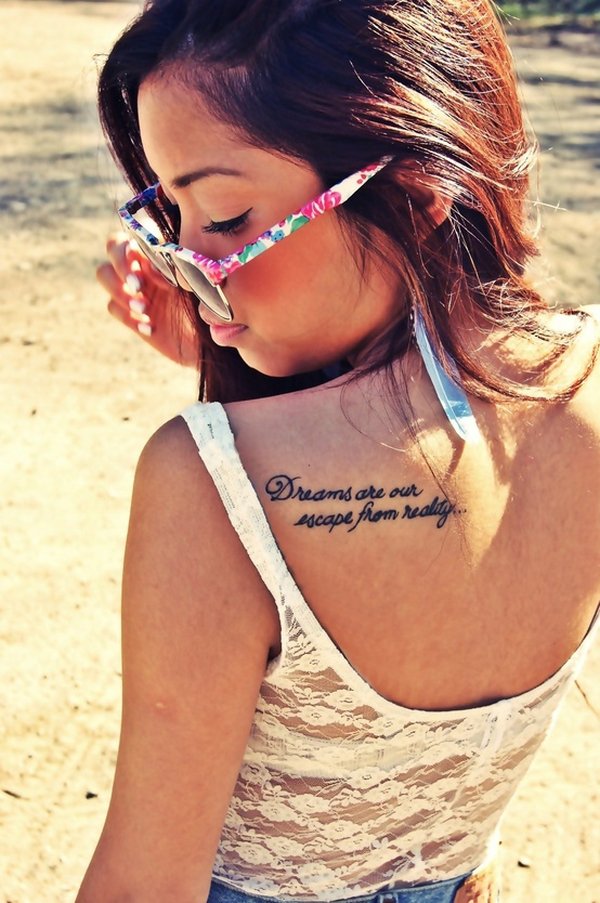
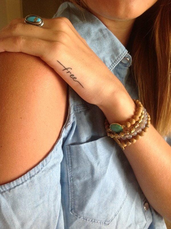
Script lettering flatters many quote tattoos because it echoes handwriting and jewelry engraving, but large flourishes need room. On ribs and sides, long ascending strokes can collide with underbust lines or waist motion unless the artist custom-fits the ductus to your shape. Print and serif hands can look literary and calm; they ask for careful spacing so the quote does not read like a stamped receipt.
Line breaks are part of the poem. Breaking for breath and meaning beats breaking only to fill a rectangle. Ask to see the stacked layout on a printed template held to your body. Mirror-reading practice helps: you will see reverse views of shoulder and rib pieces more often than you think.
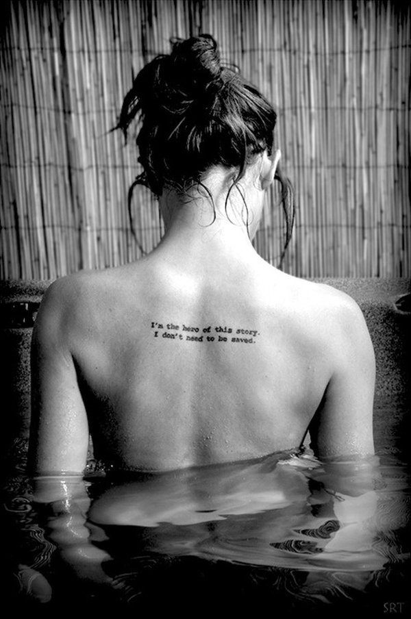
Capitalization and punctuation are design choices too. All-caps block lettering feels declarative; sentence case feels conversational; a single ampersand or em dash can change the rhythm. Ellipses and excessive exclamation marks rarely improve permanence. Treat the quote like a typeset epigraph: every mark should earn its place on a moving surface.
Placement map for readable quotes
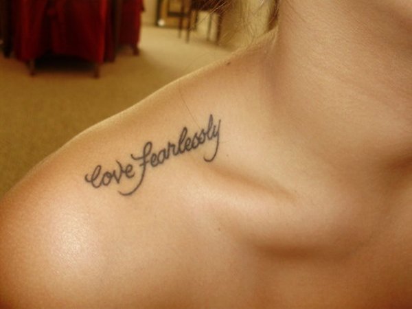
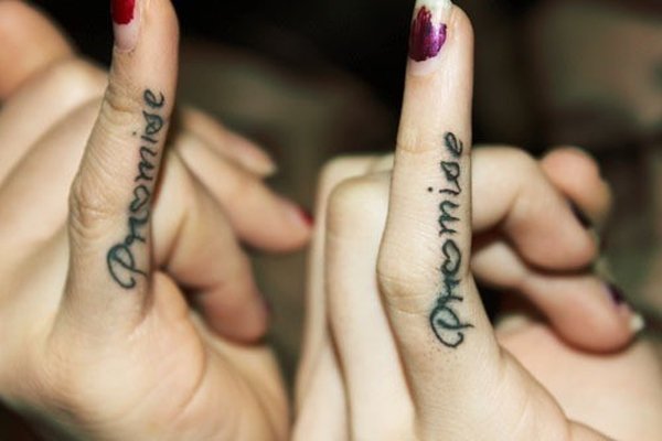
Collarbone and shoulder quotes act like jewelry—visible in open necklines, hidden under crew necks. Forearm lines are conversational; you see them while typing and gesturing. Rib and side quotes feel intimate and often stay private in daily clothes. Thigh and hip placements can be large enough for longer text and still vanish under ordinary garments. Ankle and foot lettering reads as delicate and meets shoes; discuss wear expectations honestly with your artist.
Avoid treating “woman’s body quote” as one aesthetic. Athletic shoulders, soft torsos, long waists, and petite frames change how a curve accepts lettering. References on someone else’s proportions are starting points. Your stencil should be drawn for you.
Unlike a spine column, these placements often wrap or follow a diagonal. Unlike Roman numerals, the character set includes curves, joins, and word spaces that must stay even when the skin flexes. That is why custom lettering for quotes is less optional than people hope: body-aware spacing is the difference between a motto and a sticker.
Privacy, work, and who the audience is
Some quotes are anchors for the wearer alone. Others are meant to be read. Decide before the appointment. A sternum or high-rib line may be for mirrors and partners; a forearm line enters meetings and family dinners. Neither is superior. Mismatch—deeply private words in a highly visible site, or bland filler in a sacred private site—creates quiet dissatisfaction later.
If dress codes matter in your job or community, map coverage with the clothes you actually own. Take photos in those outfits during the consult week. Design for real life, not only for the after-photo.
Ornament around text—support, do not smother
Small botanicals, underlines, tiny birds, or semicolon marks can frame a motto. Dense wreaths around tiny words often win the visual fight. Keep ornaments lighter or smaller than the lettering if the sentence is the point. If ornament is the point, shorten the text. Hybrid pieces work when one element leads.
Color in lettering is optional. Soft watercolor clouds behind black text photograph beautifully and need a stable letterform underneath so the words still read when soft pigment settles. Ask for healed examples of any color approach you want.
From gallery scrolling to a consult agenda
Pick three quotes you love and force yourself to cut one. Pick two fonts and one placement. Bring corrected spelling. Bring photos of your own body in natural light. Ask the artist to prioritize legibility at the size your site allows—not at the size the inspirational image appeared on screen. Budget for custom lettering; quote work is rarely a five-minute flash if you care about the result.
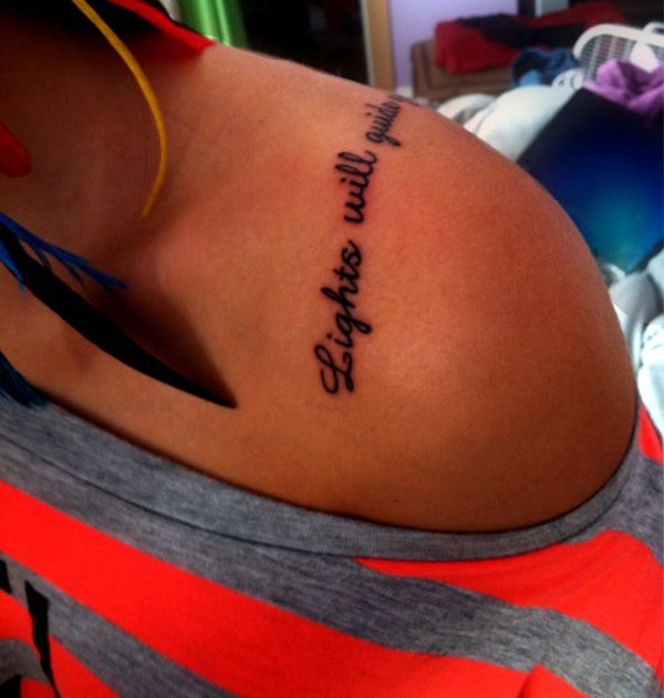
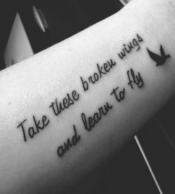
Body-quote tattoos succeed when the sentence is truly yours, the type fits the curve, and the visibility matches your life. Use this collection to study how words sit on shoulders, ribs, arms, and legs—then leave with fewer candidates and clearer placement, so the ink reads as intention rather than a caption stuck on skin.

Comments
Continue reading

Meaningful Love Quotes for Inspiration (and Ink)
Meaningful love quotes that still feel true — short lines for tattoos, gifts, and everyday reminders, with placement and wording tips.
40 One-Word Tattoo Ideas: Placement, Type, and Meaning
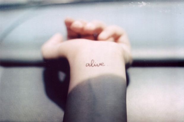
A gallery of single-word tattoos—love, faith, strength, wanderlust, and more—with guidance on typography, body placement, and choosing a word that still fits years later.
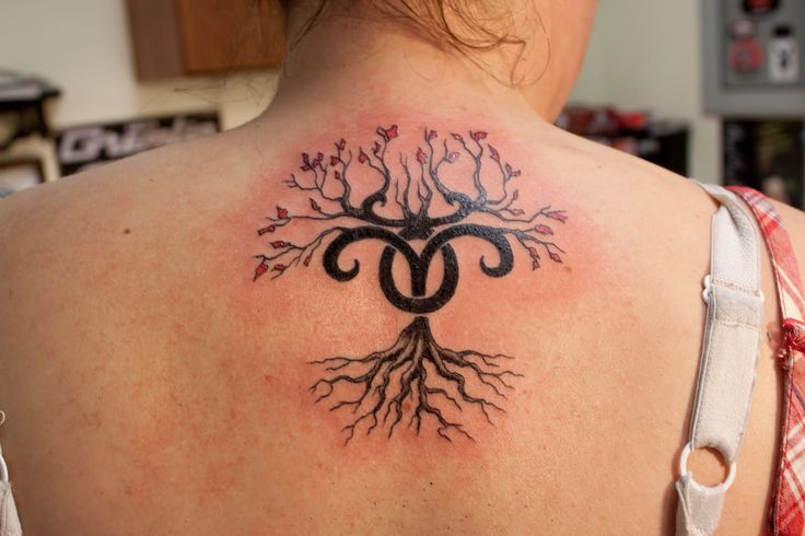
16 Taurus Tattoo Ideas: Bulls, Glyphs, and Venus-Inspired Ink
Sixteen Taurus tattoo directions—from minimal glyphs and constellation maps to floral bulls and bold blackwork—plus placement and artist tips for lasting earth-sign ink.