
40 One-Word Tattoo Ideas: Placement, Type, and Meaning
A gallery of single-word tattoos—love, faith, strength, wanderlust, and more—with guidance on typography, body placement, and choosing a word that still fits years later.
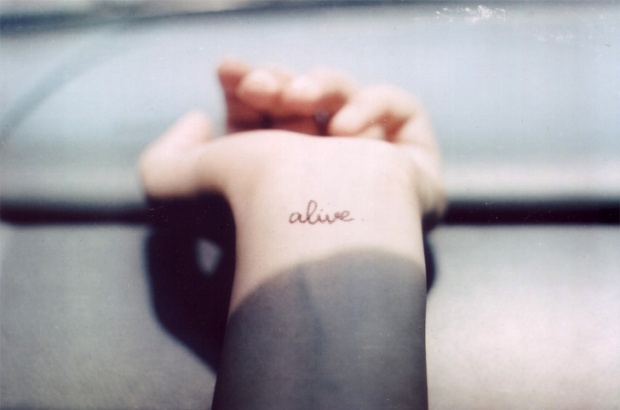
Sometimes a whole paragraph would dilute the point. One word—alive, passion, wilderness, love, faith, forgive, strength, fly, wanderlust—can carry a private history without explaining it to strangers. That is why single-word tattoos stay popular: they are readable at a glance, flexible in placement, and intimate enough that only you know the full story behind the letters.
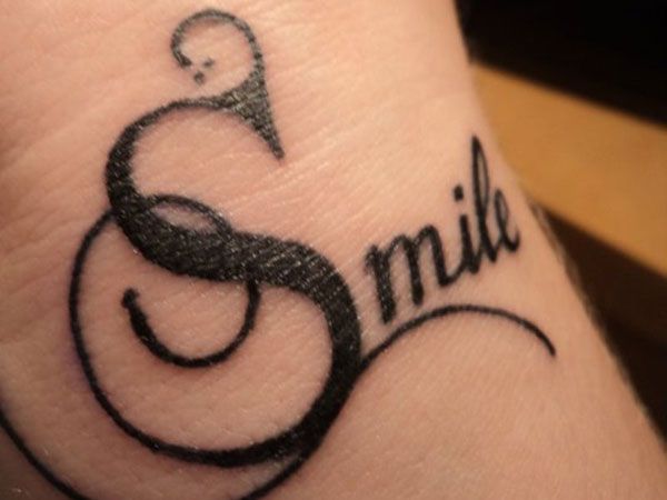
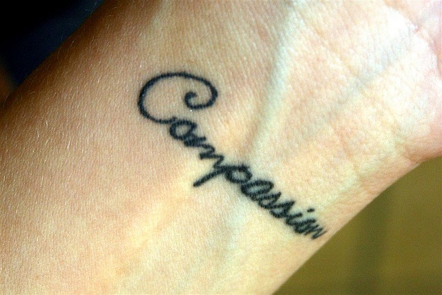
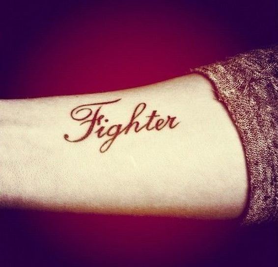
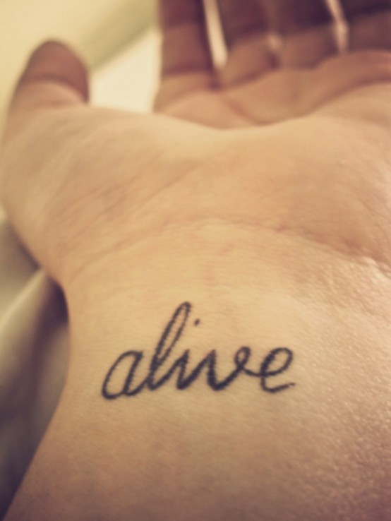
Typography does as much work as vocabulary. A lowercase cursive “alive.” on the inner wrist behaves like a daily note to self. A serif “WILDERNESS” across the forearm reads like a declaration. Script softens; block caps harden; a trailing underline or a period can change the mood of the same root word. Before you book ink, decide whether you want a whisper you can see while typing, or a statement that shows when sleeves roll up.
Why one word works
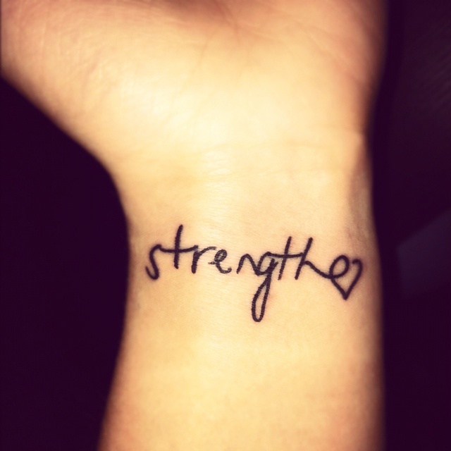
Long quotes age awkwardly when life moves on. A single noun or verb tends to stay elastic. “Strength” can mean recovery, parenting, or a hard season at work. “Wanderlust” can mean airports or simply refusing a smaller life. “Forgive” can be directed outward or inward. The gallery below collects about forty treatments—fine-line scripts, stacked lettering, foot and rib placements, words paired with tiny symbols—so you can compare how form and body location change meaning.
Popular choices cluster around love, faith, resilience, freedom, and travel. None of those themes require ornate illustration. Letterforms alone can be the art if the spacing, weight, and kerning are clean. Ask your artist for a stencil test: live with the spelling on paper for a week. Misspellings and trendy fonts age faster than the emotion that prompted them. If a word only thrills because it is trending on a feed, it is probably not ready for permanent skin.
One-word tattoos also travel well across cultures of style. Traditional shops, fine-line studios, and lettering specialists can all execute them—if you match the artist to the font. A calligraphy hand belongs with someone who tattoos scripts daily; a rigid geometric sans belongs with someone whose healed sans-serif photos stay crisp. Portfolio matching matters more than finding the cheapest hour.
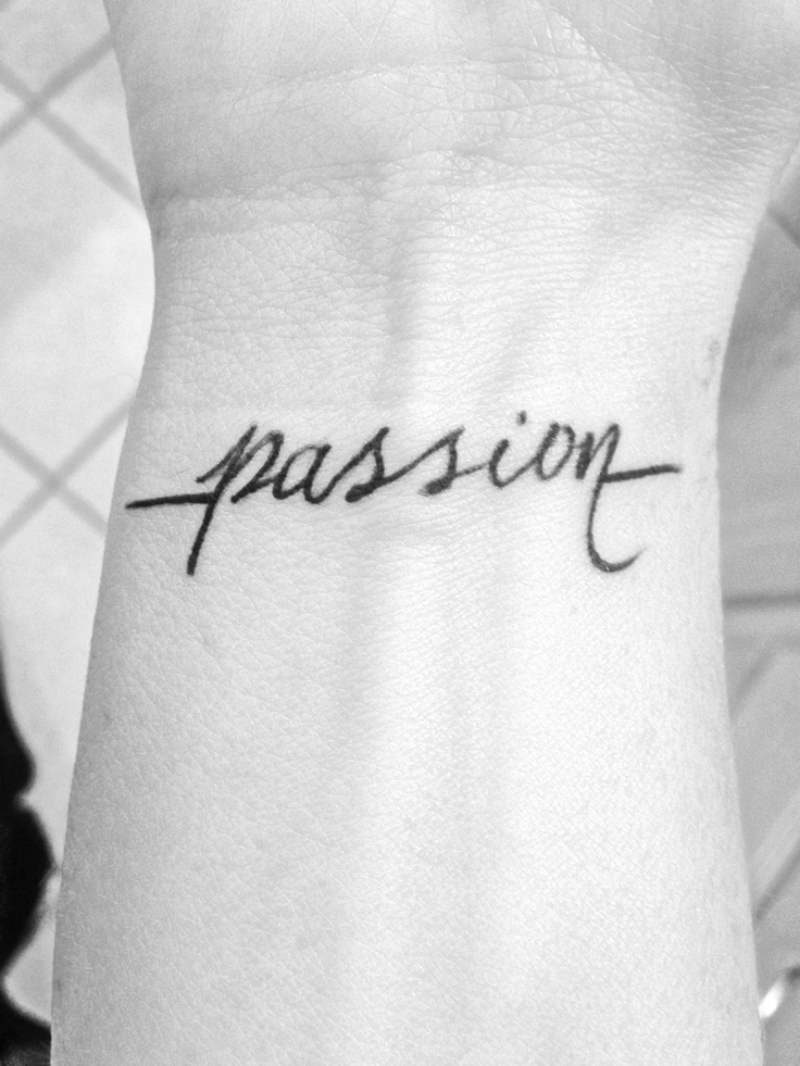
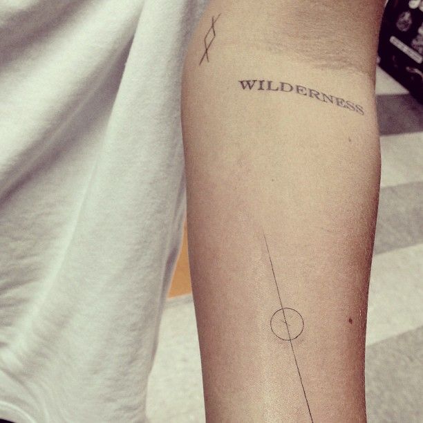
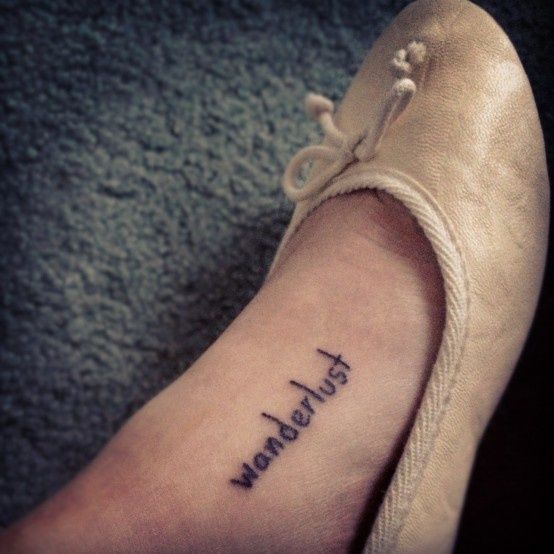
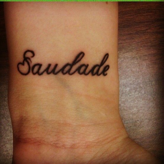
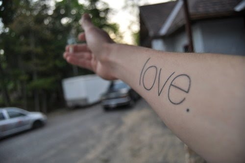
Wrist and inner forearm placements dominate this style because they stay in the wearer’s field of view. That visibility is the point for reminder words—alive, breathe, faith—and a risk for workplace-sensitive choices. Collarbone, rib, ankle, and foot designs trade daily visibility for privacy or for a narrative fit (wanderlust on a foot is an old favorite for a reason). Think about mirrors, watches, and how often you see that patch of skin in ordinary life. A motto you never notice becomes décor instead of a companion.
Script, serif, and the space around letters
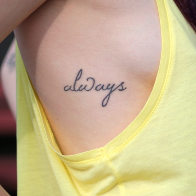
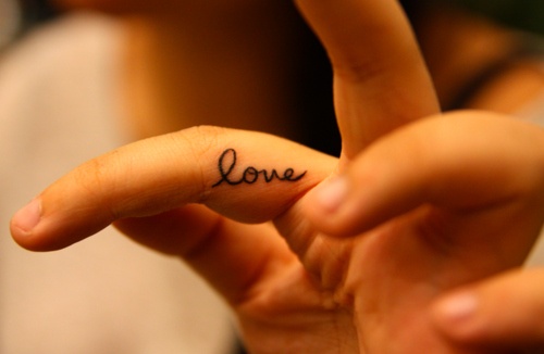
Fine-line handwriting suits short words and small canvases. It can blow out if the lines are too thin for the skin type or if the artist rushes. Slightly thicker strokes and generous letter spacing help longevity. Serif and sans-serif caps work better for longer words such as wilderness or wanderlust, where cursive loops can tangle. Horizontal baselines feel calm; vertical stacks along the spine or side of the finger feel architectural; wrapping a word around a finger or ankle needs careful planning so the reading order stays obvious when the joint bends.
Some designs add a single companion mark—a rune, a line through a circle, a tiny heart—without turning the piece into a full illustration. Keep the accessory smaller than the word if the word is the point. If the symbol starts competing, you no longer have a one-word tattoo; you have a logo. Negative space is part of the design: crowding letters against a joint crease or into a busy existing tattoo sleeve will make even perfect lettering look muddy.
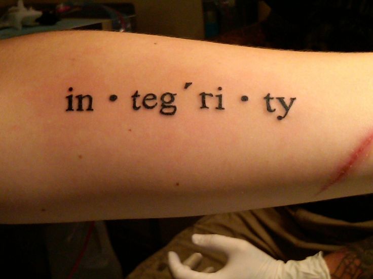
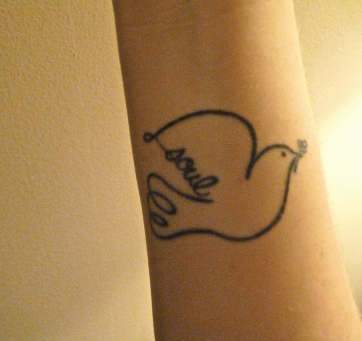
Language choice matters. English is common in inspiration galleries, but a word in your first language—or a word that only your family uses—often holds harder. Avoid translating through an app without a fluent reader. Confirm accents, gender endings, and calligraphy conventions with someone who lives in that language daily. Capitalization is a meaning choice too: “Love” is not the same graphic object as “love,” and all-caps “FLY” hits differently than a soft script “fly.”
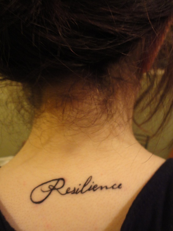
Placement as part of the meaning
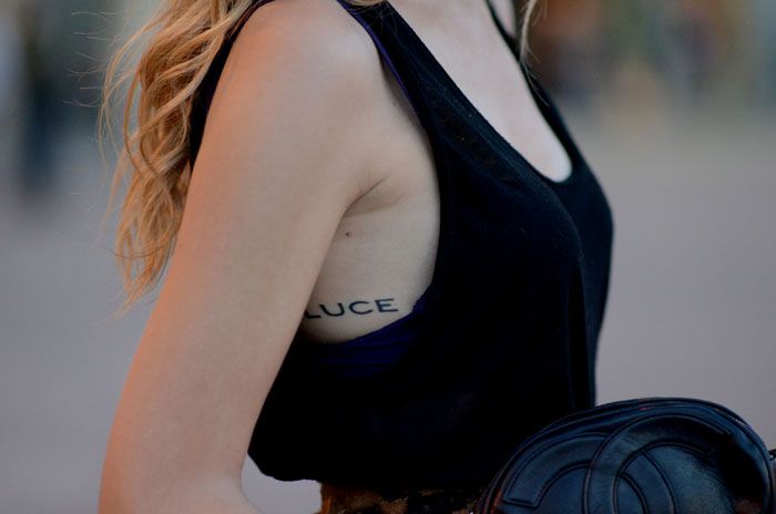
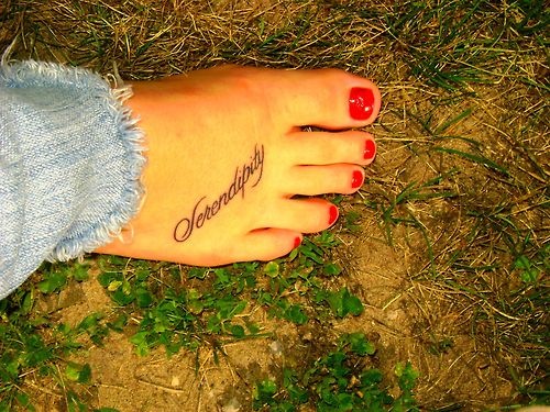
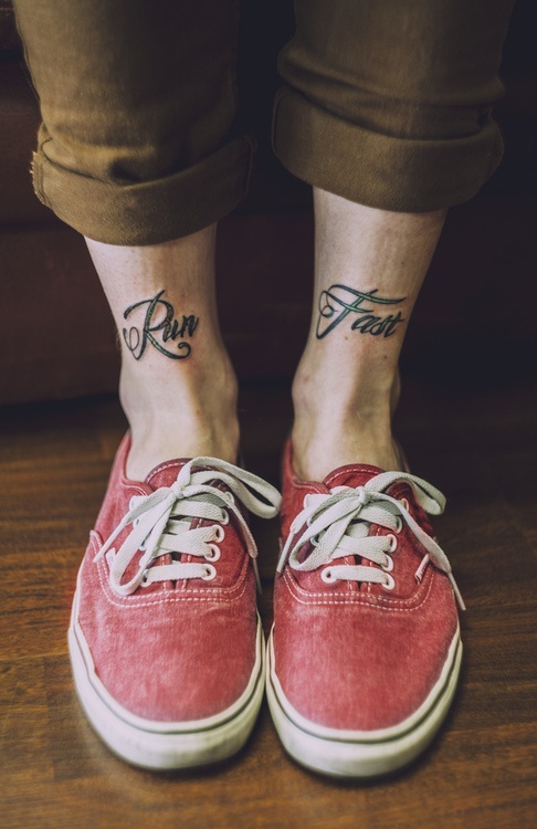
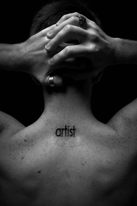
Where you put the word is half the design. Inner wrist: private-public hybrid, easy to cover with a watch, hard to ignore when you want the reminder. Side of finger: tiny and risky for fade; choose thicker lines and expect touch-ups. Behind the ear or nape: intimate, revealed on purpose. Ribs and sternum: personal and often more painful; good for words you want close to the breath. Foot and ankle: travel metaphors land naturally; shoes and friction can stress healing, so aftercare discipline matters more than the poetry of the placement.
Think about how the letters will stretch with muscle and age. Areas that flex constantly can distort delicate script. Slightly larger letterforms and a skilled hand mitigate that better than shrinking everything to “keep it cute.” Ask to see healed work on similar body areas—fresh photos flatter thin lines that may not survive two summers of sun and lotion.
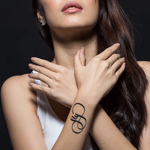
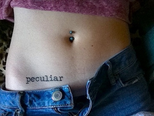
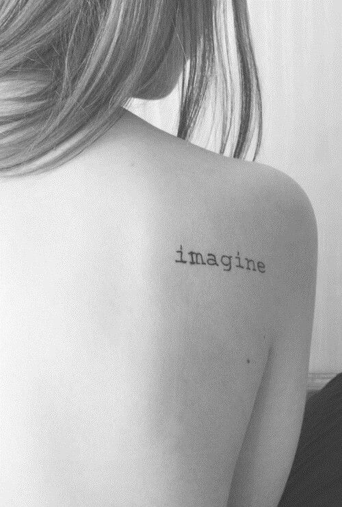
If you already have tattoos, match line weight and ink density so the new word joins the collection instead of fighting it. A hyper-fine script next to bold traditional work can look accidental unless you plan the contrast on purpose. Leave breathing room so the one word remains legible when the surrounding pieces darken with age.
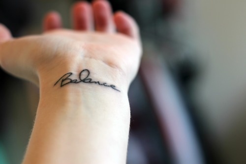
Choosing your word without rushing
Write a short list, then cut it. Prefer verbs and nouns that still make sense if your circumstances change. Names and dates are different commitments; one-word concepts are closer to mottos. Sit with candidates while you commute, cook, or argue with email. The word that still feels true after boredom arrives is safer than the word that only thrills on a mood board. Say it aloud. If it sounds theatrical when spoken in your own voice, it may look theatrical in ink too.
Browse the remaining designs for rhythm and scale rather than for a word to copy wholesale. Many of the strongest pieces in this set succeed because the lettering fits the limb, not because the vocabulary is rare. A common word done with excellent spacing still beats an obscure word in shaky script. Steal composition ideas—arc, stack, underline—not someone else’s exact biography.
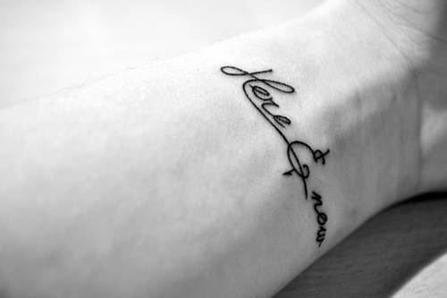
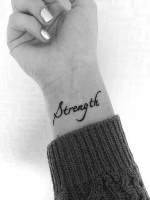
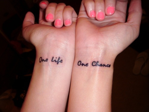
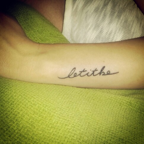
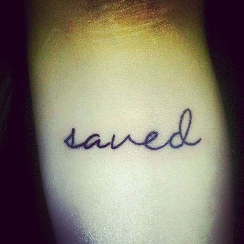
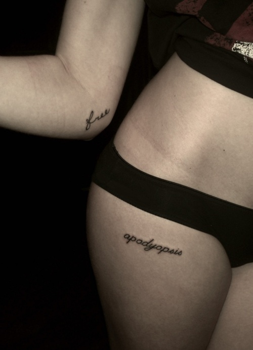
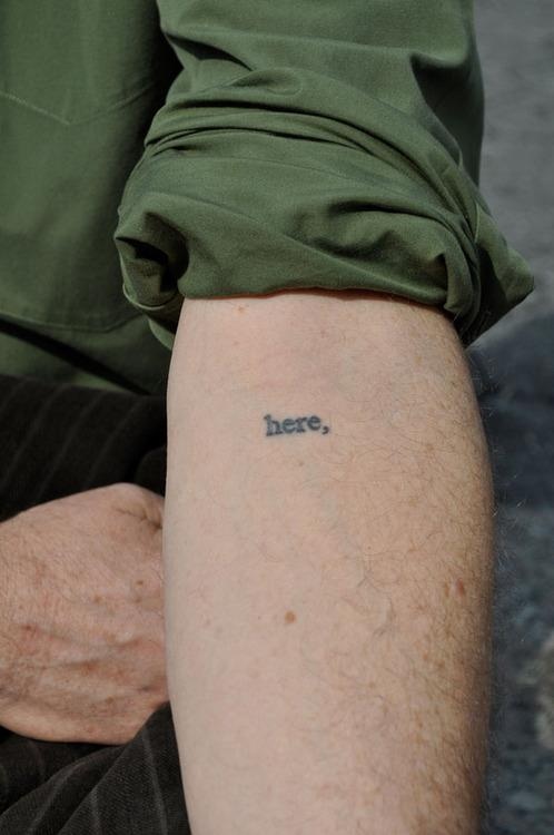
Studio basics still apply. Choose a licensed artist whose healed lettering photos look sharp, not only fresh. Aftercare for small text is the same as for larger work: keep it clean, moisturized as directed, and out of pools and heavy sun while healing. Fine lines on hands and feet may need maintenance years later; budget for that honesty instead of treating touch-ups as failure. Sunblock on healed lettering is not optional vanity—it is how thin strokes stay readable.
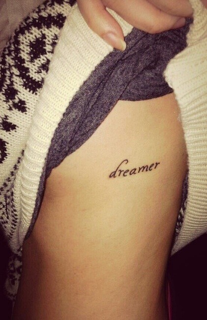

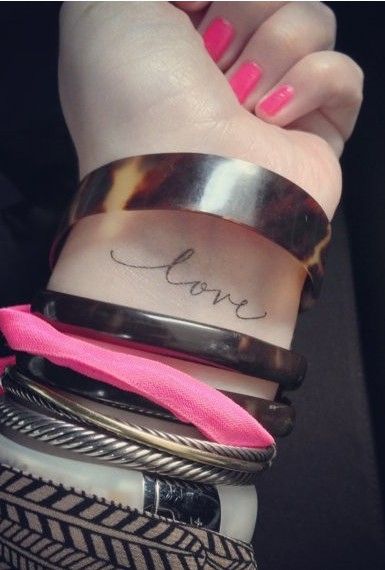
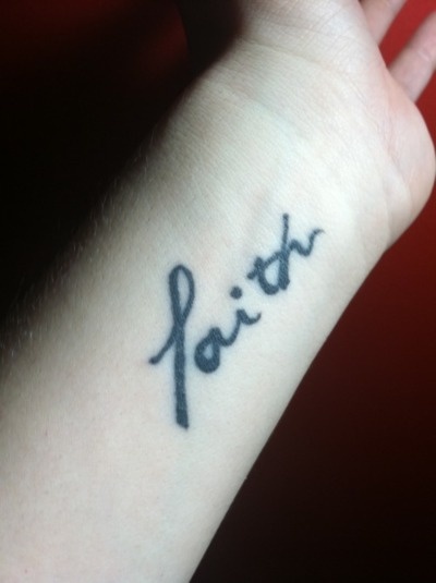
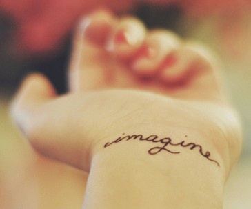
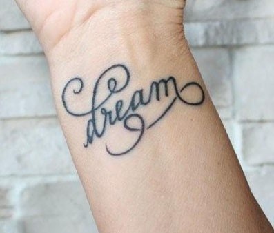
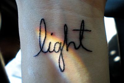

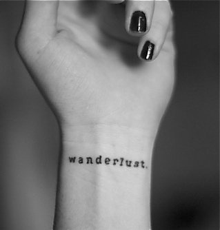
When you have a favorite from the set, take it to a consultation as a reference for scale and mood—not as a stencil to photocopy. Your wrist is not their wrist; your handwriting preference is not their portfolio default. Bring two or three runners-up so the artist can suggest which lettering style will heal cleanest on your skin tone and placement. The best one-word tattoos look inevitable on the person wearing them: right letters, right size, right place, and nothing extra that dilutes the single idea you meant to keep.
If you leave this gallery with only a shortlist and a clearer sense of wrist versus foot, script versus caps, you already did the useful work. The ink can wait until the word stops feeling like a mood and starts feeling like a fact.

Comments
Continue reading

Meaningful Love Quotes for Inspiration (and Ink)
Meaningful love quotes that still feel true — short lines for tattoos, gifts, and everyday reminders, with placement and wording tips.
16 Taurus Tattoo Ideas: Bulls, Glyphs, and Venus-Inspired Ink
Sixteen Taurus tattoo directions—from minimal glyphs and constellation maps to floral bulls and bold blackwork—plus placement and artist tips for lasting earth-sign ink.
Glorious Wrist Tattoos: Design Criteria and Inspiration
Wrist tattoo ideas from tiny icons to lettering and bands—placement, silhouette, jewelry clearance, and how to brief an artist (design focus, not medical advice).