
Mosaic Illustrations by Charis Tsevis
Athens designer Charis Tsevis builds photomosaics where a Like-hand or portrait resolves from thousands of thematic cells—Gestalt craft for editorial and ads.
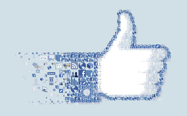
Charis Tsevis builds pictures that ask your eyes to commute. From a distance, a portrait or icon locks into place. Step closer—or zoom—and the continuity breaks into hundreds or thousands of smaller images, each a tessera with its own job. Greece-based and working from Athens through Tsevis Visual Design, he has spent decades refining digital mosaic and photomosaic illustration for editorial pages, advertising campaigns, and large public images. The single frame on this page—a thumbs-up hand dissolving into social-network icons—is a compact lesson in that craft: the whole is a gesture everyone recognizes; the parts are the culture that made the gesture famous.
Mosaics, for Tsevis, are not a stylistic garnish. They are a way of thinking about perception. He has described the continuous zoom between part and whole as the fascination that keeps him returning to the form—the same pleasure ancient floor makers knew, restated with pixels, vectors, and custom software.
Athens studio, global assignments
Tsevis is an award-winning visual designer and illustrator living and working in Athens. Through Tsevis Visual Design he has served a wide international client list while also teaching editorial design part-time at AKTO College of Art and Design. That double life—commissioned image-making and classroom clarity—shows in the work’s readability. Even at extreme density, his mosaics usually remain legible as posters first and puzzles second.
In the early 2010s, around the time this Sortrature page first appeared, his Behance showcases of editorial illustrations from 2011–2012 circulated widely. Features highlighted celebrity and culture photomosaics—Hugh Laurie for TV Guide, Shaquille O’Neal for Fast Company, Steve Jobs for Discover, festival and tech subjects for weeklies and business magazines—often posted at enormous resolutions so viewers could magnify until individual cells became readable scenes. Some pieces ran to the scale of tens or even more than a hundred megapixels. The point was not bragging rights. It was to make the zoom a genuine second reading.
Gestalt on a deadline
Tsevis frequently anchors his mosaic thinking in Gestalt psychology’s claim that the whole is greater than the sum of its parts. In practice that means each fragment must do two jobs at once: contribute local color and detail, and participate in a global contour the brain can assemble without instruction. Fail the first job and the surface goes muddy. Fail the second and you have a scrapbook, not a portrait.
Advertising work made that dual requirement commercial. Campaign mosaics for brands and institutions—among them sports drinks, colleges, data firms, furniture retailers, tourism, energy drinks, and motorsport—used the form to visualize complexity: diversity as many faces in one figure, data as many points in one body, fandom as many emblems in one athlete. The thumbs-up Like mosaic on this page belongs to the same family of thinking. Interface icons, speech bubbles, charts, devices, and Facebook marks cluster into a hand while the palm opens into clean negative space. Meaning lives in both scales.
How a digital mosaic is built
Unlike a traditional stone mosaic, Tsevis’s process is hybrid and iterative. Over years he has developed custom tools and scripts—later named projects in his tool ecosystem include systems aimed at batch silhouette work, coordinate remapping, and variable-size tessellation—so that density can change across a face or emblem. Tighter cells can hold an eye or a logo edge; looser cells can carry background air. Manual montage in Photoshop and Illustrator remains part of the craft: composition, symbolic selection, and the decision to remove a fragment that does not earn its place.
He has compared mosaic editing to knowing when a piece does not belong. Not every cut stone or cropped icon improves the field. Quality depends as much on refusal as on inclusion. That editorial severity is why his better images survive magnification. Random collage collapses under zoom; curated tesserae keep revealing intentional relationships—color rhymes, thematic echoes, local jokes that reward slow looking.
In more recent Olympic and cultural series he has also described AI-supported sketching combined with hand montage and proprietary mosaic conversion. Even there, the claim is hybrid authorship rather than one-click generation: machine proposals, human structure, custom tessellation. The older advertising and editorial mosaics that first made his name online already demonstrated the same hierarchy—concept first, cell craft second, spectacle only as a byproduct of density done well.
Reading the Like-hand on this page
The image kept with this article is a social-media emblem rebuilt as mosaic. Against a pale blue field, a right hand gives the thumbs-up associated with the Like button. The thumb and outer contour are packed with blue-and-white interface glyphs: the “f” mark, envelopes, megaphones, globes, profile silhouettes, charts, gears, padlocks, phones, monitors. The palm’s interior opens into a sharp white void, a rest for the eye and a reminder that silhouette is still the master shape. At the wrist, icons thin and drift, as if connectivity itself were fraying into air.
As a period piece from the early social-web years, it compresses a whole media mood: optimism about sharing, the aesthetics of Facebook blue, the sense that identity was becoming a swarm of small signals. As a craft piece, it demonstrates variable density, controlled negative space, and thematic cell selection. You can enjoy it as a logo remix in three seconds, or spend three minutes hunting padlocks and bar charts along the thumb’s edge.
Why the form still holds
Photomosaic illustration sits between information design and portraiture. It flatters the brain’s talent for pattern completion while offering a second narrative to anyone willing to lean in. Tsevis’s long practice—more than thirty years of laying mosaics in one medium or another—keeps returning to that commute between scales. Ancient tesserae taught the same lesson in stone; his versions teach it in the visual language of magazines, campaigns, and the network icons that once felt brand-new.
If you only keep one habit from looking at his work, make it this: view twice. First for the emblem. Then for the swarm that secretly builds it. In Charis Tsevis’s mosaics, neither reading is optional—and the pleasure is the distance your eyes travel between them.

Comments
Continue reading

Still-Life Photography by Margareth Perfoncio
São Paulo photographer Margareth Perfoncio’s still lifes of food and flowers—Old Master light, dark wood, and tables that feel inevitable.

Meaningful Love Quotes for Inspiration (and Ink)
Meaningful love quotes that still feel true — short lines for tattoos, gifts, and everyday reminders, with placement and wording tips.
Christina Hess’s Animals From History: Costumed Pets as Playful Portraits
Illustrator Christina Hess reimagines historical icons as ornate animal portraits—Elvis Petme and friends—mixing puns, costume detail, and soft history lessons.