
Street Style Neon Colours: Spring Daylight Brights
How fluorescent accents work as a spring thaw signal—one-hit colour, neutrals as frames, and daylight rules for wearing neon before summer heat.
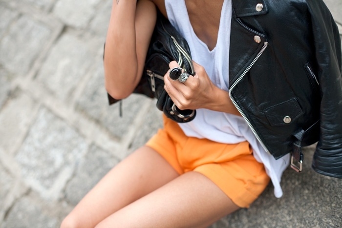
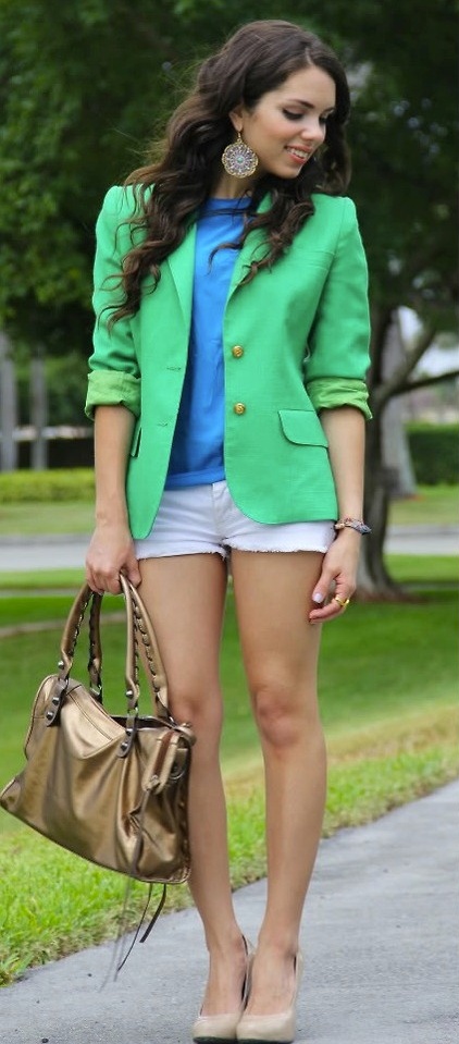
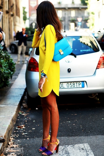
Neon on the street in spring is not the same gesture as neon under summer night light. When the season is still deciding whether to stay cold after dark, fluorescent colour works like a weather report written in fabric: acid yellow against a navy trench, electric coral on a leather sleeve, lime flashing from a bag while the rest of the outfit stays muted. The Spring/Summer colour story that once filled this gallery was less about dressing like a highlighter and more about choosing one bright signal that could survive daylight, wind, and the commute.
Street style has always loved contrast, but spring neon has a specific job. It announces thaw. It cuts through greige coats that have not yet been put away. It photographs cleanly at noon when winter’s charcoal palette would disappear into wet pavement. The looks collected here treat brightness as architecture—placed, framed, and balanced—rather than as costume.
Why spring wants a loud colour
Early-season dressing is transitional by force. You still need layers. You still need closed shoes on some mornings. What you do not need is another month of visual apology. A neon accent solves the problem without forcing you into summer silhouettes too early. A vivid knit under a dark jacket, a fluorescent skirt with opaque tights, a highlighter sneaker against black denim—these are spring moves because they keep warmth while changing the mood.
Colour forecasting for trend watchers often sounds abstract until you see it on a sidewalk. Forecasts talk about “energy,” “optimism,” “digital brights.” On the street, that language becomes simpler: will this shade still look intentional when the sky is flat and the wind is mean? Spring neon that works tends to sit next to structured neutrals—black, camel, white, stone—so the bright piece has a frame. Head-to-toe neon can succeed later in the year when heat justifies lighter fabrics and shorter hems. In spring, framing is kinder.
One hit, two hits, and the danger of three
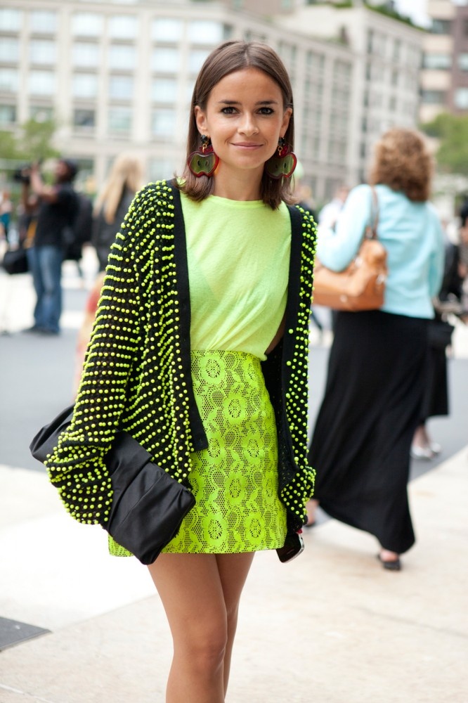
The most reliable spring formula is one neon hit: a single garment or accessory that carries the colour story. Two hits can work when they share a temperature—both cool neons (cyan, lime, violet) or both warm ones (tangerine, hot pink, acid yellow)—and when they are separated by a neutral zone. Three hits usually tip into costume unless you are deliberately building a monochrome neon column, which is a different essay and a braver morning.
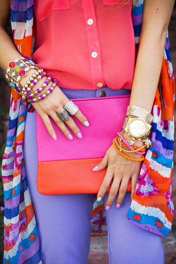
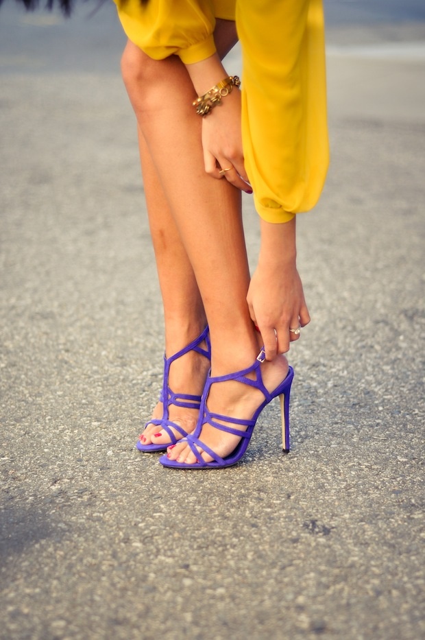
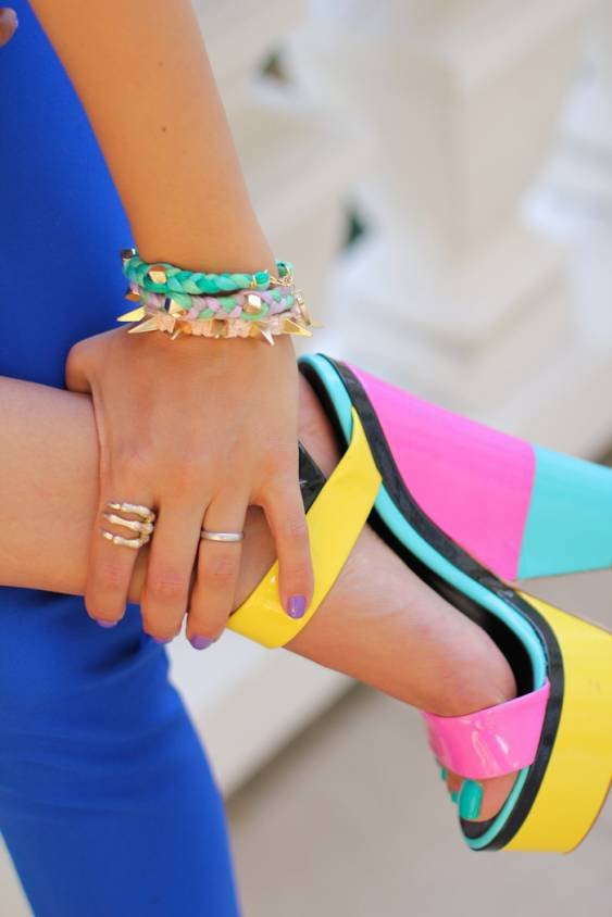
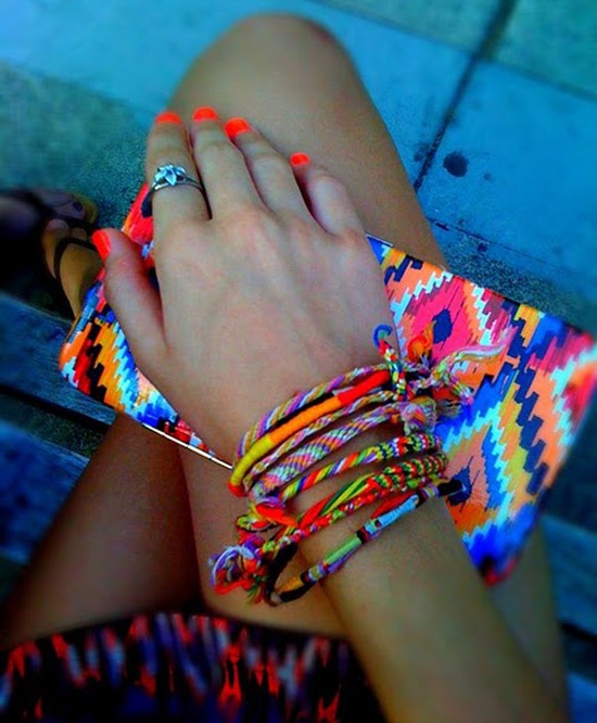
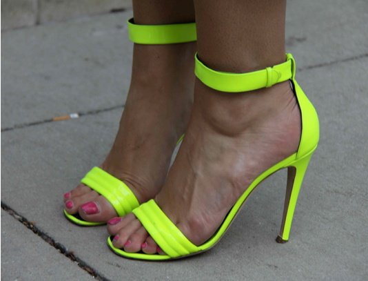
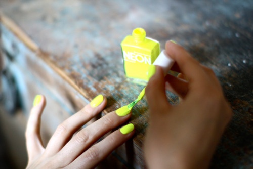
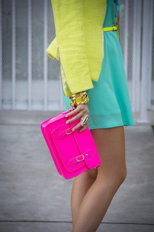
Accessories are the low-risk laboratory. A fluorescent clutch, socks, nail polish, or sunglasses arms can test whether a shade flatters your skin before you commit to a coat. Bags are especially efficient because they move with you through the day and stay visible even when jackets close. Shoes are riskier: neon footwear dirties fast in spring rain and can dominate every photo. If you choose neon shoes, keep the rest quieter than you think you should.
Daylight is the real stylist
Neon is a daylight fabric in spring. Under overcast skies, some fluorescent dyes look chalky; under hard noon sun, others bloom. That is why street photographs from fashion weeks matter: they show what a colour does outside a studio. Look at how neon sits against skin, hair, and city stone. A shade that felt perfect in a shop’s warm lighting can turn harsh beside pale concrete. The fix is rarely abandoning neon; it is changing the neighbour colours. Warm neon often softens beside cream and camel. Cool neon often sharpens beside charcoal and white.
Texture also changes neon’s volume. Matte neon cotton reads graphic and sporty. Neon satin or patent reads nightclub even at 11 a.m. Neon knit reads approachable. Neon leather reads expensive and slightly aggressive. Spring street style usually prefers matte and knit for daytime, saving shine for evenings when the season finally commits to longer light.
Pairing neon with the clothes you already own
You do not need a neon wardrobe. You need one intentional bright object and a closet of adults. Black remains the easiest partner because it makes neon look designed rather than accidental. White makes neon look sport-luxe. Denim makes neon look young without trying. Camel and taupe make neon look editorial. Patterns are trickier: tiny prints can vibrate unpleasantly next to fluorescent solids; bold graphic prints can compete. If you mix print and neon, let one dominate and keep the neon in a simple shape.
Proportion matters as much as hue. A neon miniskirt with an oversized blazer feels current. A neon blazer with narrow black trousers feels sharp. A neon hoodie with tailored trousers can bridge weekend and work-adjacent dressing if the rest stays clean. What fails is neon in a flimsy cut with no structure—spring wind exposes weak garments, and weak neon looks louder than strong neon.
Makeup, hair, and the rest of the frame
Neon clothing changes the face. A hot-pink lip beside a hot-pink coat can flatten everything into one blob of colour. Often the smarter move is quieter makeup with one precise detail—clean skin, defined brow, or a muted lip—so the garment keeps the spotlight. Hair that is overly matched to the neon can look themed; hair that contrasts (deep brunette with lime, blonde with violet) usually photographs better in daylight.
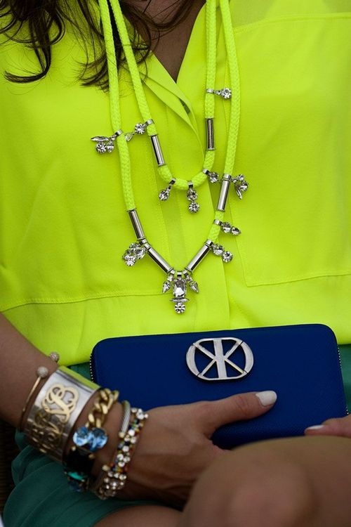
Jewelry should not fight the colour either. Yellow gold can warm cool neons; silver and chrome can cool warm ones. Overly ornate pieces steal focus. In spring street dressing, neon is already jewelry enough.
Reading the gallery as a colour lesson
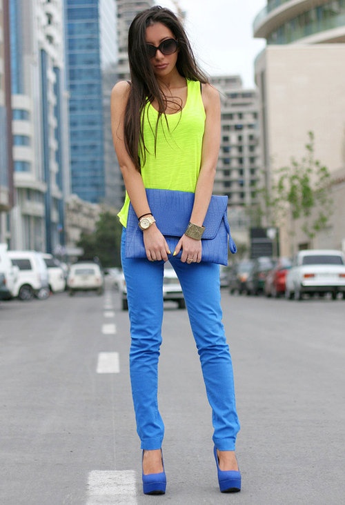
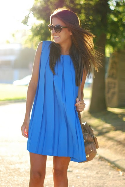
These images are not a shopping list. They are a set of experiments in how much brightness a real outfit can hold when the season is still half winter. Notice where neon sits on the body: near the face it becomes identity; at the feet it becomes punctuation; at the bag it becomes a moving caption. Notice which looks use leather, denim, or tailoring as ballast. Notice how often black or white appears as a pressure valve.
If you are building a spring rotation, steal the structure more than the exact shade. Ask: where is the bright object? What neutral holds it? Is the silhouette strong enough for wind? Does the colour still make sense at lunch outdoors? Those questions matter more than chasing last season’s exact fluorescent code.

A practical spring checklist
Before you wear neon out, check three conditions. First, lighting: if your day is mostly indoor fluorescent offices, choose a softer neon or keep it to an accessory so the colour does not scream under bad tubes. Second, weather: wet spring sidewalks punish pale neon shoes and clingy neon synthetics. Third, context: a meeting, a gallery opening, and a weekend market ask for different volumes of brightness. The same lime jacket can be perfect or wrong depending on the room.
Trend colour only becomes personal style when it survives your calendar. Spring neon that lasts is the piece you still want after the first warm weekend—the one that feels like relief from winter grey, not like a dare you lost. Wear the forecast if it fits your life. Ignore it if it only fits a photograph. The street, in the end, is where colour either earns its keep or gets folded away until next year.

Comments
Continue reading
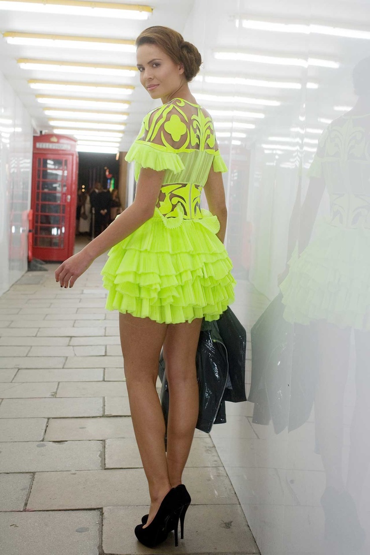
Street Style Neon Colours #2: Night Heat Voltage
A second neon chapter for warm evenings and artificial light—signal colour in crowds, shine after dark, and heat-ready saturation instead of spring thaw accents.
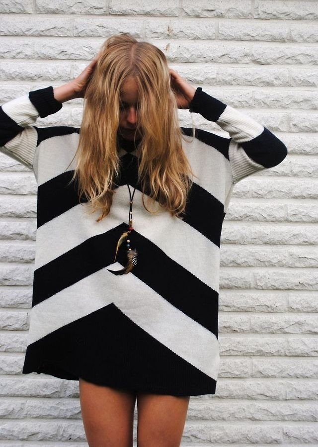
Street Style Stripes: Rhythm, Scale, and Colour Partners
How to wear stripes as personal style tools—scale, direction, mixing patterns, and colour partners that keep graphic looks intentional.
Global Street Style #3: Color, Warm Climates, and Hero Accessories
LA, Mediterranean, and Rio-spirited street looks where bags, shoes, sunglasses, and jewelry lead the silhouette instead of heavy coats.