
Sharon Stone – Amica Special Edition
Sharon Stone’s Amica 50th-anniversary editorial by Gomillion & Leupold—a December 2012 magazine feature of classic Hollywood print glamour.
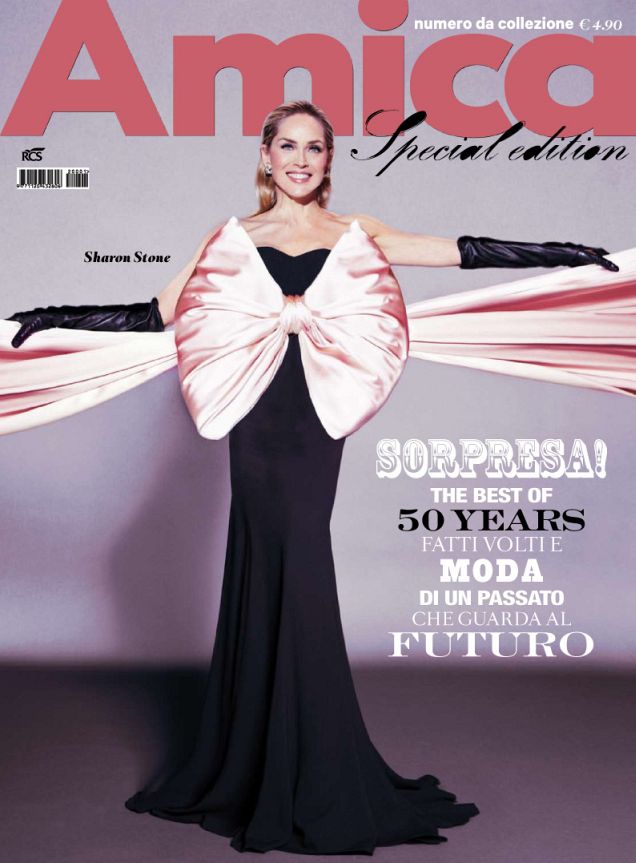
In December 2012, Italian fashion magazine Amica marked a half-century with a cover that felt deliberately old-school glamorous: Sharon Stone, smiling wide, in a black Yves Saint Laurent dress punctuated by a pink bow. The images that followed—shot by Steven Gomillion and Dennis Leupold, styled by Beau Quillian—circulated on design and style blogs as a “Super Sharon” anniversary editorial, often dated to the magazine’s January 2013 pages. Looking back now, the feature reads less like disposable celebrity content and more like a period document of how glossy print still staged Hollywood charisma just before social media fully rewrote the cover game.
A jubilee cover in a changing magazine culture
Amica’s fiftieth anniversary was a natural moment to reach for a globally recognizable face. Stone, then in her mid-fifties and long past the 1990s breakthrough that made her a household name, remained a reliable symbol of controlled screen intensity and red-carpet polish. Anniversary issues in European fashion publishing often mix heritage branding with contemporary photography; this one paired an Italian title’s milestone with an American star whose image still traveled easily across language barriers. The cover’s simplicity—face, smile, bow, dark dress—was part of the pitch. It did not rely on novelty props or concept overload. It relied on presence.
Contemporaneous coverage treated the shoot as classic Hollywood shine: feminine, high-luster, unapologetically glamorous. That tone mattered in late 2012. Fashion media was already accelerating online, but print covers still functioned as cultural bookmarks. A bow dress and a confident smile could trend for a week on blogs and still feel like an object you might hold. The feature’s afterlife on sites that recirculated editorial photography preserved that bookmark quality. What we have here is a gallery of those circulated frames—period artifacts of how the shoot was shared, not a studio vault dump with full production notes.
Gomillion & Leupold’s polished register
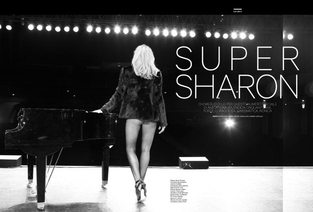
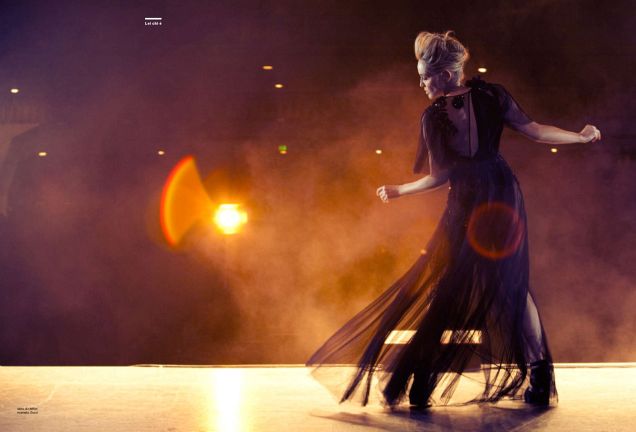
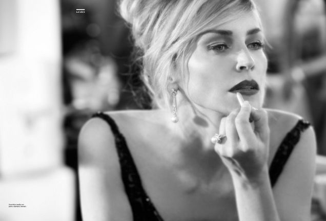
Photographers Steven Gomillion and Dennis Leupold—working as Gomillion & Leupold—brought a clean, high-finish commercial language to the session. Their editorial work of the era favored clarity over grit: skin lit to glow, fabrics readable, poses that telegraph star power without needing a caption. For an anniversary issue, that register was strategic. Jubilee covers rarely want experimental muddiness; they want an image that can stand next to archive covers and still look like a celebration. Hair by Terry Millet and makeup by Billy B. completed a team credit list that reads like a classic magazine masthead of the period—specialists named, roles clear, craft visible.
Stylist Beau Quillian’s choices lean toward structured femininity rather than shock. The bow becomes a motif of softness against Stone’s famously sharp screen persona. That contrast is useful historically. Stone’s public image had long balanced vulnerability and steel; fashion editorials often choose one pole. Here the styling softens the frame without erasing authority. The smile on the cover is not coy. It is expansive, almost defiantly pleasant—an adult star comfortable enough to look delighted in a format that sometimes prefers ice.
Reading the editorial as a time capsule
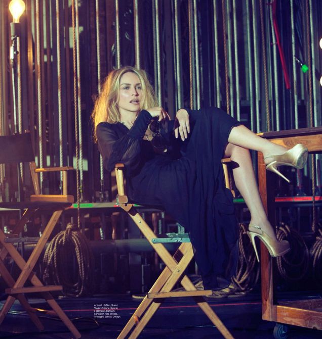
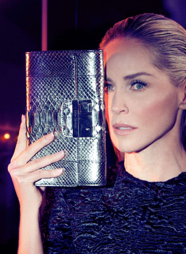
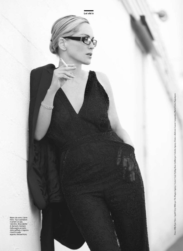
Magazine features of this type reward slow looking more than gossip. Notice the rhythm between vertical portraits and wider fashion frames: covers and hero shots sell the face; interior spreads sell the clothes and the body language. Color temperature stays warm and flattering. Shadows are controlled. Nothing here aims for documentary roughness. That is not a flaw; it is the genre. Late-print fashion photography often functioned as aspirational theater, and anniversary issues amplify the theater. The “special edition” framing on this post’s original title matches how blogs filed the shoot—less as news, more as a collectible set of images.
Historically, Stone’s early-2010s magazine appearances sat at an interesting career point. The roles and public conversations around aging actresses were shifting, sometimes clumsily, in mainstream press. Features like this one answered with a visual argument: glamour need not retire on a schedule. Whether that argument feels progressive or simply commercial depends on the viewer. What remains undeniable is the craft density—lighting, styling, retouching norms of the era, and a cover concept simple enough to survive compression on blogs and phones of 2012.
Italy, Hollywood, and the anniversary bargain
Italian fashion magazines have long traded in Hollywood faces as a kind of shared European-American glamour language. Casting Stone for a fiftieth-anniversary issue was a bargain both sides could understand: the title borrowed instant recognition; the actress received a high-finish fashion platform that treated her as a contemporary cover star rather than a nostalgia cameo. Complex and other outlets covering the shoot in December 2012 leaned hard on age-as-spectacle headlines—standard for the era, and part of why reframing matters now. The more interesting historical question is not “how does she look for her age?” but “what kind of femininity did an anniversary issue think was celebratory?” The answer, visible in these frames, is luminous, structured, and smiling without apology.
The bow dress cover in particular became a mini-meme among style blogs that week: classic, feminine, almost throwback in its clarity. That reaction tells us something about 2012 tastes. Amid experimental covers and celebrity-concept overload, a clean portrait with one strong prop could still feel refreshing. Special editions often chase spectacle; Amica chased legibility. Decades later, legibility is what survives compression, cropping, and the loss of surrounding magazine context.
How to look at these frames today
Approach the gallery as period fashion history rather than as a current lookbook. Ask what the anniversary wanted to signal: continuity, international reach, star power. Ask what the photography team delivered: polish, readability, a smile that travels. Compare the cover’s graphic clarity with the interior variations—softer angles, different wardrobe beats, the same insistence on luminous skin and composed posture. The set does not need a conspiracy theory or a scandal hook. Its interest is in how a major European title chose to celebrate fifty years with one American face and a bow that still reads as the editorial’s signature prop.
If you remember the early 2010s blog ecosystem, you may also remember how quickly such shoots moved from magazine page to screen gallery. Credits traveled with them—photographers named, stylists noted, recirculation lines appended. Stripped of those habits, the pictures still hold: Stone at ease inside a jubilee frame, Gomillion & Leupold’s lighting doing its commercial best, Amica staking a claim that print glamour remained worth a special edition. That claim is historical now. The images remain the evidence—seven frames of an anniversary bargain that print culture, for one more season, still knew how to strike.

Comments
Continue reading

Kristen Stewart for V Magazine, Spring Preview 2013
V81’s Wild at Heart cover story—Kristen Stewart shot by Inez & Vinoodh, styled by Joe McKenna, in pale minimal spring glamour.
Brad Pitt for Esquire US, June/July 2013
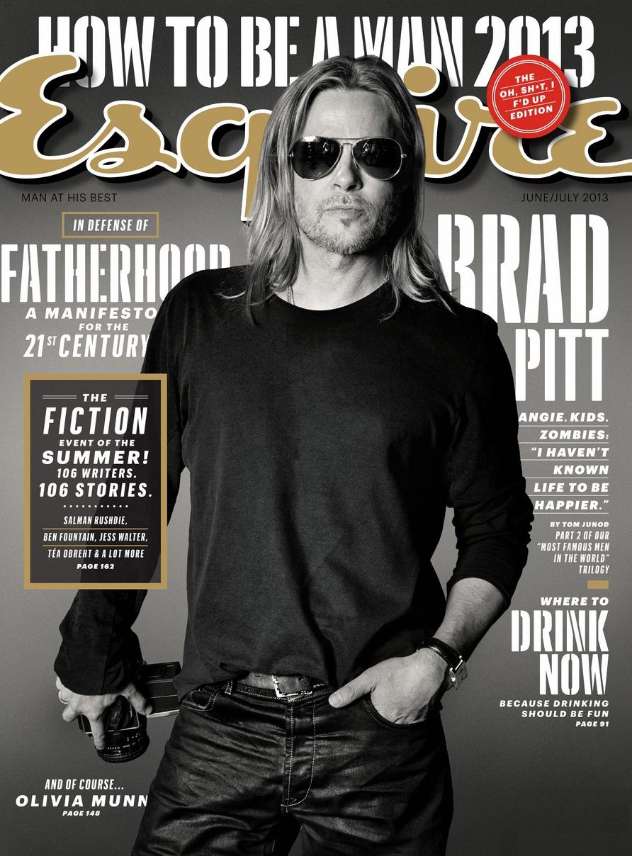
Max Vadukul’s monochrome Esquire cover portraits—camera prop, aviators, Tom Junod’s “A Life So Large” summer 2013 package.
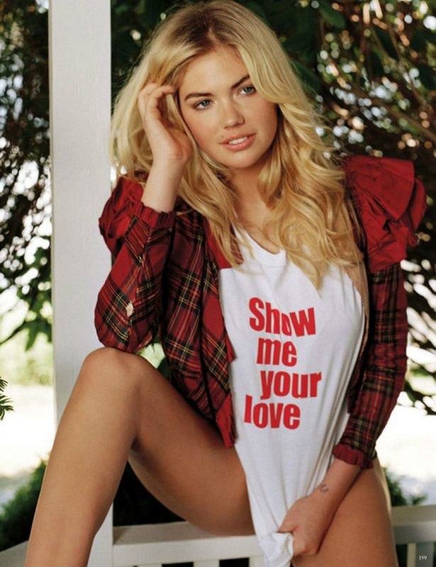
Kate Upton for Vogue Germany January 2013: Bruce Weber
Bruce Weber and Anne Christensen’s January 2013 Vogue Germany feature—outdoor European wardrobe romance, from Ackermann to Eres.