
Pretty Pastel Wedding Ideas
How to build a soft wedding palette—blush, mint, blue, and lilac—across flowers, tables, fashion, and cake without muddy color overload.
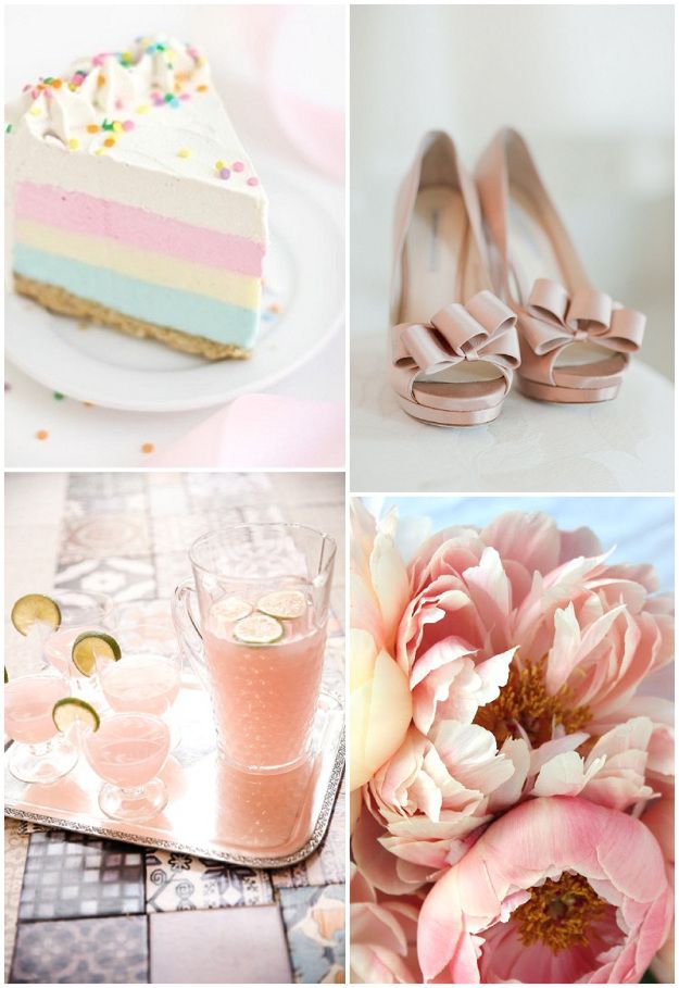
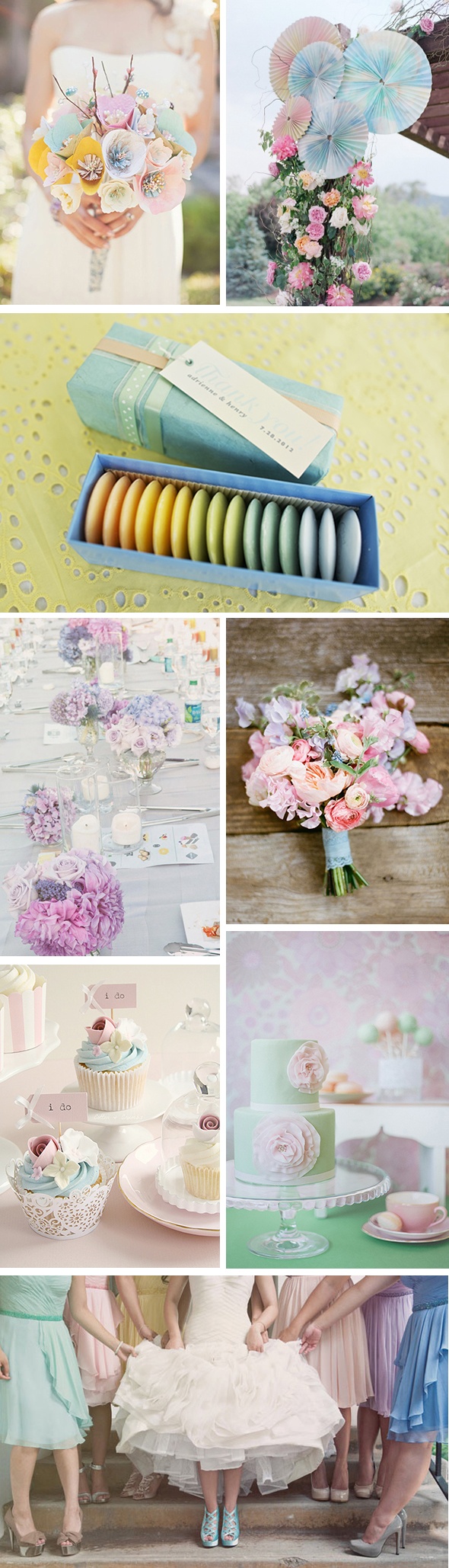
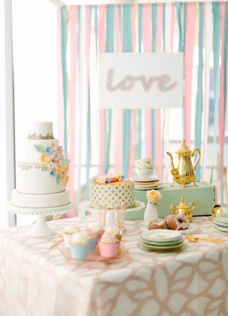
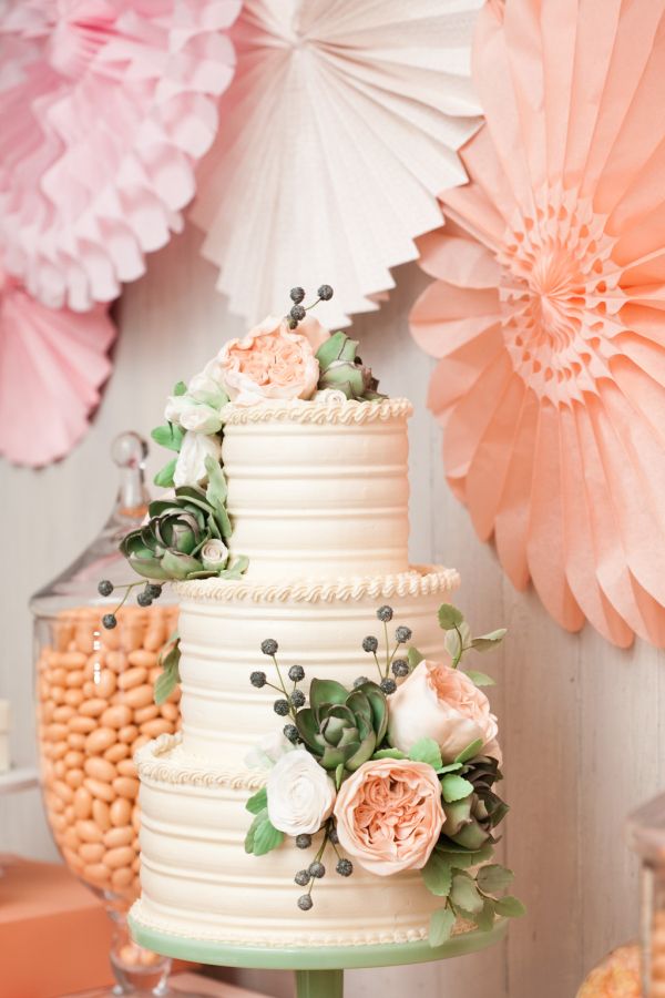
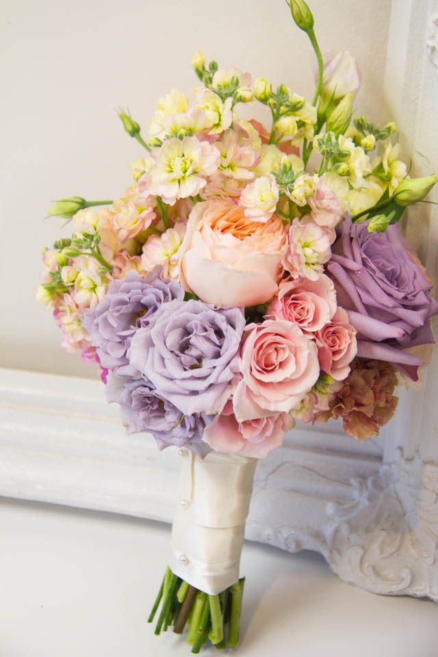
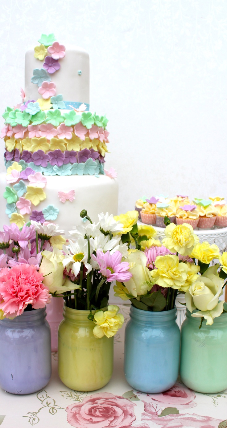
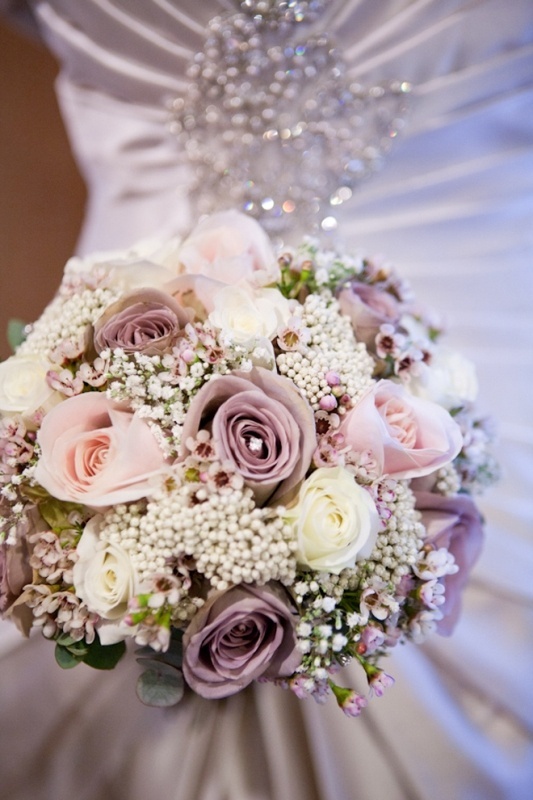
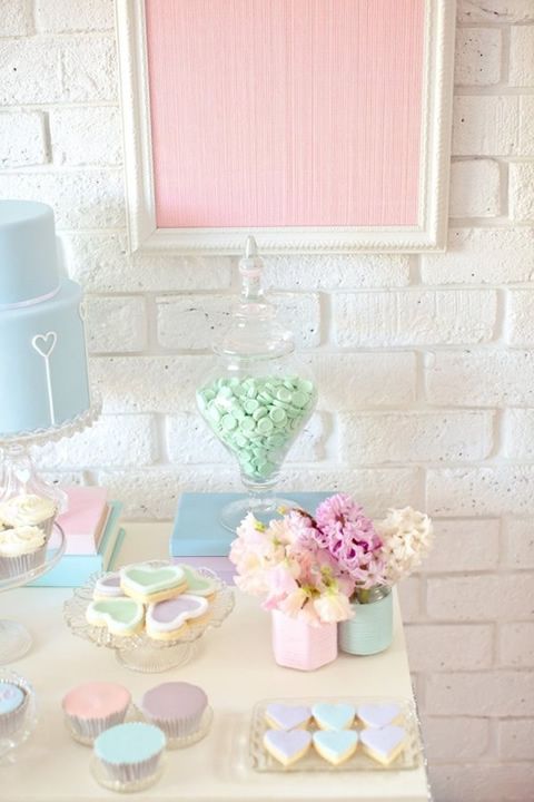
Pastel weddings work because soft color behaves like light: it fills a room without shouting. Pink, mint, powder blue, lilac, peach, and butter yellow can sit beside whites and creams so the day feels airy rather than themed. The look suits spring and summer especially well, but it also travels indoors when you control lighting and textiles. The images below show how pastels appear across flowers, tables, cakes, and fashion. Use them as a palette study, then edit ruthlessly for your own venue.
Build a palette before you buy anything
Start with two or three pastels plus a neutral. A common successful mix is blush, mint, and ivory; another is blue, lilac, and soft gray. Avoid collecting every pretty swatch you like. When too many pastels compete, the room turns muddy on camera and confused in person. Decide which color leads—usually the one in the bouquet or the linens—and let the others support.
Check your venue’s base tones. Warm wood and gold lighting push peach and cream forward. Cool stone and daylight favor mint and blue. If the walls are already saturated, keep pastels on tables and florals rather than fighting architecture with a full color wash. Sample fabrics and ribbon in the actual room if you can; phone photos of paint chips under store lights lie. Write the palette as three hex-like descriptions or fabric names on one card and share it with florist, baker, rental company, and stationer so nobody improvises a fourth family of color.
Season matters less than people think, but availability does. Spring peonies make blush easy; late summer may push you toward garden roses, dahlias in soft tones, or dyed materials used carefully. If a flower only exists in a loud saturation, skip it rather than forcing it into a soft scheme.
Flowers do the heavy lifting
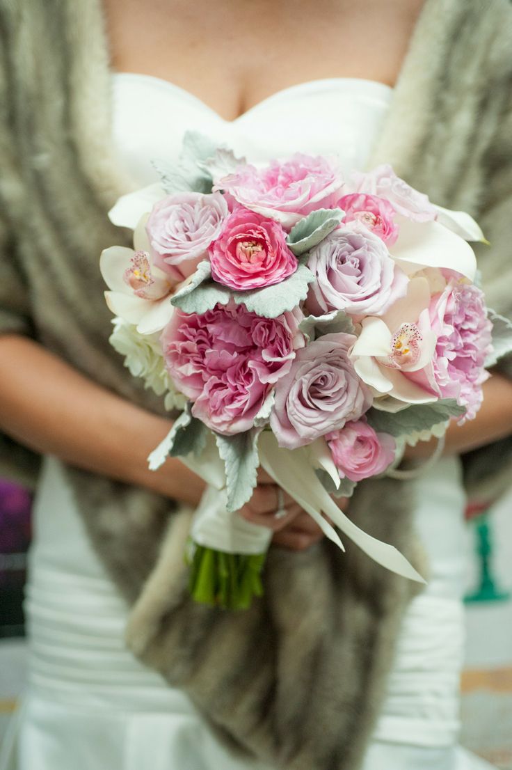
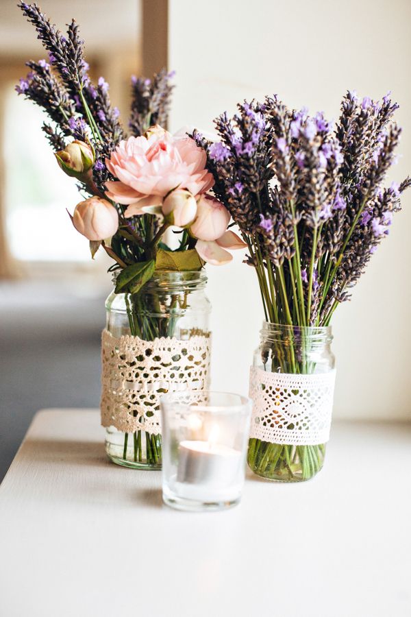
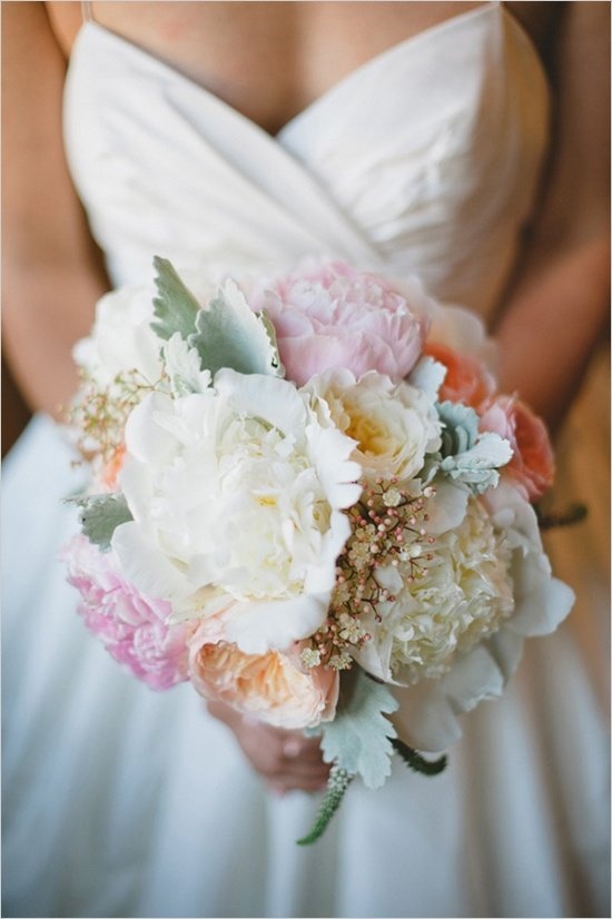
Pastel schemes live or die in the floral plan. Garden roses, peonies, ranunculus, sweet peas, stock, and hydrangeas take soft dyes and natural soft hues gracefully. Mix textures: fluffy blooms against slender stems, a few deeper buds for depth so the arrangement does not look washed out. Greenery matters more than people expect. Soft eucalyptus, dusty miller, and pale herbs keep mint and gray-green in play without forcing neon leaves into a delicate palette.
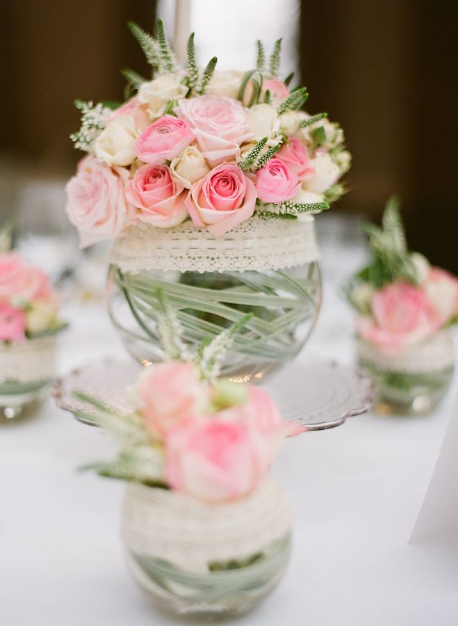
For centerpieces, repeat the bouquet language at a smaller scale rather than inventing a second color story. Low arrangements help conversation; taller ones need clear sightlines. If budget is tight, concentrate color in the ceremony backdrop and head table, then use simpler greenery elsewhere. Guests experience the strongest color moments first and last; mid-room can stay quieter. Boutonnieres and corsages should echo the bouquet, not introduce a surprise accent from a different mood board.
Ceremony florals benefit from negative space. A soft floral arch or asymmetric corner spray often looks more pastel than a dense wall that reads as one solid block. Leave room for light to move through petals; pastels need air.
Tables, paper, and small objects
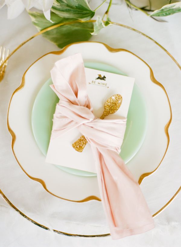
Linens in soft blush, mist blue, or pale lavender set the field. If rental options are limited, white cloth with pastel runners, napkins, or underplates still reads intentional. Candles in matching tones—or clear glass with soft ribbon—add glow without introducing a new hue. Place cards, menus, and escort displays are inexpensive places to lock the palette: letterpress or calligraphy in gray-mauve ink on cream stock often looks more refined than loud printed graphics.
Glassware and flatware should not fight the pastels. Clear, gold, or soft metallic finishes usually cooperate. Bright colored chargers can work if they match a lead pastel exactly; random accent colors rarely do. Favors are optional. If you include them, keep packaging quiet—a small ribbon or tag is enough. Table numbers can carry a watercolor wash of your lead color; they should not become a second design project.
Lighting finishes the tablescape. Warm string lights soften mint and blue; cooler LEDs can make blush look gray. Test one table under the venue’s evening lighting before you commit to hundreds of dollars in dyed napkins that shift under the wrong bulbs.
Fashion, cake, and photography notes
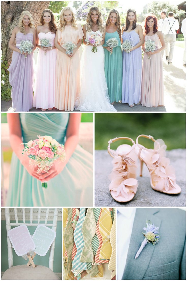
Pastel bridesmaid dresses in mismatched soft shades can look cohesive if saturation stays similar. A mint dress next to a neon mint will break the spell. For suits and ties, a single pastel accent—pocket square, tie, boutonniere ribbon—often photographs better than a full pastel suit unless that is a deliberate statement. Jewelry with pearls, soft gold, or pale stones continues the quiet luxury cue. Shoes and clutch details are good places for a private pastel joke that does not dominate the aisle.
Cakes take pastels beautifully in buttercream or watercolor fondant techniques. Keep the cake’s palette linked to the flowers rather than inventing a fourth color family. Macarons, meringues, and glazed desserts can echo the same tones on the dessert table without requiring a second design meeting. Ask the baker for a tasting board photographed in daylight and under evening light; frosting color shifts more than people expect.
Tell your photographer the palette in advance. Soft colors need careful exposure; overexposing “for brightness” can erase blush into white. Natural light and gentle fill usually flatter pastels more than harsh flash. If you plan a sunset portrait set, bring a wrap or second look that still fits the color story so the evening frames do not suddenly turn dark and unrelated. Share mood images that show texture, not only hue—linen, petal edges, matte paper—so the shoot stays tactile rather than candy-colored.
Common pastel mistakes
The first mistake is treating “pastel” as unlimited permission. Soft pink plus soft blue plus soft yellow plus soft green can cancel into visual noise. The second is ignoring contrast: a pastel room still needs darker anchors—chair frames, menu ink, a deeper bloom—so faces and edges read. The third is buying novelty items in pastel plastic that cheapen an otherwise careful scheme. Prefer real materials with soft dye over loud “cute” objects.
The fourth mistake is forgetting guest experience. Pale linens show spills; choose fabrics and service rhythms accordingly. Outdoor pastels can bleach in noon sun; schedule key photos when light is kinder, or accept that midday images will look hotter than your mood board.
A short planning sequence
- Choose lead pastel + one support + one neutral.
- Lock florals and linens to that trio.
- Match paper goods and ribbon next.
- Add fashion accents last so they do not drive the whole scheme.
- Walk the venue at the time of day you will celebrate and adjust saturation if light is warmer or cooler than expected.
- Review one sample table or mock bouquet in person before final orders.
Pastel weddings feel pretty when every object agrees on softness. Pick the shades you can live with in a hundred photographs, then stop shopping for more color. If a new idea does not fit the three-swatch card, it does not belong at the reception.

Comments
Continue reading

Funny Animal Signs That Warn People (While Animals Ignore Them)
From a seagull on a no-birds disc to classic zoo and park ironies—why animal warning signs get funny, and what the rules are still for.

How to Find Local Amenities on Vacation: Mechanics, Haircuts & More
Locate trustworthy local services and everyday spots while traveling or settling in—using publications, reviews, map apps, neighbor tips, and low-pressure exploration.

Kristen Stewart for V Magazine, Spring Preview 2013
V81’s Wild at Heart cover story—Kristen Stewart shot by Inez & Vinoodh, styled by Joe McKenna, in pale minimal spring glamour.