
Penélope Cruz for the Campari Calendar 2013
Campari’s 2013 Kiss Superstition Goodbye calendar stars Penélope Cruz in thirteen red-soaked tableaux shot by Kristian Schuller—a dated campaign gallery with fashion-house wardrobe and Milan creative credits.
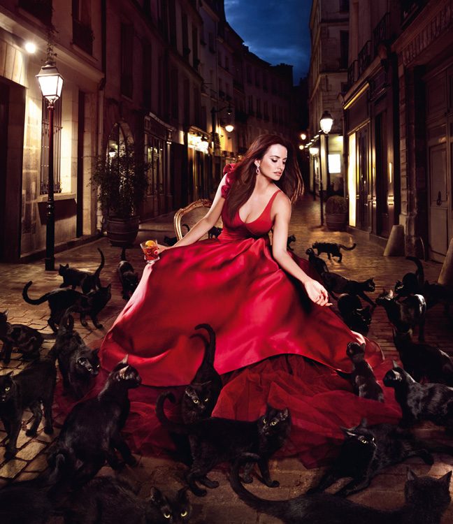
In November 2012, Gruppo Campari unveiled its fourteenth collectors’ calendar with Penélope Cruz as the face of the 2013 edition. The campaign theme was clear and deliberately mischievous: Kiss Superstition Goodbye. Across thirteen vivid images, Cruz stages the classic taboos—black cats, broken mirrors, ladders, indoor umbrellas—while the brand’s signature red runs through wardrobe, lighting, and mood. Paris-based fashion photographer Kristian Schuller shot the set; the concept came from BCube Milan, with Andrea Marzagalli as senior art director and Bruno Vohwinkel as senior copywriter. Production sat with L&A Artist in Milan. This page treats that calendar as a dated advertising object, not as today’s news.
Campari’s calendar had already built a lineage of Hollywood and fashion-world leads—Salma Hayek, Eva Mendes, Jessica Alba, Milla Jovovich among them—before Cruz joined. Her casting carried an extra Spanish-Italian resonance for a Milanese spirits house: an Oscar-winning actress whose screen persona already mixed glamour with a willingness to play darker, more theatrical notes. The brand’s public line at the time stressed confidence over fear: the number thirteen as something to celebrate rather than avoid. Cruz’s own comments in period coverage echoed that curiosity—she called the superstition brief intriguing and singled out Schuller’s eye as a reason the collaboration felt stimulating.
What the 2013 brief actually sold
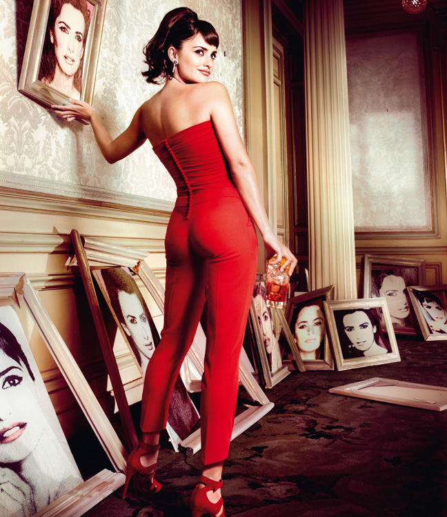
Collector calendars for spirits brands walk a narrow line. They must feel luxurious enough to keep, theatrical enough to photograph well in press kits, and on-brand enough that the bottle’s color vocabulary never disappears. Campari’s red is non-negotiable; everything else is staging. Schuller’s reputation for surreal, painterly fashion imagery made him a logical match for a superstition narrative that needed magic without tipping into cheap horror. The images read as fashion tableaux first—red-themed dresses and shoes from houses including Vivienne Westwood and Ferragamo, jewellery by Chopard—then as allegorical scenes second.
Thirteen frames matter symbolically and commercially. A calendar needs twelve months plus a cover or lead plate; Campari turned that arithmetic into the campaign’s joke. CEO Bob Kunze-Concewitz framed the edition around defying broken mirrors and mystical cats, offering “Campari lovers” an intense, pleasurable moment built on confidence. That language is period advertising copy, and it still explains why Cruz was asked to smile through omens rather than simply pose against seamless paper.
Fashion blogs and style sites that circulated the images in late 2012 treated the calendar as an event gallery: scroll the months, compare looks, note the props. The surviving pictures here keep that gallery function while the surrounding text restores the campaign credits that caption dumps usually erase.
Kristian Schuller’s theatrical stills
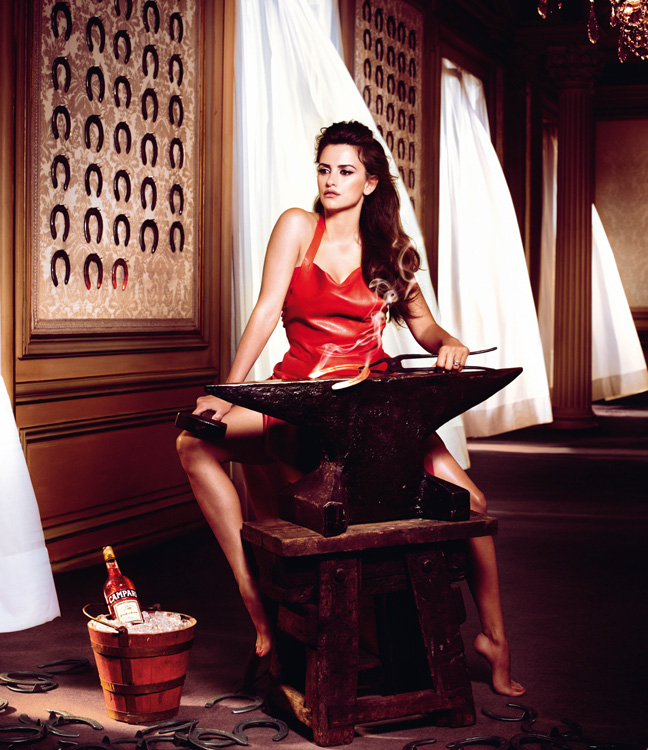
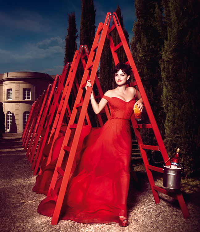
Schuller does not shoot product catalogs; he shoots scenes that behave like short films paused mid-gesture. In interviews around the launch, Cruz described his pictures as alive, almost painterly, and said she watched his technique closely because she loves photography. That collaboration tone shows in the frames: Cruz is not a passive mannequin for red satin. She leans into the props—mirrors, animals, architectural hazards—with the same physical commitment she brings to film roles.
Look for how color temperature stays warm even when the superstition prop is cold or sharp. Campari red saturates fabric and lipstick; shadows deepen without turning the set into a noir pastiche. Jewellery catches hard light so that Chopard pieces register at calendar scale, where viewers often encounter the work as screen-sized crops rather than wall prints. Shoes and hems become secondary characters because full-length calendar pages reward silhouette as much as face.
The superstition props themselves are readable at a glance. That is advertising discipline. A black cat must parse in a thumbnail; a ladder must not become an abstract graphic; a broken mirror must still show Cruz’s face in fragments. Schuller’s surreal lean helps the props feel enchanted rather than documentary. You are not watching a safety brochure. You are watching a fashion myth about luck.
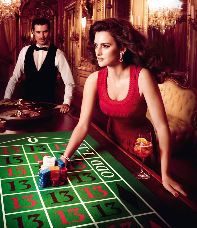

How Cruz fits the Campari calendar tradition
Previous Campari calendar stars sold different facets of the brand’s Italian-glamour fantasy: old Hollywood sheen, beach-body Americana, Euro-chic severity. Cruz brought Spanish screen intensity and a proven appetite for stylized fashion storytelling. Period press noted that some people asked whether the superstition concept was too odd; she treated that oddness as a reason to say yes. That anecdote matters historically because it explains the campaign’s tone—playful defiance rather than pure seduction.
Her involvement reportedly extended beyond a single studio day: look collaboration, styling conversations, and a desire for mutual satisfaction between actress, photographer, and brand. Whether every detail of that process survived in every market’s press kit, the published images still show a performer who understands stills as acting. Mouth, hands, and eye-line change from plate to plate. The calendar becomes a character study in red.
For archive readers in 2012–2013 fashion media, the Cruz calendar sat beside other celebrity fashion events of the season. Filing it correctly means keeping the year, the brand, the photographer, and the theme together. Strip any of those and the pictures become generic “Cruz in red” glamour—which is precisely what the superstition brief was designed to avoid.
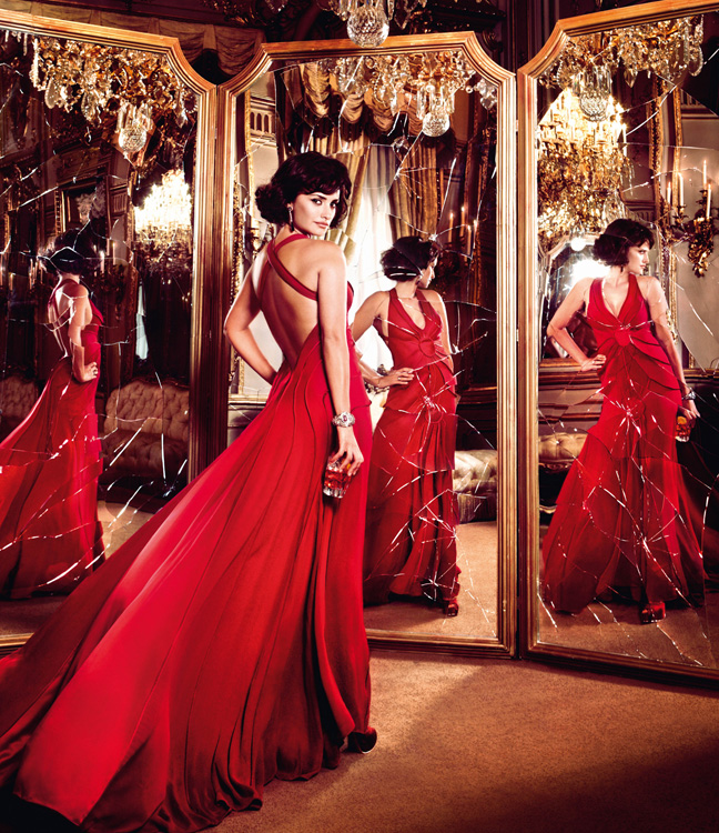
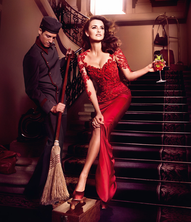
Reading the set month by month
Move through the gallery as if you were flipping a printed calendar on a bar wall or a collector’s shelf. Ask what each plate sells: face, silhouette, prop, or all three. Notice how often Cruz meets the camera versus how often she performs for an unseen omen. Calendar photography has to work both as a single hero image and as a sequence you revisit across a year. Schuller’s theatrical continuity—color, lighting grammar, Cruz’s physical authority—keeps the months related without making them identical.
Also notice what is absent. There is no attempt here to turn the campaign into a modern career retrospective or a “where is she now” feature. The useful historical reading stays inside the 2012 launch window and the 2013 wall year the calendar was meant to mark. Fashion houses named in the release are credits for that sitting, not an open invitation to rewrite the piece as a Westwood or Ferragamo story. Campari remains the commissioning brand; Cruz remains the protagonist; Schuller remains the author of the stills.
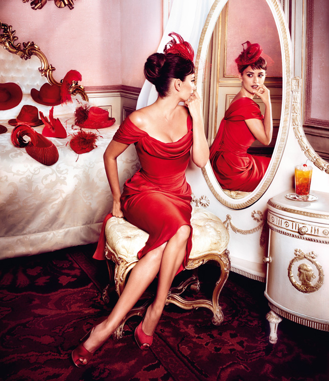
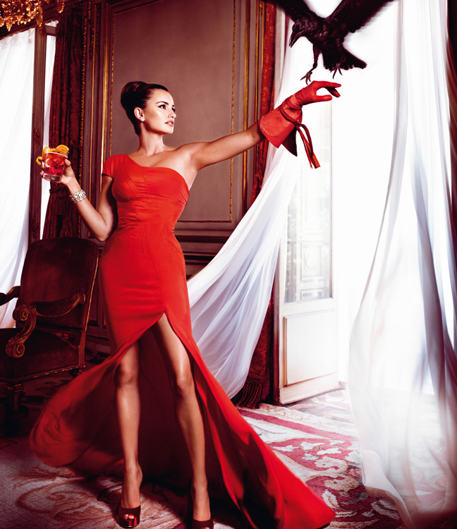

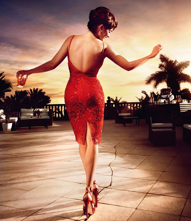
If you are filing this campaign for research, keep five facts beside the images: Campari Calendar 2013; theme Kiss Superstition Goodbye; star Penélope Cruz; photographer Kristian Schuller; creative concept by BCube Milan. Then pick one plate where the prop and the red dress fight for attention—and decide which wins. That small argument is what made the fourteenth edition more than another celebrity liquor calendar hanging in a back bar.

Comments
Continue reading

Bar Refaeli for Passionata Lingerie, Spring/Summer 2013
Bar Refaeli as Passionata’s Spring/Summer 2013 face—a retro housewife-pinup lingerie campaign from early-2010s fashion advertising.

Alessandra Ambrosio for Arkitect’s Summer 2013 Campaign
A look back at Alessandra Ambrosio’s Arkitect summer 2013 campaign—bright commercial fashion photography from the Victoria’s Secret era.
Beyoncé for H&M, Summer 2013
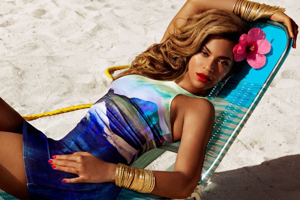
Beyoncé as Mrs. Carter in H&M’s summer 2013 campaign—Bahamas shoot by Inez & Vinoodh, elemental concept, swim and sundress gallery.