
Chungkong’s Minimal Movie Posters
Netherlands designer Chungkong strips cult films to one image, one quote, and a playful color field—flat graphic posters built after hours from advertising craft.
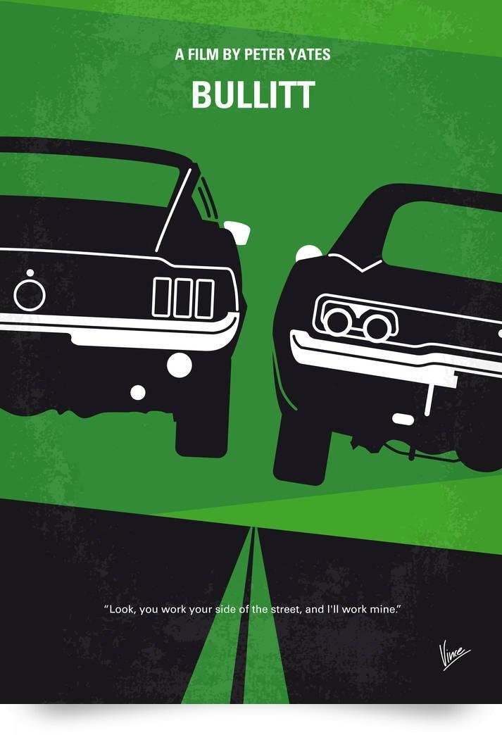
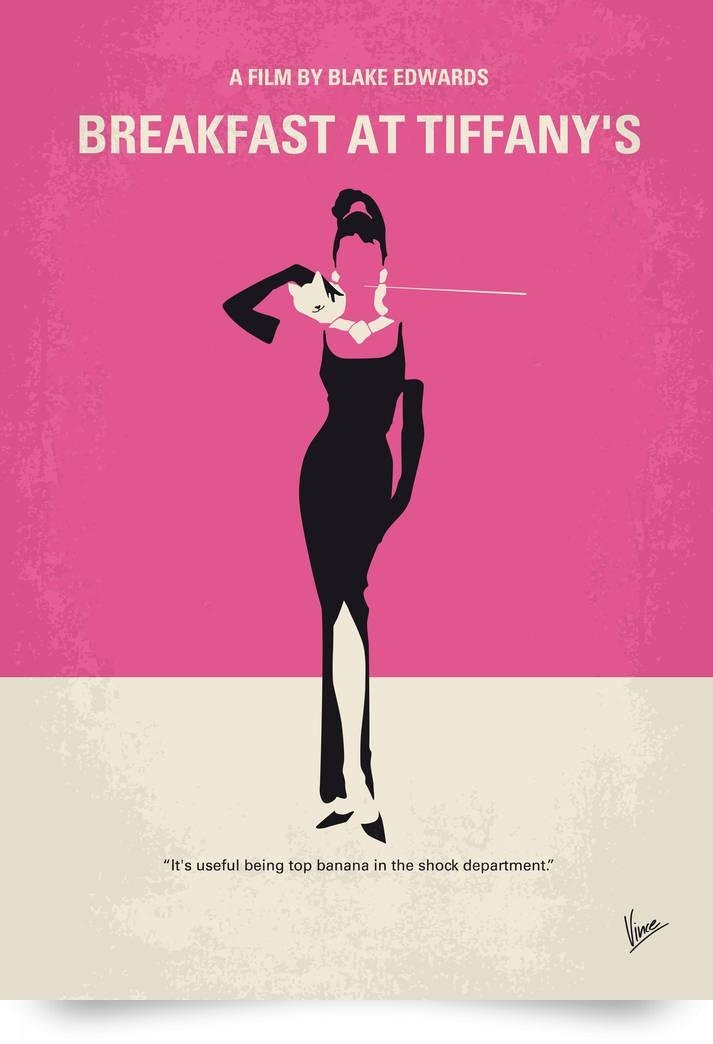
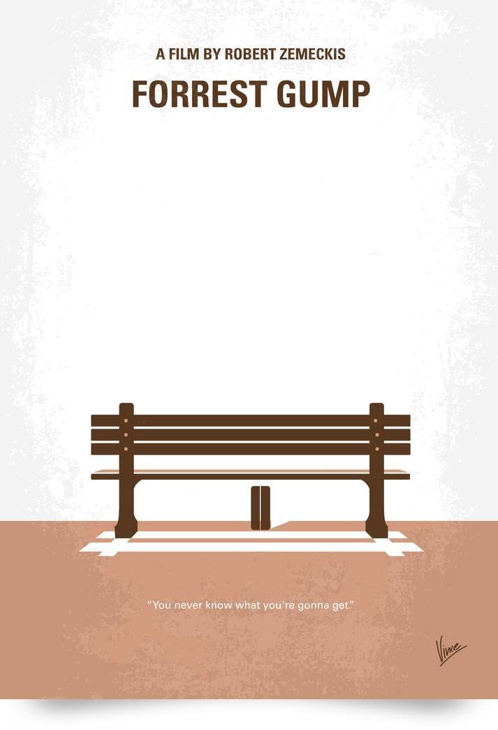
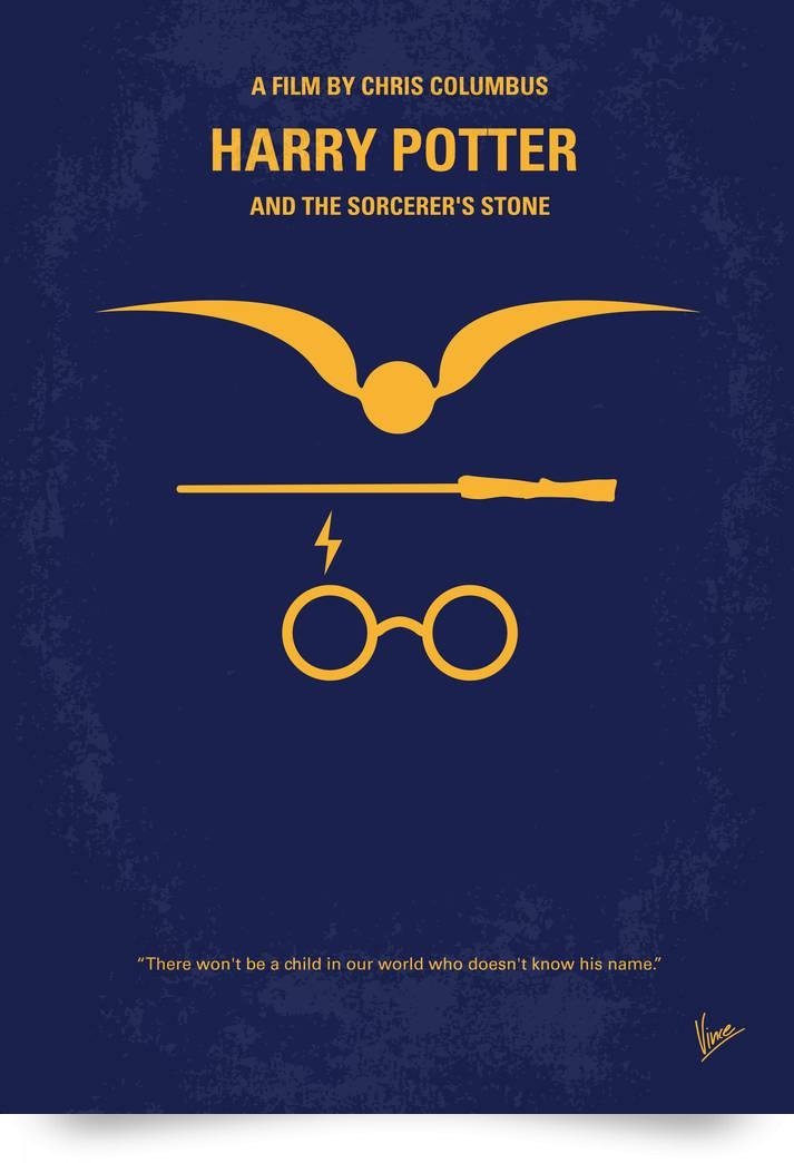
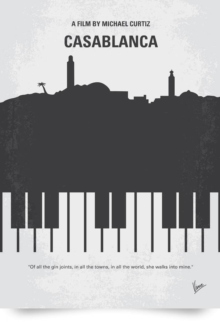
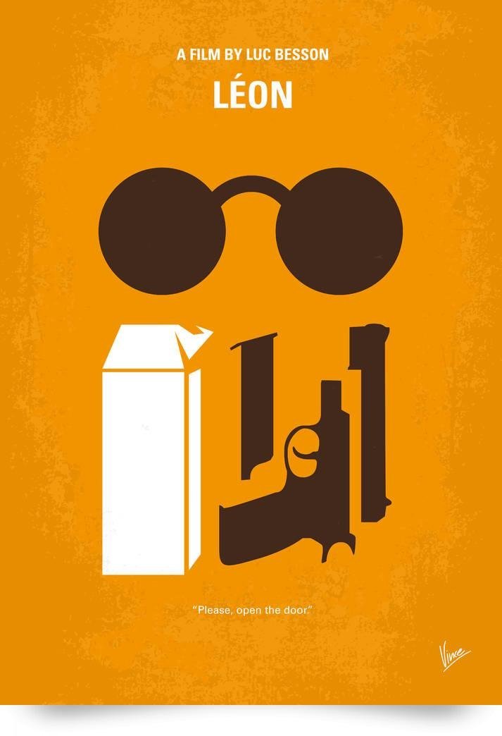
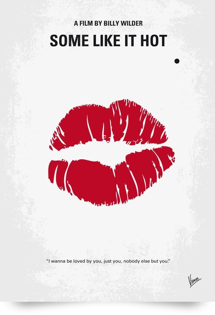
Netherlands-based graphic designer Chungkong built a second life after office hours: while daylight belongs to client advertising and brand identities, evenings belong to an expanding archive of minimal movie posters. The project treats cinema like a design problem. Strip a film to one image, one quote, one color story, and ask whether a viewer still recognizes the title before reading the type. When the answer is yes, the poster works. When the answer is almost, the joke is still half-formed and the designer keeps cutting.
By the mid-2010s, that night practice had already become a recognizable internet genre piece—flat shapes, playful wit, cult titles, and a refusal to clutter the frame with every cast credit a studio marketing department usually demands. Chungkong’s language is simple on purpose. Humor does the heavy lifting. A silhouette, a prop, a fragment of architecture, or a single iconic object has to carry the plot. The viewer supplies the rest from memory.
What “minimal” means in these posters
Minimalism here is not emptiness for its own sake. It is compression. Official movie marketing often stacks faces, taglines, release dates, critic quotes, and franchise logos until the sheet looks like a press kit. Chungkong’s posters reverse that hierarchy. The illustration becomes the headline. Typography stays quiet and functional—title, sometimes a director credit, often a short line of dialogue at the bottom. Negative space is not leftover; it is the room the joke needs to breathe.
That approach rewards film literacy. If you know the movie, the poster feels inevitable. If you do not, the design still reads as a sharp graphic, but the punchline waits for a second look or a whispered title from a friend. The best pieces in the series sit on that edge: instantly legible to fans, still elegant to strangers. They are closer to pictograms than to trailer stills.
Color decisions matter as much as drawing. Saturated fields and limited palettes make the posters work at small phone sizes and large print sizes alike. A single accent hue can stand in for an entire mood—noir cool, pulp heat, sci-fi chill, comedy brightness. Because the compositions are so reduced, wrong color is fatal. Right color feels like casting.
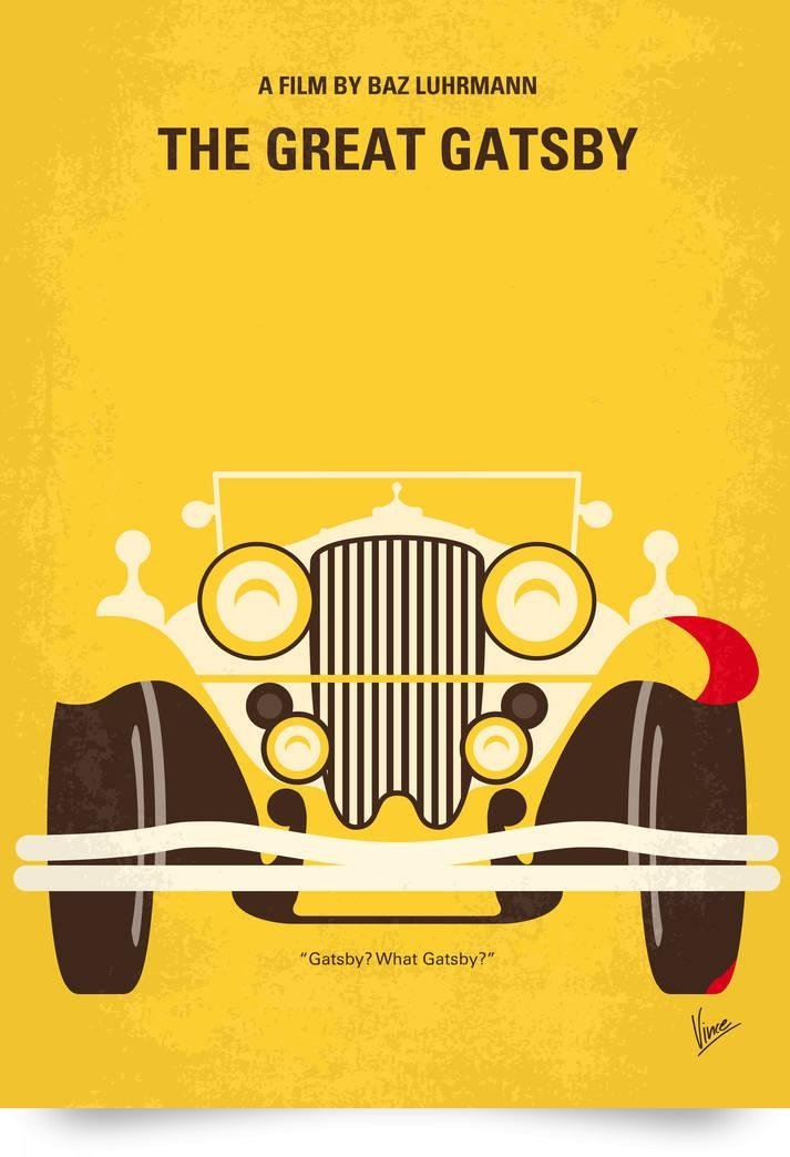
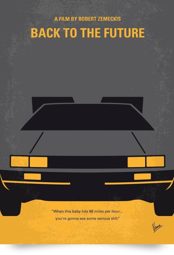
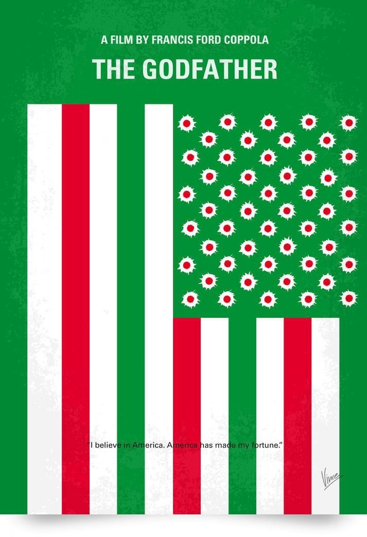
Day job craft, night job obsession
Chungkong has described the poster habit as something that began as a strange, pleasant hobby and hardened into compulsion: watch a film, then immediately ask what the minimal version would look like. That loop matters editorially. These are not one-off viral gimmicks. They are a catalogue practice—title after title, year after year—closer to a lifelong sketchbook than to a seasonal portfolio drop.
Training shows through the polish. Client work forces clarity, hierarchy, and brand restraint. The posters borrow those professional muscles and aim them at popular culture. You can feel advertising discipline in the way each sheet resolves in a second, then rewards a longer stare. Dutch graphic traditions of reduction and directness also sit in the background; Chungkong has pointed to figures such as Dick Bruna as models for how much meaning a simple shape can carry when the designer trusts the audience.
Subjects spill beyond cinema. Cult movies remain the center of gravity, but the same method has been applied to music, sports, books, and geek-culture icons. The movie posters still define the public image of the project because film memory is shared so widely. A sports poster may delight a niche. A film poster can stop a stranger in a feed because the story already lives in their head.
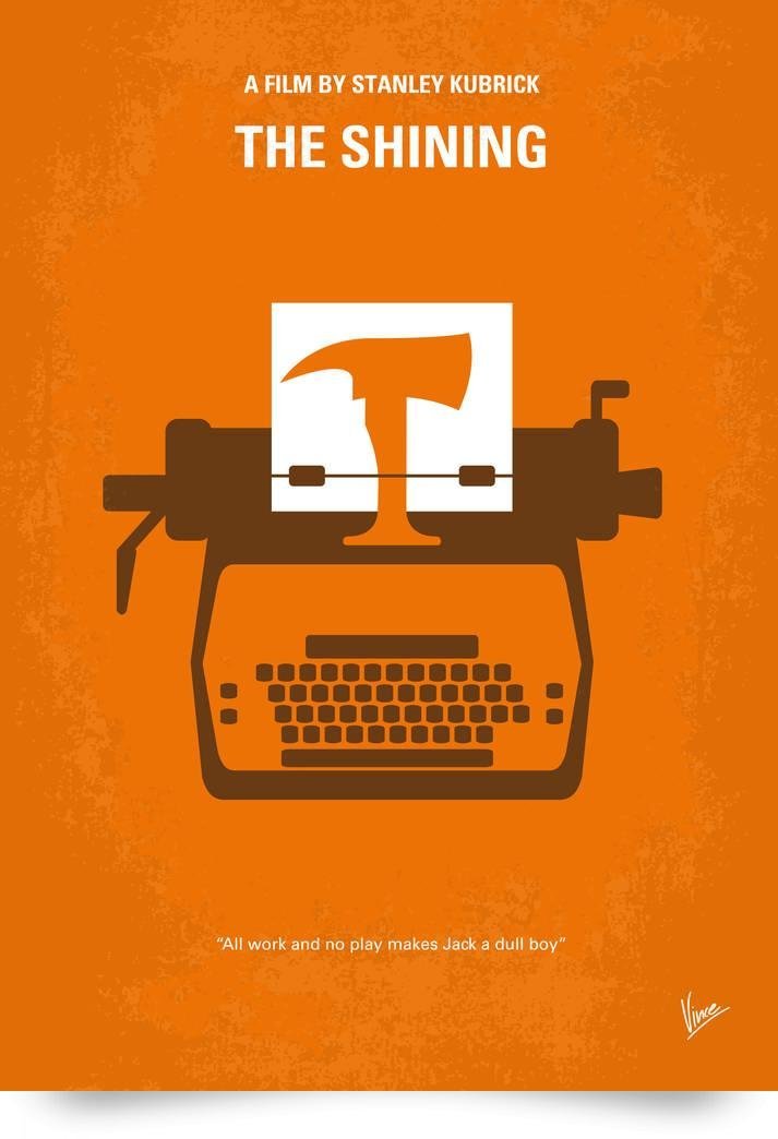
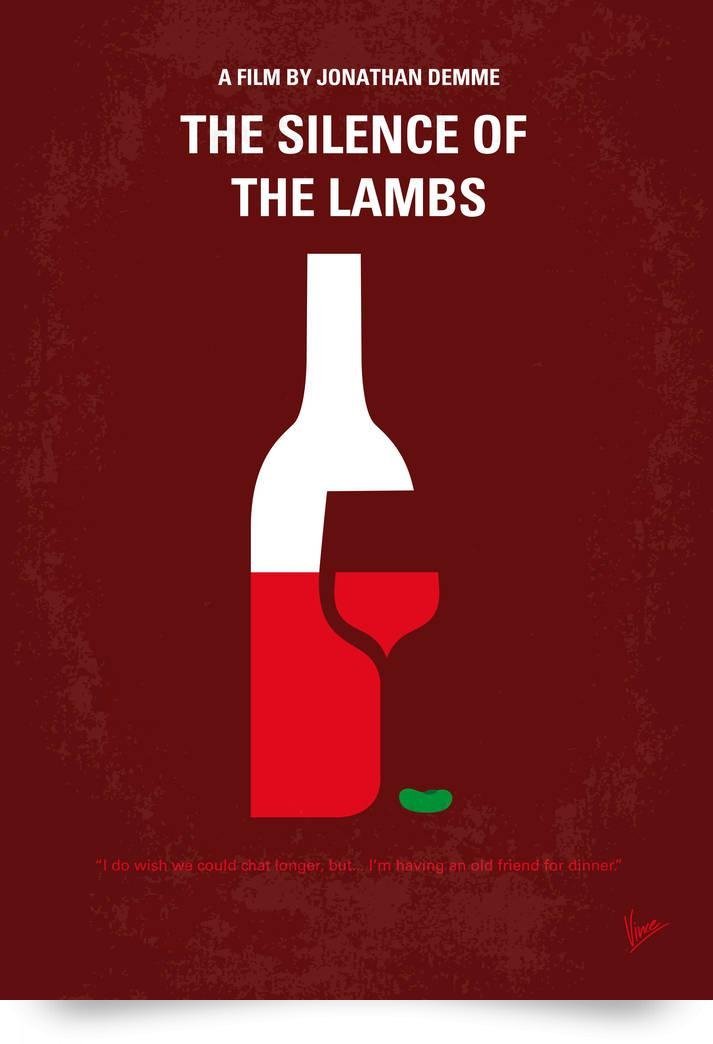
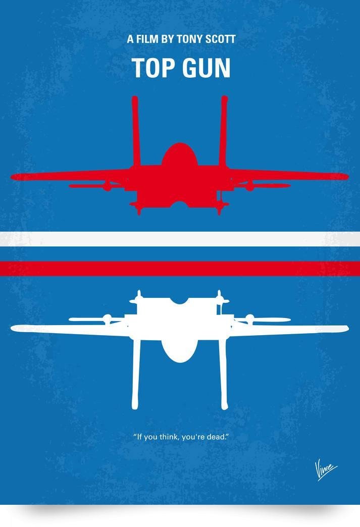
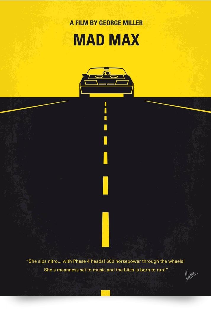
How to read this gallery
Move through the images as if you are testing a memory game rather than browsing décor. For each poster, pause before the title settles and ask three questions:
- What object or shape is doing the storytelling? A prop, silhouette, or environment fragment usually carries the whole plot.
- What did the designer refuse to include? Missing faces, missing explosions, and missing franchise noise are often the cleverest choices.
- Would the joke survive in black and white? If yes, the structure is strong. If no, color is carrying meaning the drawing alone cannot.
That reading habit separates Chungkong’s project from generic “clean poster” mood boards. The point is not merely fewer elements. The point is choosing the one element that behaves like a key. Good keys unlock recognition. Great keys unlock recognition and a smile at the same time.
Also notice rhythm across the set. Some posters are almost pictogram-pure. Others allow a little more narrative staging. Variety inside a strict system is what keeps a long series from going stale. The rule—“strip it down”—stays fixed; the punchline changes with every film.
Flat design, not miniature worlds
It helps to keep Chungkong’s medium clear, especially if you arrive here from other “minimal” art posts. This is graphic design on a flat plane: illustration, type, color fields, and the memory of cinema. It is not tabletop photography. It is not food diorama work. It is not a physical set built from crackers or cauliflower. The reduction happens in drawing and layout, not in scale tricks with objects on a desk.
That distinction protects the artist’s signature. Many internet galleries blur every clever reduction into one aesthetic bucket labeled “minimal.” Chungkong’s posters belong specifically to poster culture—wall art that behaves like a logo for a story you already love. The craft question is always graphic: Can a film become a mark?
Collectors and casual fans responded for the same reason designers did. The pieces are easy to hang, easy to share, and easy to argue about. Friends can disagree about which film is better and still agree that the poster distilled the right icon. In an era when official marketing often feels overproduced, a one-idea sheet can look almost radical.
A practical takeaway for designers
If you steal one exercise from Chungkong’s archive, make it this: pick a film you know too well, ban every face, and force yourself to sell the story with one object and two colors. Then add a quote only if the image still needs a caption. Most first drafts fail because they keep too much. The useful failure teaches hierarchy faster than another tutorial about grids.
Look again at the posters on this page with that exercise in mind. Notice where a tiny illustration carries a whole franchise memory. Notice where humor arrives from understatement rather than from a gag doodle. And notice how often the “simple” solution is actually the bravest one—because once you remove the safe clutter of marketing chrome, every remaining line has to be right.

Comments
Continue reading

Funny Animal Signs That Warn People (While Animals Ignore Them)
From a seagull on a no-birds disc to classic zoo and park ironies—why animal warning signs get funny, and what the rules are still for.

How to Find Local Amenities on Vacation: Mechanics, Haircuts & More
Locate trustworthy local services and everyday spots while traveling or settling in—using publications, reviews, map apps, neighbor tips, and low-pressure exploration.

Kristen Stewart for V Magazine, Spring Preview 2013
V81’s Wild at Heart cover story—Kristen Stewart shot by Inez & Vinoodh, styled by Joe McKenna, in pale minimal spring glamour.