
Wandson Lisboa’s Magic Wand: Design, Toys, and Instagram Play
A profile of Wandson Lisboa—Brazilian-born, Porto-based designer and visual artist—whose Instagram squares turn toys, friends, and primary color into finished little worlds.
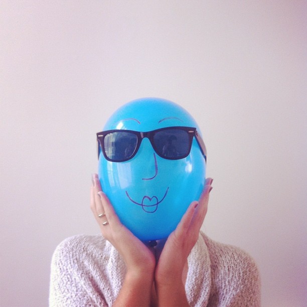
Wandson Lisboa answers to Wand among friends, and the nickname fits. His pictures feel like a magician’s pocket show: bright props, perfect timing, and a punchline you understand before you finish reading the caption. Born in Brazil and living in Porto, Portugal, he built a public practice at the meeting point of graphic design, phone photography, and pop-culture play—especially the kind that fits inside an Instagram square.
Early profiles liked to introduce him with a wink: a professional internet user who designs in the leftover hours, whose favorite catchphrase is “put a like on it,” whose favorite rhetorical tool is the hashtag, whose iPhone never dies mid-idea, whose favorite color is Pantone, whose favorite book is the App Store, and who shares a house in Oporto with no cats. The joke bio is affectionate, not mocking. It describes a creative life that treats the feed as both diary and portfolio—and refuses to apologize for joy.
That tone is the first thing to preserve when you look at his work. Many online portfolios perform seriousness. Wandson Lisboa performs delight with design-school discipline. The combination is rarer than either quality alone.
From Maranhão to Porto
Wandson Lisboa’s path runs from Maranhão, Brazil, to design study and a life based in Porto. That geography matters to the work. Brazilian color memory—bold primaries, carnival brightness, cartoon clarity—meets Portuguese streets, tiles, cafes, and gray Atlantic light. The clash becomes a style: saturated objects against ordinary urban backdrops; toys and icons staged like fashion editorials; friends turned into characters inside tiny narratives.
He trained in communication, advertising, and graphic design, then kept using social media the way many designers once used sketchbooks. Posts document odd foods, funny words, strange objects, and sudden ideas. Nothing gets over-polished into corporate emptiness. The charm is that the craft is real while the tone stays playful. You can sense a layout brain even when the subject is Woody from Toy Story posing like a celebrity.
Moving countries often forces a creative person to rebuild an audience from scratch. Instagram became that rebuilding site: portable, visual, and friendly to someone who thinks in posters. Porto supplied endless textured walls and soft daylight. Maranhão supplied the courage to keep color loud.
The Instagram square as stage
Before every brand wanted a “creative partner,” Wandson Lisboa treated Instagram as a personal theatre. The square is a poster. Color blocking does the job of typography. Negative space is intentional. A toy, a snack, a sneaker, or a friend becomes the hero product for three seconds of scroll time. Hashtags operate like chorus lines—half joke, half filing system.
That approach is why lists of inventive Instagram accounts began naming him. The feed does not rely on luxury travel flexes or anonymous stock aesthetics. It relies on personality and concept. You recognize a Wandson frame the way you recognize a designer’s portfolio page: confident palette, clean silhouette, one idea executed all the way.
Battery anxiety is part of the lore for a reason. Much of the magic happens in motion—between a cafe table and a sidewalk, between a rehearsal with friends and a sudden prop gag. The phone is the camera, the studio light is whatever the city gives, and the deadline is the mood before it fades. Graphic design training then finishes what the street starts: cropping, color, sequencing, and the courage to post something silly with professional finish.
Sequence matters as much as single frames. A strong grid reads like a magazine spread when you open the profile. Alternating close-ups and wide jokes, warm and cool accents, human faces and object still lifes—those rhythms are editorial decisions, not accidents of uploading.
Toys, friends, and pop icons
Woody is not a random mascot. Toy Story figures carry nostalgia that crosses languages, which lets Wandson Lisboa build scenes without long captions. A cowboy doll in a new context becomes instant surrealism for adults who still remember the movie. Friends appear with the same generosity—posed, styled, and celebrated rather than used as anonymous extras. The work is social in the old sense: made with people, for people, about the pleasure of looking together.
Primary colors do heavy lifting. Red, yellow, and blue read as children’s-book clarity even when the composition is sophisticated. Surreal twists stay friendly—more daydream than nightmare. That warmth separates his visual voice from colder digital collage trends. Where some surreal feeds chase uncanny dread, Wandson Lisboa chases delight and recognition.
Pop culture here is raw material, not name-dropping. A character, logo shape, or snack package becomes a formal element—a red rectangle, a yellow oval, a silhouette—before it becomes a reference. Designers will notice that order of operations. Fans will just laugh and hit like, which is fine; the picture works on both levels.
Design brain, photographer’s timing
Call him a photographer and you miss the layout intelligence. Call him only a designer and you miss the timing of the shutter and the street. The interesting zone is between. He stages like an art director and captures like someone who knows the joke dies if you overthink it for twenty minutes. That dual skill later made brand collaborations feel natural—major entertainment, telecom, and retail names among them—because he already spoke fluent campaign language in personal posts.
Still, the heart of the practice remains the small daily invention. A visual diary that refuses to delete the weird entries becomes a long-term archive of taste. Looking back across years of squares, you see consistency: humor without cruelty, pop without emptiness, craft without stiff perfectionism.
Art direction for clients asks for the same muscles: brief, concept, prop, light, crop, publish. The difference is budget and paperwork. The Instagram years were unpaid R&D that happened to be public. Many designers hide experiments; Wandson Lisboa made the experiments the show.
How to read a Wandson picture
Ask three questions. What is the single idea? Which color carries the emotion? What ordinary Porto (or travel) background makes the prop feel newly strange? If you can answer those, you have the method. Aspiring creators often copy props and miss the harder part—the editorial decision to keep one idea and throw the rest away.
Also notice the absence of apology. Silly subjects get serious production. That permission slip is contagious. Designers who only show “serious” work online can learn from a feed that treats joy as a brief worth pitching. Try posting one fully finished joke this week with the same care you give a client PDF. The exercise reveals how much polish humor can carry.
Look for edges. Clean silhouettes against soft walls. Color echoes between clothing and object. Empty margins that behave like brand guidelines. Those quiet choices are where the “magic wand” actually lives.
The wand without the smoke machine
Wandson Lisboa’s wand is not software mystique; it is the habit of transforming whatever is at hand—an action figure, a friend’s laugh, a Pantone-bright object, a charged phone—into a complete little world. Graphic design supplies the grammar. Instagram supplies the stage. Porto and Maranhão supply the accents. The audience supplies the likes he jokes about chasing, and sometimes those likes are the least interesting part of the trick.
Scroll the image above slowly. Look for the design decisions hiding inside the play: edge alignment, color echo, empty space that behaves like a margin. Then try the same rules on your own table tonight with one object and one clean background. You may not become Wandson Lisboa, but you will understand why his particular magic wand keeps working—because it starts with attention, ends with a smile, and never waits for a bigger budget to begin.

Comments
Continue reading
20 Tasty Instagram Accounts for Food Lovers and Photographers
Twenty food Instagram handles—from Ida Skivenes and Jamie Oliver to Minimalist Baker, Local Milk, and Drizzle & Dip—kept as a tasting list without fake follower counts.
20 Instagram Accounts Travel Lovers Still Hunt For Inspiration
Twenty travel Instagram handles—from Nat Geo and Murad Osmann to Legal Nomads, Skimbaco, and Young Adventuress—preserved as a discovery list without fake follower counts.

Dramatic Photo Art by Sukron Ma’mun (Ipoenk Graphic)
Cirebon, Indonesia photographer Sukron Ma’mun uses theatrical natural light to frame village life, play, and place in lyrical photo art.