
Irina Shayk in Sports Illustrated Swimsuit 2013: Seville with Alex Cayley
A gallery feature on Irina Shayk’s 2013 Sports Illustrated Swimsuit shoot in Seville—tiled stairs, stone light, and bullring pageantry by Alex Cayley.
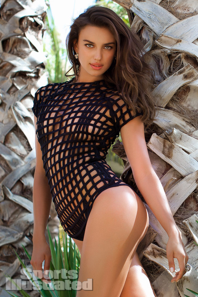
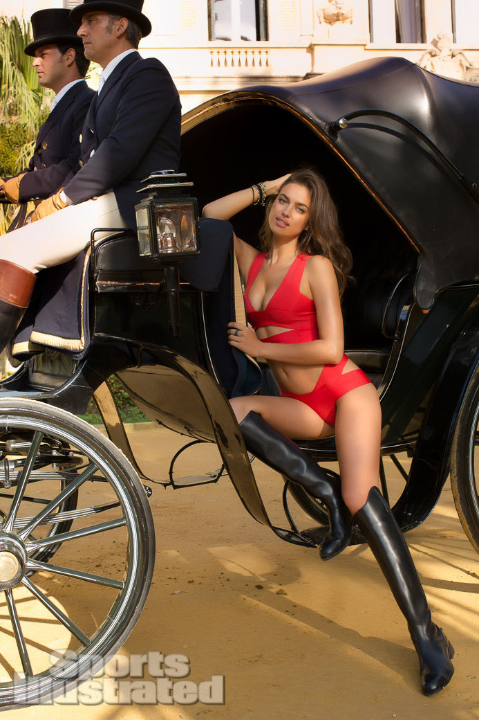
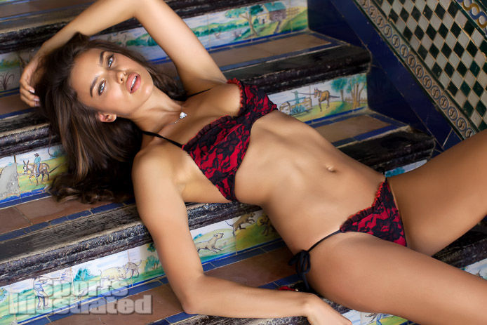
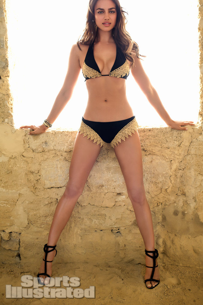
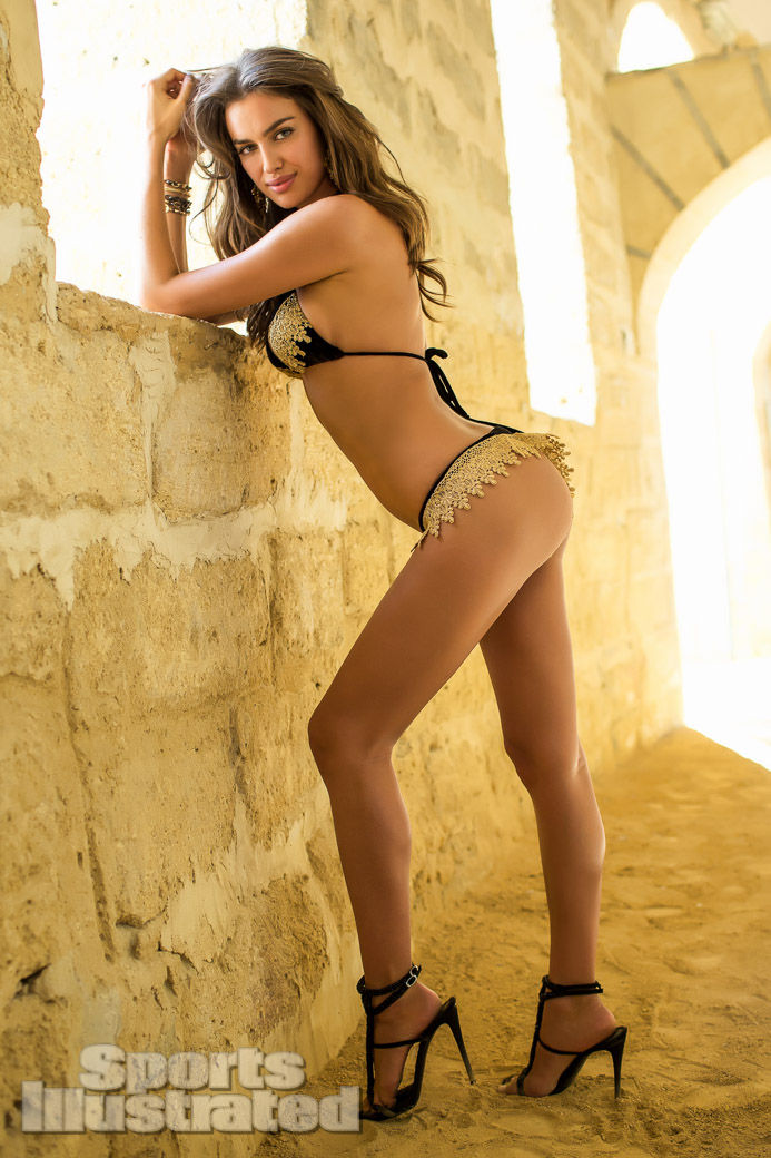
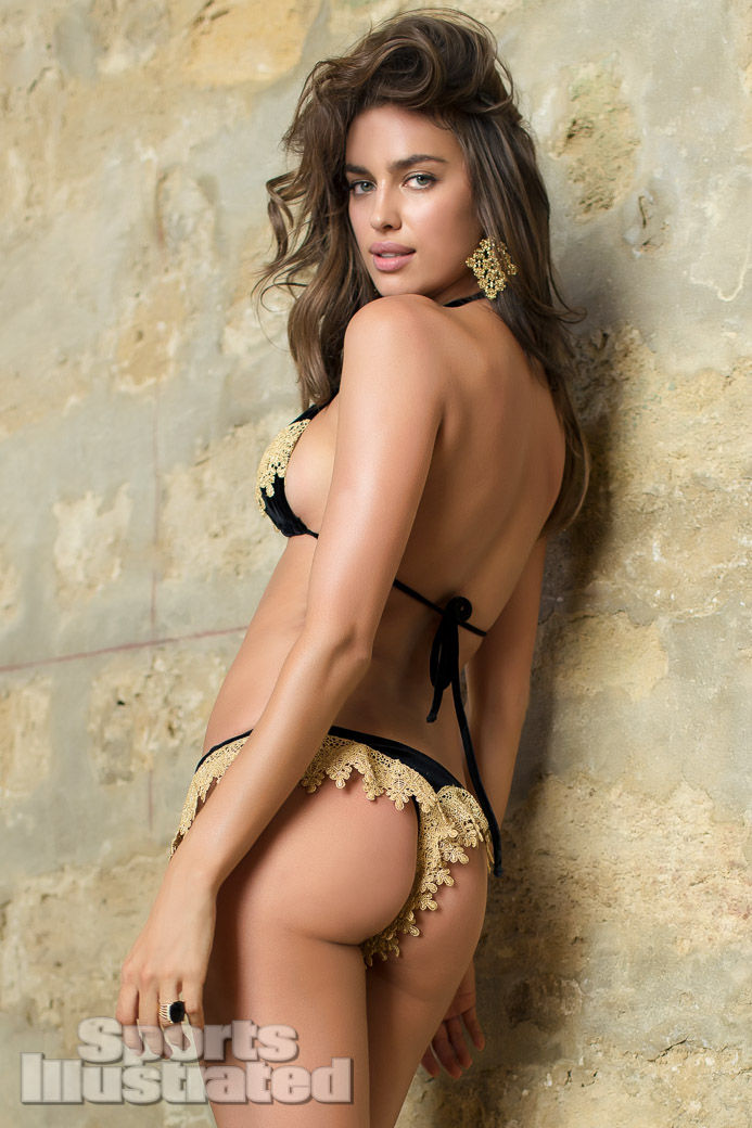
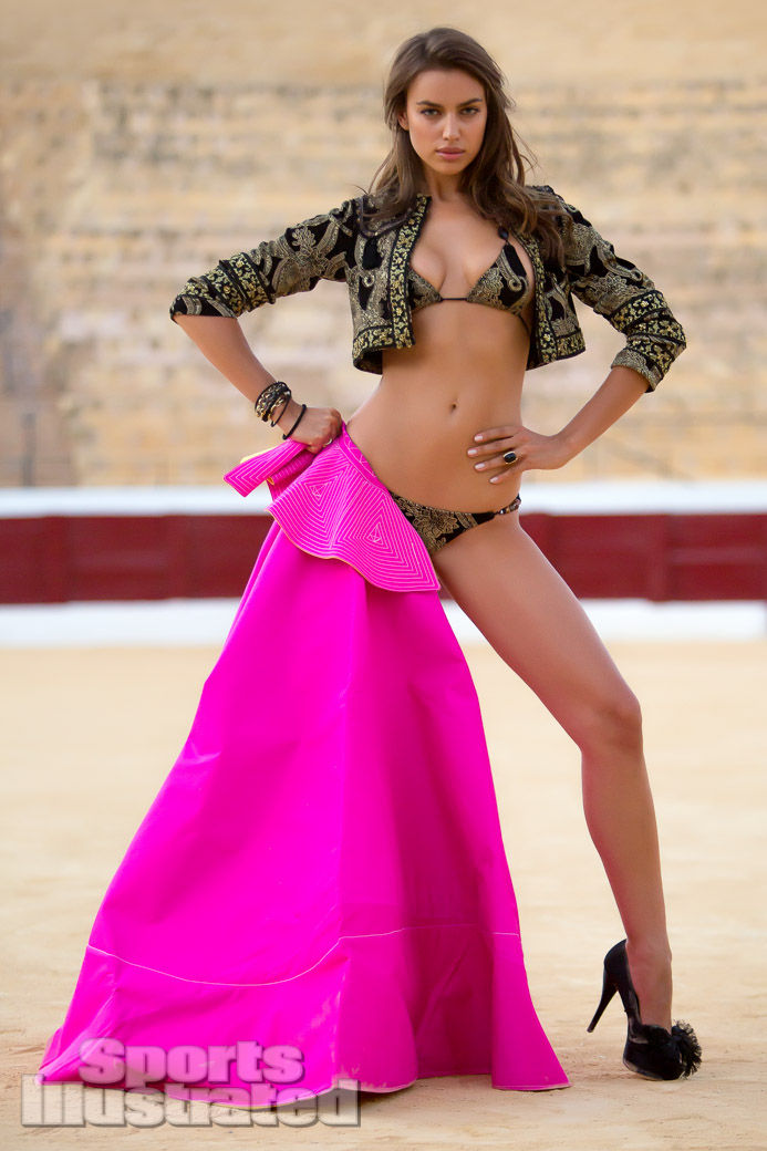
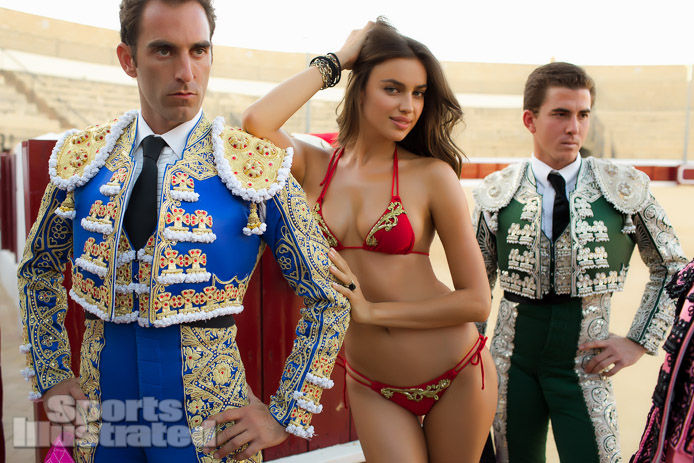
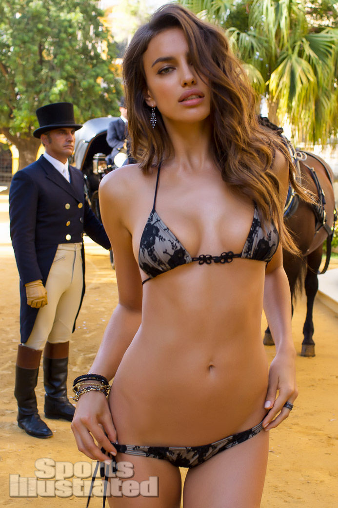
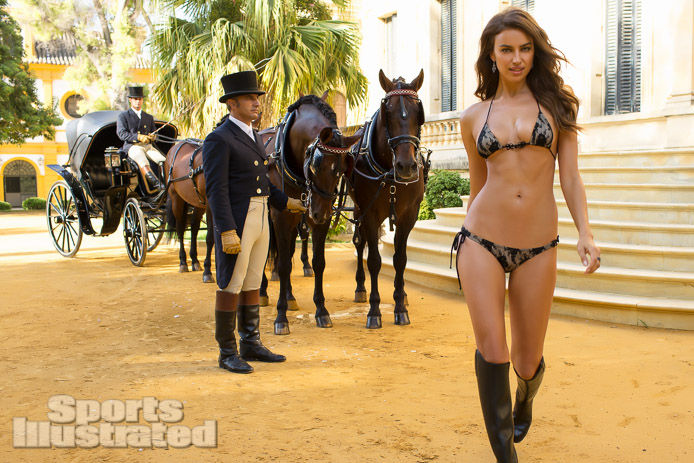
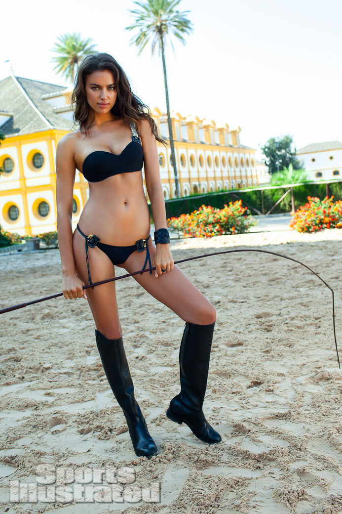
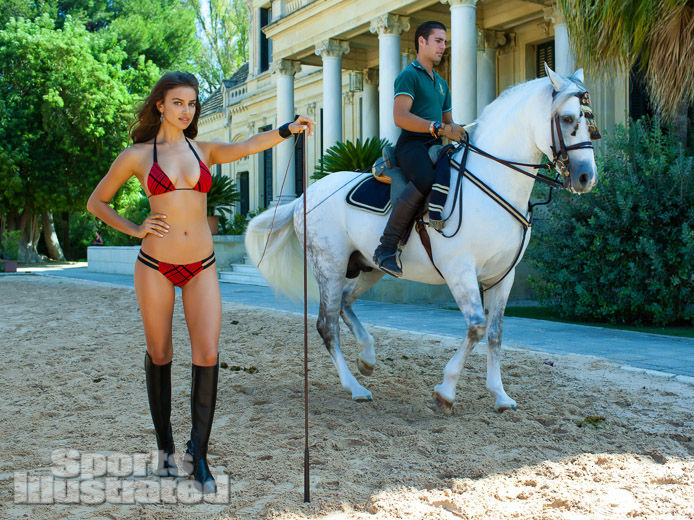
Sports Illustrated’s 2013 Swimsuit Issue placed Irina Shayk in Seville, Spain, with photographer Alex Cayley. The assignment belonged to a different genus than her commercial brand work that year. SI Swimsuit sells a magazine fantasy of place: architecture, light, local texture, and swimwear styled as travel editorial. In Seville that meant tiled stairs with painted horseback scenes, sun-bleached stone openings, palm-edged outdoor frames, geometric mosaic walls, and—most memorably in this set—a bullring sequence with matadors in full suit-of-lights embroidery flanking a red-and-gold bikini.
By 2013 Shayk was already deep into her SI tenure. She had debuted years earlier and taken the cover in 2011. The Seville chapter is best read as mid-run destination storytelling: a model who knew the franchise’s grammar, dropped into Andalusian heat and pageantry. This gallery gathers frames from that issue’s circulation—vertical portraits and wider cultural tableaux—without treating the shoot as breaking news or modern tabloid fuel. It is a dated magazine package, and that is its value for anyone searching the URL today.
Seville as the real co-star
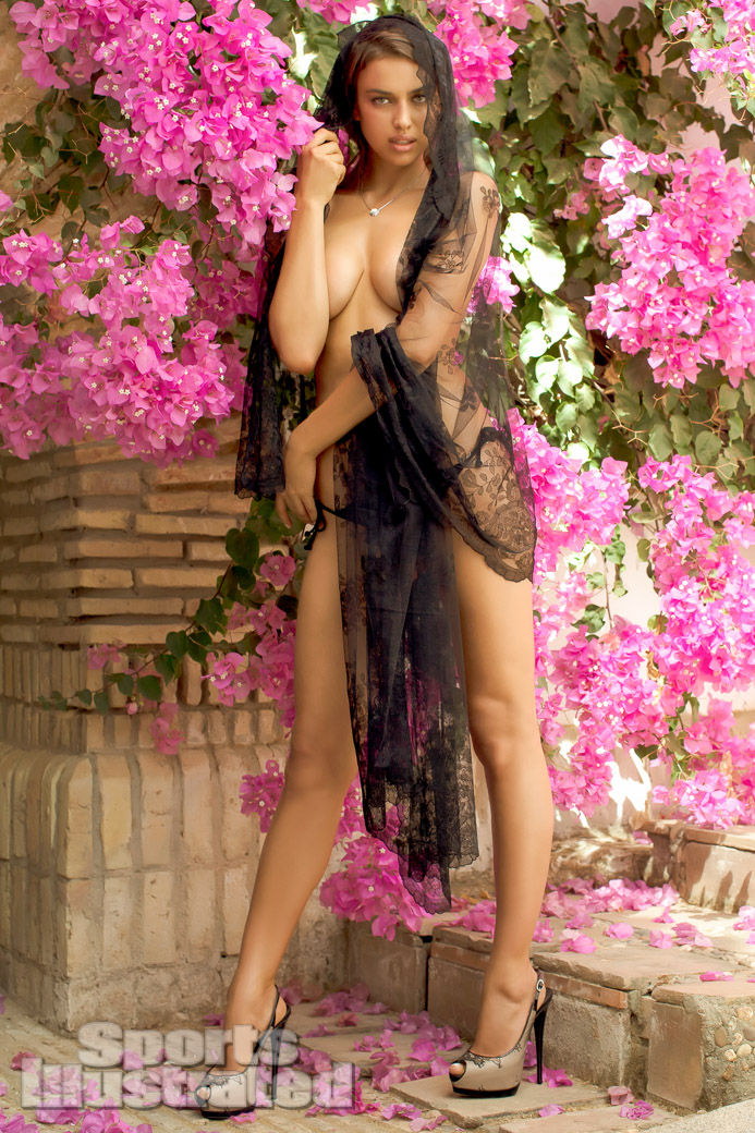
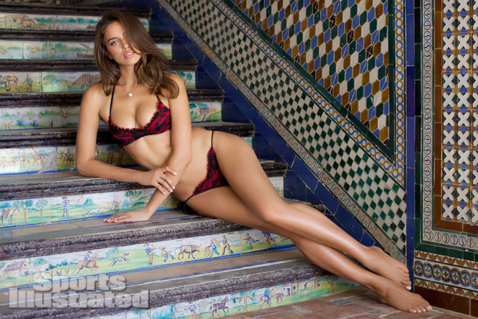
Destination swimsuit editorials live or die by location. Seville offered SI a dense visual toolkit that a generic beach club in any country could not match. Painted ceramic stair risers turn a reclining pose into a conversation with folk imagery—horses, rural figures, pottery storytelling baked into the architecture. Geometric mosaics in blue, green, ochre, and white give lace something historic to compete with. Rough stone windows blasted with white midday light create halos that no softbox can fake honestly. The circular drama of a plaza de toros supplies theater architecture—tiered seating, wooden barriers, open sky—ready-made for a wide frame.
Cayley’s photographs use those surfaces as characters. A red lace two-piece on hand-painted tiles is not the same sentence as a red lace two-piece on seamless paper. The city supplies history; the swimsuit supplies fashion; the model supplies continuity across SI’s annual cast. Period local coverage noted Shayk working around Seville’s bullring and street life during the production window. In the gallery, that cultural brief becomes literal when matadors in blue and green embroidered jackets stand beside her in the arena’s bright sun. The image is theatrical on purpose. SI Swimsuit often borrows local costume and landmark energy to distinguish one year’s travel package from the last. Seville’s iconography—toreros, tendidos seating, hard southern light—does that work without needing a long caption essay under every frame.
Editorial swimwear, not retail catalog
The difference between this shoot and Shayk’s Beach Bunny campaign of the same year is structural. Beach Bunny sold mixable commercial bikinis with a carnival slogan and retail shelves in mind. SI sold pages in an annual issue. Suits in a Swimsuit Issue can be fashion-forward, architectural, or nearly sculptural—cage weaves, lace overlays, gold embroidery—because the primary product is the magazine experience. Readers flip for place and persona; the swimwear is costume for geography.
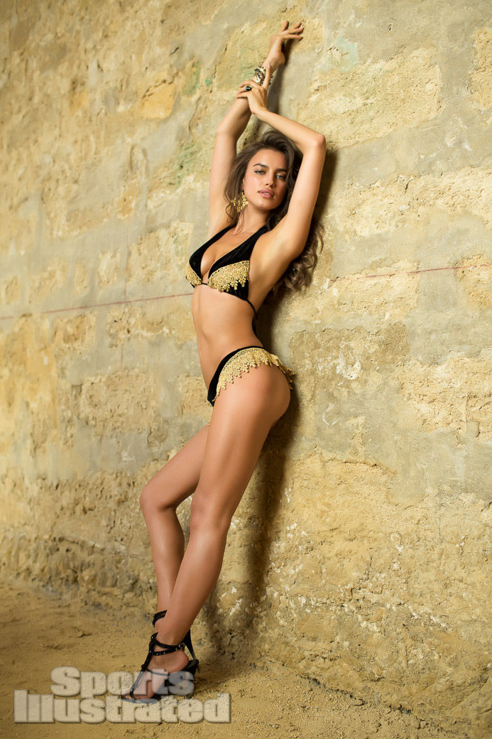
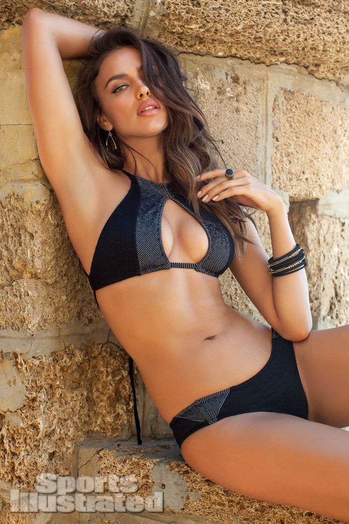
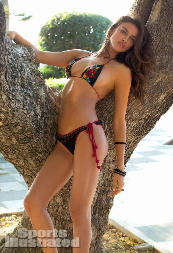
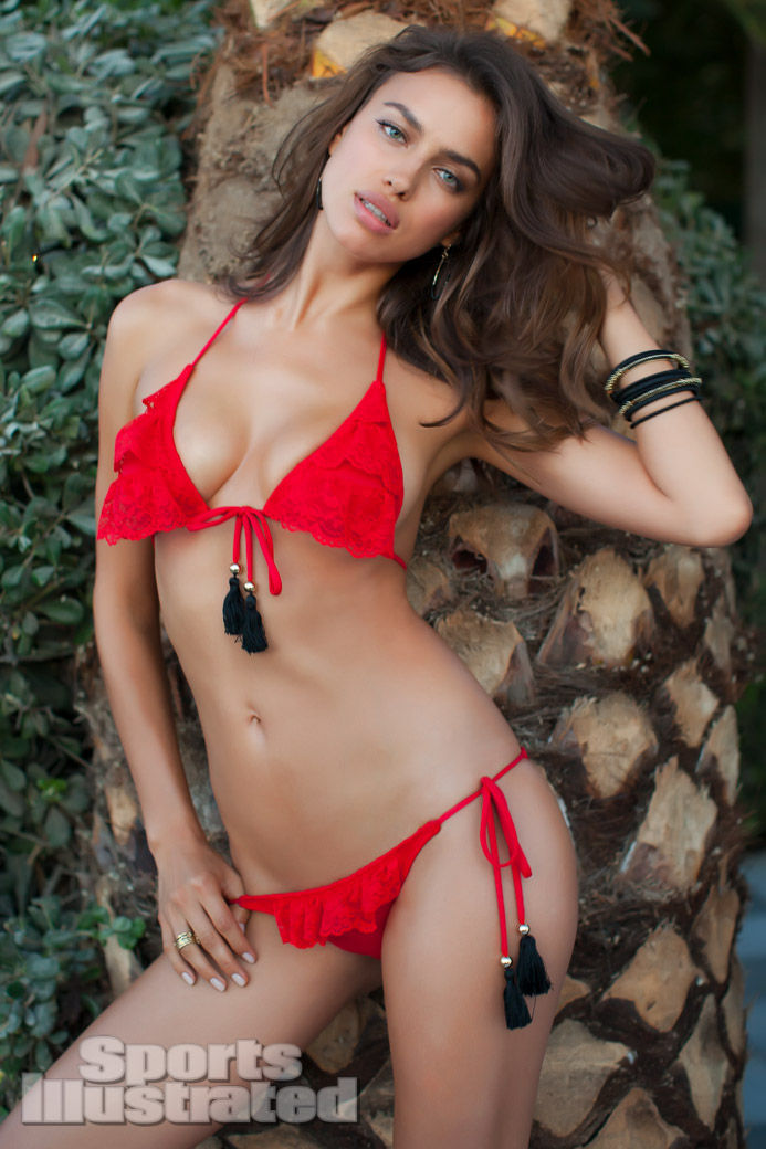
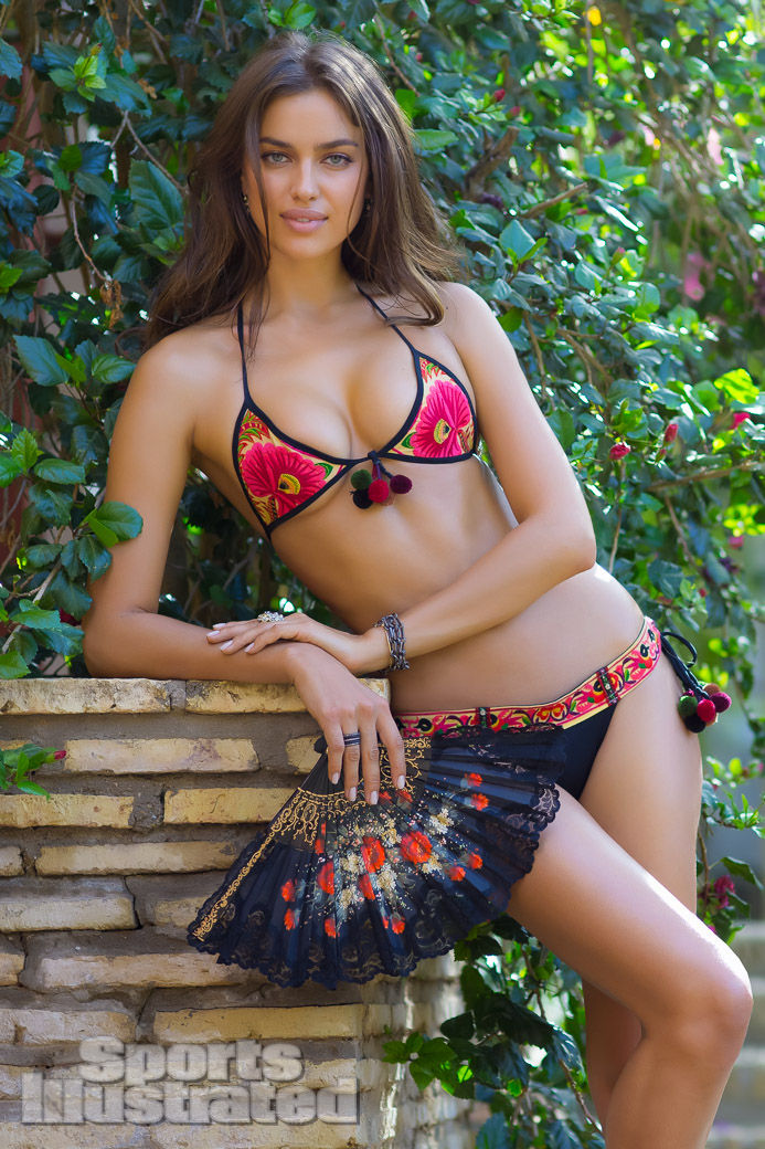
Watch how the wardrobe changes across the set. A black lattice one-piece against palm bark reads graphic and modern. Black bikini pieces with champagne lace trim and caged heels read evening-glam even at noon. Red lace with ruffled edges on ceramic stairs leans romantic and decorative. The bullring red-and-gold string bikini answers the matadors’ embroidery in the same chromatic language. Variety is the point. An SI destination package rarely commits to one silhouette; it builds a portfolio of moods under one city name so the feature feels like travel, not a single product ad repeating the same suit in five angles.
That editorial freedom also explains poses that would be odd in a pure commerce campaign: arms braced in a stone window against blown-out backlight, body stretched along tiled steps, group tableaux with costumed locals. Commerce wants the SKU clear. Magazine fantasy wants the place unforgettable. Shayk’s job is to hold both—readable as a star, never so dominant that Seville becomes mere backdrop wallpaper.
Where 2013 sits in the SI timeline
Shayk’s Swimsuit resume stretches from late-2000s debuts through a 2011 cover and later destination years that eventually closed a roughly decade-long run with the franchise. The 2013 Seville installment sits after the cover peak and before the end of that arc. That mid-career placement shows in the confidence of the posing: less audition energy, more ownership of the frame. She looks comfortable inside SI’s mix of athletic glamour and fashion theater, able to hold a quiet vertical portrait and a busy cultural wide shot with the same authority.
Historically, early-2010s Swimsuit Issues still functioned as annual events with print gravity. Images traveled through the magazine, the SI Swimsuit site, and fashion blogs that mirrored galleries almost shot-for-shot. A feature like this continues that gallery habit: identify the year, name the place and photographer when known, keep the cultural detail visible, and refuse to collapse the story into later-life gossip that has nothing to do with Seville’s tiles or Cayley’s light.
Keeping Shayk’s 2013 campaigns from blurring together
Readers who bounce between early-2010s campaign galleries can easily mush every Shayk set into one mood. Resist that. Beach Bunny’s Take Me to Rio was retail swim marketing—carnival color selling separable bikinis for a U.S. label. La Clover’s Valentine’s set was holiday lingerie for a Chinese brand—private rooms and lace. Xti was Spanish footwear in studio chroma—boots and flip-flops as heroes. SI 2013 is magazine destination editorial in Seville. Same face; four different commercial or editorial sentences. Naming the sentence is the whole historical task of pages like this one.
If you only remember one contrast, make it this: SI wants you to feel you traveled; Beach Bunny wants you to feel you could buy the bikini; La Clover wants you to feel you entered a private evening; Xti wants you to feel you could point at a shoe. Seville’s tiles and bullring only serve the first of those jobs.
How to read the Seville set
- Find the architecture first: tiles, stone windows, arena seating—place before pose.
- Track wardrobe variety: graphic black, lace romance, gold embroidery answering local costume.
- Notice hard Spanish light: overexposed openings and sharp shadows are location signatures, not retouch accidents.
- Separate magazine from merchant: these frames advertise SI’s annual myth of travel more than a single boutique label.
- Watch group vs solo: matador tableaux sell culture; quiet verticals sell star continuity across the issue.
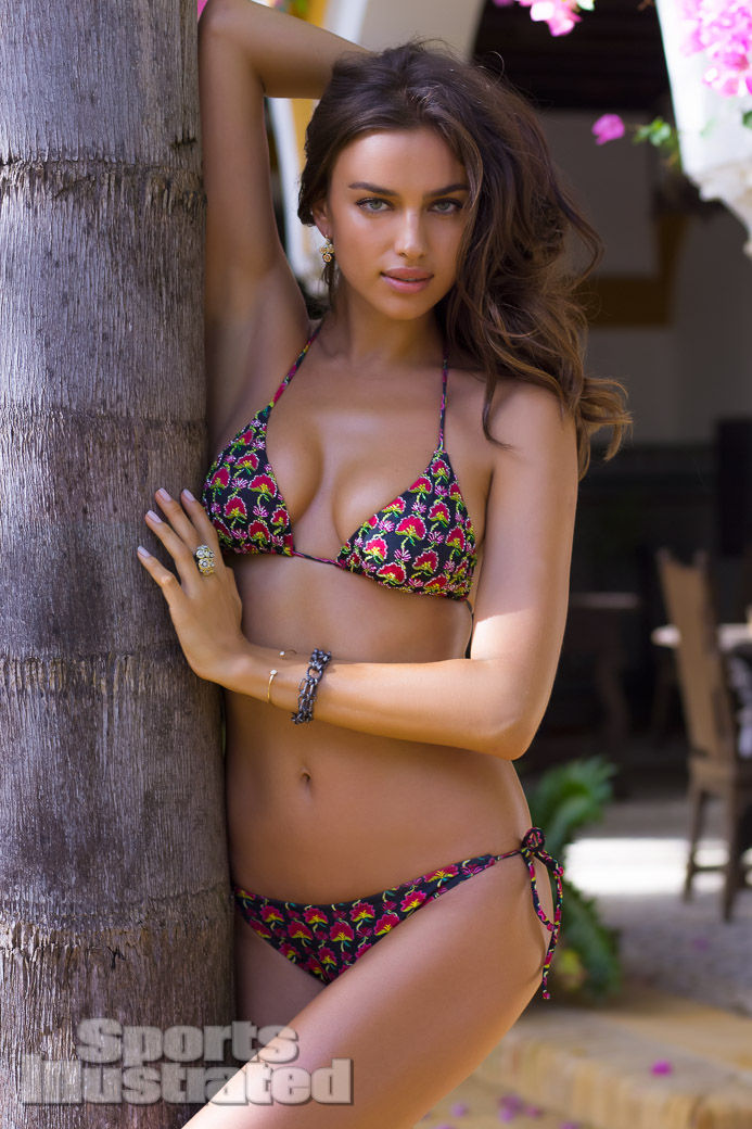
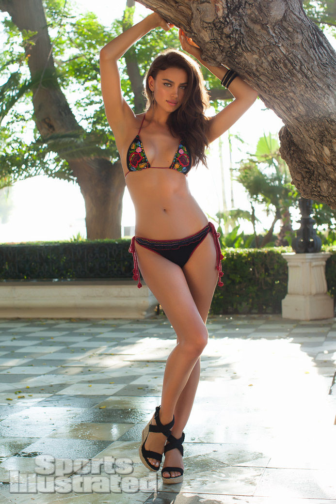
Would a destination swimsuit story still choose the bullring today, or would it chase quieter plazas and hotel pools? The 2013 Seville package answered with maximal local theater—tiles, stone, arena pageantry—and Shayk held the center without competing with the city. That balance is what makes the set worth revisiting as fashion history: not gossip from the year, but a record of how SI turned Andalusia into an annual swimwear stage.

Comments
Continue reading

Kate Upton’s SI Swimsuit 2013: Antarctica Cover with Derek Kettela
A gallery feature on Kate Upton’s second consecutive Sports Illustrated Swimsuit cover—Antarctica ice, ship decks, and seven-continents destination energy by Derek Kettela.
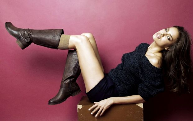
Irina Shayk for Xti: The 2011–12 Footwear Campaign
Studio heat and product-first posing: Irina Shayk’s early-2010s Xti shoe campaign for the Spanish label’s 2011–12 collection—boots, flip-flops, and saturated backdrops.
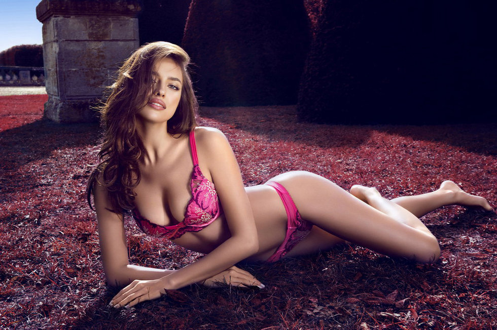
Irina Shayk for La Clover: Valentine’s Day Lingerie Campaign 2013
Irina Shayk fronts Chinese lingerie house La Clover’s Valentine’s Day 2013 campaign—lace, magenta, and intimate rooms framed as early-2010s seasonal fashion history.