
Inspirational Quotes for Your Walls: Typography and Placement
How to choose, typeset, and hang wall quotes so the words work as home décor—scale, materials, room-by-room placement, and lines that still feel true daily.
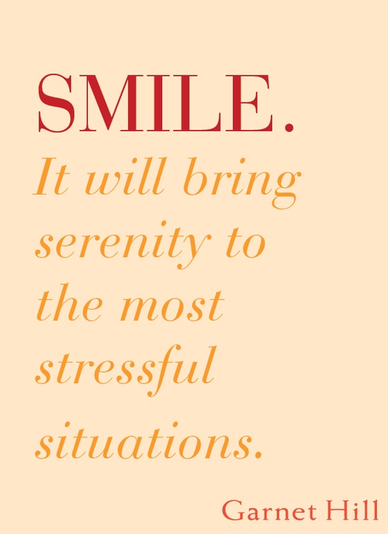
A quote on a wall is furniture for the mind. It sits in your peripheral vision while you make coffee, answer email, or walk from bedroom to door—repeating a short idea until it becomes part of the room’s personality. That is different from scrolling sayings on a phone. Wall quotes are décor first: typography, scale, material, and placement decide whether the words feel intentional or like a temporary sticker that never got removed.
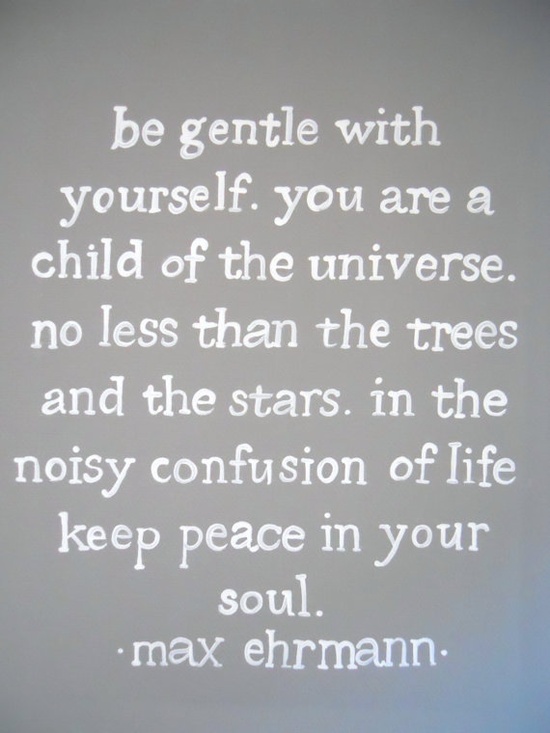
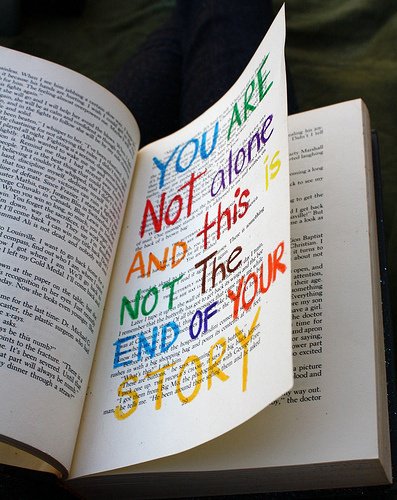
This guide is about putting language on walls well. The images below are visual prompts for style and mood—serif calm, bold modern sans, handwritten energy, minimal one-liners. Use them to brief a printer, a lettering artist, or your own weekend project, and treat the words as design elements as seriously as you would a painting.
Why walls change how quotes work
On a wall, a sentence becomes architecture. You read it at a distance, often sideways while moving, sometimes only in fragments until you stop. That means length matters. A paragraph that inspires in a book can overwhelm a hallway. Short lines with clear rhythm win: one clause, a line break that matches breath, maybe a second short beat. If you need the full speech, frame a printed page or keep a book on the shelf; walls prefer compression.
Walls also enforce taste. A phrase you love privately may not be the phrase you want greeting guests. Ask whether the quote is for you alone (bedroom, office nook) or for shared space (entry, living room). Private walls can be tender, weird, or fiercely specific. Shared walls usually benefit from wider generosity—ideas about home, curiosity, kindness, craft—rather than inside jokes that exclude half the household.
Finally, permanence is relative. Paint and large decals commit more than a lean-to frame you can move. Choose commitment level before you fall for a typeface.
Pick words that survive daily sight
A wall quote should still feel true on an ordinary Tuesday. Avoid lines that only work at peak motivation or that shame you into productivity. Prefer language with room to breathe: invitations, observations, steadiness. If a quote needs a long explanation to make sense, it is a poor mural candidate.
Check attribution and wording if you care about accuracy. Misquoted classics on giant canvases age poorly. If the author is unknown or the line is yours, that is fine—clarity beats false prestige. Paraphrase carefully when you shorten; do not twist meaning to fit a prettier line break.
Test the sentence out loud. Awkward stress patterns become obvious when spoken. Wall typography cannot hide clunky rhythm the way a quick social graphic can.
Typography is half the message
Typeface choice sets emotional temperature. Classic serifs suggest libraries, letters, and permanence. Clean geometric sans-serifs feel modern and architectural. Script and brush lettering add intimacy but lose legibility fast at small sizes or across long phrases. Decorative display faces should be reserved for very short words—“gather,” “breathe,” a family name—not for multi-line philosophy.
Limit yourself. One primary type family per piece is usually enough; a second weight or a single italic for emphasis can help. Three competing fonts on one wall read as a poster sale, not a home. Letter spacing (tracking) often needs slight opening on walls so forms do not clot at viewing distance.
Hierarchy matters: if you include attribution, make it quieter than the quote. Tiny all-caps under a generous main line is a classic museum-label move that keeps focus on the words you actually want to live with.
Materials and formats for real rooms
You have more options than a vinyl sticker. Framed prints and canvases move when you move and protect paper from kitchen grease. Wood signs suit farmhouse and cabin moods when the grain and stain match other wood in the room. Metal letters or pin-mounted typography cast soft shadows and feel sculptural. Hand-painted mural lettering is the most custom—and the hardest to undo.
Removable decals help renters, but quality varies. Cheap vinyl can look wrinkled or glossy in a way that fights matte walls. If you use decals, measure twice, clean the wall, and accept that textured plaster may not hold tiny serifs. For textured walls, a hanging frame is often kinder than adhesive letters.
Size relative to furniture: a quote above a sofa should relate to the sofa width, not float as a lonely postage stamp. A vertical piece beside a doorway can be narrower and taller. Leave margin from crown molding and light switches so the composition feels planned.
Placement by room
Entry. First walls teach household tone. Short welcomes and calm intentions work; aggressive hustle slogans can feel like a boss waiting in the foyer.
Kitchen. Humidity, splashes, and busy visuals compete. Prefer wipeable frames away from the stove, or very short words in a breakfast nook. Food-related wit ages faster than quieter lines about gathering.
Living room. This is gallery territory. A single strong quote can replace a painting, or sit within a gallery wall if it shares color temperature with neighboring art. Avoid surrounding it with so many frames that the sentence disappears.
Bedroom. Softer statements and lower visual volume help. What you read last at night and first in the morning should not spike adrenaline unless that is a deliberate choice.
Office or studio. Craft and focus lines can live here without invading shared leisure space. Keep scale professional if clients visit—handwritten scrap energy suits a private desk better than a client-facing wall.
Hallways and stairs. Narrow spaces favor vertical stacks and brief lines. Make sure you can read the piece while walking without stopping mid-stair for a paragraph.

Color, contrast, and the wall behind the words
Legibility is kindness. Light letters on light paint vanish; dark letters on busy patterned wallpaper fight for survival. High contrast is not the only path—soft charcoal on warm white can feel gentler than stark black—but some contrast is non-negotiable.
Coordinate with the room’s existing palette rather than introducing a fifth accent color just for the quote. Metallic foils photograph beautifully and sometimes glare under real lamps; check them at night. If the wall is already art-heavy, a quieter monochrome print may serve better than neon script.
Consider empty wall as part of the design. Crowding a quote between shelves, switches, and a TV makes even excellent lettering look like an afterthought. Give the words a clear rectangle of attention.
Composing line breaks and layout
Line breaks should follow meaning and breath, not arbitrary centering. Breaking after a weak word (“the,” “and,” “of”) leaves the eye stranded. Break on natural phrases. Centered layouts feel ceremonial; left-aligned blocks feel literary and modern. Very long center-stacked lines can create a Christmas-tree shape that weakens the message—edit the text or widen the format.
If you pair a quote with an illustration or photo, decide which leads. Illustration-led pieces treat words as caption; typography-led pieces treat imagery as atmosphere. Dual heroes usually cancel.
Mock up at real size with paper printouts taped to the wall for a day. Living with the scale beats guessing from a phone screen. Adjust before you commit to paint or expensive production.
A wall-quote checklist
- Is the line short enough to read at a glance?
- Will you still want this sentence in a year?
- Does the typeface match the room’s era and formality?
- Is contrast strong enough on your actual paint color?
- Does size relate to the furniture beneath or beside it?
- Can renters or future-you reverse the choice if needed?
Choose one wall, one sentence, and one clear typographic voice. Hang it where your daily path already goes. When the lettering is right, you stop “looking at décor” and start living next to a thought—quietly, repeatedly, on purpose.

Comments
Continue reading
Glorious Wrist Tattoos: Design Criteria and Inspiration
Wrist tattoo ideas from tiny icons to lettering and bands—placement, silhouette, jewelry clearance, and how to brief an artist (design focus, not medical advice).
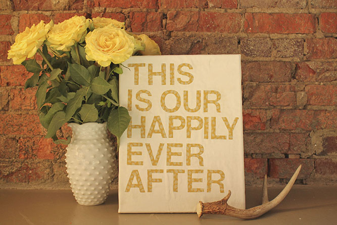
5 DIY Quote Wall Art Ideas: Fabric, 3D Letters, Canvas, Watercolor, and Subway Type
Five reachable DIY approaches to quote wall art—fabric and canvas lettering, dimensional letters, painted canvas, watercolor words, and subway-style typography.
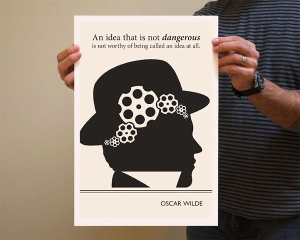
Evan Robertson’s Illustrations from Underlined Book Quotes
Through Obvious State, designer Evan Robertson turns underlined literary lines into black-and-white posters where text and drawing think together.