
5 DIY Quote Wall Art Ideas: Fabric, 3D Letters, Canvas, Watercolor, and Subway Type
Five reachable DIY approaches to quote wall art—fabric and canvas lettering, dimensional letters, painted canvas, watercolor words, and subway-style typography.
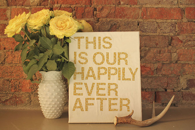
A favorite line on the wall does more than fill empty plaster. It turns a hallway, bedroom, or studio corner into a small declaration of mood—hopeful, wry, quiet, or bold—without needing a gallery budget. Quote wall art has stayed popular for a reason: the materials are reachable, the process is personal, and the finished piece can look as polished or as handmade as you want.
Below are five DIY approaches that still hold up years after the first craft blogs popularized them: fabric or canvas lettering, dimensional (3D) letter walls, painted canvas quotes, watercolor letter art, and subway-style typography. Each one can stand alone or sit in a mixed gallery wall. Keep local inspiration images as visual cues, and treat the steps as flexible recipes rather than rigid kits.
1. Quotes on fabric and canvas
Fabric stretched over a frame gives soft texture that flat paper cannot. You can buy blank stretched canvas, or stretch cotton duck or linen yourself over a simple wood stretcher. The quote can be painted freehand, traced from a printed template, or applied with fabric paint through a stencil. The goal is contrast: dark lettering on light cloth, or the reverse if your room already leans bright.
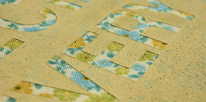
Start by choosing a short quote—ideally under fifteen words—so the letters stay large enough to read from across the room. Print the line at the size you want, tape it behind translucent fabric if the weave allows, or transfer with graphite paper onto opaque canvas. Fabric paint or acrylic mixed slightly thinner than usual sits into the fibers without cracking as easily when the cloth flexes. Work in layers: a light pencil map, then paint, then a second pass for weight on downstrokes if you want a calligraphic feel.
Finish by checking edges. If the fabric wraps the frame, pull it taut and staple on the back so the front stays drum-flat. A thin coat of clear fabric medium can help seal painted letters against dust. Hang with ordinary picture wire or sawtooth hangers; fabric pieces are usually light. This style suits bedrooms and reading nooks where soft surfaces already belong.
2. Three-dimensional wall quotes
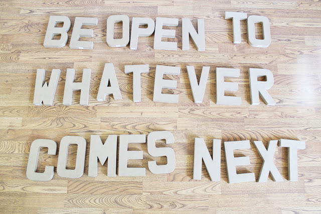
Dimensional letters turn a quote into architecture. Wood, foam board, cardboard, or lightweight MDF letters can be painted, stained, or left raw, then arranged on the wall so shadows do part of the design work. Unlike a flat print, a 3D quote changes with the hour: morning side light deepens edges; overhead evening light softens them.
Plan the layout on the floor first. Spell the quote, adjust kerning by eye, and photograph the arrangement so you can recreate spacing on the wall. Many makers mark the wall lightly with painter’s tape baselines or temporary paper templates. Adhesive choice matters: removable mounting strips for renters, small nails or construction adhesive for permanent installs on painted drywall you own. Keep heavier wood letters near studs when possible, or use proper wall anchors.
Color strategy is simple. Match the letters to trim for a quiet built-in look, or contrast them against the wall for a graphic punch. Mixed finishes—matte bodies with a single metallic accent word—can highlight the emotional peak of the quote without clutter. Leave breathing room around the whole phrase; crowded letters read as noise. This approach thrives above a sofa, along a stair landing, or as a focal word cluster in a home office.
3. Painted quotes on canvas
Classic painted canvas is the most forgiving entry point. A blank canvas, a ruler or laser level for guidelines, acrylic paint, and a steady brush are enough. You can aim for crisp sans-serif block letters, loose brush script, or a hybrid where the first word is bold and the rest stays smaller.
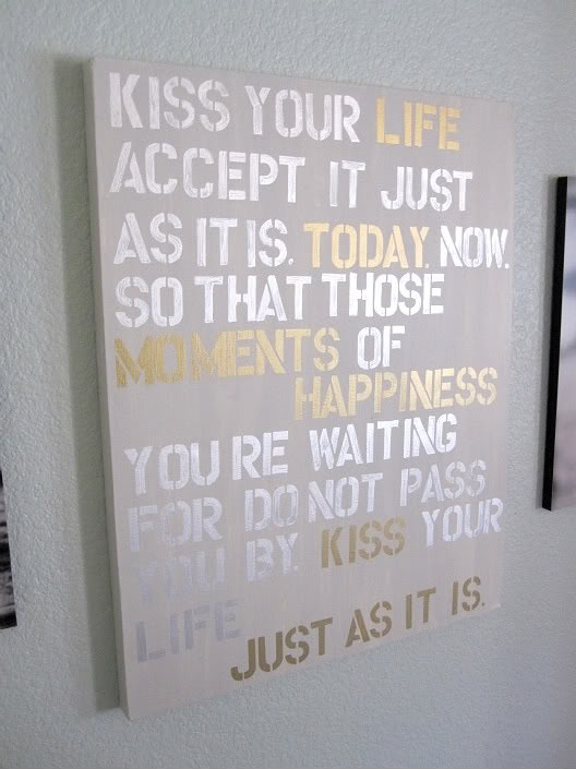
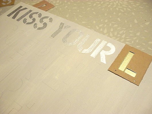
Prep the surface with a light background wash if you want atmosphere—soft gray, blush, or warm cream—then let it dry fully before lettering. Use washi tape as temporary baselines. Sketch letters lightly in pencil; acrylic will cover most guidelines, but erase excess graphite before the final coat so it does not muddy pale colors. Flat brushes cut cleaner edges for block type; round brushes suit script. If a stroke goes wrong, wipe quickly with a damp cloth while the paint is wet, or wait, overpaint the background locally, and retry.
Composition tips: center short quotes; left-align longer passages like poetry; leave more margin than you think you need. A canvas that feels “too empty” in the studio often reads correctly once it hangs on a large wall. Varnish is optional; a matte spray can unify sheen if some letters look glossier than others. Pair one strong canvas with smaller companion pieces rather than filling every inch of wall with text.
4. Watercolor wall art with words
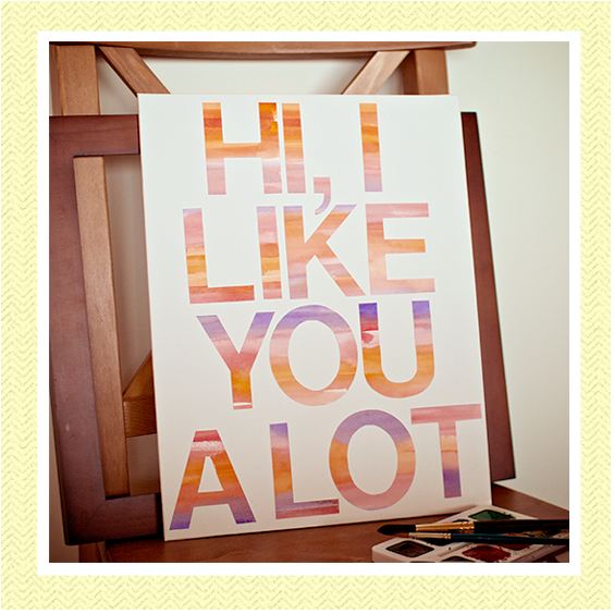
Watercolor quote art leans softer and more illustrative. Washes of color become the backdrop, and lettering sits on top in ink, gouache, or denser watercolor. The charm is imperfection: blooms, gradients, and uneven edges feel intentional rather than unfinished.
Use watercolor paper taped to a board so it does not buckle. Wet the area you want for the wash, drop in two or three related hues, and tilt the board gently so pigments mingle. Let the paper dry completely before writing; damp paper makes ink bleed past recovery. For lettering, waterproof fine liners or brush pens keep edges sharp against the wash. Some makers paint large abstract shapes first—circles, stripes, soft rectangles—then place the quote in the quietest zone of color so the words remain readable.
Frame under glass with a mat that echoes one pigment from the wash. Watercolor pieces are sensitive to humidity and direct sun; avoid damp bathrooms and harsh south-facing walls unless you use UV-protective glazing. This style pairs well with botanical rooms, nurseries, and spaces where hard graphic posters would feel too loud. If you want a larger statement, create a triptych of related washes with one continuous quote split across three frames.
5. Subway-style typography art
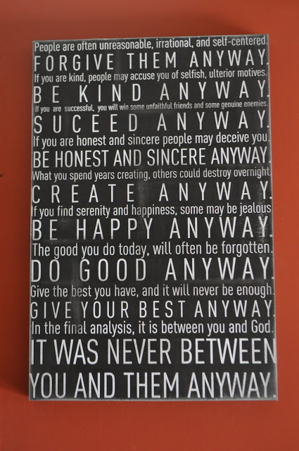
Subway art borrows the stacked, varied-weight typography of transit posters and vintage destination boards. Words sit in horizontal bands; some lines shout in condensed capitals, others whisper in smaller case. The quote becomes a composition of hierarchy rather than a single script flourish.
You can build subway art digitally and print it, or assemble it by hand with stamps, stencils, and paint on board or canvas. Choose a limited palette—black and cream, navy and soft white, charcoal and blush—so the typography stays the star. Vary size and weight according to meaning: emphasize the emotional verb or the place name; demote connecting words. Align columns carefully; uneven baselines are part of the vintage look only when they are deliberate, not accidental.
Budget versions use heavy cardstock or foam core in a thrifted frame. Higher-end versions use wood panels with lettering painted or vinyl-cut and burnished on. Either way, measure the wall space first. Tall, narrow subway pieces suit hallway niches; wide landscape formats work above consoles. If the quote is personal—family names, a wedding date, a city you left and still miss—subway structure makes it feel designed rather than scrapbooked.
Choosing materials, quotes, and placement
Materials should match how permanent you want the piece to feel. Renters lean toward fabric frames, canvas, and watercolor under glass that leave with you. Homeowners can commit to dimensional letters and larger painted panels. Always check wall condition: fresh paint should cure before adhesive strips go on; textured plaster may need nails instead of strips.
Quote selection is half the project. Prefer lines you will still like in five years. Avoid overlong passages that force microscopic type. Attribution, if you include it, can sit smaller beneath the main line. If the words are not yours, respect copyright and fair-use norms for commercial reproduction; private home display of a short attributed quote is a different context from selling prints.
Placement follows sight lines. Eye level for standing rooms, slightly lower above sofas and beds. One strong quote piece often beats five competing slogans. Leave negative space so the wall can breathe. Lighting matters: a picture light or nearby lamp can make painted letters glow at night; harsh overhead fluorescents flatten watercolor washes.
A practical weekend workflow
Saturday morning: pick the quote, measure the wall, and gather supplies. Saturday afternoon: prep surfaces—stretch fabric, prime canvas, or tape watercolor paper. Sunday: lettering and finishing. Dry time is not optional; rushing varnish or hanging wet paint invites smudges. Photograph the finished piece in daylight before hanging so you have a record if you remake it later in a different size.
Mistakes are normal. Crooked letters can become intentionally staggered layouts. A muddy wash can be cropped under a mat. Extra blank canvas can become a second companion piece with a single word. The point of DIY quote art is not factory perfection; it is a wall that sounds like you.
Whether you stretch a line of fabric lettering, build a shadowed word sculpture, paint a clean canvas, float ink over watercolor, or stack type like a transit board, each of these five routes turns language into décor you made with your own hands. Start with one wall and one sentence. The room will tell you when it is enough—and when it is ready for the next line.

Comments
Continue reading
Simple, Cute Valentine Gift Wrapping Ideas
A craft guide to personalized Valentine wraps—kraft bases, paper hearts, ribbon, tags, and texture mixes—using inexpensive supplies and the gallery examples as patterns.

DIY Spring and Easter Napkin Rings for the Holiday Table
Make Easter and spring napkin rings—nest, knit flower, bunny, scrap-flower, and edible styles—with sizing, food-safety, and batch tips for a calm tablescape.
Inspirational Quotes for Your Walls: Typography and Placement
How to choose, typeset, and hang wall quotes so the words work as home décor—scale, materials, room-by-room placement, and lines that still feel true daily.