
Home Dream Home: Looking from the Outside
Curb appeal as the series’ exterior chapter—façade proportion, entry clarity, planting, dusk light, and maintenance that match the home inside.
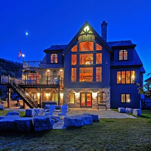
Interior galleries show how a home feels once you cross the threshold. Exterior design decides what the street is allowed to expect before anyone knocks. Looking from the outside is the complementary chapter of Home Dream Home: façades, entries, plantings, paths, and dusk lighting that work like a book cover—honest about the story inside, inviting enough that people want to open the door.
Other installments in the series wander through cozy rooms, neon colour play, ombré surfaces, romantic detailing, and renovation sequences. This piece stays outdoors on purpose. Curb appeal is not a coat of paint alone; it is proportion, material restraint, a readable entry, and the walk from sidewalk to stoop.
The façade as first sentence
A strong elevation reads in a few seconds from the curb: roof line, wall mass, window rhythm, and where the door sits in that composition. If guests cannot find the entry, the house feels confusing even when the living room is perfect. Give the door a clear hierarchy—porch depth or a defined landing, a light that works at night, house numbers large enough to read from the street, and a path that aims at the threshold instead of wandering past it.
Decorative clutter around the door rarely helps. One well-scaled planter or seasonal wreath usually beats five competing accents. The exterior’s job is clarity first, charm second.
Materials that agree with each other
Too many cladding types on a modest house create visual noise: stone veneer here, board-and-batten there, a brick stub, a metal panel, a third trim colour. Choose a primary skin and one secondary accent. Let window frames, soffits, and a front door carry contrast instead of inventing a new material at every corner.
Honesty ages better than imitation stacked without logic. If you use manufactured stone, keep it on volumes where mass makes sense—a foundation band, a chimney, a porch base—rather than sprinkling it like garnish. Wood, fibre cement, brick, and metal can coexist when one leads and the others support.
Windows, shutters, and proportion
Window rhythm shapes friendliness. Aligned heads and even spacing calm an elevation; random punched openings can make additions feel unfinished. When replacing windows, match the language of the roof and porch rather than defaulting to whatever grille pattern is on sale.
Shutters help only when they are sized as if they could close. Undersized decorative shutters read as stick-ons from the sidewalk. If real operability is impossible, keep width and height honest relative to the glass, or skip them and invest in better trim profiles instead.
Colour outdoors versus colour indoors
Exterior colour must survive sun, rain, and neighbourhood context. Soft neutrals and deep muted hues usually age more gracefully than high-chroma statements that fight the landscape. That brief differs from indoor neon experiments and ombré feature walls elsewhere in Home Dream Home. Outside, restraint often reads as confidence; a saturated front door can still supply personality without repainting the whole body every three years.
Test large swatches on more than one elevation. North light and south light change everything. Plan body, trim, and sash as a set: sometimes the walls stay quiet while the door carries the only vivid note. That single decision is one of the highest-return curb upgrades relative to cost.
Landscaping that frames architecture
Planting should reveal the house, not smother it. Keep foundation beds low enough that sills and porch rails stay visible. Layer heights—groundcovers, mid shrubs, a few vertical accents—instead of building a hedge wall that turns the façade into a green box. Paths deserve the same seriousness as indoor circulation: width for two people, drainage that works, and edges that stay neat without weekly heroics.
Trees are long bets. Place them for summer shade on glass-heavy sides and for winter sun where rooms need it. Avoid parking a future trunk against the foundation line. Seasonal containers by the entry can rotate with holidays without forcing a permanent redesign of the beds.
Light after sunset
Many houses look finished at noon and vanish at 8 p.m. Layer exterior light the way you would indoors: a welcoming entry fixture, soft path markers, and a restrained wash on one key façade plane or specimen tree. Avoid stadium brightness. Glare flattens detail and annoys neighbours. Warm-forward LEDs usually feel more residential than icy floods.
If you dine or lounge outside, light that zone separately so the street face can stay quieter. Motion fixtures belong on side yards and service paths more than on the primary porch composition.
Porches, stoops, and outdoor rooms
A porch is the handshake between public and private. Depth matters. Shallow decorative porches rarely get used; a few extra feet turn them into evening rooms with a bench and a side table. Choose weather-honest furniture—materials that tolerate rain or move inside easily. A full living-room set that dies in the first storm is not exterior design; it is outdoor storage in denial.
Stoops and stairs need safe treads, handrails where height demands them, and landings that do not trap ice or leaves. Beauty that fails basic safety is incomplete work.
Roofs, gutters, drives: the unglamorous half of curb appeal
Sagging gutters, streaked walls, and downspouts that dump onto the front walk undercut even a freshly painted door. Maintenance is part of the look. Clean eave lines, coherent gutter colour, repaired masonry pointing, and a driveway or walk that does not trip guests do more for “dream home” perception than ornamental hardware alone.
If budget forces a sequence, fix the approach surface and water management before buying decorative extras. Guests feel care through their feet as much as through their eyes.
Matching outside to inside without copying
The exterior should preview the home’s temperament without duplicating every interior finish. A calm, cozy living room pairs naturally with quiet cladding and warm entry light. A more playful indoor colour story can still sit behind a restrained façade; door colour, planters, and evening glow can hint at personality. What fails is a mismatch so sharp that visitors feel bait-and-switched—casino brightness outside with spa silence inside, or a severe street face that hides a chaotic interior with no bridging cues.
This outdoor chapter exists so Home Dream Home is not only sofa-deep. Houses are judged first from the shared street, the sidewalk, the common drive. When that first view is clear, cared for, and proportioned with the same seriousness you give a reading nook, the dream-home idea holds together all the way to the threshold.
Tonight, walk your own approach after the porch light comes on. Notice where your eye catches and where it stumbles—numbers, path edge, plant height, door colour, glare. Repair the first stumble you cannot unsee. Exterior progress compounds in small, visible steps, and the cover starts to match the book.

Comments
Continue reading
Fantasy Homes: Floating Huts, Rock Cottages, and Cliffside Dreams
A gallery of extraordinary dwellings—on water, stone, cliffs, and forest edge—plus what their drama can teach ordinary rooms.
Attic Bathroom Design Ideas: Light, Layout, and Roof-Friendly Fixtures
Design ideas for converting an attic into an extra bathroom—working with slopes, skylights, wet-zone materials, eaves storage, and fixture placement.
Ladder Shelving Repurpose Ideas: DIY Bookcases, Dividers & More
Turn an old ladder into shelving, a room divider, towel rack, or narrow desk—practical DIY steps, safety checks, and styling tips with photo ideas.