
Jon Defreest’s Breaking Bad Portraits: Gallery Icons of Heisenberg’s Cast
A look at Jon Defreest’s Breaking Bad character portraits for Gallery1988—graphic, poster-ready faces from the show’s early-2010s art moment.
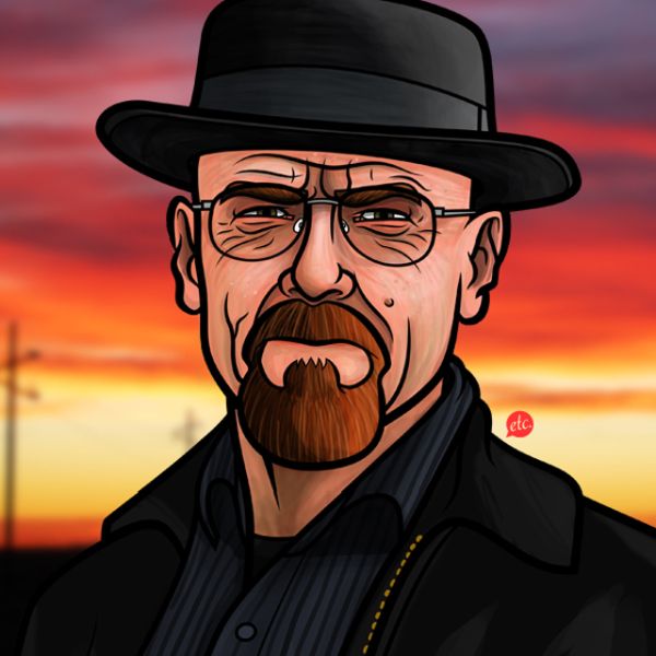
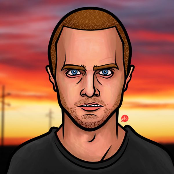
By the summer of 2012, Breaking Bad had already become more than a prestige drama. It was a visual language: the porkpie hat, the goatee, the yellow hazmat suits, the desert light that made every moral choice look sun-bleached and irreversible. Fan art followed the show everywhere, but Boston-based illustrator Jon Defreest’s character portraits stood out because they did not simply copy stills. They treated Walter White, Jesse Pinkman, Saul Goodman, and the rest of the Albuquerque ensemble as graphic icons—clean, poster-ready, and sharp enough to survive outside the episode frame.
Defreest contributed the series to Gallery1988 Melrose for its Breaking Bad Art Project, one of the early gallery showcases that treated the AMC series as serious pop culture rather than disposable TV ephemera. The portraits arrived at a moment when the show’s fifth season was deepening into tragedy, and audiences were hungry for images that could hold both affection and menace. Looking at the set today, that tension is still the point.
Who Jon Defreest is in this story
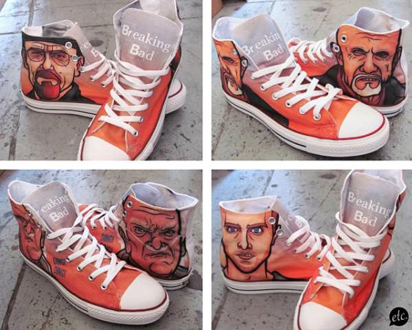
Defreest’s path into Breaking Bad lore did not begin with a gallery brief. Around early 2011, while working at a small startup hunting for viral marketing ideas, he mocked up a faux pair of Chuck Taylor All Stars inspired by the show. The gag was sharp enough that Bryan Cranston’s people noticed. What followed became a rare fan-artist arc: actual sneaker production, commissions from cast members, and eventually a visit to the set. The Ave Venice later printed Converse designs sporting Defreest’s artwork, turning illustration into wearable merchandise without sanding down the show’s darker humor.
That background matters for reading the portraits. These are not anonymous internet tributes. They come from someone who had already learned how to translate Gilligan’s world into objects people wanted to own—shoes, prints, parody posters—while keeping the characters legible as themselves. Defreest also played with the show’s mythology elsewhere, including the spring-break parody poster Breaking Buds and a fabricated holiday special gift package for Cranston. The portrait series sits in that same playful-but-precise lane: fan work with professional finish.
What the portraits do well
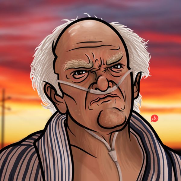
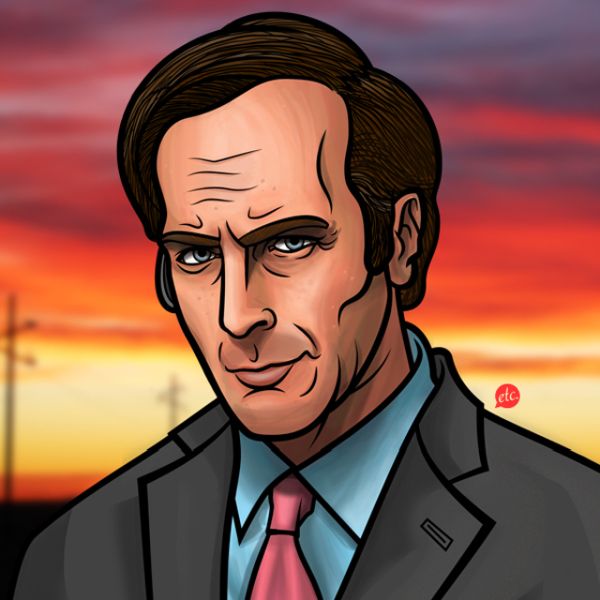
Television faces are easy to recognize and hard to redesign. Copy too closely and you get a painted screenshot. Stylize too freely and you lose the actor’s authority. Defreest’s portraits walk that middle path. Silhouettes stay familiar—Walter’s hat brim, Saul’s flashy confidence, Jesse’s wounded swagger—but the surfaces read as illustration first. Flat color fields, hard edges, and simplified lighting turn each face into a kind of logo for a moral position inside the story.
Walter White / Heisenberg is the inevitable center of gravity. In Defreest’s hands, the dual identity becomes a graphic problem: how much of the mild chemistry teacher remains once the hat and stare take over? The best Heisenberg images succeed when the face still looks human enough to regret what it is doing. Saul Goodman, by contrast, thrives on swagger. His portrait energy is courtroom neon and late-night commercial shine—the lawyer as brand. Jesse sits somewhere between innocence and damage; a good Jesse portrait has to leave room for both, or it becomes only a sidekick costume.
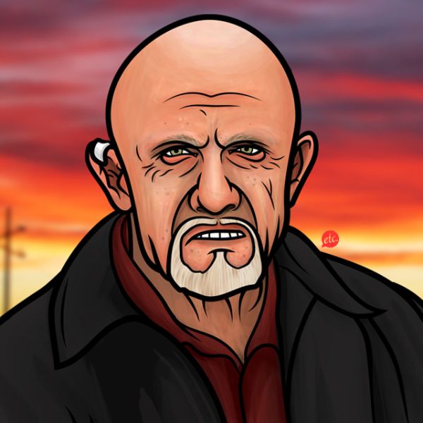
Secondary characters deepen the set. Breaking Bad works because the supporting cast is never wallpaper. Skyler’s intelligence, Hank’s bluff warmth, Gus’s icy control, Mike’s weary professionalism—each needs a distinct visual temperature. A gallery wall of Defreest’s portraits functions almost like a casting board: you can feel the show’s architecture without a single plot spoiler written underneath.
Gallery culture and TV fandom in 2012
Gallery1988’s Breaking Bad Art Project belonged to a broader early-2010s shift. Prestige television was migrating into art spaces, limited prints, and collectible objects. Shows like Mad Men, The Walking Dead, and Breaking Bad generated not only memes but curated exhibitions. For illustrators, that meant a new market: work that had to satisfy fans who knew every costume detail and collectors who wanted a clean object on a wall.
Defreest’s portraits fit that economy. They are readable at poster scale. They reproduce well. They flatter the characters without turning crime into cute kitsch. In an era when image sharing often stripped credit from artists, work tied to a named gallery project and a known illustrator had a better chance of remaining attributed—an issue Defreest and many peers already understood from sneaker and print culture.
There is also a craft lesson here for anyone drawing from film and television. Strong character illustration usually rests on three choices: a decisive silhouette, a limited palette that suggests personality, and one expressive feature that carries the psychology—eyes, mouth line, tilt of the head. Defreest’s set repeatedly makes those choices. The result is fan art that behaves like branding without losing affection for the performances that made the branding possible.
How to look at the set
Start with recognition, then look past it. Ask what each portrait emphasizes that a screenshot would not. Does Walter’s face feel colder or sadder than the episode you remember? Does Saul look more salesman than attorney? Does Jesse’s expression tip toward fear or defiance? Those small shifts are where illustration earns its keep.
Then consider the group as a system. Hang the portraits mentally side by side and notice hierarchy: who looks like a protagonist, who looks like a storm about to arrive, who looks like comic relief that knows too much. Breaking Bad is a machine of escalating consequences; a good portrait series makes that machine visible in faces alone.
Finally, remember the historical weather around these images. In 2012 the show was still unfinished for many viewers. The portraits freeze characters mid-arc, before the ending closed every door. That incompleteness gives them a different charge than later commemorative art. They are less memorial and more field notes from a culture already half-obsessed with Heisenberg’s transformation.
If you draw characters yourself, try a narrow exercise after studying Defreest’s approach: pick one Breaking Bad face, reduce it to five shapes, and force every emotional cue into the eyes and jawline alone. The portraits here suggest how much story can survive that kind of subtraction—and why this particular Albuquerque cast remains so tempting to redraw.

Comments
Continue reading

Dramatic Photo Art by Sukron Ma’mun (Ipoenk Graphic)
Cirebon, Indonesia photographer Sukron Ma’mun uses theatrical natural light to frame village life, play, and place in lyrical photo art.

Bird’s-Eye Views: Florian Beaudenon’s Instant Life
Paris photographer Florian Beaudenon’s Instant Life series captures people in their rooms from above—intimate, collaborative overhead portraits of everyday joy.
Abandoned Cars Reclaimed by Nature: Rust, Growth, and Quiet Ruin
When neglected vehicles are left outdoors long enough, rust, moss, and trees rewrite them into strange still lifes—sad, photogenic, and slowly returning to the ground.