
Breaking Bad Fan Art: Characters, Craft, and 2012 Visual Fandom
Jesse Pinkman graphic portrait and the craft of Breaking Bad fan art—limited palettes, icon reduction, and the 2012 poster-art moment.
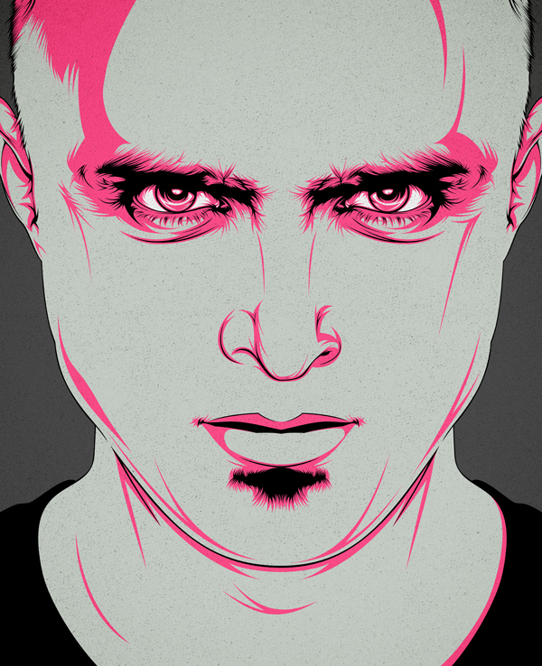
By September 2012, Breaking Bad was no longer only a clever cable premise. It was a visual language. Yellow hazmat suits, desert horizons, the pink teddy bear, Jesse Pinkman’s battered empathy, Walter White’s slide into Heisenberg—these images escaped the episodes and became material for posters, prints, GIFs, and hand-drawn portraits. Fan art sat at the center of how the fandom stayed awake between airings.
This page is a gallery with craft context: artwork inspired by the show’s characters and iconography, plus notes on why the series invited illustration so aggressively in that moment. It is not a spoiler encyclopedia and not a merch catalog. It is about looking—at faces, motifs, and the decisions artists make when they translate a television epic into still images.
Why Breaking Bad was catnip for artists
Vince Gilligan’s series offered designers a rare combination: strong silhouettes, a limited but memorable color grammar, and moral contrast you could read in a face. A porkpie hat and sunglasses could stand for an entire identity shift. A hazmat suit could become a flat graphic without losing meaning. Albuquerque’s hard light and empty space encouraged compositions that feel like posters even when they begin as memories of a scene.
Character design helped. Jesse Pinkman has a face illustrators love—expressive eyes, a distinctive goatee shape, vulnerability that survives stylization. Walter White’s bald head and facial hair become almost logo-like. Gus Fring’s calm suit reads as corporate menace in a single costume note. Supporting players carry props that print well: the RV, barrels, pizza on a roof, the bear falling from the sky in the show’s own dream logic.
In 2012 that visual toolkit collided with a surge of pop-culture poster culture—screenprint galleries, Mondo-adjacent aesthetics, Tumblr circulation, and limited drops that sold out in minutes. Breaking Bad arrived at a technical moment when fan art could look professional without a studio marketing budget.
The 2012 art moment around the show
As season five approached and then aired on AMC that summer, official and semi-official campaigns amplified what fans were already doing. Gallery 1988’s Breaking Bad Art Project, promoted through weekly reveals and limited screenprints, put named illustrators on show iconography and staged a public exhibit in Los Angeles. Comedian Paul Scheer’s Breaking Gifs project helped turn clue-hunting and poster chasing into a shared event leading into and through the season’s first half.
Independent artists kept working in parallel: vector portraits, painterly key art, parody mashups, typographic quote posters, and character studies that never waited for a license. Mid-2012 fandom treated images as participatory. Watching was only half the hobby; redrawing the myth was the other half. That is the climate in which galleries like this one were collected and shared.
The professional poster wave mattered because it raised the bar. Fans saw what limited-palette printmaking and bold negative space could do with the same symbols they loved. Amateur work improved by proximity. The conversation moved from “I drew Walt” to “I made a poster that could hang beside gallery work.”
Reading the Jesse portrait
The portrait above is a clear example of craft choices fan artists make when they stop chasing photorealism. The palette collapses to grey skin, black shirt and hair accents, and a hot pink used for contour, iris, and shadow. Pink is not random; it echoes the character’s name and emotional heat while refusing naturalistic color.
Line work does the shading. Thick pink strokes dig into the brow and eyelids until the stare feels exhausted and confrontational at once. A grainy texture on the skin keeps the piece from looking sterile, as if it could live on paper or a screenprint matrix. The cropped buzzed head and tight framing remove scenery so character psychology becomes the entire subject.
That is a smart response to Breaking Bad’s own storytelling. The show is famous for wide desert frames, but it is equally famous for faces under pressure. Fan art that zooms into Jesse’s eyes is not ignoring the series’ style; it is choosing one of its strongest instruments. If the piece feels intense without a single barrel or RV in sight, that is the craft working.
Common craft approaches in BrBa fan art
- Icon reduction — distill a character to hat, glasses, suit, or hazmat shape until the silhouette alone reads.
- Limited palettes — desert ochres, hospital greens, warning yellows, or a single accent color against charcoal.
- Poster composition — centered figures, bold negative space, type treated as design rather than caption afterthought.
- Motif stacking — teddy bear, barrel, RV, and desert sky assembled into a symbolic still life.
- Emotional close-ups — especially of Jesse, Skyler, or Walt at turning points, where micro-expression carries plot.
Digital tools made these approaches widely accessible in 2012—tablets, vector software, texture overlays—but the best pieces still depend on decisions, not filters. What do you subtract? Which color is allowed to shout? Where does the crop cut the body? Those questions separate a memorable tribute from a soft screenshot with a filter on top.
Ethics and attribution
Fan art thrives in a grey zone between love letter and copyrighted property. For viewers, the respectful habit is simple: credit artists when known, avoid stripping signatures from shared files, and remember that a gallery of inspiration is not the same as claiming ownership of a studio’s characters. For artists, studying the show’s cinematography—color scripts, lens choices, costume shorthand—usually produces stronger work than copying a single publicity still.
Limited official print projects also taught a practical lesson: scarcity and craft can coexist with fandom generosity. Not every piece needs to be free, and not every paid piece needs to be cynical. The healthiest corner of the scene celebrated technique.
How to look at a Breaking Bad art gallery
Ask which season’s mood the piece belongs to. Early Walt anxiety looks different from later Heisenberg certainty. Jesse’s face changes as the story costs him more. Poster art that freezes a motif in time can feel mythic; portrait art that chases a specific emotional state can feel intimate. Both are valid responses to the same series.
Then ask what medium the artist is pretending to inhabit. Screenprint flatness, oil painterliness, comic inking, and vector minimalism each translate Albuquerque’s story differently. The Jesse piece here chooses graphic-print energy. Another artist might have rendered the same character in dusty realism. Comparing those choices teaches more about fandom than arguing over a favorite episode ranking.
If you make your own work, pick one constraint before you start: two colors only, or no facial likeness beyond silhouette, or a single prop as the whole composition. Constraints are how Breaking Bad itself built style—and they remain the fastest way for fan artists to turn admiration into something with a point of view. Start there, look hard at the eyes in the portrait above, and decide what your version would refuse to include.

Comments
Continue reading
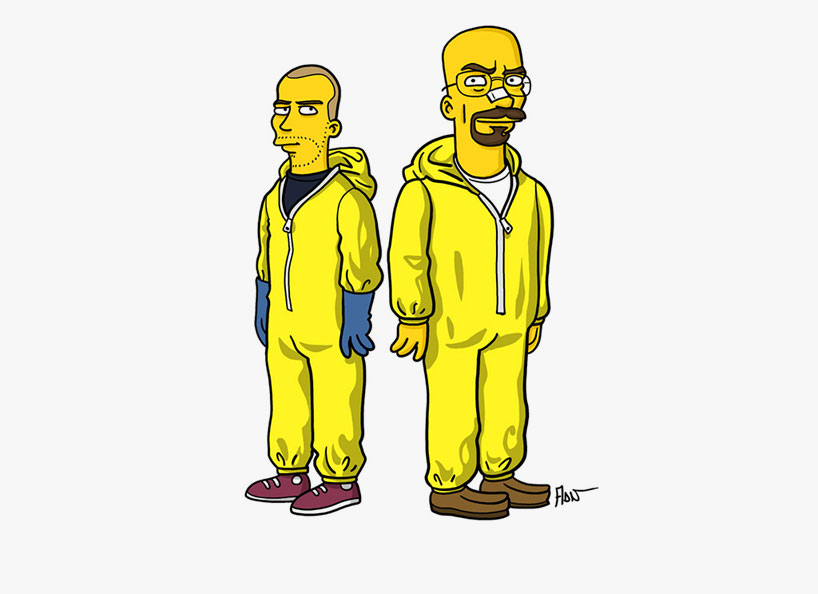
Simpsonized Breaking Bad Characters by ADN
Adrien Noterdaem (ADN) recasts Walter White, Jesse, Saul, and the Breaking Bad circle in Simpsons form—desert crime icons rebuilt in yellow, with the full gallery.

Still-Life Photography by Margareth Perfoncio
São Paulo photographer Margareth Perfoncio’s still lifes of food and flowers—Old Master light, dark wood, and tables that feel inevitable.

Meaningful Love Quotes for Inspiration (and Ink)
Meaningful love quotes that still feel true — short lines for tattoos, gifts, and everyday reminders, with placement and wording tips.