
Watercolour Tattoos: Soft Colour, Painterly Edges, and Body as Canvas
A gallery of watercolour-style tattoos—washes, drips, and light linework—plus practical notes on subjects, placement, colour, and longevity.
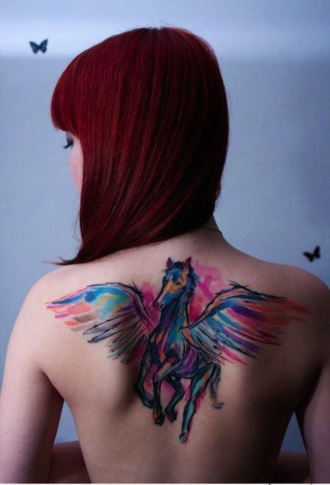
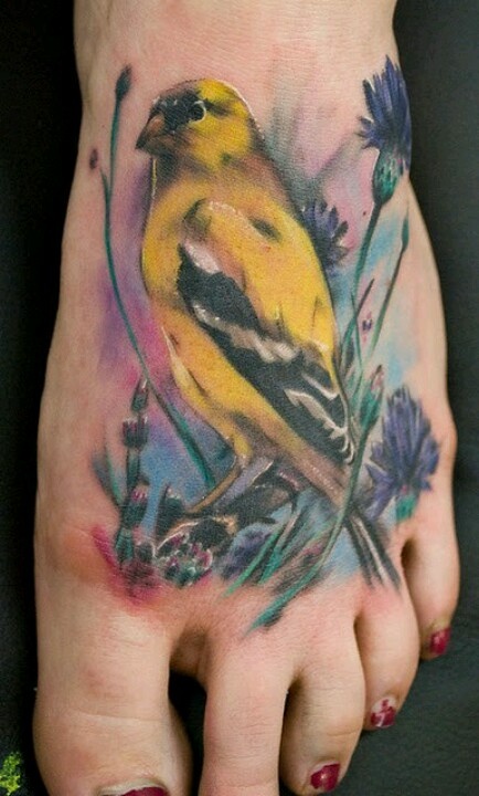
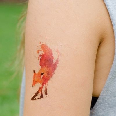
Watercolour tattoos treat skin the way a paper wash treats a sheet: colour moves first, and line arrives only where it earns its keep. Instead of the sealed outlines of American traditional work, the style leans on soft edges, translucent layers, and deliberate drips that look wet even when they are fully healed. The gallery below gathers examples of that painterly approach—mythic animals, portraits, birds, florals—so you can study how artists translate brush logic into ink.
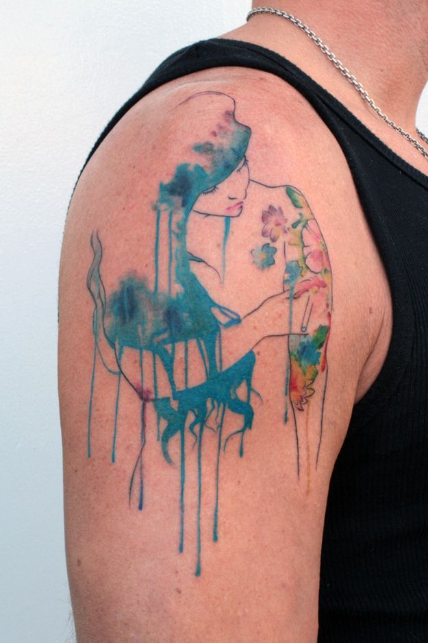
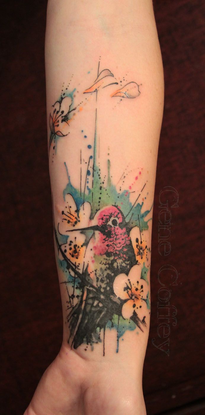
The appeal is obvious. A Pegasus spanning the upper back can carry blues, pinks, and oranges that behave like paint thrown across a canvas. A shoulder portrait can dissolve into teal drips that run down the arm. A forearm hummingbird can sit inside a halo of lime and sky-blue wash, petals loosening as if a breeze had just passed. Soft colour feels intimate, and it photographs beautifully—two reasons the look spread so quickly through early-2010s tattoo culture and never fully left.
What follows is less a catalogue of “cool ideas” and more a working guide: how the style is built, which subjects forgive softness, where on the body washes succeed, how colour ages, and what to ask before you book. Use the images as evidence, not as stencils to copy line for line.
What “watercolour” means on skin
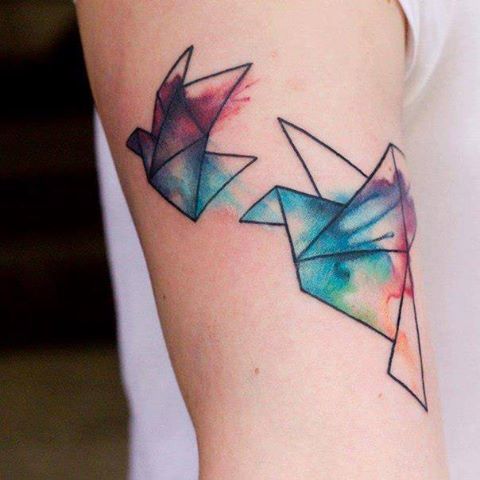
On paper, watercolour is pigment suspended in water, guided by gravity and absorbency. On skin, the metaphor has to be engineered. Artists build the look with diluted colour packs, layered passes, negative space, and controlled bleed that stops before it becomes mud. Many pieces keep a light sketch—charcoal-like line, broken contour, stippled speckles—so the wash has something to hang on. Others almost abandon outline and let hue alone describe a wing, a petal, or a face.
That difference matters when you choose a design. Pure wash can look ethereal in photos and softer after healing. Hybrid work with fine illustrative line tends to hold silhouette longer. Neither approach is “more authentic”; each is a different bargain between painterly freedom and long-term readability. Ask to see healed photos from the same artist, not only fresh, glossy finishes. Fresh ink always looks wetter than life, and social-media crops often hide the edges where soft colour meets unworked skin.
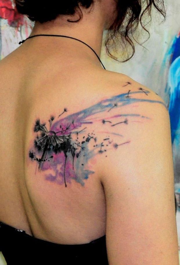
Technique also includes what the artist refuses to do. Overworking a wash can turn translucent colour into a solid blob. Packing too many hues into a small zone creates gray when the pigments optically mix over years. Good watercolour tattooers leave breathing room—areas of bare skin that act like white paper—and they plan drip paths so gravity on the body matches the composition, not an accident of posing for the camera. Splatter and stipple, used sparingly, can suggest paint flung from a brush; used carelessly, they read as noise.
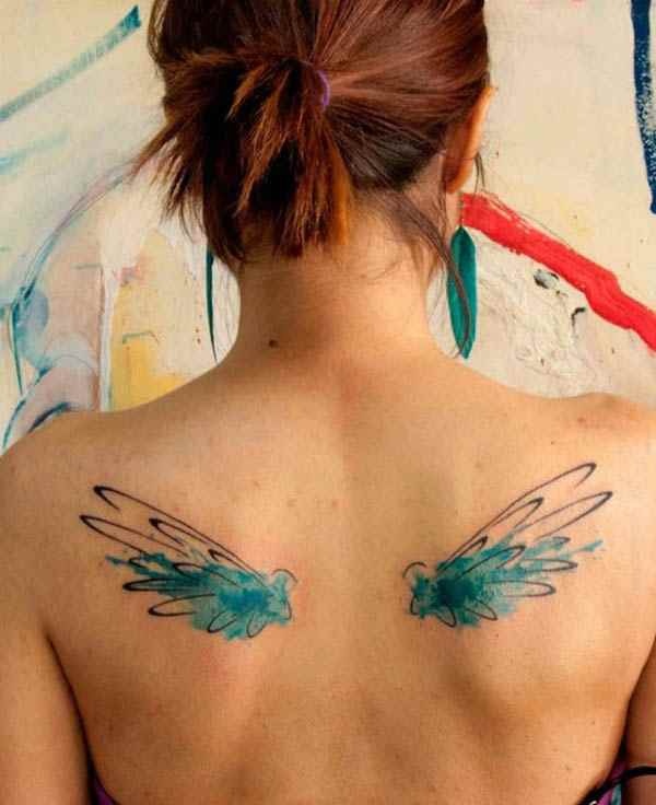
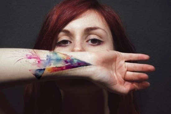
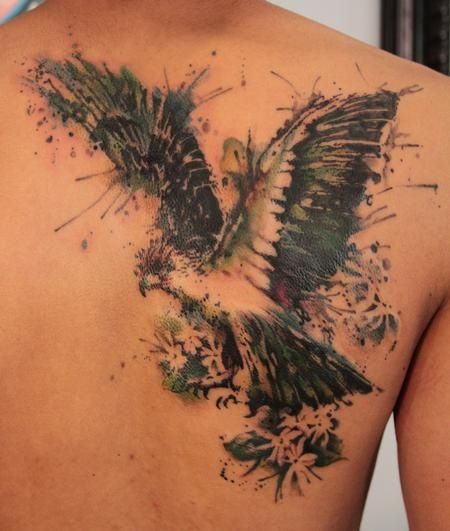
Compare the back piece and the forearm bird in this set. The Pegasus uses the full shoulder span as a landscape for wing colour. The hummingbird keeps sketchier black structure inside a cooler wash halo. Both are watercolour in spirit, yet they make different promises about how much silhouette will remain if colour softens. Reading those promises before you commit is half the craft of collecting this style.
Subjects that suit the style
Myth and nature dominate the genre for a reason. Wings, feathers, flowers, birds, and portrait fragments already suggest motion and atmosphere; soft colour amplifies that suggestion without needing heavy black fill. A winged horse across the back uses the body’s width as a canvas. A hummingbird on the inner forearm uses the arm’s length for drip and petal drift. Abstract bursts—splashes, gradients, colour fields with almost no figurative core—work when you want pure pigment drama rather than a narrative emblem.
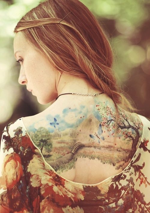
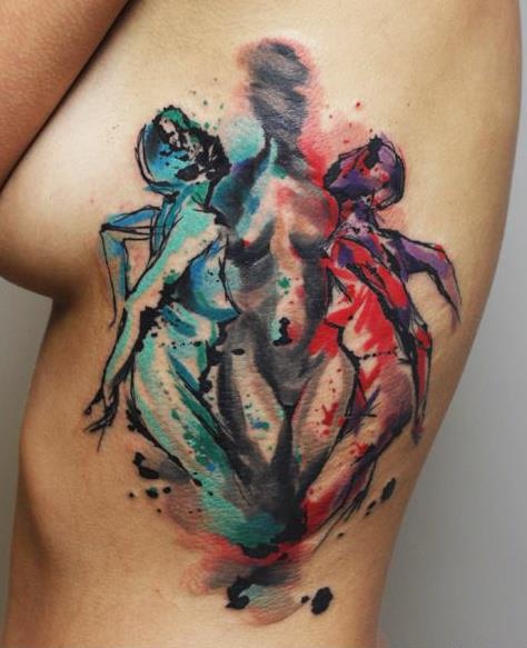
Portraits in watercolour are trickier. Faces need enough structure to remain faces after healing. The strongest examples usually keep delicate line in features while allowing hair, fabric, or background flora to dissolve. If you want a loved one’s likeness, discuss longevity frankly: soft colour alone is rarely enough for facial recognition a decade later. Artists who specialize in painterly portraits often pair wash with micro-line or selective contrast so the eyes and mouth stay anchored. The bowed-head figure with teal hair-drips in this gallery is a useful case study: emotion lives in the wash, identity lives in the thin facial drawing.
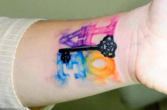
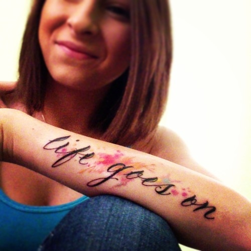
Animals and botanicals forgive softness more easily. A bird can lose a little edge and still read as a bird; a blossom can soften into a colour memory and still feel floral. That is why so many watercolour portfolios lean on flora and fauna. If your idea is a geometric symbol, a letterform, or a tiny icon meant to stay razor-sharp, this may not be the right dialect. Soft ink is a mood language more than a logo language. When in doubt, ask whether the design would still communicate if it were printed as a pale lithograph rather than a bold poster.
Placement, scale, and colour strategy
Large flat planes—back, thigh, outer upper arm—give washes room to bloom. Tight areas such as wrists and ankles force compression; drips can look cramped, and colour can muddle as the piece wraps. That does not forbid small watercolour work, but it asks for simpler silhouettes and fewer competing hues. Think of the body as a stretched sheet: the more even the surface, the cleaner the paint story.
Movement of the body matters too. Elbows, knees, and ribcage stretch and fold; soft gradients can break unevenly across those joints. If a design depends on a continuous drip path, place it where the skin stays relatively stable when you sit, lift, or twist. Artists who understand anatomy will redraw a reference so the wash follows muscle and bone rather than fighting them. A shoulder piece that looks perfect with the arm hanging may collapse when the arm lifts—ask for a pose check during the stencil stage.
Colour strategy separates gallery-worthy pieces from muddy ones. Limited palettes—two or three related hues with one accent—usually age more gracefully than rainbow explosions. High-chroma pigments can fade unevenly; artists who understand saturation will build intensity in stages rather than packing every pocket of skin on the first pass. White highlights and pale pastels deserve special caution: they may brighten a fresh photograph and soften faster than darker neighbours. Plan for a future touch-up if the design depends on delicate pastel contrast. Darker anchors—deep teal, indigo, soft black sketch—help the eye find the subject when pale washes quiet down.
Choosing an artist and living with soft ink
Not every excellent traditional tattooer is an excellent watercolour tattooer. Look for portfolios that show healed soft edges, intentional negative space, and colour that still reads as colour months later. Ask how the artist handles “drip” motifs so they look designed rather than accidental. Discuss aftercare carefully: soft colour can look blotchy during peeling if you pick or over-moisturize. Sun is the quiet enemy of bright washes; SPF on healed work is not optional vanity—it is how you keep teal from turning gray.
Also decide what you want the piece to do in five years. Some people love the idea that a watercolour tattoo will soften into an atmospheric stain. Others want the bird, flower, or mythic animal to stay crisp. Those preferences change design choices before the needle ever touches skin. Bring reference paintings, not only other tattoos; a good painterly artist can translate paper logic into body logic without copying someone else’s stencil. Mention allergies, previous scarring, and how much sun your job involves—those details change colour plans more than mood boards do.
Budget and session planning deserve honesty as well. Layered colour takes time. Rushing a large wash into a single short appointment often shows later as uneven saturation. A thoughtful artist may prefer two sessions: structure first, colour refinement second. That is not upselling for its own sake; it is how translucent work stays translucent instead of becoming a dense patch. Touch-ups a year later are common for soft colour; build that expectation into your relationship with the shop rather than treating it as a surprise failure.
If you are collecting ideas from this set, pick one motif and one placement, then ask an artist you trust how much outline the design needs to survive your lifestyle. Soft colour is not fragile by definition—but it is honest. It shows sun, time, and technique more plainly than a heavy black frame ever will.

Comments
Continue reading

Meaningful Love Quotes for Inspiration (and Ink)
Meaningful love quotes that still feel true — short lines for tattoos, gifts, and everyday reminders, with placement and wording tips.
40 One-Word Tattoo Ideas: Placement, Type, and Meaning
A gallery of single-word tattoos—love, faith, strength, wanderlust, and more—with guidance on typography, body placement, and choosing a word that still fits years later.
16 Taurus Tattoo Ideas: Bulls, Glyphs, and Venus-Inspired Ink
Sixteen Taurus tattoo directions—from minimal glyphs and constellation maps to floral bulls and bold blackwork—plus placement and artist tips for lasting earth-sign ink.