
15 Cool MacBook Sticker Ideas: Collage, Sparse Lids, and Layout Tips
Fifteen MacBook sticker layouts—plus how to compose collage vs. sparse lids, pick themes, and apply vinyl so it lasts.
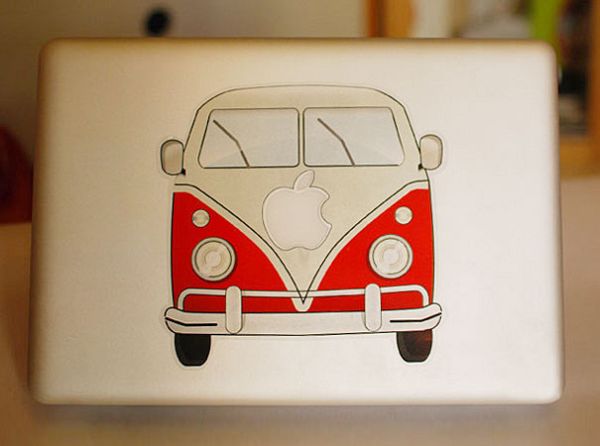
A blank MacBook lid is a clean product. A stickered MacBook lid is a personality board. For years, designers, students, developers, and travelers have treated that aluminum rectangle like a portable scrapbook—half decoration, half soft armor against scratches and coffee-shop anonymity. The fifteen examples below collect cool MacBook stickers and decal layouts: dense collage lids, sparse single icons, ironic slogans, brand mashups, and geometric fills that turn a laptop into something you recognize across a room.
This is not a shopping list. It is a look at how people compose stickers on a laptop, what styles hold up visually, and how to personalize a Mac without turning the lid into visual noise. Whether you prefer one bold decal or a lid so covered the metal disappears, the same design questions apply: hierarchy, color, theme, and edges that will survive daily open-and-close wear.
Why MacBook stickers stuck around
Laptops travel. Stickers travel with them. Unlike phone cases that get replaced yearly, a MacBook often lasts long enough for a sticker collection to grow into a timeline: conference badges, city skylines, band logos, indie brands, inside jokes. The lid becomes a public-facing portfolio of taste. That is why “cool MacBook stickers” remains a durable search—people want inspiration for layout as much as for individual designs.
There is also a practical angle. Vinyl and die-cut stickers add a thin layer of scuff resistance. They do not replace a sleeve, but they can hide small marks and make a machine feel owned rather than rented from a corporate fleet. In shared offices and coworking spaces, a distinctive lid also helps you spot your laptop on a crowded table without flipping every device open.
Sticker culture on Macs also mirrors broader design trends. Minimalist years favor one large graphic. Maximalist years favor collage. Neither is wrong. The lids that photograph well usually look intentional—whether dense or sparse—because the owner made choices instead of sticking whatever came free in a conference bag.
1–4. Dense collage vs. breathing room
Some lids go full collage: edge-to-edge coverage with overlapping shapes, color blocks, and tiny logos fighting for attention. Done well, collage feels intentional—like a carefully packed suitcase. Done poorly, it reads as random clutter. The difference is usually color harmony and a few recurring motifs. If every sticker is a different neon, the eye never rests. Try limiting yourself to two or three dominant hues and let smaller accents break the pattern.
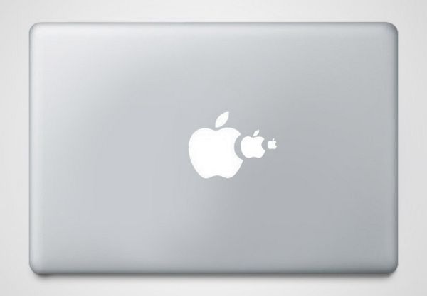
Sparse layouts are the opposite strategy: one large decal or a small cluster with plenty of aluminum showing. Negative space becomes part of the design. This approach ages better when you change cities, jobs, or tastes, because you can swap one piece without peeling a whole mosaic. Sparse lids also photograph cleanly and tend to look more “designed” in professional settings where a sticker bomb might feel loud.


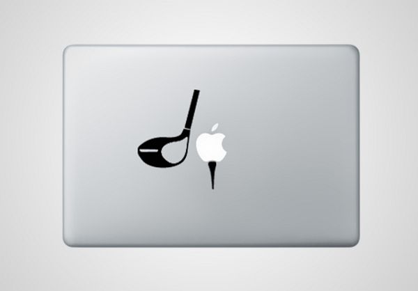
Mid-density arrangements often look the most balanced. Think three to eight stickers grouped toward a corner or along a visual axis, leaving the Apple logo either covered on purpose or carefully framed. Covering the logo is a style choice; framing it with stickers can feel like a crest around a seal. Either way, decide deliberately—half-covered logos usually look accidental.
5–8. Themes that read clearly
The strongest stickered Macs usually have a theme—even a loose one. Travel stamps and city names. Music and festivals. Design tools and type specimens. Developer humor and conference swag. Nature icons. When themes mix without a bridge (say, a wildlife sticker next to a crypto slogan next to a cartoon food), the lid can feel like someone else’s locker. Themes do not have to be strict; they just need a shared mood: wry, outdoor, typographic, playful, or graphic.

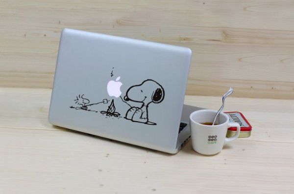
Illustration-heavy stickers—hand-drawn animals, characters, tiny scenes—soften the machine’s industrial look. They work especially well on silver lids where color pops. On darker shells, high-contrast line art and white vinyl often read better than pastel fills that disappear into charcoal aluminum.
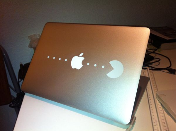
Typography stickers are their own category: witty one-liners, studio names, monospace jokes. Keep letterforms large enough to read from a few feet away. Micro-text that only you can decipher at six inches rarely photographs well and rarely impresses anyone across a café table. If type is your theme, treat kerning and alignment as seriously as you would on a poster—crooked slogan stickers undermine the joke.
9–12. Materials, edges, and longevity

Quality vinyl with clean die-cuts lasts longer than paper stickers that curl at the corners. Holographic and glitter finishes look striking in photos; they also show fingerprints and can clash if overused. Matte vinyl usually photographs cleaner and feels less toy-like on a work machine. Outdoor-rated vinyl handles backpack abrasion better than soft indoor stickers.
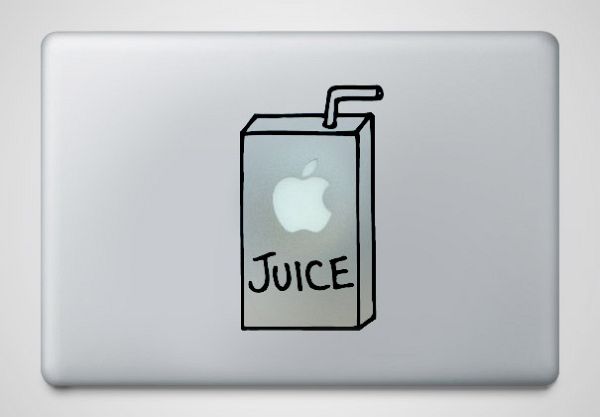
Apply stickers on a clean, dry lid. Wipe oil and dust first. Align carefully—once vinyl bites, repositioning can leave residue or stretch thin designs. If you share a workspace and might sell the laptop later, consider a thin clear skin under the stickers so removal is kinder to resale value. Heat from a hair dryer on low can help lift old vinyl without scraping the finish.
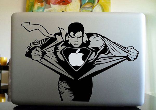

Edges matter. Stickers that hang past the lid lip peel first. Keep a small margin from ports and hinges so daily opening does not catch a corner. Full-wrap “skin” decals are a different product category—smoother, more uniform, less collage energy—and can sit under or instead of individual stickers depending on the look you want. Skins plus a few focal stickers can give you color and personality without a full sticker bomb.
13–15. Building a lid that feels like yours
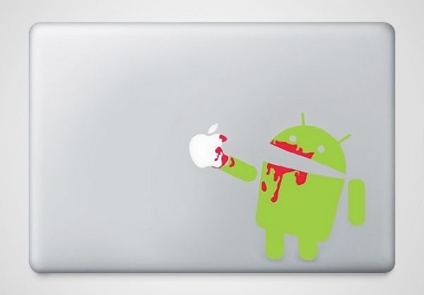
Start with one anchor sticker—the largest or most meaningful piece—then add supporting marks around it. Treat the lid like a poster layout: hierarchy, balance, and a place for the eye to land. Photograph your Mac from above after each addition; the camera is harsher than your desk lamp and will show when something feels off-center. Step away for a day before committing to more vinyl; impulse additions are how lids turn chaotic.
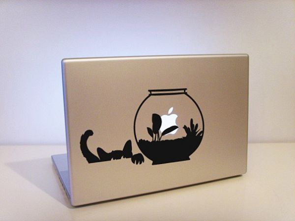
Rotate seasonally if you like change. Swap a few pieces rather than stripping everything. Collections that evolve slowly look more authentic than a one-night sticker dump bought as a set. Independent artists, local shops, and event booths still produce the most memorable pieces; mass multipacks can fill gaps but rarely carry the same story. Keep a small envelope of backups so you can replace a peeled corner without redesigning the whole lid.
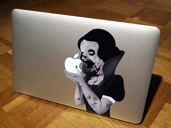
Cool is subjective. The lids that feel cool in person usually share three traits: a readable theme, intentional spacing (whether dense or sparse), and stickers that mean something to the owner. Mimic layouts from galleries like this one for composition ideas, then fill them with marks that match your work, humor, and places—not someone else’s aesthetic checklist. Your Mac should look collected by you, not styled for a stock photo.
A practical way to choose
If you want a quiet professional look, pick one or two high-quality decals and leave aluminum visible. If you want maximum personality, build a collage with a limited color palette and recurring shapes. If you are undecided, leave the center open and grow outward over months. The fifteen examples here prove there is no single correct MacBook sticker style—only layouts that feel deliberate versus accidental.
Whatever direction you take, clean the surface, respect the edges, and stop adding pieces when the lid already has a clear center of gravity. A MacBook sticker collection should look collected, not crowded—and the best ones still look like they belong on a working machine you carry every day.

Comments
Continue reading

Attic Bathroom Design Ideas: Light, Layout, and Roof-Friendly Fixtures
Design ideas for converting an attic into an extra bathroom—working with slopes, skylights, wet-zone materials, eaves storage, and fixture placement.
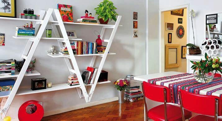
Ladder Shelving Repurpose Ideas: DIY Bookcases, Dividers & More
Turn an old ladder into shelving, a room divider, towel rack, or narrow desk—practical DIY steps, safety checks, and styling tips with photo ideas.
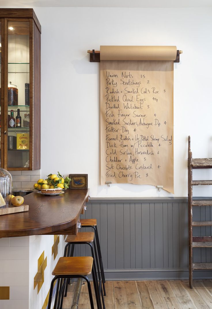
Cool Home Lifehacks That Actually Save Time
Practical household tricks—kraft-paper lists, safer nailing, fridge bottle stops, mint-tin drawers, phone stands—using things you already own.