
Stunning Advertising Photos by Scott Newett
Melbourne advertising photographer Scott Newett’s campaign craft—liquids, still life, and people lit for persuasion, with a hyper-real finish built on lighting control.
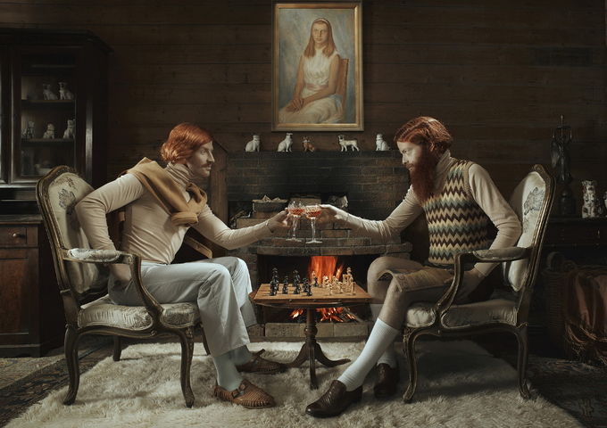
Scott Newett is an Australian advertising photographer based in Melbourne, known especially for liquid and beverage work, as well as campaigns that involve people, still life, and architectural clarity. His commercial images are built for persuasion—products lit until they feel inevitable—but the craft underneath is patient: controlled highlights, believable condensation, surfaces that look touchable through a screen. The photographs collected here sample that advertising eye at full strength.
Advertising photography obsesses with surfaces. Products and people are groomed toward a kind of perfected readability. Newett’s best campaign frames accept that brief and still leave room for wit, tension, or a slightly uncanny polish. You are meant to want the thing—and also to notice the photograph as a made object.
A commercial practice with technical gravity
Newett studied photography at RMIT and has spent decades shooting for agencies and brands across Australasia and beyond. Client lists associated with his career have included major telecom, spirits, beer, and soft-drink names—work that demands consistency under pressure, not only a single hero frame. Liquid photography in particular is unforgiving: bubbles move, ice melts, labels scuff, reflections betray the set. Getting a pour or a beaded bottle to look “natural” often means building an unnatural amount of control.
That control is the quiet signature. Highlights are shaped rather than accidental. Dark areas stay rich without crushing into mud. Colors feel heightened yet anchored to materials you recognize—glass, metal, citrus pulp, fabric. In an era when heavy digital fabrication can fake almost anything, Newett’s reputation has often rested on lighting skill that does the heavy lifting before retouching begins. The goal is hyper-real persuasion that still photographs like a physical event.
Agencies hire that reliability. A campaign may need matching frames across pack shots, lifestyle plates, and social crops. The lighting language has to hold when the art director asks for a tighter logo, a warmer grade, or a vertical crop for a phone banner. Photographers who can only deliver one magical horizontal rarely survive that workflow.
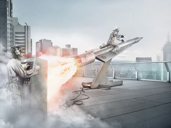
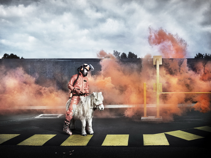
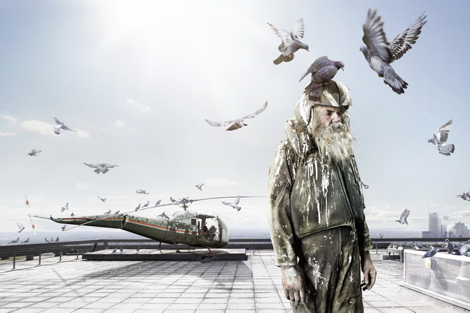
What to look for in campaign frames
Start with the specular highlights—the bright reflections on glass and liquid. In strong advertising work they are shaped into readable forms that describe volume. A bottle should feel round; a glass should feel thick or thin as the brief requires. Then look at the “hero” zone: where the label, logo, or key ingredient sits in the brightest, cleanest light. Everything else supports that readability.
Next, notice edges. Soft transitions can make food and drink feel appetizing; hard rims can make technology or packaging feel precise. Newett’s better images choose edge quality deliberately rather than defaulting to one Photoshop gloss. Backgrounds are rarely neutral by accident—they are tonal stages that push the subject forward without litter.
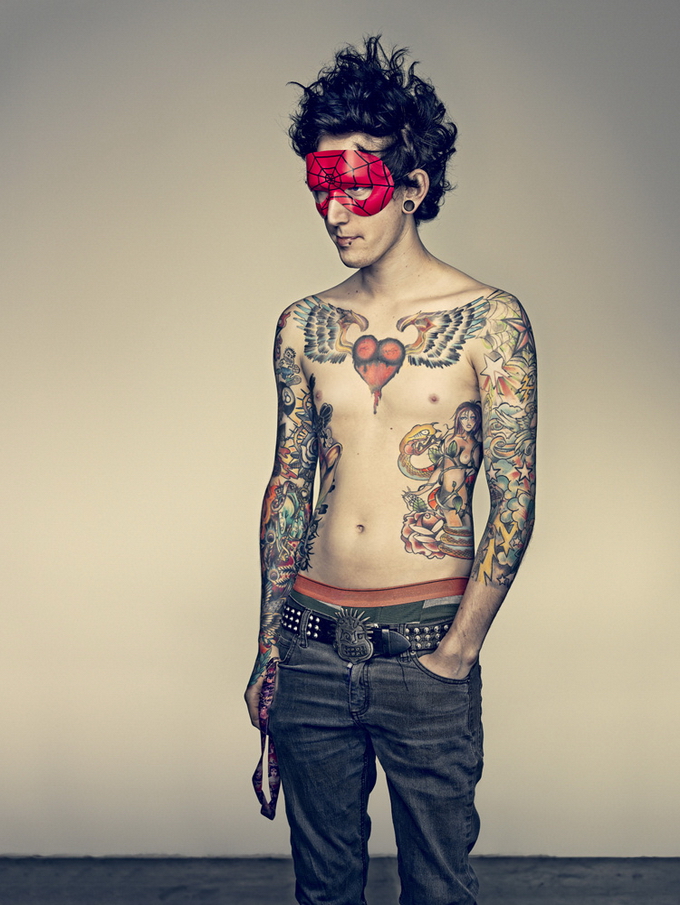
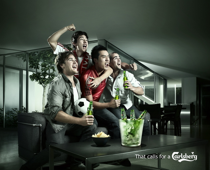
People in advertising frames are often asked to perform desire, refreshment, or belonging. When Newett shoots people, watch the hands and the mouth as much as the eyes. Hands holding a product must look effortless while hitting an exact angle for the label. That choreography is invisible when it works and awkward when it fails. Clothing texture, skin highlight, and product highlight have to share one lighting story so the frame does not split into separate photos glued together.
Still life, appetite, and engineered accident
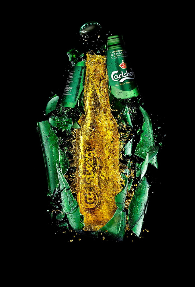
Food and drink still life in advertising is a negotiation between appetite and geometry. Splashes must feel spontaneous and land on cue. Condensation must read cold without turning the label to mush. Citrus oil in a spray, foam on a pour, ice caught mid-crack—these “accidents” are usually rehearsed. Looking at Newett’s still-life advertising frames, ask which moment is the manufactured peak: the second before the splash settles, the bead that sits exactly where type remains legible.
Color grading in this genre tends toward delicious exaggeration—deeper ambers, colder condensation blues, greener limes. The skill is stopping before the product becomes plastic. Material truth still has to whisper under the gloss: you should believe the glass would be cold in your hand. Scale tricks matter too; a macro crop can turn a droplet into a landscape, while a wider plate shot has to keep the product heroic without looking lonely on an empty table.
Personal work beside the brief
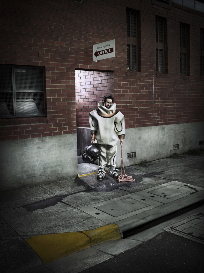
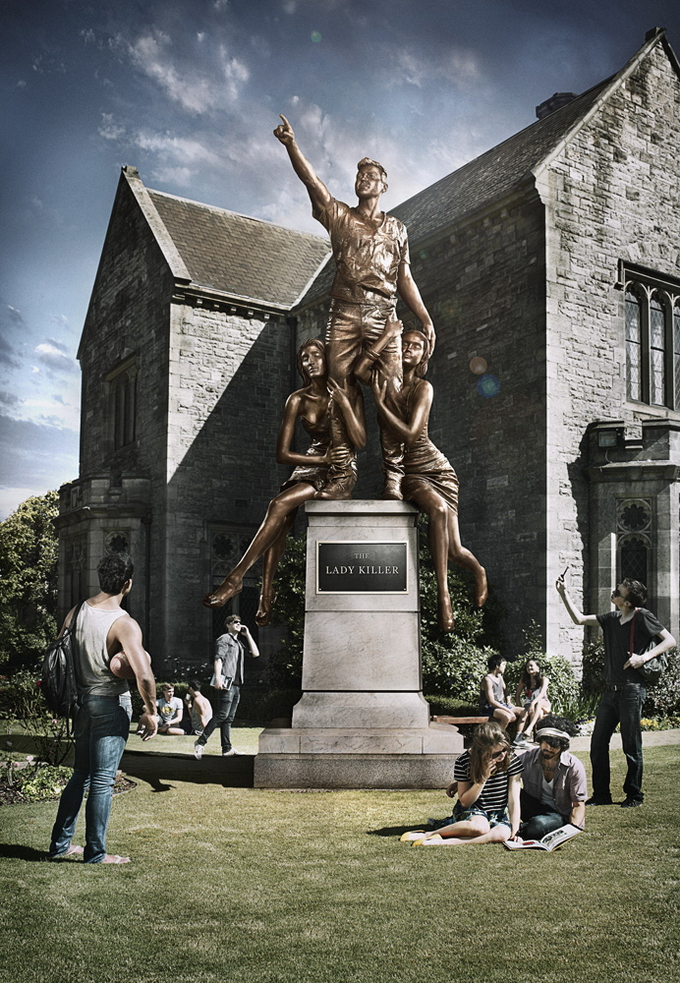
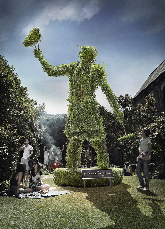
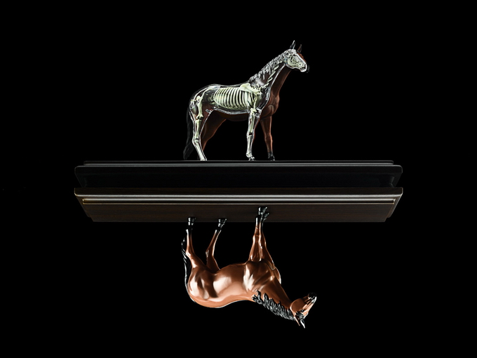
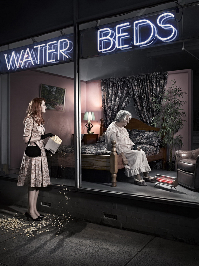
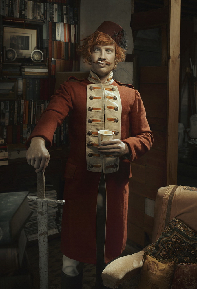
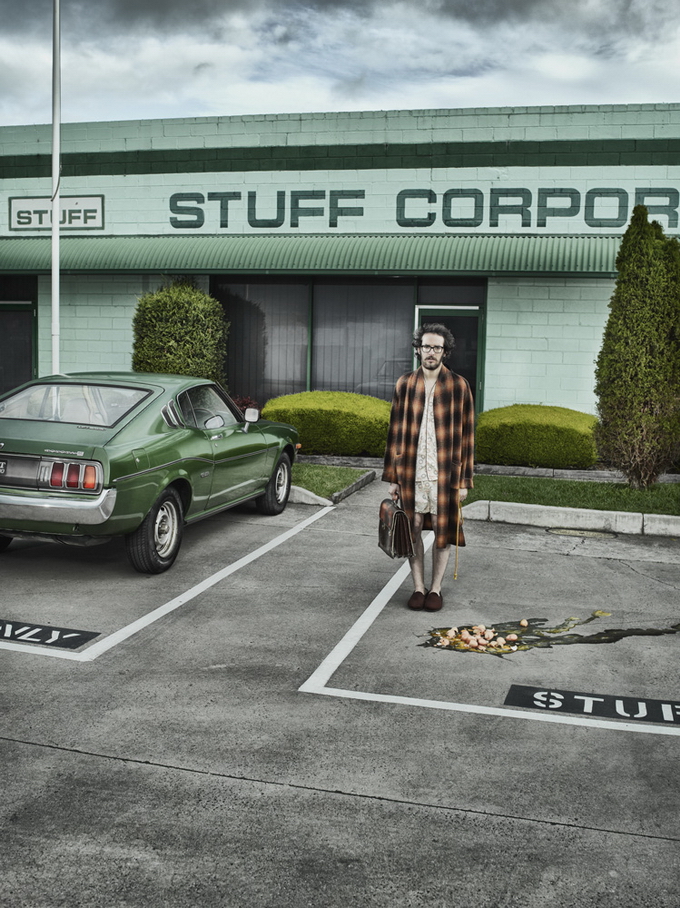
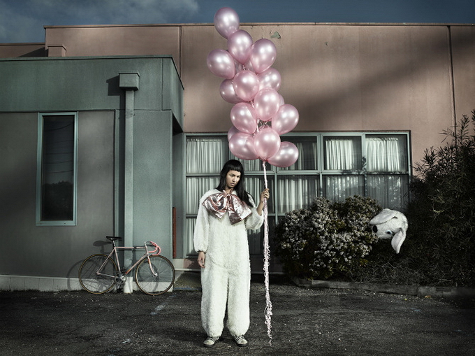
Like many long-career advertising photographers, Newett has also pursued personal series outside client mandates—projects that borrow commercial lighting fluency and aim it at narrative oddity, failure, or social unease rather than product glory. That parallel practice matters for reading the campaign work: the same mind that can perfect a bottle can also stage a world where something is slightly wrong. Even when the assignment is pure sell, you can sometimes sense a photographer who understands how thin the line is between desire and absurdity.
Studio infrastructure supports both modes. Newett has been associated with Cubed Studio in Melbourne and represented through production partners for larger jobs. Advertising at this level is rarely a lone person with a camera; it is a coordinated set of stylists, producers, retouchers, and agency stakeholders. The photographer’s job is to hold a visual standard while the clock and the brief keep moving. Credit belongs to the team, but authorship of light—where the key sits, how hard it is, what the reflections say—still traces back to the person behind the lens.

Reading this set as a portfolio slice
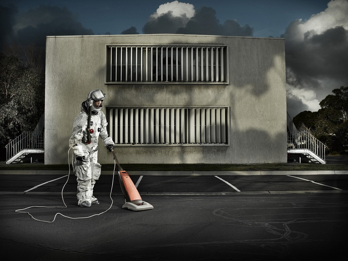
Move through the images slowly. For each one, name the job the photo is doing: appetite, status, refreshment, humor, trust. Then name the lighting tool you think is doing the most work—soft wrap, hard edge, backlight rim, reflected fill. You do not need studio jargon to practice this; you need attention. Advertising images are designed to be consumed quickly. Looking slowly is how you see the construction.
Compare vertical and horizontal frames. Verticals often favor bottles, bodies, and stacked narratives for print or phone. Horizontals can give products a landscape to live in—tabletop stages, environmental context, wider gesture. Newett’s advertising range covers both, which is part of why agencies return: flexibility without a collapse in finish quality.
If you make pictures yourself, steal principles rather than props. Shape one highlight. Protect the logo zone. Decide whether the edge should be soft or hard. Leave one small imperfection that keeps the scene from feeling computer-born. Those habits travel from beverage tables to any product brief.
Scott Newett’s advertising photographs earn a second look because they treat selling as a craft problem with aesthetic stakes. The brands change; the demand for clarity under beautiful pressure does not. When a campaign image still feels considered after the product pitch fades, you are looking at a photographer’s hand—and that hand is the reason this set holds together.

Comments
Continue reading

Dramatic Photo Art by Sukron Ma’mun (Ipoenk Graphic)
Cirebon, Indonesia photographer Sukron Ma’mun uses theatrical natural light to frame village life, play, and place in lyrical photo art.

Bird’s-Eye Views: Florian Beaudenon’s Instant Life
Paris photographer Florian Beaudenon’s Instant Life series captures people in their rooms from above—intimate, collaborative overhead portraits of everyday joy.
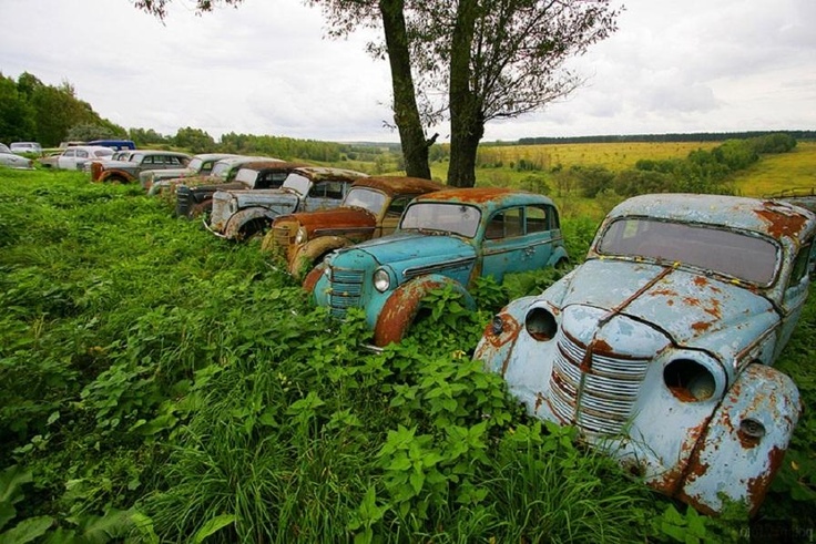
Abandoned Cars Reclaimed by Nature: Rust, Growth, and Quiet Ruin
When neglected vehicles are left outdoors long enough, rust, moss, and trees rewrite them into strange still lifes—sad, photogenic, and slowly returning to the ground.