
Kate Upton in V Magazine Spring Preview 2013: The Discreet Charm
Sebastian Faena’s V #81 spring story casts Kate Upton as an ironic hotel housewife—sixties styling by Julia von Boehm, couple tableaux, indie fashion fiction.
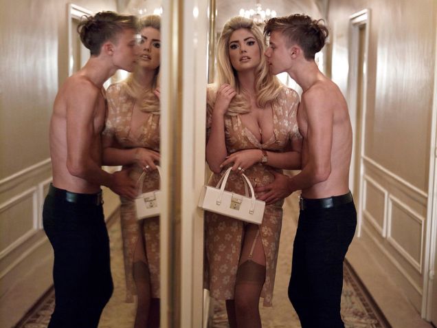
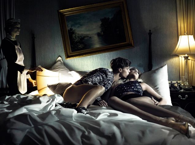
V Magazine’s spring 2013 preview framed Kate Upton inside a fashion story, not a swimsuit destination and not a national-Vogue cover myth. Photographed by Sebastian Faena for issue 81 and titled The Discreet Charm of Kate Upton, the editorial cast her as an ironic, slightly bored kept housewife sharing hotel-room frames with a slender male counterpart. Styling by Julia von Boehm leaned into sixties silhouettes, Converse as deliberate punctures of glamour, and the kind of narrative posing that independent fashion magazines prefer over icebergs, latex Newton citations, or Brazilian newsstand gloss.
By January 2013 Upton was already a newsstand constant—SI covers looming, campaign chatter loud, blog galleries endless—but V’s job was different. Publisher Stephen Gan’s title specialized in character-driven fashion fiction: short cinematic chapters where clothes advance a joke or a mood. This gallery gathers those Faena frames—horizontal room scenes, couple tableaux, soft daylight on patterned interiors—as a historical spring-preview package. The hotel is a set. The boredom is a prop. What the URL is for is the V Magazine story, not a personality scrapbook.
Spring preview grammar, not cover franchise grammar
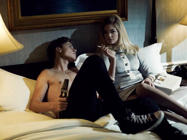
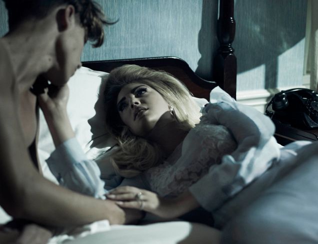
A spring preview issue sells next-season clothes through attitude. V’s preview culture in the early 2010s favored tight narrative clusters over destination travel. Faena’s brief, as he described it at the time, put Upton in the part of a confused, kept housewife with irony—romance frames that refuse sincerity, a male model more shirtless than she is, boredom as a fashion device. That is magazine theater. It is not Sports Illustrated’s seven-continents adventure, and it is not Vogue Italia’s Helmut Newton latex homage. The room, the bed edge, the doorway, and the couple’s mismatched energy do the place-work that ice shelves and ship rails do in SI’s Antarctica package.
Hair by Didier Malige and makeup by Jeanine Lobell keep the sixties reference readable without turning the set into costume-party pastiche. Von Boehm’s styling mixes elevated pieces with sneakers and casual interruptions so the “discreet charm” title lands as wit rather than perfume-ad sincerity. Period blog coverage also named Liam Dean and Kremi Otashliyska among the story’s supporting faces—another signal that this is ensemble fashion fiction, not a lone pin-up dump. When you scroll the gallery, track how often the second body and the furniture share authorship of the frame with Upton. In a V story, that shared authorship is structural. Remove the partner and the irony collapses into ordinary glamour.
Spring-preview timing matters too. January newsstand energy is about announcing a season, not memorializing a polar expedition that will define a swimsuit franchise two months later. V wants readers to feel they are inside a short film about clothes and manners. SI wants readers to feel they traveled. Those are incompatible fantasy products, even when the same model headlines both.
Why V’s market voice matters
V Magazine occupied a New York indie-luxury niche: closer to art-fashion conversation than to mass sports-magazine newsstand rituals, less national-Vogue institutional than Condé Nast’s country editions. Putting Upton inside that niche in early 2013 was a translation job. The same year she would sell Antarctica for SI and high-gloss covers for Vogue markets; here she sells irony, interior scale, and a short film you can flip in seven frames. Gan’s earlier design work around CR Fashion Book had already signaled interest in Upton as a fashion character rather than only a swimsuit headline. The V spring preview continues that character experiment with Faena’s camera as the director of photography.
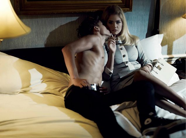
Indie fashion titles often use couple staging to create narrative tension that a solo beauty crop cannot. The male counterpart in these pictures is not a boyfriend rumor; he is a compositional tool. His shirtlessness, his curl of hair, his placement at the edge of the mattress or doorway—all of it builds the “discreet charm” joke. Fashion blogs of the period leaned hard on that contrast because it was the story’s hook. Keep the hook attached to the images and you keep the URL honest.
Readers searching this slug usually want confirmation of photographer, issue timing, and the story’s tone. The answers stay concrete: Sebastian Faena, V #81 spring 2013, The Discreet Charm of Kate Upton, hotel staging, Julia von Boehm styling, Malige and Lobell on hair and makeup. Those facts are the usable index. Later career noise does not belong here. Neither do affiliate swimwear plugs or blog-era outbound spam. The artifact is the fashion story’s grammar—horizontal frames, domestic props, couple chemistry as editorial device.
How the pictures stage “discreet charm”
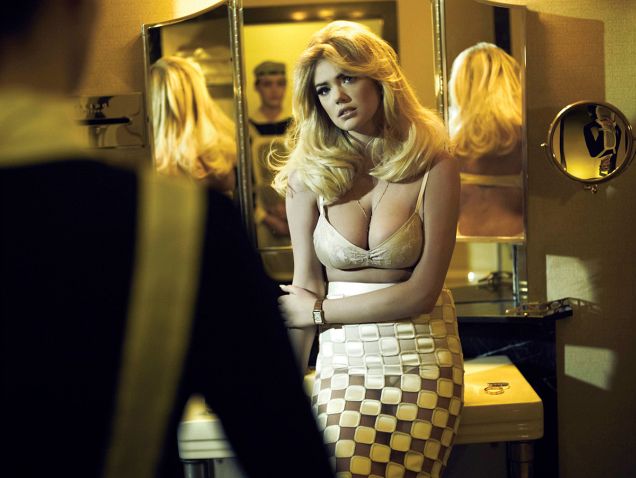
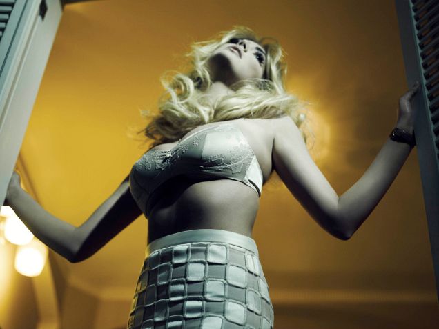
Irony only works if the clothes still look desirable. Faena’s lighting keeps skin and fabric soft enough for a fashion magazine while the poses refuse romance-novel sincerity. A bored glance toward camera, a body angled away from the partner, sneakers under evening fabric—these are editorial punchlines. They also explain why the set feels smaller and warmer than polar SI pages or Meisel’s street-latex Vogue Italia chapter. Scale is intentional. V wants you inside a room; SI wants you outside a continent; Vogue Italia wants you inside a myth of urban erotic power; Vogue Germany wants Weber’s outdoor air; Vogue Brasil wants newsstand glamour for a Latin American edition.
Compare wardrobe logic across Upton’s 2012–2013 magazine map and the differences sharpen further. SI Antarctica uses swimwear as expedition costume against ice. Vogue Brasil’s July cover uses Miu Miu and mixed international–Brazilian houses to define “the new sexy.” Vogue Germany under Bruce Weber opens outdoor American-European romance with Ackermann, Vuitton, Hermès, Dior. Vogue Italia under Steven Meisel and Carlyne Cerf de Dudzeele pushes Newton-era latex mistress fantasy for Franca Sozzani’s title. V Magazine uses sixties-coded ready-to-wear and couple staging to preview spring with a wink. Same model; five different editorial sentences. Naming the sentence is the whole point of keeping separate URLs.
Horizontal framing deserves a second look. Many of these images are wider than they are tall, which suits hotel narrative—two bodies, furniture, doorway depth. SI’s Antarctica cover energy and many Vogue verticals prioritize a single towering figure. V’s spring preview often prioritizes a scene. If you only remember one formal difference, remember that: scene versus icon.
Reading checklist for the Faena set
- Title first: The Discreet Charm of Kate Upton signals irony before any caption does.
- Find the second body: the male counterpart is structural, not decorative filler.
- Track interior props: beds, doorways, soft daylight—hotel as narrative machine.
- Notice sneakers and casual breaks: von Boehm’s styling refuses uninterrupted glamour.
- Keep V separate from SI and Vogue: spring-preview fiction is not destination cover energy and not national-Vogue mythmaking.
- Prefer scene over icon: horizontal couple frames are doing story work, not just beauty crops.
What remains useful, years later, is how cleanly the story does a small job well: turn a ubiquitous early-2010s face into a short fashion play for an indie luxury title’s spring book. Scroll once for the joke in the posing. Scroll again for the clothes that still have to sell the season. If both registers stay visible, Faena’s brief succeeded.

Comments
Continue reading
Kate Upton for Vogue Germany January 2013: Bruce Weber
Bruce Weber and Anne Christensen’s January 2013 Vogue Germany feature—outdoor European wardrobe romance, from Ackermann to Eres.
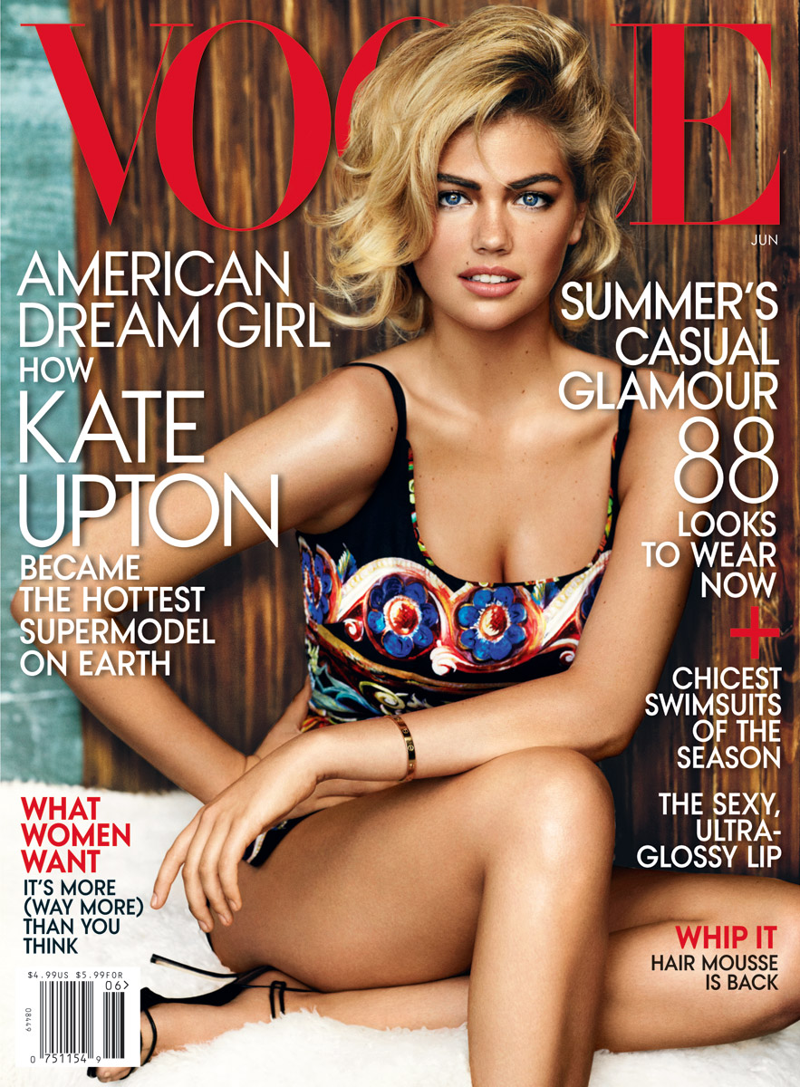
Kate Upton for Vogue US, June 2013
Mario Testino’s sunlit Uruguay cover story for American Vogue’s June 2013 issue—The Kate Upton Effect—in summer knits, swim, and casual glamour.
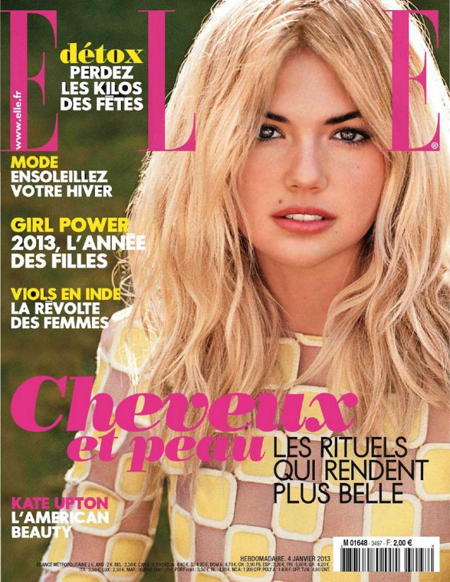
Kate Upton for Elle France, January 2013
Matt Jones and Nora Bordjah frame Kate Upton as “American Beauty” for Elle France’s January 2013 issue—casual French chic, tousled hair, and wearable fashion ease.