
Interesting Photography by Gary Salter: Wry Advertising & Lifestyle Still
London photographer Gary Salter builds character-driven advertising and lifestyle images with dry humor—people, locations, and timed visual punch lines.

Gary Salter is a London-based photographer and director whose advertising and lifestyle images are built around character, location, and a dry sense of humor. Born in Blackpool and trained in graphics and photography in Liverpool before settling in London, he makes commercial pictures that behave like short stories rather than catalog stills. The selection here leans into that twisted, playful register: setups that look ordinary until the punch line lands inside the frame.
His client list has long included major brands—among them Mercedes-Benz, Nissan, Ford, Vodafone, Citibank, LG, Jaguar, Nike, McDonald’s, and PlayStation—alongside campaigns and portraits that move through agencies and awards circuits. What holds the work together is not a single filter or preset. It is a preference for people as protagonists, places as stages, and jokes that arrive through gesture, prop, and timing instead of caption text. Viewers who meet these frames on a coffee break often remember the gag longer than the product name, which is both a creative win and a commercial risk Salter has learned to balance.
Advertising that behaves like a sketch
Commercial photography often flatters the product until the product disappears into polish. Gary Salter’s stronger frames keep the brand inside a human situation. Someone is mid-action, mid-embarrassment, mid-delight. The object or service becomes a character in the scene rather than a logo parked on white infinity. That approach suits lifestyle and people-heavy productions: large crews, real locations, and enough control to stage a moment that still feels spontaneous when the shutter closes.
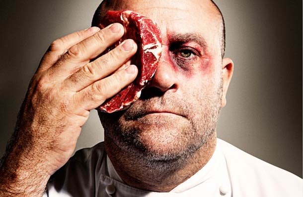
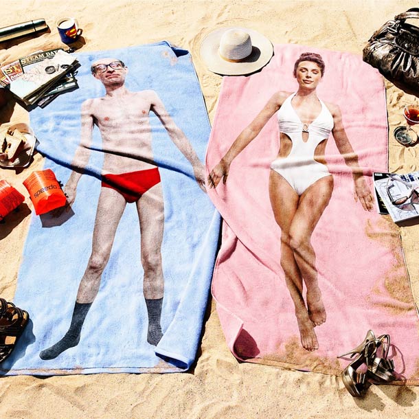
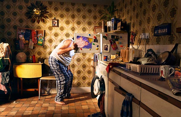
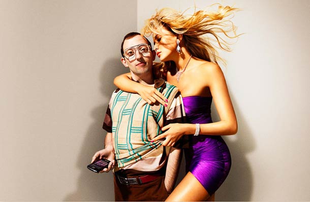
Humor in advertising is fragile. Too broad and it looks like a stock comedy still; too subtle and the brief never lands with the client or the public. Salter’s wry tone sits between those poles. The images invite a double take. You read the scene as nearly documentary for a second, then notice the exaggeration—the prop that should not be there, the expression that lasts a beat too long, the geometry that makes the joke inevitable. That double take is useful in a scroll culture: the picture holds attention without shouting, and it rewards a second glance when the first smile fades.
A background in graphics shows in the clarity of the compositions. Shapes lock together. Color blocks read at thumbnail size. Negative space gives the eye a place to rest before the gag. The pictures are funny, but they are also designed. That combination—wit plus structure—is why the work survives outside a single media buy. A campaign ends; a well-timed still can keep circulating as photography.
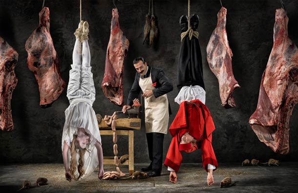
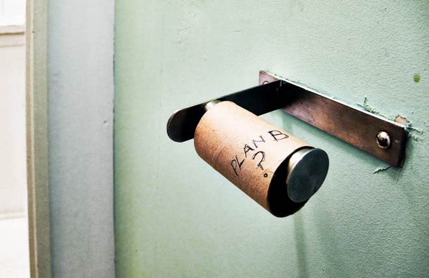
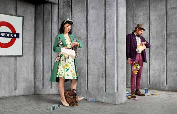
People, places, and production craft
Salter specializes in large-production people and location work. That means casting, wardrobe, weather plans, and the patience to wait for a face that sells the idea. It also means collaboration with agencies and art directors who arrive with a concept that still needs a photographic solution. The best commercial photographers do not merely execute a layout; they push the scene until it becomes more memorable than the brief on paper. Salter’s reputation rests partly on that willingness to build images and stories beyond the first sketch.
His portraits of high-profile subjects—actors, athletes, public figures—often keep the same wit. Recognition is not enough; the frame wants an unexpected angle on a familiar face. That curiosity about people and the stories hidden in plain sight is something he has pointed to as ongoing fuel. Personal observational projects become testing grounds for ideas that later migrate into campaigns, so the commercial work does not feel sealed off from looking at ordinary life.
Stills and moving image sit adjacent in his practice. Directing commercials alongside photography keeps timing and performance sharp. A still that works often has the bones of a beat you could film: entrance, reaction, hold. Looking at the gallery with that in mind helps explain why the humor feels timed rather than pasted on. The joke has a beginning and a punch, even when it occupies a single rectangle.
Location choice carries narrative weight. Interiors and streets are selected for character, not only for convenience. Light supports readability; comedy dies in muddy shadow or in glare that hides the face. When color is bold, it is usually structural—another design tool—not decorative noise. Production craft here is invisible when it succeeds: you feel the joke, not the call sheet.
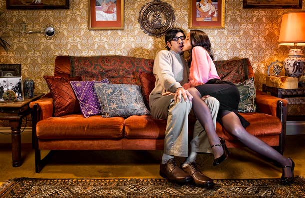
What to watch for in the sequence
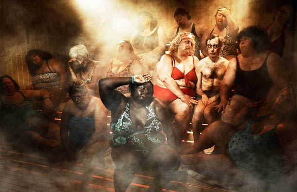
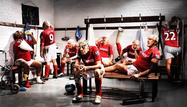
Scan the images for recurring tools. Props do narrative work—objects that redirect the story in one glance. Body language sells the joke before you invent a caption. Locations feel like sets even when they are real streets and rooms. Lighting keeps faces and key objects legible. Cropping decides whether the gag is generous or tight. Together those choices explain why the humor rarely needs text inside the frame.
Notice how rarely the joke depends on a written punch line. The photograph has to carry the idea silently. That is a hard commercial skill and a reason these pictures still work as a gallery years after a campaign cycle ends: the gag is visual, so it survives outside the original media plan. Silence is part of the craft.
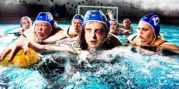
Compare quieter frames with louder ones. Salter’s range includes both understated wryness and more theatrical setups. The common thread is control. Even when a scene looks chaotic, the edges of the frame feel considered. Chaos is cast and directed. Ask, of any single image, what would break if you moved the camera two steps left. The answer is usually the joke’s geometry.
Also watch for empathy. The humor is rarely cruel. Subjects are allowed dignity even when the situation is absurd. That kindness keeps brand work shareable and keeps personal-looking projects from tipping into mean-spirited sketch comedy. Wit without contempt is harder than it looks.
Awards, clients, and the long game
Recognition from bodies such as the Association of Photographers, D&AD, and other industry awards has followed campaigns for clients across food, broadcast, finance, charity, and consumer brands. Awards are not the point of looking at the work, but they mark a career built on repeated delivery under commercial pressure. Humor that wins briefs has to clear legal, brand, and cultural gates while still feeling alive on set. That pressure cooks soft ideas until only the durable ones remain.
Working mainly from London with shoots across the UK and Europe, Salter sits in a tradition of British advertising photography that values wit and craft over pure gloss. The pictures in this set belong to that conversation: they are meant to be enjoyed quickly and remembered longer than a slogan. Later portrait and lifestyle commissions—whether for household names or quieter brands—extend the same curiosity about character.
For younger photographers, the useful takeaway is not “add a funny prop.” It is build a visual sentence with subject, verb, and punch, then light and crop until the sentence reads at a glance. For art directors, the takeaway is trust a photographer who can improve the brief without abandoning it. For everyone else, the takeaway is simpler: commercial photography can still surprise.
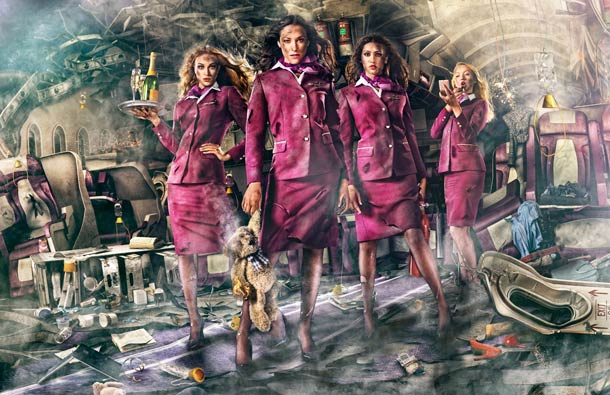

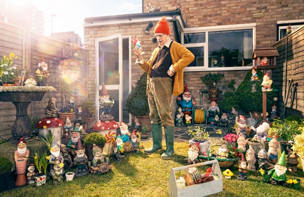
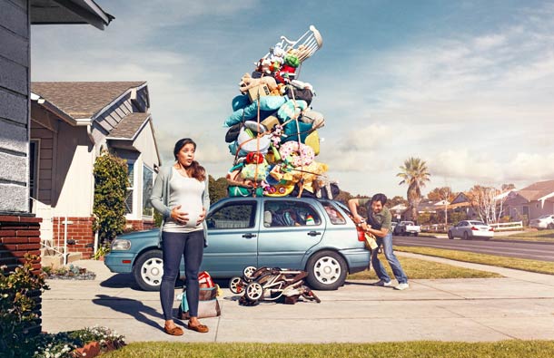




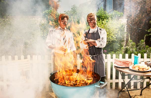
If one frame makes you smile before you can explain why, stay with it. Is the joke in the prop, the face, the location, or the crop? That small reverse-engineering habit is a fair way to leave Gary Salter’s pictures—curious about how a commercial still can feel as timed as a punch line.

Comments
Continue reading

Dramatic Photo Art by Sukron Ma’mun (Ipoenk Graphic)
Cirebon, Indonesia photographer Sukron Ma’mun uses theatrical natural light to frame village life, play, and place in lyrical photo art.

Bird’s-Eye Views: Florian Beaudenon’s Instant Life
Paris photographer Florian Beaudenon’s Instant Life series captures people in their rooms from above—intimate, collaborative overhead portraits of everyday joy.
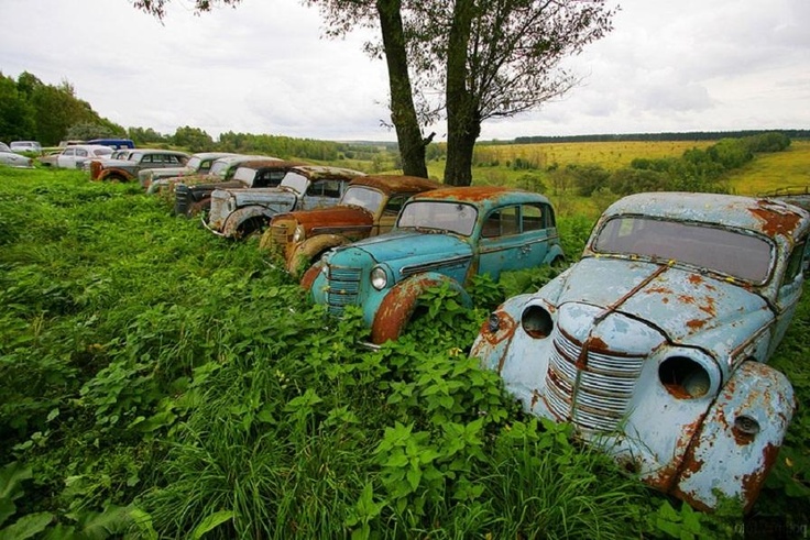
Abandoned Cars Reclaimed by Nature: Rust, Growth, and Quiet Ruin
When neglected vehicles are left outdoors long enough, rust, moss, and trees rewrite them into strange still lifes—sad, photogenic, and slowly returning to the ground.