
Fantastic Package Designs: Criteria for Judging Standout Packs
A gallery-minded look at package design—structure, hierarchy, material, systems, and unboxing—without the hard sell.
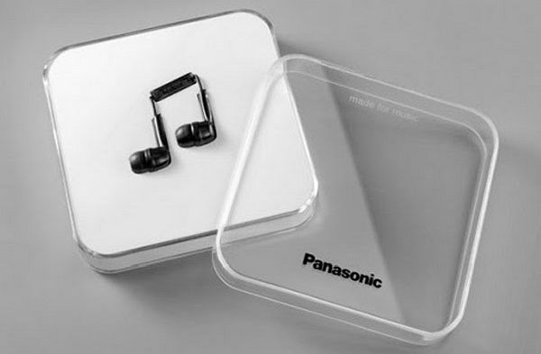
Fantastic package design is not a pile of pretty boxes. It is a short argument made of structure, type, color, material, and the moment of opening. The best packs protect the product, signal what it is, and leave a memorable silhouette on a shelf or in a feed. The weaker ones decorate first and think later. This gallery look favors criteria over shopping lists: how to judge a pack as design, then how to read striking examples with a designer’s eye rather than a checkout impulse.
Packaging sits at a crowded intersection—brand system, industrial constraint, retail theater, and unboxing ritual. A fantastic solution usually wins more than one of those games at once. It may also fail a different game on purpose: a museum-like gift box can be awkward in shipping; a shipping-first mailer can look shy in a boutique. Clarity about the job is part of the craft.
Criteria before spectacle
- Structural honesty. Does the form protect, portion, and open without fighting the user?
- Information hierarchy. Can you name the product, brand, and key differentiator in three seconds?
- Material conviction. Do paperboard, glass, soft-touch coatings, kraft, or plastic feel inevitable for this category?
- Shelf and screen silhouette. Would you recognize the pack as a thumbnail and across an aisle?
- System thinking. Do variants share a family while remaining distinct?
- Secondary life. Does the pack invite reuse, display, or clean recycling—or does it die the moment it is opened?
- Touch and reveal. Are finishes, die-cuts, windows, or inner trays earning their cost with a real experience?
Use those tests on every “wow” pack you meet. Spectacle that fails hierarchy becomes noisy. Hierarchy without material pleasure becomes clinical. Fantastic design usually balances both.
Structure as the first idea
Before graphics, there is a blank: sleeve, carton, bottle, pouch, tin, tube, clamshell, mailer. Structure decides how the hand meets the brand. A die-cut window can prove freshness or texture without a paragraph of claims. A modular box that becomes a toy or display turns waste into play. A single outer shell with interchangeable waist seals can cut ink and tooling while keeping a collectible rhythm across flavors.
Judge structural ideas by friction. If opening requires instructions, the theater has become a puzzle. If the product rattles, protection failed. If the pack cannot stand, stack, or ship without custom babying, the idea may belong in a concept gallery more than in a supply chain. Concept packs still matter—they expand the vocabulary—but label them honestly when you study them.
Color, type, and cultural cues
Color often carries ingredient or origin before words do. An all-over fruit pattern can announce the hero note on skincare. Terrain-coded hues can map a fragrance line to geography. Checkerboard nostalgia can signal a food tradition without a fake farm story. The test is specificity: does the palette belong to this product’s world, or could it slide onto any neighbor on the shelf?
Typography carries tone. Condensed utilitarian numbers can make a bottle feel like field equipment. A fluid script can soften a savory snack into hospitality. Oversized route codes can turn a range into a system you want to complete. When type and structure argue—luxury serif on a battered mailer, for example—the pack feels unresolved unless the contradiction is the point.
Illustration and photography should be evidence, not wallpaper. Botanical drawings, long-exposure motion studies, or stone-and-terrain product shots can root a brand in place. Stock gradients rarely do. If removing the image would not change your understanding of the product, the image was decoration.
Systems beat one-off heroes
A single heroic SKU is easier to admire than a coherent range. Fantastic package design often shows its quality in the third and seventh variant: same architecture, shifted accent, unbroken recognition. Color-coded arches on identical pouches, shared grids with flavor seals, or family patterns with controlled swaps—these moves prove the designer thought past the hero shot.
Systems also discipline sustainability claims. One outer box reused across flavors with lightweight differentiators can reduce material theater. Refill pouches that match the primary visual language make the responsible choice feel premium rather than punitive. Judge eco gestures by whether they are structural or merely printed leaf icons.
Unboxing as paced storytelling
Retail shelf and direct-to-consumer unboxing ask for different pacing. On shelf, the outer face must win in a second. In unboxing, inner trays, tissue, and nested reveals can unfold a narrative. Fantastic packs know which stage they are designing for. Overdesigned outer faces can feel desperate online; underdesigned outers can disappear in stores. The gallery mindset is to ask which stage the designer optimized—and whether that match fits the brand’s real channel.
Tactile finishes—soft-touch, spot gloss, letterpress bite, raw kraft against neon print—reward the hand. They should clarify hierarchy, not bury it under effects. A neon folk-hero illustration on kraft tea packaging, for example, works when contrast is the story: tradition meeting electric contemporary energy. Effects without a story are just cost.
How to walk a package gallery
For each example, including the one above, run a quick pass:
- Name the product category without reading fine print.
- Point to the single strongest design decision—structure, color, type, or reveal.
- Guess the intended channel: boutique shelf, supermarket, or mailer.
- Ask what you would steal for a different category, and what you would refuse to copy.
That habit turns inspiration into literacy. You stop collecting “cool packs” and start collecting moves: window as proof, seal as variant engine, pattern as ingredient billboard, silhouette as trademark.
Common failure modes
Watch for packs that shout sustainability while using inseparable mixed materials. Watch for luxury cues piled onto low-cost forms until the object feels costume-like. Watch for humor that insults the product. Watch for photography that could belong to any competitor. Watch for ranges where every SKU tries to be the hero, so none can be found quickly by a returning buyer.
Also watch for the opposite failure: safe minimalism that leaves no memory. Restraint is a strategy only when the remaining elements are sharp. Empty space is not automatically elegant; sometimes it is unfinished thinking.
A compact viewing checklist
- Structure: protect, open, stand.
- Hierarchy: brand, product, proof.
- Material: right for category and hand-feel.
- System: variants related, not cloned or chaotic.
- Memory: one silhouette or motif you can recall tomorrow.
Hold fantastic package designs to those five points and the gallery gets sharper. The point is not to buy everything on sight. The point is to see why a pack earns its place in the hand—and why some beautiful faces still fail as design.

Comments
Continue reading

Attic Bathroom Design Ideas: Light, Layout, and Roof-Friendly Fixtures
Design ideas for converting an attic into an extra bathroom—working with slopes, skylights, wet-zone materials, eaves storage, and fixture placement.
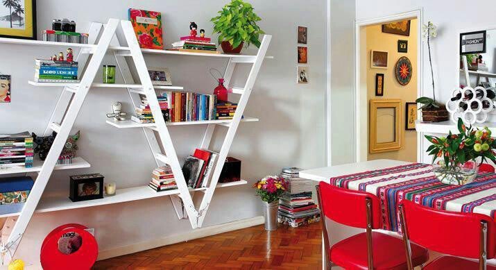
Ladder Shelving Repurpose Ideas: DIY Bookcases, Dividers & More
Turn an old ladder into shelving, a room divider, towel rack, or narrow desk—practical DIY steps, safety checks, and styling tips with photo ideas.
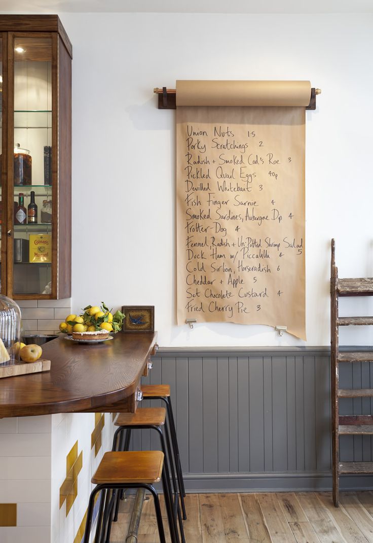
Cool Home Lifehacks That Actually Save Time
Practical household tricks—kraft-paper lists, safer nailing, fridge bottle stops, mint-tin drawers, phone stands—using things you already own.